Showing posts with label Stone. Show all posts

Thursday, 9 June 2022

2022 Topic 08: Split Complementary Colours {by Floss Nicholls} with Seth Apter stamps


Orange - Neutral
Main Colour: Dirty Orange
Complements: Yellow Beige, Pink Stone
Type: Twist - One colour is neutral ( FF Stone)
Created from Frescos: Haystack, Peach Nectar, Stone


Hi everyone, it's Floss (flossworkshopart) with you today, and I'm here to share how I used layers to create a set of matching (but non matching) mixed media tags using split complementary colours with you.

How can they be matching but not matching at the same time I hear you cry...take a look below and you'll see that by creating a 'master board' first it naturally lends itself to become  an un-matching set.


I really love to incorporate texture, fabrics and collage within my art...mix that in with some stitching and embossing and it makes me one very happy girl. So when Seth Apter brought out his new range of mini stamps I was literally jumping for joy when they arrived in the post and I just could not wait to get into my workshop and start using them! 


I started by creating a colour wheel with the beautiful HAYSTACKPEACH NECTAR and STONE fresco finish colours with the idea of layering these colours together to make a set of mixed media tags incorporating fabrics and eyelets. 

You can create your own colour wheel by using the PaperArtsy blank found at https://www.facebook.com/groups/paperartsypeople/files. I found this sheet particularly useful to check my colours throughout the making as I wanted to limit my palette to the three mixed colours and didn't want variation in my mixing.

Here comes the theory bit...if you need clarification to understand the split complementary colour process...or you missed Keren's introduction a few days ago...I hope you find my explanation clear...please do jump straight ahead to the next bit** if you already have a good understanding of what split complementary colours are. 

The position of a letter Y is helpful in finding which mix of paints you'll be using on the colour wheel. First of all mix equal amounts of your two chosen primary colours together to make your secondary colour.  In this case because it's a twist on the standard colour wheel I used Haystack and Peach Nectar to create my 'dirty orange' (secondary) shade seen on the down stroke of the Y. The complementary colour of the dirty orange is Stone. As it is 'split' complementary you'll be using the tertiary colours either side of the stone shown below with the two upper V strokes of the Y to create your art. You mix these tertiary colours which I will call pink stone and yellow beige by mixing equal amounts of the mixed secondary colours (Stone with Peach Nectar and then Stone with Haystack) with stone.

**Using the split complementary colour combination is a fun way to explore how colours really go together well. You'll notice there is a little box beneath the colour wheel with 'all 3 mixed' written inside it.  I often use a mix of all my colours that I use on one piece, I find it brings them all together and harmonises my art. I added this box as a force of habit without even thinking, however, I did not use this mix on the tag project this time as I wanted to stick to the three colours shown with the Y.


Prior to using my new colour palette I used some old book papers with different sized text and fonts, with some old maths papers to collage onto a sheet of 300gsm white card.  I like to collage different size/font style text over another as, for me, I'm not trying to read the text but use the it as a form of textured marks. I also like to rip rather than cut the pages as I prefer the raw look rather than a clinical/stark edged feel to my art.

To begin building my coloured layers I used Ranger's black Archival ink with one of Seth Apter's gorgeous new rubber stamps (EM67 - available now from PaperArtsy Retailers) with an older one of my favourites EM41, to stamp some textures onto my 10 x 8 gel plate and let that dry. Remember what you put down first onto your gel plate will be on the top of the pulled print. 

Notice how I have created + crosses by using the EM67 'ONE' stamp portrait and landscape over each other, and layered the 'ONE' stamp over the EM41 multi boxes stamp to make the texture my own...you may prefer to make x crosses. Seth did say "make it your own" in his introduction blog post...and that's what I love about these new mini stamps; they have so many options to truly go bonkers with a multitude of different textures in the way you use them, so do have some fun...Try using different pressures when applying the stamps to the gel plate or don't renew the ink each time you stamp to give you a variation on shades too. I started mixing my colours to use on the gel plate whilst the ink was drying. I found it useful to have the colour wheel to hand to check my mixing to keep the continuity in the colours.


I started with applying the lightest colour first, yellow beige, (made by mixing Haystack with Stone then  mixed with Stone again) and only covered parts of the plate. I didn't want to pull a flat colour print (which would have happened if I'd covered the whole plate) and left that to dry. I loved the way the paint 'pickled' a little leaving tiny bubble circles within the colour; I hoped the next shade would show through when I pulled it. I let this dry too.


I was actually itching to see how this was going to come out as the layers were looking so beautiful on the gel plate, and as you know, you never really know what that pull is going to be like when it comes off so I had my fingers crossed it would all be ok and I wouldn't have to re collage a sheet...although...the way I looked at it was that if it all did go wrong I'd just have a bit more play time...so that's not a bad thing!


I then used the pink stone colour, (made by mixing Peach Nectar with Stone then mixed with Stone again) and covered the remaining parts of the plate. Before pulling the print I used the EM41 and EM67 rubber stamps again, this time pressed into the paint to take areas of paint off and also stamp the paint elsewhere on the plate too. By doing this I am not only creating more texture but allowing different colours to show through the layers. I used the collaged sheet to pull the print.


Look at the way the edges of the collage have left fabulous marks on the gel plate ready for a fun second pull. Using collage on the pulled print not only leaves those edgy marks on the gel plate ready for the next pull but gives you interesting lines within the print where there are different levels of paper.


To add solid blocks of texture I mixed my 'rose stone' with some grunge paste and used a palette knife to spread a thin layer of this over parts of the now collaged printed card. I was aware that the colour was slightly lighter than the three I was trying to stick to, but gave myself permission to run with it as I wanted the solid grunge texture block. I then used EM70 to press the rectangle textures and EM72 zigzag textures into the grunge paste whilst it was still a little damp. If you try to do this whilst it is very wet it will give you a very smudged/stippled appearance rather than the clean lines of the stamp. Maybe do a test piece before you apply it to your master sheet if this process is new to you. If you need the image to be a little softer then wait for the grunge paste to dry and sand it back. By sanding it, it can also give you the option of some interesting high and low areas.


I ran the whole piece through the sewing machine using black thread for contrast. The lines of the collage and grunge paste gave me a hint of where to sew. I used six random lines as there would be six tags.  I made sure some of the lines crossed where the master sheet would be cut and so where each tag would be separated from one another. On the reverse, I put masking tape over the stitched lines. This was to secure the stitching ,especially where it would be cut mid line but also to add to the texture.
 

Rubber stamp EM69 just sang to me to be embossed using the new Mud Pie WOW embossing powder.  It has a very slight metallic shimmer to it but it's not too 'glitzy'. I am not a glittery sparkly kind of girl at all but I quite like a little metallic shimmer from time to time. I decided to use only a small section of the stamp so as it was not too overloaded and just gave it a slight accent.


I used a similar method for gel printing on the reverse but without stamping black ink onto the gel plate first. Instead I chose to use the stamp EM70 in the paint on the plate after I rolled it to give more stamp definition in the contrasting colours.


I then chose to divide the A4 sheet into six. The first cut was in half making two A5 sheets then each A5 into three so each piece measured 105mm x 70mm. You may choose to make your tags a different size...whatever works for you and what you will use them for...

I was happy with my colour swatching! The colour wheel really did prove helpful with mixing consistently! 

 
I like corners taken off as triangles so measured 16mm in from each edge along the top and 30mm down the sides and snipped them off using scissors. Once you have done one you don't really need to measure any others as you have made your template with the first one...measure twice cut once to be sure before you cut. You may prefer a rounded tag top or one that is cut using a scalloped punch.

I thought I'd use Seth's "more is more" approach as I was using his stamps so stamped a few acid free white tissue paper sheets with EM41EM66, EM69, EM70 and EM72 and collaged these tissue paper bits over the sewn tags using a matte medium.


To make the tags more sturdy where the ribbon is attached I decided to use remnants of natural linen and bits of old parcel paper where the eyelets were to be punched. I tore the paper to have a fairly rugged edge using a deckled edge ruler and rough cut the linen remnants. You may prefer to cut the paper rather than tear it, especially if you cut your collage right at the start to match that.

I machine stitched some of the added linen and parcel papers for more textured detail again using black thread. I often use a combination of straight and zigzag stitching over one line.


Again I used the colour wheel to swatch/colour match my ribbon/threads. I could not believe my luck in that I actually had a very near match to the 'dirty orange', 'pink stone' and the 'yellow beige' in ribbons that I collect from odds and ends.


Thread and tie your ribbons/threads through the eyelets, if you chose to use them and enjoy what you have achieved.


The reverse being a little less detailed allows space for you to add messages, quotes, phrases, words of kindness or whatever you choose to add...or not.


I thoroughly enjoyed making these tags and the gel print pull for me was both exciting and nerve wracking at the same time with the not knowing if it would work. I definitely had an ohhh yesss!!! moment when I revealed the amazing textures that the collaged lines had left behind as well as added to the pull. Its definitely a technique I will use again. Let me know in the comments below if this is something you have already done or if you are eager to try it. 

I love the way these colours work together and painting the colour wheel has proved to be a good step to use if you are unsure of your colour mixing/matching choices. I personally can see a pile of these growing in my workshop as I explore more combinations.  

I think looking at the tags now I may even go back to them and add some hand stitches over the zigzag stamped prints or some of the other lines, but I will look at them for a while first before I make that final decision...If you are more of an ATC kind of person maybe this technique may inspire your next batch?

Until next time, enjoy your art time and I'll see you again soon... 

Much love
Floss 🌸


If you live near me (East Sussex UK) and fancy joining me doing this project in my workshop then I will be holding in-person classes of up to six persons over the next few coming weeks. You can find a link to this and all my other mixed media workshops on my website at  www.flossworkshopart.com


Tuesday, 15 February 2022

2022 Topic 03: Second Life {by Victoria Wilding} with Ink & the Dog mini stamps


Hi everyone, it's Victoria Wilding with you today, and I'm here to share with you an accordion book project which delves into your paper stash, older stamps and gives a second life to old fabrics, buttons and even leaves collected from the garden.


This project is all about the layers and is a really good way of using up some of those bits and pieces cluttering up your creative space. I love projects like this, that allow you to use up leftovers and just play with your supplies, techniques and mediums. There's no limit to what you include, so the great thing is that you really can just use what you have to hand and disappear down the creative rabbit hole for a few hours as you fiddle around with all the different elements. The satisfaction of flipping through the finished pages at the end and seeing all the pretty things you made out of leftover scraps really is thrilling.


I find it helpful to plan out a project in three stages: the background initial layer, the middle ground interest layers and the foreground focal point layer. Deciding on what each of those stages consists of, helps me to focus and break my creating down into manageable chunks as I rarely complete a project in a single sitting.

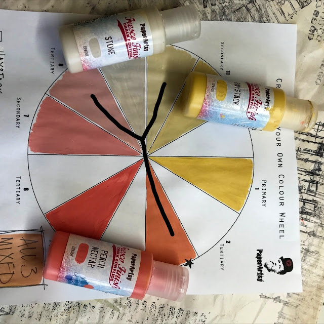
I wanted to create a project which offered the most opportunity to use up a variety of items in my creative stash and around the house, and an accordion book was perfect for this due to the  multiple pages to work on. To keep things a bit more organised and cohesive, I decided to work with a neutral, earthy colour palette sticking to creams, browns, blues and greens so that the finished product had a pretty, elegant, vintage vibe as, well, this is just my thing!


Flowers are a go to subject in my art and where it all began for me, so it was a no brainer to use PaperAtsy Ink & the Dog Minis stamps (MN67MN69MN70 and MN71) for their gorgeous floral imagery and I just had to use some watercolour goodness with these; enter PaperArtsy Infusions. I also wanted to use a technique which would give me a subtle texture to the base of the book and decided to use a brayer technique with PaperArtsy Fresco Finish Acrylics to achieve this.


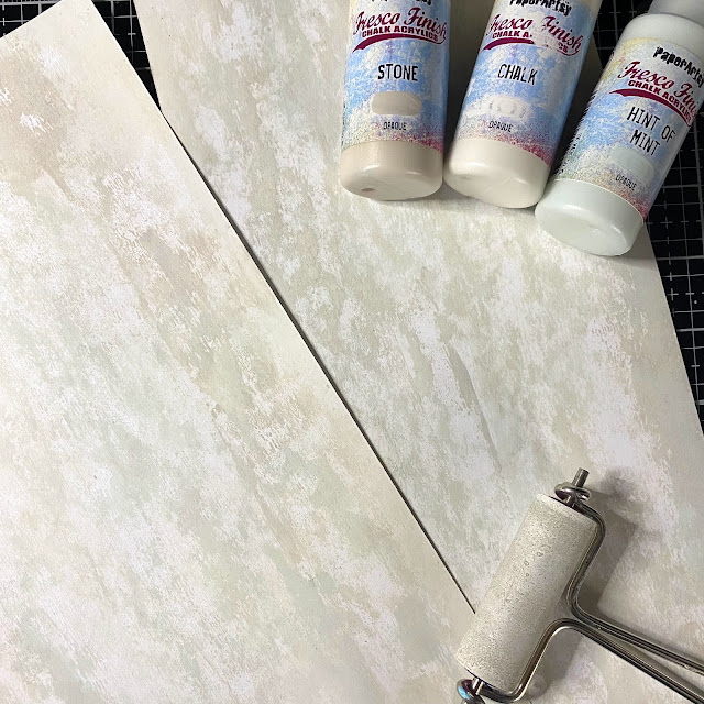
I started off by creating the background layer, the accordion book itself. I used two pieces of Smoothy card stock and marked 6 inches from the top on the shortest side, to give me two pieces of card measuring 11.5 x 6 inches. Then using a brayer, I added layers of Fresco Finish Chalk Acrylics in the colours ChalkStone and Hint of Mint, rolling from the outside of each edge to the centre of the card. I repeated this as needed until I had a layer of colour I was happy with. Once dry I turned over the card and repeated on the opposite side.


Once the paint was dry I used a scoreboard to score down the short side of the card at 4 inch intervals to create the pages. I then used a bone folder to press along each fold, folding each strip into an accordion effect. Once folded each strip of card gives you two 6x4" pages and one slightly shorter page. I adhered the shorter page on each strip of card together, taking care to make sure that the overall width of this joined page was 4" wide (the same as the other pages).  Once stuck together I had one long sheet of card (measuring 20x6") which folded into a total of  five pages (ten if you count the front and the back side). I then set this part of the book aside whilst I created all the layered elements for each page.


Next up was making the middle ground, interest layers, that I would be using. I love to use fabric from old clothes in my projects, usually using items that just wouldn't meet the requirement for resale at the charity shop. The fabric I used for this project was from an old white linen shirt, that had started to go the colour of old chewing gum! After cutting the shirt into sections at the seems, I used the back section of the shirt to cut out six rectangles (measuring 4 x 2 1/2 "). As you can see from the image below, I used a card template and a charcoal pencil to mark the rectangles out  on the fabric before cutting them out with fabric scissors. Once cut out, I set them aside and moved onto the next step.
 
 
Now I moved onto creating other interest layers for the middle ground. I knew I wanted several elements that all worked together whilst ensuring that there was some variety to the pages, to keep the viewer's interest. I also needed to consider what to do about the middle page of the book where there was the ugly join to contend with, that ran straight down the page from joining the two pieces of card together. I decided to cover the majority of this with a rectangle of card. To make it less obvious that this choice was borne from disguising the join, I decided to use the same on the front cover of the book.

From my scrap box, I cut three pieces of white card (5 1/2 x 3 1/2") and created a gel print background on each one. I wanted to keep to the botanical theme so I cut some leaf stems from a miniature rose plant to use (you could also use stamps or stencils if you'd prefer). I then gathered my gel plate, brayer, paint, leaves and card on my desk.


To create the gel print, I applied a thin layer of the Fresco Finish Chalk Acrylics (Niagra Falls) to the gel plate with my brayer. I placed the leaves on top of the paint layer and then used a scrap piece of paper to remove the paint from the open spaces, leaving behind paint just where the leaves had been.


I then removed the leaves and layered on a thin coat of Fresco Finish Chalk Acrylics (Chalk) before placing my card on top of the gel plate and pulling the print. These were then set aside to dry.


With nine pages still requiring middle layers, I once again turned to my scraps box and selected some old book paper, Kraft paper tags and white card die cuts to use. Using a deckle edge ruler I tore two pages of old book paper (measuring 5x3") and set them aside. I then selected the three pieces of Kraft paper below and did some background stamping using the PaperArtsy Minis stamp (MN62) and Fresco Finish Chalk Acrylics (Chalk). I applied the paint to the stamp using some cut and dry foam and once done, quickly cleaned the paint off the stamp using my water spray and an old toothbrush. Once the paper was dry, I dropped some water onto the paper and poured embossing glitter on the top, so that it would cling to the water droplets. I removed the excess powder and heat set with my embossing gun.


The white card die cut frames were next on the list of layers to prep. Another note here, as I was using up items from my paper stash, you don't need to use the exact same shaped pieces in your project. The whole point is that you use what you have and failing that, hand cut rectangles of varying sizes from your paper scraps; you'll still get a great end result! Using the PaperArsty Ink & the Dog Minis stamp (MN62) once again, but this time using some Ranger Distress Ink (Speckled Egg), I added some stamping to the white card. I also added some embossing powder to the scalloped lace edge of the bottom piece in the image and the intricate frame (not shown here).


The final layer I prepared was the focal point using PaperArtsy Minis Stamps (MN67MN69MN70 and MN71) and this was my favourite bit of the project! Now I feel this next bit needs to come with a warning as I used six different PaperArtsy Infusion colours since I already had them in my stash and after all, I am a colour junkie, however, if I was to make the project again, I liked the effect of the Rocky RoadSleight Blue and The Sage colours the most, so would limit myself to just these three.


My first art love was watercolour and you can achieve a really nice watercolour effect by stamping with infusions, a technique I first learned in a class with Raquel Burillo Perez. You simply sprinkle the infusions onto your stamp and lightly spritz with a water spray and stamp on your card. You can continue to spray more water and do multiple stampings for 2nd, 3rd and even 4th generation stampings. The first images I stamped out were a bit patchy as I found that the pigment was pooling in the dips of the stamp, rather than sticking to the image itself (see bottom right of the image below) and whilst I wanted them to look a bit grungy, I wanted to clearly see the flowers.


To solve this issue, I cleaned the stamp and re-stamped, but this time for my initial step I stamped with a VersaMark Watermark Stamp Pad (which is a very sticky ink) and then sprinkled the infusions on top, spritzed with water and stamped onto white card. I used this technique with each of the four flower minis stamps (MN67MN69MN70 and MN71).


Next I trimmed the images into individual, small rectangles and used a paper distresser to distress the edges. To give them a bit more of a vintage vibe, I used a sponge and a light hand to apply some Ranger Distress Ink (Frayed Burlap and Walnut Stain) to the white outside edges.


In the final book I use seven of these florals and I also use three flowers that I stamped on some scraps of tea dyed paper in Ranger Archival Ink (Cornflower Blue). 


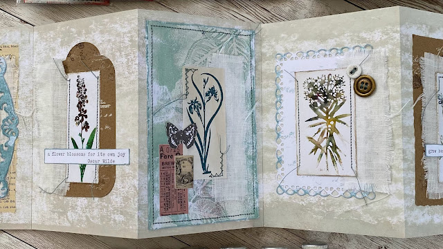
With all the main layers now ready, the final step of the project was assembling all the layers together on each page.

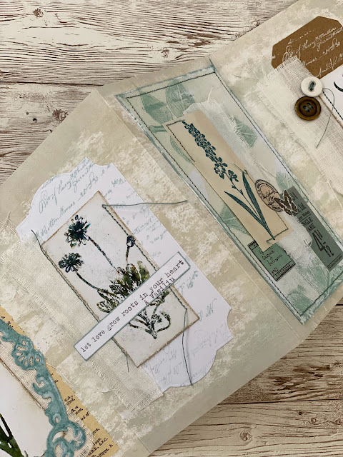
I like to audition the different pieces next to each other and look for a variety of shape and colour on each page. I started by taking all of my layer elements and creating ten bundles (one for each page of the book), ensuring that each one contained a large middle element (tag, book paper, die cut) strip of fabric and a floral topper.

Looking at the elements together in this way led me to making some last minute changes to my intended compositions for each page, to create more interest in the overall project and make each page a bit more unique. The first tweak I made was to the size of the fabric strip. I found that the rectangle of linen was too large and covered too much of the underlying layers on most of the pages, the exception being the open frame which you can see through (bottom left on the image below). I therefore decided to use just two of the original rectangle strips on the pages with the open frames  and cut the other four rectangles in half down the short side to create 8 strips of linen (measuring 1 1/4 x 4") for the remaining pages. Once I was happy with the size of the fabric strips, I texturised them by pulling along each edge to pull loose some threads.

I keep a stash of small ephemera items such as small tickets, flowers and butterflies in little pots on my shelf, so I rummaged through these and also selected some additional items for those pages that needed a bit more going on. If you don’t have items like these, you could easily cut some printed paper into small ticket shapes instead and add writing or doodles for extra interest.


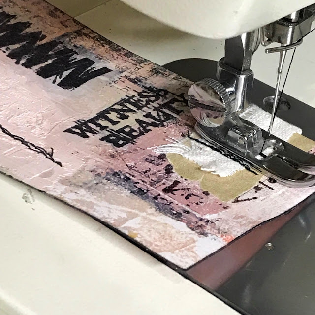
I then stitched the large middle element, the fabric and the floral focal point together on my sewing machine. I like that extra little detail and texture that stitching gives to the finished project.


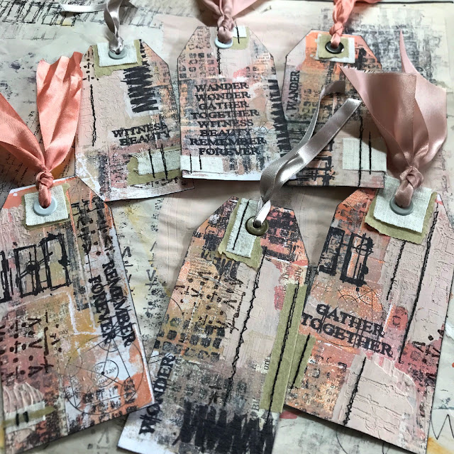
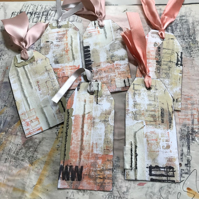
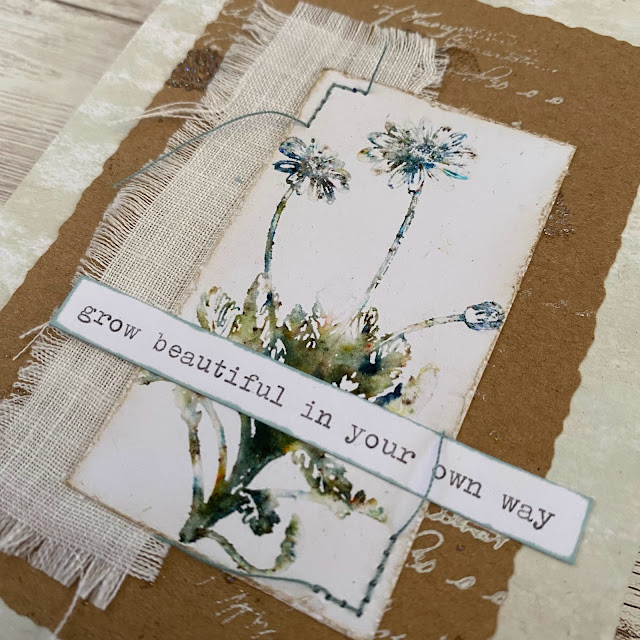
The very final step was gluing everything down onto each page of the accordion book. I started by gluing a layered piece onto the centre of each page and finished off by adding any little tickets, butterflies, buttons and sentiments I'd chosen. Here are some close up images of the individual pages.


So there you have it, an accordion book with pages on both the front and back, using all the bits and bobs you have lying around in your stash and repurposing a few other things around the house. There's so many variations you could tweak to make a project like this your own. You could get creative incorporating background textures from old sponges, bottle tops, fabrics, feathers or threads, in your gel prints. Or just using different shapes for your middle interest layers or different application techniques for the acrylic paint, would give you a totally different finish.

I love the variety you get with a project like this and each page can be made to be totally unique or follow an overall theme. I'd love to see what you make so don't forget to tag me on social and use #paperartsy

Thanks so much for taking the time to get creative with me today!

Victoria