A note from Leandra:
Seth adds to his fabulous collection of mini designs with this new release. These little guys offer a mix of chunky and fine detail designs, and if you know anything about Seth's style, you will realise that his creativity is rich with contrasts. Be it shifting colour, texture or size, these images can really help you create those all important contrasts in your backgrounds. But don't think that these are just about creating backgrounds.... oh no!!! Often these little designs have within them opportunities to create focal points too. Seth will share within his samples below, various ways you could pick out details to create focal points; stitches and colour pops for example. Mini stamps like these are a fun way to build your stamp collection purposefully, with images that chime with your inner muse.
Seth will be along to share with you LIVE his new products and ideas over in our Facebook Group, 'PaperArtsy People' shortly after this post publishes, and ... don't forget
These stamps are available EXCLUSIVELY from our approved stockists. Please check the list at the foot of this post to find a retailer online or geographically near you, it makes sense to order within your country where possible. Our retailers also endeavour to join the designer's live to share their direct shopping links - this makes it super easy for you to find a store with product in stock immediately.
Hey gang. Seth Apter here. Woo hoo. It is that time again. New release time. No matter how many times this occurs, I am as excited for a new release now as I was for my very first PaperArtsy release back in 2016! So let me jump right in and share what I have in store for you.
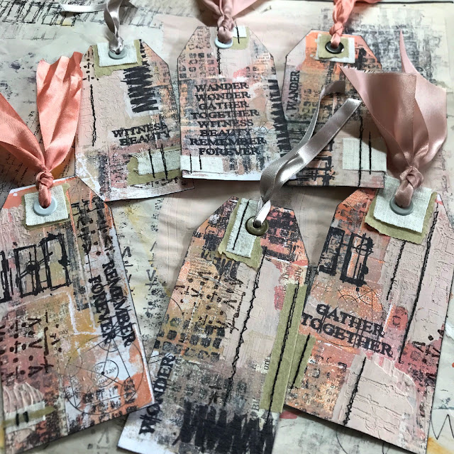
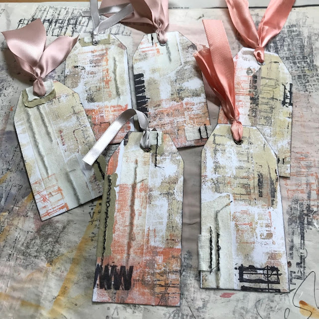
Let me introduce you to my 8 all new Mini Stamps. And remind you that they say good things come in small packages.

I am calling this collection Make Your Mark. Those who know me well know that I often say make it your own. I encourage every maker to take any commercial product they have and use it their own way with their own twist. Although I may be the designer of these stamps, your creative imagination can enable you to use them in ways that I hadn't ever thought of. As artists, we not only want to literally make our own marks on our art but we also want to figuratively make our mark in the world. Hoping that these new stamps inspire you to do just that.

I am calling this collection Make Your Mark. Those who know me well know that I often say make it your own. I encourage every maker to take any commercial product they have and use it their own way with their own twist. Although I may be the designer of these stamps, your creative imagination can enable you to use them in ways that I hadn't ever thought of. As artists, we not only want to literally make our own marks on our art but we also want to figuratively make our mark in the world. Hoping that these new stamps inspire you to do just that.

Price: RRP €4.90 +VAT Size: approx credit card size
All stamps are individually trimmed onto cling foam with a laminated storage/index sheet.
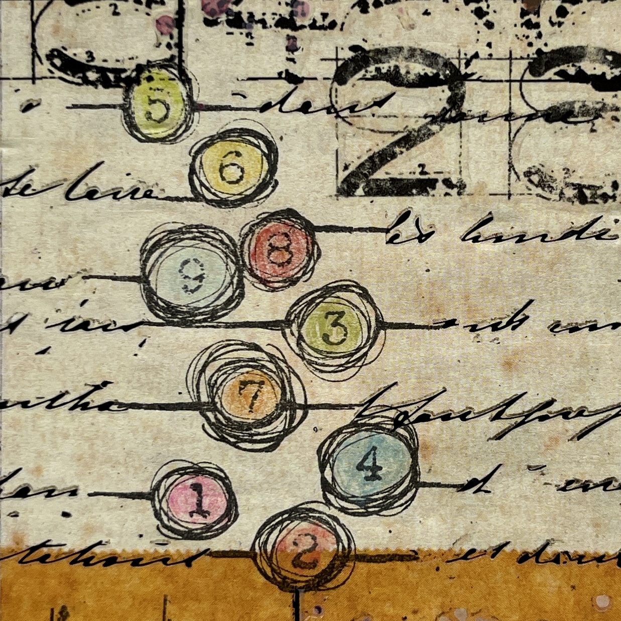
Eclectica³ Mini Seth Apter 73 (EM73)

MAKE IT COUNT
I love to use numbers in my art - as much for the look of them as for the counting component. Most of the number stamps that are available typically place the numbers in order. For this design, I knew I wanted to go random instead.

As I often do, I made sure there was some open space around the elements so that you could either add your own color shades or let your background peek through. And of course those scratchy lines coming from the swirly circles can also serve as a jumping off point for additional details.
Eclectica³ Mini Seth Apter 74 (EM74)

THERE IS...
Every collection of stamps I have released includes at least one (and usually many more) scratchy, grungy designs that are perfect to add details and dimension to a background. Mini 74 fits that bill.

For this design, I chose to lay out the grungy marks almost as if they were words in paragraph format pulled from a book page. But of course they are abstract and you can choose to have them reflect your own message.

Eclectica³ Mini Seth Apter 75 (EM75)

WORLD OF WONDER
Mini 75 also highlights a grungy design that can be used as a layer in a background. But this stamp is very versatile and can be used in many other ways as well.

I love using just the edges of the stamps to create my own border. In even calls to mind abstract drips.

The design is bold and graphic enough to also stand on its own as a focal element too. And all those breaks in the drawing allow the background to show through.

Eclectica³ Mini Seth Apter 76 (EM76)

CHRONICLES
Most techniques in mixed media are additive, where a new layer is added on top of the old layers. But techniques can be subtractive too, where you actually remove a layer. And what better way to do that than to scratch? Mini 76 captures the beauty of that approach.

Having these strong blocks of brush strokes scratched and distressed enable you to shift the color and have bits of the background show through.

STONEHENGE
And remember to turn your stamps. All different ways. Just because they might be packaged horizontally doesn't mean you cannot think of them vertically.

And just because there might only be 4 elements in the design also doesn't mean that you cannot stamp them multiple times - to create an impression all your own.

Eclectica³ Mini Seth Apter 77 (EM77)

FIGURES
Mini 77 also has the scratchy, subtractive element that I love so much. For this release, this design is also my nod to circles. As they are abstract, you can think of them as screw heads, wrapped stones, pebbles from the beach, or even small pathways.

Adding my own scratchy scribbles - in red - is an example of taking design elements from the stamps and repeating them using the hand of the maker.

Eclectica³ Mini Seth Apter 78 (EM78)

DISCOVER
I love the design of Mini 78 as one can see it as a ladder or train tracks. Either way, both interpretations are symbolic of going places.

In this piece, the gaps enable the very complex background to show through. But they can also be used to add color blocks, numbers, or even tiny text. I can also imagine using this stamp as the basis for a color swatching page in my journal.

Eclectica³ Mini Seth Apter 79 (EM79)

THERE IS...
When I create art for my new releases, I often highlight a single stamp in each sample I create. But most of my art tends to include many (many!) different stamps. So for this release, the sample that I highlighted above for Mini 74 is also my sample for Mini 79. BOTH of these stamps are the stars of this show.

Mini 79 is a series of scratchy and broken lines with added grungy details. You can use it horizontally or vertically and it can serve as the start of your own addition - such as writing or, as seen in There Is..., a loose guide for over-stitching.

Eclectica³ Mini Seth Apter 80 (EM80)

STASHED
Mini 80 adds the shape of degraded and distressed crosses and pluses to the other abstract shapes in this collection. As in many of the designs, scratches and gaps are evident.

Of course when making your mark with a stamp, you also want to remember to make your mark with your own hand. In this pieces I added random pencil lines, drew a loose outline, and filled in gaps with a contacting color.

I hope you have been inspired to not only use these stamps...but to use them in ways that make them all your own. As always, cannot wait to see the magic that you create.
A HUGE thank you to the PaperArtsy crew for making these stamps and making all this creativity possible!
You can see more and visit me at...
PaperArtsy Stockist List
Our stockists are your go-to source for all PaperArtsy products, and we suggest that you also use the PaperArtsy People Facebook group to source a retailer in your country. Many are members of our FB group and will happily share links to their online stores.
Australia
Bev's Cross Crafts, Spreyton, Tasmania https://www.bevscrosscrafts.com.au/
Crafters Cupboard, Berwick, Victoria www.crafterscupboard.com.au
Memories on the Murray, Murray Bridge, SA https://www.memoriesonthemurray.net/
Natalie May Scrapbooking, Dover Gardens, SA https://nataliemay.com.au/
Scrapbook Superstore & More, South Penrith, NSW https://www.scrapbooksuperstore.com.au/
The Scrapbooker's Confetti Box, Swansea, NSW https://thescrapbookersconfettibox.com/
The Scrapbook Store, North Perth,WA http://thescrapbookstore.com.au/
Belgium
Cart N Scrap Art, Antwerp, www.cartnscrapart.be
Créatelier Caracolle, Liège, www.createliercaracolle.be
Canada
Paper Art Creations Inc, Leduc, Alberta, www.paperartcreations.com/
Scrapbook Centrale, Dollard Des Ormeaux, Quebec www.scrapbookcentrale.ca
Scrapbook Centrale, Dollard Des Ormeaux, Quebec www.scrapbookcentrale.ca
Scrap Addicts, Edmonton, Alberta www.scrapaddicts.ca/
Scrap and Bean, Edmonton, Alberta scrapandbean.com/
Scrapbooking Fairies, Drayton Valley, Alberta www.scrapbookingfairies.com/
The Paper & ink Boutique, Calgary, Alberta www.paperandinkboutique.com/
The Scrap Yard, Calgary, Alberta, www.thescrapyardcalgary.com/
The Scrap Yard, Calgary, Alberta, www.thescrapyardcalgary.com/
Denmark
Hobbyboden Scrapworld Samso www.hobbyboden.dk
France
Eirl Bancon Cartoscrap, Midi Pyrenees, www.cartoscrap.com
Fée Du Scrap, Saint Sébastien-Sur-Loire, www.feeduscrap.fr/
Horizon Créatif, Ste Jalle www.horizon-creatif.fr
Instant Créatif, La Possession, La Réunion, www.icreatif.re
Katzelkraft, Ingwiller www.katzelkraft.fr/en/
Kerudoc Creation, St Yvi www.kerudoccreation.com
Le Grenier des filles, Pierre Benite
Page de scrap, Saint Pavace, www.pagedescrap.fr/
Scrap Déco Home, Goutrens, www.scrapdecohome.fr/
Toutencolle, Dun sur Auron www.toutencolle.fr
Germany
Stempeloase Munich, Munich www.stempeloase.de
Stempelfee Shop, Hilden www.stempelfee-shop.de
Stempellaedle, Stuttgart, www.stempellaedle.de/shop
Italy
Immagine SAS di Rapaccini, Rome, www.immaginelab.com
Il Negozio Della Mamma Di Cle, Torino, www.ilnegoziodellamammadicle.com
Marte Savona, Savona, www.martesavona.it
Pezze E Colori, Lissone, www.pezzeecolori.it/
Piccole Passioni, Siena, www.piccolepassioni.it
Piccole Passioni, Siena, www.piccolepassioni.it
Japan
La Wadao, Odawara, Kanagawa, www.lawadao.com
Tiny Dots, Funabashi-shi, Chiba www.tinydots.shop-pro.jp
Netherlands
De Hobbystudio, Genemuiden, www.dehobbystudio.nl/
Doe@ding,Spijkenisse doeading.nl/
Hobbycompleet de Duif, Leeuwarden www.hobbycompleet.nl
Stampingcorner, Capelle Aan Den Ijssel www.stampingcorner.nl
Spain
Cien por Cien Manualidades, Barcelona, www.100x100manualidades.es
Ideas 10 Manualidades Y Scrapbook, Bilbao ideas10manualidades.com/
Marakiscrap, Tarragona, www.marakiscrap.com
Scrap & Papers Experiences, Barcelona, www.scrappapersexperiences.com
The Paradise Corner, Barcelona, www.theparadisecorner.com
Taiwan
Mandy's Cards, Taipei www.facebook.com/mandy.card.77
United Kingdom
Amelia's Creative Crafts, Studley, Warwickshire www.ameliascreativecrafts.co.uk
Art from the Heart, Harrogate, Yorkshire www.afth.co.uk
Crafts at The Malthouse, Herstmonceux, East Sussex, www.themalthouse.co.uk/
Loobi Crafts, Leighton Buzzard, Bedfordshire, www.loobicrafts.co.uk
Stampers Grove, Springbank, Lilliesleaf, Melrose,Scotland www.stampersgrove.co.uk
The Artistic Stamper Craft Store, Faversham, Kent www.theartisticstamper.com
The Forget me not Kraft Kabin, Rochford, Essex, www.TheForgetMeNotKraftKabin.co.uk
USA
Artistic Artifacts, Alexandria, VA www.artisticartifacts.com/
Artistic Studio Creations, Fayetteville, Georgia www.facebook.com/ASCbyCrystal
Craftiness, Chatsworth, CA, www.craftinessonline.com/
Everything Scrapbook & Stamps, Lake Worth, Florida https://everythingmixedmedia.com/
Frantic Stamper, Oregon www.franticstamper.com
Free Heart LLC, Denver, Colarado, www.freeheartllc.com/
Joggles, Coventry, Rhode Island, www.joggles.com
PaperCraft Clubhouse, Westbrook, Connecticut, papercraftclubhouse.com/
Qingquing's Stamp Shop, Portland, Oregon
Runaway, Art & Craft Studio, NE Salem, Oregon www.runawayart.com/
Simon Says Stamp, Columbus, Ohio www. simonsaysstamp.com
Topflight Stamps, Irmo, South Carolina topflightstamps.com/
If you are interested in becoming a PaperArtsy stockist contact Dounia@paperartsy.com for more information
PaperArtsy Links
Facebook Group PaperArtsy People
Facebook Page PaperArtsy
Twitter twitter.com/paperartsy
Instagram instagram.com/paperartsy
Pinterest uk.pinterest.com/paperartsyhq
YouTube youtube.com/user/PaperArtsy