Showing posts with label Niagara Falls. Show all posts

Monday, 19 May 2025

Mini album with Seth Apter Products {by Etsuko Noguchi}


Hi everyone, nice to be back with you again

Etsuko here with you today.

This year on the blog, we have free reign to do a deep dive into PaperArtsy product ranges of our choosing. For this post I have been exploring Seth Apter's products. Today I'm looking forward to sharing with you what I figured out when I made the mini album with Seth Apter's stamps.


In this post, my theme is how to create a mini album using Seth's stamps in a fun and effective way. Please take a look.


Before starting the project, I first prepared these Seth products. The stamps are the latest ones released earlier this year and the colors are Seth’s originals.  I used most of the colors for gel printing by Seth's colours. It seems to me that Seth weaves stories by making stamps from things that inspire him on his walks and travels. I share that feeling and wanted to enjoy creating my works using these stamps. The paints I used here were PaperArtsy Fresco Finish Chalk Acrylics - Glacier Ice, Niagara Falls, Fuzzy Cactus, Heavy Cream, Steel Grey, Rusty, Kiwi Gold, Tomato and some more. Fabulous stamps were Seth Apter's stamp sets 43, 44 and 45 (ESA43, ESA44 and ESA45).


First I used gel plates to make the base of the album and the collage papers. The first painting I did, that Seth showed in a video, was to use opaque colors and then lightly dab transparent colors on top of them. I used black and white papers and printed them alternately until I had a paper of a color I liked.


In addition to the two-colored paper, I also prepared some washi papers, added paints with  water and printed it using the same gel plates. I used these for thin tape and coloring points.


This time I decided to make a simple rectangular mini album in the √2 golden ratio, using a collage technique made from gel print papers I had made previously. The diagram above explains how to create the √2 golden ratio rectangle used here.


Draw the diagonal of the square, and use the diagonal as a radius to draw an arc that is tangent to the extension of the base of the square. Draw a rectangle that encloses the resulting figure. This is a √2 rectangle. Dividing it will create a smaller √2 rectangles (from book - Balance in Design). I tried to base the collage on this method, but I didn't use it for everything. When I overdid it a bit, or the colors didn't work out, I just relied on my usual eyeballing to fix it. Using this √2, the actual dimensions of the rectangular card are 3 inches high and 4 1/4 inches wide.


These six cards were my first attempts and after some trial and error I eventually created the following 12 pages of cards.


I created 12 rectangular cards, as described written above, 3 inches high and 4 1/4 inches wide using Smoothy (Heavyweight) A4 white stamping card and collaged the gel printing papers on them top. From the 12 collaged cards I chose this card as the cover of the album. I used 'CLASSIFILD' from ESA07 stamp set.


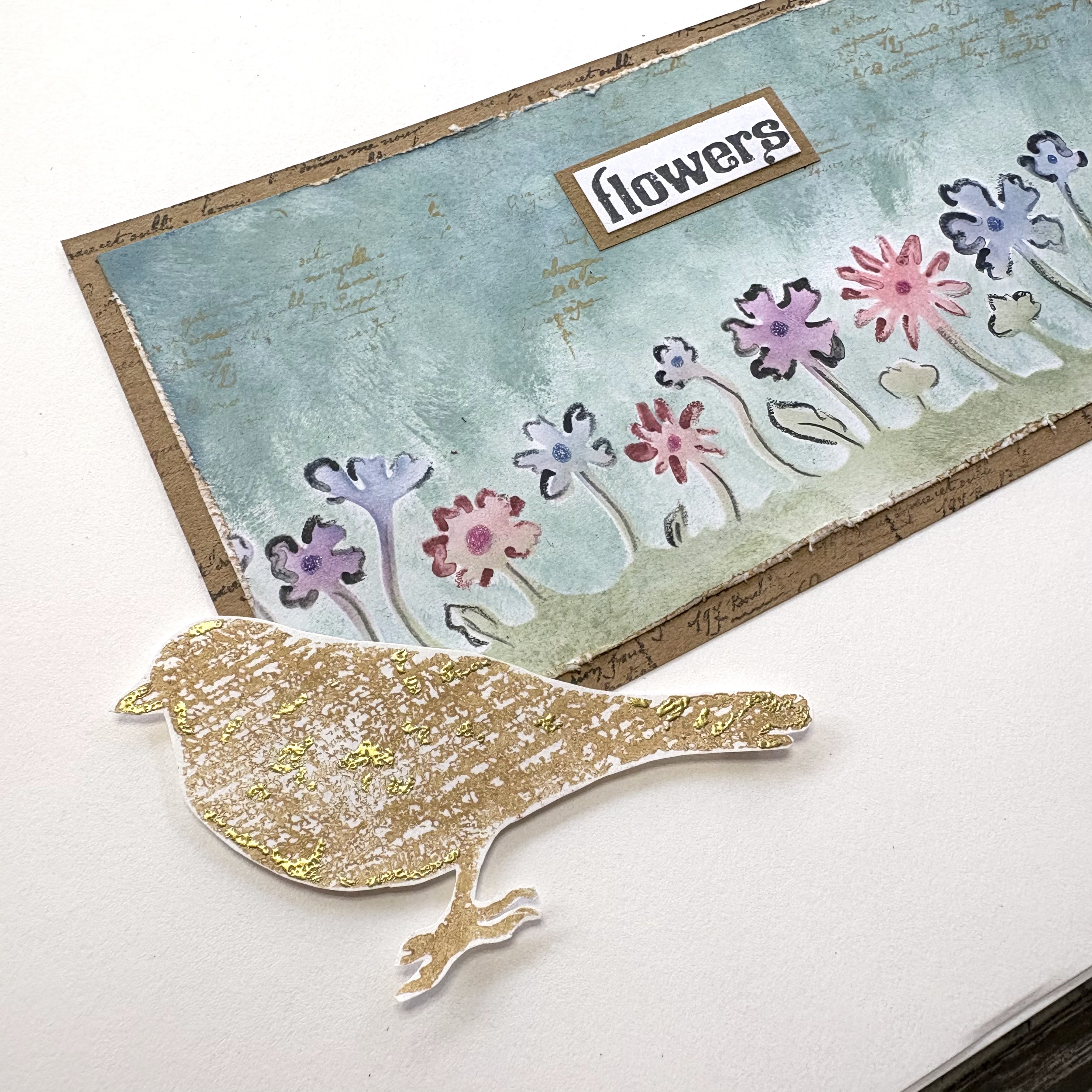
Now, let me give you a brief introduction to each page. The gel printing papers were used almost as is, and variations were added by stamping with ink or embossing powder. The technique and Seth's stamps used will be shown in the enlarged photos below.


On this page, I added some leftover pieces. The embroidered fabric, stamped paper, and textured wallpaper used for paint stamping. The metal 6 is made by embossing foil using a cutting die and then coloring it in a vintage style with alcohol ink to create numbers and letters, which I use whenever necessary.


The marks shown here are from stamps and Seth’s printed tissue paper, and I love the Damask pattern stamp on the right-hand page and I think it will come in very handy.


Here I printed the letter X onto fabric and stitched around it. Also I embossed it onto wax papers with embossing powder then I glued them over the collage.


The last page. The photo is a little dark and hard to see, but the grid on the left page is made of bronze powder. You can see it in the enlarged photo below. I used light pink gel print paper for this whole page.

For the spine, I chose a simple vintage-style card.


I mainly use Seth's new 3 set stamps here, but I chose this CLASSIFIED for the focal point because the words stand out. I used Seth Apter stamp set 07 and 44 (ESA07 and ESA44). Ranger Industries Archival Ink (ground espresso and jet black) with Distress embossing powder (Lost Shadow).


I used Seth Apter Mini stamp EM45 with Distress embossing powder (Lost Shadow). The green lines were made by painting Green Patina onto washi paper and ripping it into thin strips.


PaperArtsy's blank tissue is thin but strong enough that it doesn't wrinkle easily, making it a great product. It also goes great with stamps and Mattints, so I use it whenever I get the chance. Here I used the ESA35 stamp with white embossing powder on blank tissue paper. I took the photo with the light shining on it, so the tissue paper looks white, but you can't really tell from the outside. Satin Glaze seems to be good for adhesion.


From here on, I will introduce the products, which are made using the same techniques. I used stamps are ESA43 and ESA18The former used Archival Ink jet black with Lost Shadow embossing powder and the latter used mixed whitish powder.


Stamp is ESA34 with some Red Ink.


Stamped ESA43 with bronze powder on the Vellum paper.


Stamped ESA45 with Seth's Baked Texture the altered page.


Stamped ESA45 with Archival Ink jet black with Lost Shadow embossing powder. The photos below show the products used above.


I decided to make a fabric hinge to hold the 12 cards in the album. To match the colors of the album, I diluted Bougainvillea with water and dyed some off-white fabric, then dried it and it turned out a great color.


I stamped the EM69 stamp all over the dry cloth using Destress Ink Vintage Photo.


I rip a piece of hinge fabric to the width of the card, attached it between two cards with double-sided tape, and then joined two other cards together using a sewing machine.


I wanted to dangle something from the back of the album, so I tried out a lot of different things but nothing seemed right. I thought a simple thing like a branch would be good, so I bundled together some hemp string to make a branch, then wrapped embroidery thread around it and made it like this.


Since I made the width of the hinge fabric a little wider, the cards didn't hang loosely together, so I connected them tightly with backstitching like this. This completed the project.


In most cases, when I make an album, I emphasize unity and create one or two master boards, then insert photos and stamp images to create a flow. However, this time I wanted to try a √2 composition, so I made a collage using printed paper. There were some pages that were disjointed, but I enjoyed the process. I would like to use this experience to create more creative works. If you would like to create abstract works using Seth's stamps, please share them with us on Facebook, PaperArtsy people, or Instagram. We look forward to seeing you.


Thank you so much visiting.

Etsuko xx


Facebook: Etsuko Noguchi
Instagram: Pixienest
Pinterest: Etsuko N

Friday, 17 January 2025

January 2025 - With 3 Things: Art Journal Page {by Victoria Wilding}


Hi friends, it's Victoria  with you for a 'With 3 Things' challenge post. 

This feature on the PaperArtsy Blog is where 3 bloggers are sent 3 items in the post. Typically we will receive a stamp, a stencil and a couple of Fresco Paints, and in 2025, everyone will receive identical products. 

We have no clue what PaperArtsy HQ is going to send, the whole idea of this challenge is to do something crafty in our personal style with these 3 items. We are allowed to bring other PA products into the mix if we feel it is necessary.

So let's take a look at what I received from PA HQ ...


I’m always super excited to open my package and discover what PaperArtsy goodies I’ve been sent to create with. I love the Niagara Falls (FF205) and Gold Rush (FF204) colours from Seth Apter’s collection of PaperArtsy Fresco Finish Chalk Acrylics. Blue greens are definitely my favourite palette of colours and crop up time and again in my makes, as does gold, and whilst this paint isn’t a metallic, it’s golden hue is so yummy. As soon as I looked at PaperArtsy Stencil PS103 I was drawn to the flower section with mask and knew I wanted this to feature as a key element in my project. The stamps in HP1007EZ provide so much variety with text, nature and vintage designs. These designs lend themselves nicely to creating radically different styles of  projects, so it’s been really interesting to see how Floss and Nikki took a totally different approach to using the designs. 

I decided to make a page in my art journal, using my favoured floral and nature elements from the designs. I’m an art journal junkie so this is my favourite kind of project as it really allows you to play with a variety of products in your stash. Let’s take a closer look at the different steps I took to create this page. 

I started off by creating a centre panel for the page, using the flower section at the bottom of PaperArtsy Stencil PS103. Using the leftover ink on my blending brushes, I worked along the strip to apply a light colour to the bottom of the card.

I then used the matching flower mask to protect my ink work and applied a watered down coating of PaperArtsy Fresco Finish Acrylics in Niagara Falls FF205) to the top section of the card.

To create some more contrast to the colour in the top section, I randomly applied patches of blue ink using my blending brush. 


Next I drew some outlines around the flowers using watercolour pencils. I wet the tip of the pencil slightly before drawing, as this activates the colour and creates a darker line. I used the colours Payne’s Grey on the purple flowers, Rose on the pink flowers and Indigo on the blue flowers. 


Then I added centres to the flowers using Nuvo Glitter Markers. 


I wanted to create some extra texture to the sky, so I used the text stamp from HP1007EZ, applied PaperArtsy Fresco Finish Paint in the colour Gold Rush (FF204and randomly stamped some text details. The finished effect is subtle and provides some extra interest to the card.


I finished this part of the project by distressing the edges of the card and applying some brown ink to define the edge. 


After this I moved on to creating the elements to extend the design and finish the journal page. I started by cutting a kraft mat to layer the card on and stamping some text to the outer edges. 


Then I masked off the word flowers from the text sentiment in set HP1007EZ, before stamping on white card and mounting on kraft card. I cut this to size and set to one side. 


I like a lot of white space in my projects as it drains the eye into the focal point and provides a place for the eye to rest. I wanted to add some details to the white journal page to tie into the card, butting didn’t want these to be overpowering. Using the flourish from HP1007EZ, `I stamped and embossed it in gold direct to the journal page in the upper right corner. To judge where to stamp, I placed the card on the page and draw a faint pencil line around the top right corner of the card. Once the flourish was complete I erased this so that it could not be seen on the finished project. 


Finally I stamped the bird stamp from HP1007EZ in PaperArtsy Fresco Finish Gold Rush (FF204and, using an embossing pen drew in some highlights which I set with gold embossing powder. 


To complete the page I adhered the sentiment to the card and then attached this to the journal page with double sided tape, before using foam tape to attach the bird to the bottom left corner. To incorporate the flourish further with the overall design, I applied three small butterflies from my stash.


I really enjoyed creating this page and it would be so easy to adapt to a card making project instead. 


The touches of gold give some extra visual interest and really help to lead the eye into the central panel, where you can then consider the peaceful flower meadow scene. 


I hope you enjoyed this journal page project. Until next time, wishing you a happy creative week!

Victoria