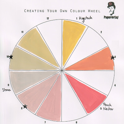
Showing posts with label EM72. Show all posts

Thursday, 9 June 2022

2022 Topic 08: Split Complementary Colours {by Floss Nicholls} with Seth Apter stamps


Orange - Neutral
Main Colour: Dirty Orange
Complements: Yellow Beige, Pink Stone
Type: Twist - One colour is neutral ( FF Stone)
Created from Frescos: Haystack, Peach Nectar, Stone


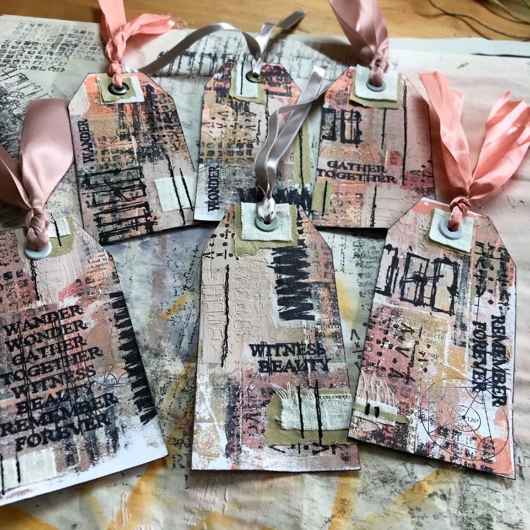
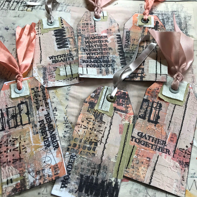
Hi everyone, it's Floss (flossworkshopart) with you today, and I'm here to share how I used layers to create a set of matching (but non matching) mixed media tags using split complementary colours with you.

How can they be matching but not matching at the same time I hear you cry...take a look below and you'll see that by creating a 'master board' first it naturally lends itself to become  an un-matching set.


I really love to incorporate texture, fabrics and collage within my art...mix that in with some stitching and embossing and it makes me one very happy girl. So when Seth Apter brought out his new range of mini stamps I was literally jumping for joy when they arrived in the post and I just could not wait to get into my workshop and start using them! 


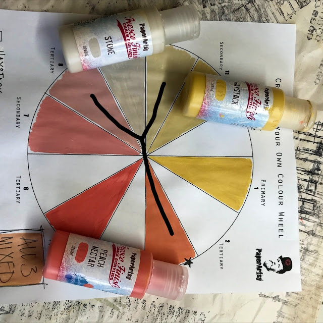
I started by creating a colour wheel with the beautiful HAYSTACKPEACH NECTAR and STONE fresco finish colours with the idea of layering these colours together to make a set of mixed media tags incorporating fabrics and eyelets. 

You can create your own colour wheel by using the PaperArtsy blank found at https://www.facebook.com/groups/paperartsypeople/files. I found this sheet particularly useful to check my colours throughout the making as I wanted to limit my palette to the three mixed colours and didn't want variation in my mixing.

Here comes the theory bit...if you need clarification to understand the split complementary colour process...or you missed Keren's introduction a few days ago...I hope you find my explanation clear...please do jump straight ahead to the next bit** if you already have a good understanding of what split complementary colours are. 

The position of a letter Y is helpful in finding which mix of paints you'll be using on the colour wheel. First of all mix equal amounts of your two chosen primary colours together to make your secondary colour.  In this case because it's a twist on the standard colour wheel I used Haystack and Peach Nectar to create my 'dirty orange' (secondary) shade seen on the down stroke of the Y. The complementary colour of the dirty orange is Stone. As it is 'split' complementary you'll be using the tertiary colours either side of the stone shown below with the two upper V strokes of the Y to create your art. You mix these tertiary colours which I will call pink stone and yellow beige by mixing equal amounts of the mixed secondary colours (Stone with Peach Nectar and then Stone with Haystack) with stone.

**Using the split complementary colour combination is a fun way to explore how colours really go together well. You'll notice there is a little box beneath the colour wheel with 'all 3 mixed' written inside it.  I often use a mix of all my colours that I use on one piece, I find it brings them all together and harmonises my art. I added this box as a force of habit without even thinking, however, I did not use this mix on the tag project this time as I wanted to stick to the three colours shown with the Y.


Prior to using my new colour palette I used some old book papers with different sized text and fonts, with some old maths papers to collage onto a sheet of 300gsm white card.  I like to collage different size/font style text over another as, for me, I'm not trying to read the text but use the it as a form of textured marks. I also like to rip rather than cut the pages as I prefer the raw look rather than a clinical/stark edged feel to my art.

To begin building my coloured layers I used Ranger's black Archival ink with one of Seth Apter's gorgeous new rubber stamps (EM67 - available now from PaperArtsy Retailers) with an older one of my favourites EM41, to stamp some textures onto my 10 x 8 gel plate and let that dry. Remember what you put down first onto your gel plate will be on the top of the pulled print. 

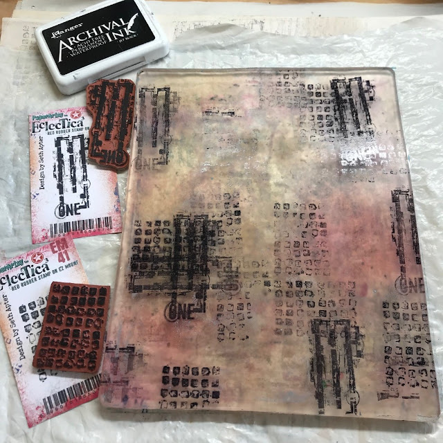
Notice how I have created + crosses by using the EM67 'ONE' stamp portrait and landscape over each other, and layered the 'ONE' stamp over the EM41 multi boxes stamp to make the texture my own...you may prefer to make x crosses. Seth did say "make it your own" in his introduction blog post...and that's what I love about these new mini stamps; they have so many options to truly go bonkers with a multitude of different textures in the way you use them, so do have some fun...Try using different pressures when applying the stamps to the gel plate or don't renew the ink each time you stamp to give you a variation on shades too. I started mixing my colours to use on the gel plate whilst the ink was drying. I found it useful to have the colour wheel to hand to check my mixing to keep the continuity in the colours.


I started with applying the lightest colour first, yellow beige, (made by mixing Haystack with Stone then  mixed with Stone again) and only covered parts of the plate. I didn't want to pull a flat colour print (which would have happened if I'd covered the whole plate) and left that to dry. I loved the way the paint 'pickled' a little leaving tiny bubble circles within the colour; I hoped the next shade would show through when I pulled it. I let this dry too.


I was actually itching to see how this was going to come out as the layers were looking so beautiful on the gel plate, and as you know, you never really know what that pull is going to be like when it comes off so I had my fingers crossed it would all be ok and I wouldn't have to re collage a sheet...although...the way I looked at it was that if it all did go wrong I'd just have a bit more play time...so that's not a bad thing!


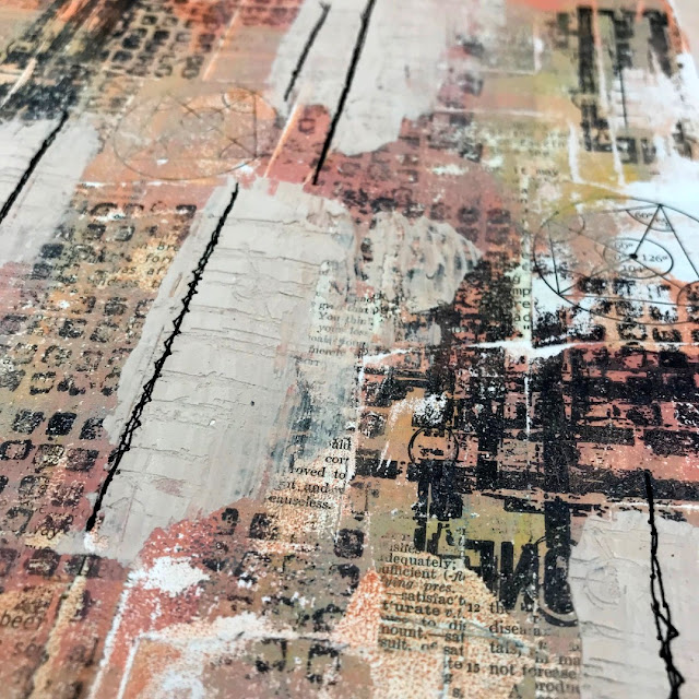
I then used the pink stone colour, (made by mixing Peach Nectar with Stone then mixed with Stone again) and covered the remaining parts of the plate. Before pulling the print I used the EM41 and EM67 rubber stamps again, this time pressed into the paint to take areas of paint off and also stamp the paint elsewhere on the plate too. By doing this I am not only creating more texture but allowing different colours to show through the layers. I used the collaged sheet to pull the print.


Look at the way the edges of the collage have left fabulous marks on the gel plate ready for a fun second pull. Using collage on the pulled print not only leaves those edgy marks on the gel plate ready for the next pull but gives you interesting lines within the print where there are different levels of paper.


To add solid blocks of texture I mixed my 'rose stone' with some grunge paste and used a palette knife to spread a thin layer of this over parts of the now collaged printed card. I was aware that the colour was slightly lighter than the three I was trying to stick to, but gave myself permission to run with it as I wanted the solid grunge texture block. I then used EM70 to press the rectangle textures and EM72 zigzag textures into the grunge paste whilst it was still a little damp. If you try to do this whilst it is very wet it will give you a very smudged/stippled appearance rather than the clean lines of the stamp. Maybe do a test piece before you apply it to your master sheet if this process is new to you. If you need the image to be a little softer then wait for the grunge paste to dry and sand it back. By sanding it, it can also give you the option of some interesting high and low areas.


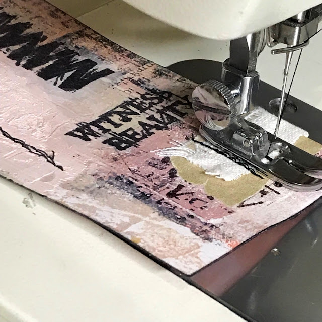
I ran the whole piece through the sewing machine using black thread for contrast. The lines of the collage and grunge paste gave me a hint of where to sew. I used six random lines as there would be six tags.  I made sure some of the lines crossed where the master sheet would be cut and so where each tag would be separated from one another. On the reverse, I put masking tape over the stitched lines. This was to secure the stitching ,especially where it would be cut mid line but also to add to the texture.
 

Rubber stamp EM69 just sang to me to be embossed using the new Mud Pie WOW embossing powder.  It has a very slight metallic shimmer to it but it's not too 'glitzy'. I am not a glittery sparkly kind of girl at all but I quite like a little metallic shimmer from time to time. I decided to use only a small section of the stamp so as it was not too overloaded and just gave it a slight accent.


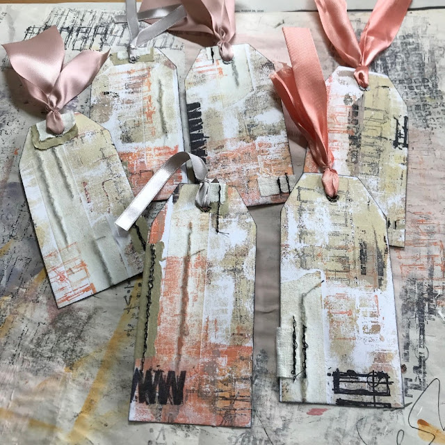
I used a similar method for gel printing on the reverse but without stamping black ink onto the gel plate first. Instead I chose to use the stamp EM70 in the paint on the plate after I rolled it to give more stamp definition in the contrasting colours.


I then chose to divide the A4 sheet into six. The first cut was in half making two A5 sheets then each A5 into three so each piece measured 105mm x 70mm. You may choose to make your tags a different size...whatever works for you and what you will use them for...

I was happy with my colour swatching! The colour wheel really did prove helpful with mixing consistently! 

 
I like corners taken off as triangles so measured 16mm in from each edge along the top and 30mm down the sides and snipped them off using scissors. Once you have done one you don't really need to measure any others as you have made your template with the first one...measure twice cut once to be sure before you cut. You may prefer a rounded tag top or one that is cut using a scalloped punch.

I thought I'd use Seth's "more is more" approach as I was using his stamps so stamped a few acid free white tissue paper sheets with EM41EM66, EM69, EM70 and EM72 and collaged these tissue paper bits over the sewn tags using a matte medium.


To make the tags more sturdy where the ribbon is attached I decided to use remnants of natural linen and bits of old parcel paper where the eyelets were to be punched. I tore the paper to have a fairly rugged edge using a deckled edge ruler and rough cut the linen remnants. You may prefer to cut the paper rather than tear it, especially if you cut your collage right at the start to match that.

I machine stitched some of the added linen and parcel papers for more textured detail again using black thread. I often use a combination of straight and zigzag stitching over one line.


Again I used the colour wheel to swatch/colour match my ribbon/threads. I could not believe my luck in that I actually had a very near match to the 'dirty orange', 'pink stone' and the 'yellow beige' in ribbons that I collect from odds and ends.


Thread and tie your ribbons/threads through the eyelets, if you chose to use them and enjoy what you have achieved.


The reverse being a little less detailed allows space for you to add messages, quotes, phrases, words of kindness or whatever you choose to add...or not.


I thoroughly enjoyed making these tags and the gel print pull for me was both exciting and nerve wracking at the same time with the not knowing if it would work. I definitely had an ohhh yesss!!! moment when I revealed the amazing textures that the collaged lines had left behind as well as added to the pull. Its definitely a technique I will use again. Let me know in the comments below if this is something you have already done or if you are eager to try it. 

I love the way these colours work together and painting the colour wheel has proved to be a good step to use if you are unsure of your colour mixing/matching choices. I personally can see a pile of these growing in my workshop as I explore more combinations.  

I think looking at the tags now I may even go back to them and add some hand stitches over the zigzag stamped prints or some of the other lines, but I will look at them for a while first before I make that final decision...If you are more of an ATC kind of person maybe this technique may inspire your next batch?

Until next time, enjoy your art time and I'll see you again soon... 

Much love
Floss 🌸


If you live near me (East Sussex UK) and fancy joining me doing this project in my workshop then I will be holding in-person classes of up to six persons over the next few coming weeks. You can find a link to this and all my other mixed media workshops on my website at  www.flossworkshopart.com


Wednesday, 25 May 2022

NEW PaperArtsy Products: Seth Apter {May 2022}


A note from Leandra:
We are loving all the mini size stamps this year, they are such a dinky, easy to use size, offer affordability at a lower price point than a full set, and lots of fun for sure! Seth has brought a nice mix of shape, font and texture in this series of 8 stamps. And did you see the paint??! Delicious colours that are going to offer both oomph and neutral options! nd of course, we worked hard to offer you colours totally different to anything else in his (or the core) range to date! 
 
Don't forget Seth will be over in PaperArtsy People shortly after this post publishes. It's super  nice to hear direct from the designer about their new release, we hope you can catch Seth either LIVE or via replay.
 
Remember, all these stamps and paints are available EXCLUSIVELY from our approved stockists for the next 3-4 months, you will find a link from the tab at the PA Blog home page, or from our IG bio, and a list at the foot of this post. 
 
Hi everyone, Seth Apter back with you with my newest releases. And this time I come bearing both stamps and paint!

I often say I love new release days and the thrill of sending out my products into the world and into your creative hands never diminishes. It is always, always, always so exciting to see what you all come up with.

For this release, 8 Eclectica Minis and 4 new Paints. Almost hard for me to believe but I now have 32 mini stamps, 32 paint colors, and 30 stamp sets with PaperArtsy.

My new stamps were inspired by a phrase I like to use when I demo and teach: make it your own. I feel that we as creative individuals have enough imagination to be able to take any commercial product and use them in a way that makes them completely your own. Each of the mini stamps were designed with this in mind and were created to give you many options in the way you use them.

As for the paints...my inspiration was more practical and was the question what colors are missing in my range that would also pair well with many of the other colors in the palette? Hoping you like the new additions and will continue to read this post to see the product images, artwork created using the stamps and paints, and ideas behind each stamp.
  

Price: Mini Stamp  RRP €4.68 +VAT    Size: credit card size (approx)
All stamps are individually trimmed onto cling foam with a laminated storage/index sheet.
  
Seth Apter  Eclectica³ Mini 65 (EM65)
 
Art for me is about personal expression and every time I create a piece of art I feel like I am telling my own story. So what better way to do that then to announce it in a stamp!
 

The design of this stamp includes its own background - text with a script font in a distressed style. The words have been spaced far enough apart so that they can be used individually or paired off as well.


Seth Apter Eclectica³ Mini 66 (EM66)
 
I love using text in my artwork, both for the meaning as well as the beauty of the letters themselves. Words for me can sometimes be a supporting design element but often they are front and center as the focal point.
 

Each of these words can be stamped on its own, matched with another word or two, or as a set. The phrase was created to reflect my thoughts and feelings about what is important to me after these past few years of challenge and upheaval.


Seth Apter Eclectica³ Mini 67 (EM67)
   
I love a stamp design that can be used in multiple ways. EM67 was created with that idea in mind, knowing that the distressed rectangle could be used as is, as a border, in segments, or in all three ways in the same piece.
 

In designing this stamp, I chose to leave open space within the lines of the rectangle. This gives the option to enable you to let the background show through, color within the lines, or - when placed horizontally, use it as a journaling block for writing. Again, options enable you to make a stamp fully your own.


Seth Apter Eclectica³ Mini 68 (EM68)
  
I love a line. The perfect element for so many things. And you know what I love even more than a line? Many lines. Introducing the many lines of EM68.
 

In this artwork, I used the entire stamp as a focal point for the piece. The lines were used like the lines from a notebook and the script text was added afterwards. But the options with this stamp are limitless based on how it is used. It can used as a mark maker for the background, to create a border around the edges, or to make a crosshatch design when overlapped horizontally and vertically.


Seth Apter Eclectica³  Mini 69 (EM69)
   

One of my favorite types of stamp designs can be loosely described as mark makers, with small details that can be added into the background for dimension, interest and visual texture.
 

EM69 will allow you to add marks to your background or, when stamped in colors contrasting to the base layers, even a focal point to draw the eye to your artwork. You can decide whether you want to to have these marks stand out or blend in.


Seth Apter Eclectica³  Mini 70 (EM70)
   

I love to swatch colors for many reasons - the process, the look of the outcome, and as a reference tool. Some time back, as part of my PaperArtsy ESA20 stamp set, I designed a large stamp with wonky, scratchy rectangles as an alternative to the more traditional swatching tools. I decided it was time to create a smaller version and that lead to EM70. 
 

While these are useful for swatching colors, these can also be used as frames, borders, design details in the background, and even journaling blocks. The ALL THE COLORS stamp was released in my PaperArtsy ESA24 set. 


Seth Apter Eclectica³ Mini 71 (EM71)
   
Slightly industrial, a little bit tribal, and just a touch vintage, EM71 was created so that it can be used as is, in segments, or in a repeating pattern to create long lines or squares/frames. 
 

Using portions of this stamp in all different directions and off the edge, enables you to make marks differently than other people using the same stamp. And do not forget that this can also simply be the start of a completely new design if you extend the lines of the stamp in unique ways.


Seth Apter Eclectica³ Mini 72 (EM72)
   
Inspired by the zig and the zag of a spring, EM72 is a design that can be used as a strong visual focal point, a background element or a border frame. 
 

Placed end to end, you can create a zig-zag line of any length and placed side by side, you can create what looks to be a grate. 


Project: Sewing With Stamps


We often get caught up using products over and over again in the traditional ways. For example, we stamp with an inkpad. Or when we are feeling a bit wild, we break outage embossing powder. But there are so many ways to use a stamp. How about, for example, as a guide for some hand stitching?


In the image above you can see that my new stamp EM72 was stamped horizontally using black ink twice. In the lower impression, I used the design of the stamp as a template for a hand stitched design. This adds layers and design interest and enables you to make your own creative choices in terms of the actually stitching pattern, color of the ink and the thread, etc. 


In the completed artwork above, I used the lines from stamp EM68 as my stitching guide. I used black ink and red thread. I also used some of the random splats and marks in the stamp design to guide me in adding some extra stitching details. As I say...make it your own!


Price: RRP €4.58 +VAT    Size: 50 ml (7 fl.oz)


We have 4 new paints from Seth to share with you today. 2 opaque, and 2 translucent

Powder Pink is an off white with a hint of pink. We all know how useful off whites are to knock back, blend and so on, but it is also nice to have them in warm and cool shades, and this pink base is certainly unique among all the fresco range. Semi opaque means it is buildable to opaque with 2 coats, but the lesser opacity can be handy in that it knocks back without complete obliteration. 

Toffee Apple everyone wants a red, and wow are they the hardest paint for us to develop and have differentiated from other reds. Translucent, this one is GORGEOUS - a rich red with a pink undertone and very different to any other reds we have in our line.

Purple Majesty is in a similar zone to Tracy Scott's Purple Wine (Semi-Opaque) and Electric Violet (Full Opaque), and the differentiation, you will be interested to know, is that Purple Majesty is a translucent - super fun as that extra transparency allows you to add interest with buildable layers or for colouring without obliteration.

Finally Stardust is an intense opaque grey with a greeny-blue base that is going to mix amazing well with Purple Majesty, but also colours in the greens or blues such as Blue Lagoon

You can see how colour mixing from one end of the spectrum to the other allows you to create a wide range of shades and colours.


All four colors work well individually, blended together, or mixed with other shades. Here are two examples using a blend of all four shades. You can see that the quantity you use of each color will completely change the outcome.


Blending even just two of the colors together can lead to beautifully complex surfaces as well. For example, Purple Majesty and Stardust...


And Toffee Apple and Powder Pink ...


Fresco Finish Chalk Acrylic Paints are a matte finish paint, with opacity varying from translucent, semi-opaque or opaque (see the hand-painted chevron on each bottle).

These paints are low VOC, UV resistant, clean up in water and suitable for indoor and outdoor use, as well as perfect for all manner of surfaces: fabric, wood, card, paper, chipboard, leather and more.

They do not require an undercoat, these are chalk based, therefore every option is like a coloured gesso; the opacity determines the level of coverage. Thin with any PaperArtsy glaze to increase the translucency to your preference.

Here is a reminder of the full range of Seth's paint, 32 colours from MAY 2022.


As always, thanks so very much for your support and taking the time to look through this post. Feel free to tag me if you do get some of these products and share your creations online. And speaking of...you can find me online at:

Socials...


Teaching Schedule:
You can find my online classes here.

 PaperArtsy Stockist List

Our stockists are your go-to  source for all PaperArtsy products, and we suggest that you also use the PaperArtsy People Facebook group to source a retailer in your country. Many are members of our FB group and will happily share links to their online stores.

Australia
Bev's Cross Crafts, Spreyton, Tasmania https://www.bevscrosscrafts.com.au/
Crafters Cupboard, Berwick, Victoria www.crafterscupboard.com.au
Memories on the Murray, Murray Bridge, SA  https://www.memoriesonthemurray.net/
Natalie May Scrapbooking, Dover Gardens, SA https://nataliemay.com.au/
Scrapbook Superstore & More, South Penrith, NSW https://www.scrapbooksuperstore.com.au/
The Scrapbooker's Confetti Box, Swansea, NSW https://thescrapbookersconfettibox.com/
The Scrapbook Store, North Perth,WA http://thescrapbookstore.com.au/ 
Time To Createwww.timetocreate.com.au

Belgium
Cart N Scrap Art, Antwerp, www.cartnscrapart.be
Créatelier Caracolle, Liège, www.createliercaracolle.be

Canada
Clipper Street Scrapbook Company, Langley, BC. www.clipperstreet.com
Paper Art Creations Inc, Leduc, Alberta, www.paperartcreations.com/
Scrapbook Centrale, Dollard Des Ormeaux, Quebec www.scrapbookcentrale.ca
Scrap Addicts, Edmonton, Alberta www.scrapaddicts.ca/
Scrap and Bean, Edmonton, Alberta scrapandbean.com/ 
Scrapbooking Fairies, Drayton Valley, Alberta www.scrapbookingfairies.com/
The Paper & ink Boutique, Calgary, Alberta www.paperandinkboutique.com/
The Scrap Yard, Calgary, Alberta, www.thescrapyardcalgary.com/ 

Denmark
Hobbyboden Scrapworld Samso www.hobbyboden.dk

France
Eirl Bancon Cartoscrap, Midi Pyrenees, www.cartoscrap.com
Fée Du Scrap, Saint Sébastien-Sur-Loire, www.feeduscrap.fr/
Horizon Créatif, Ste Jalle www.horizon-creatif.fr
Instant Créatif, La Possession, La Réunion, www.icreatif.re
Katzelkraft, Ingwiller www.katzelkraft.fr/en/
Kerudoc Creation, St Yvi www.kerudoccreation.com
Le Grenier des filles, Pierre Benite
Page de scrap, Saint Pavace, www.pagedescrap.fr/
Scrap Déco Home, Goutrens, www.scrapdecohome.fr/
Toutencolle, Dun sur Avon www.toutencolle.fr

Finland
Heidin Korttipaja, Istunmaki, www.korttipaja.fi/fi
Piia Paper, Kittiläwww.piiapaper.com/fi

Germany
Stempelbar, Berlin, www.stempelbar.de
Stempeloase Munich, Munich www.stempeloase.de
Stempelfee Shop, Hilden www.stempelfee-shop.de
Stempellaedle, Stuttgart, www.stempellaedle.de/shop

Greece
Scraps N Pieces, Kallithea www.scrapsnpieces.gr

Italy
Immagine SAS di Rapaccini, Rome, www.immaginelab.com
Il Negozio Della Mamma Di Cle, Torino, www.ilnegoziodellamammadicle.com
Marte Savona, Savona, www.martesavona.it
Pezze E Colori, Lissone, www.pezzeecolori.it/ 
Piccole Passioni, Siena, www.piccolepassioni.it

Japan
La Wadao, Odawara, Kanagawa, www.lawadao.com
Tiny Dots, Funabashi-shi, Chiba www.tinydots.shop-pro.jp

Netherlands
De Hobbystudio, Genemuiden, www.dehobbystudio.nl/
Doe@ding,Spijkenisse doeading.nl/
Hobbycompleet de Duif, Leeuwarden www.hobbycompleet.nl
Stampingcorner, Capelle Aan Den Ijssel www.stampingcorner.nl

Norway
Hobbygarasjen, Kopervik, www.Hobbygarasjen.no

Spain
Cien por Cien Manualidades, Barcelona,  www.100x100manualidades.es
Ideas 10 Manualidades Y Scrapbook, Bilbao ideas10manualidades.com/
Marakiscrap, Tarragona, www.marakiscrap.com
Scrap & Papers Experiences, Barcelona, www.scrappapersexperiences.com
The Paradise Corner, Barcelona, www.theparadisecorner.com

Sweden
Butik Elva, Staffanstorp, www.butikelva.se

Taiwan
Mandy's Cards, Taipei www.facebook.com/mandy.card.77

United Kingdom
Amelia's Creative Crafts, Studley, Warwickshire  www.ameliascreativecrafts.co.uk
Art from the Heart, Harrogate, Yorkshire www.afth.co.uk
Blade Rubber Stamps, London www.bladerubberstamps.co.uk
Crafts at The Malthouse, Herstmonceux,  East Sussex, www.themalthouse.co.uk/
Fave Rave, Stourbridge, West Midlands www.shabbychicstencils.co.uk
Loobi Crafts, Leighton Buzzard, Bedfordshire, www.loobicrafts.co.uk
Papermaze, Ipswich, Suffolk www.papermaze.co.uk/ 
Stampers Grove, Springbank, Lilliesleaf, Melrose,Scotland www.stampersgrove.co.uk
The Artistic Stamper Craft Store, Faversham, Kent www.theartisticstamper.com
The Forget me not Kraft KabinRochford, Essex, www.TheForgetMeNotKraftKabin.co.uk

USA
Artistic Artifacts, Alexandria, VA www.artisticartifacts.com/
Artistic Studio Creations, Fayetteville, Georgia www.facebook.com/ASCbyCrystal
Craftiness, Chatsworth, CA, www.craftinessonline.com/
Ephemera Paducah, Paducah, Kentucky www.ephemerapaducah.com
Everything Scrapbook & Stamps, Lake Worth, Florida https://everythingmixedmedia.com/
Frantic Stamper, Oregon www.franticstamper.com
Free Heart LLC, Denver, Colarado, www.freeheartllc.com/
Golden Hills PaperCrafts, Fairfax Station, Virginia, www.goldenshillpapercrafts.com/
Joggles, West Warwick, Rhode Island, www.joggles.com
PaperCraft Clubhouse, Westbrook, Connecticut, papercraftclubhouse.com/
Qingquing's Stamp Shop, Portland, Oregon
Runaway, Art & Craft Studio, NE Salem, Oregon www.runawayart.com/
Simon Says Stamp, Columbus, Ohio www. simonsaysstamp.com
Topflight Stamps, Irmo, South Carolina topflightstamps.com/

Our brand is only available from established stockists who are VAT/ GST/ sales tax registered and for whom product education is a core principle. We would rather supply a few hand selected stockists, than the greater masses. If you would like to apply to be a stockist, you can find our more about our supply criteria here.

PaperArtsy Links
Facebook Group PaperArtsy People
Facebook Page PaperArtsy