Showing posts with label ESN48. Show all posts

Thursday, 16 June 2022

2022 Topic 09: Leftovers {by Kate Yetter} with Sara Naumann stamps


Hi everyone, it's Kate (Kate Yetter – Musings, Tea and Drippy Paint) with you today, and I'm here to share with you a mini journal centered around the beach. It's that time of year where we all need a place to document the memories from our summer holiday and what better place than a handmade album/journal.


Some might call me a pack rat when it comes to saving every last piece of scrap/craft paper but I call it frugal. Supplies are expensive and I am all about using what is on hand. Since I already have the basics such as stamps, paints, stencils, etc, I have a good starting point. My goal for this project was to construct this journal from leftover bits on my desk. So if you have a pile of scraps you can't bear to throw away, follow along.  

Keeping with the beach theme, I chose blue and green as my main color scheme and used pinks and browns as supporting colors.


I had a large variety of leftover scraps to incorporate into my journal including stamps, tissue paper and die cuts. 


These paper bags were leftover from school lunches last year. I am finally able to put these bags to good use as the base of my project. 


I made a small booklet as an embellishment, using a bag from a gift shop souvenir. 


To construct the album, I attached the paper bags using masking tape. Because I kept the background of the page inserts white, I wanted a contrasting background on the album to make the pages pop. Instead of painting the whole page, I used black gesso just around the edges. 

 
To create the album cover, I used leftover printed tissue paper that wrapped a souvenir. I glued a portion of the tissue paper to a white background.
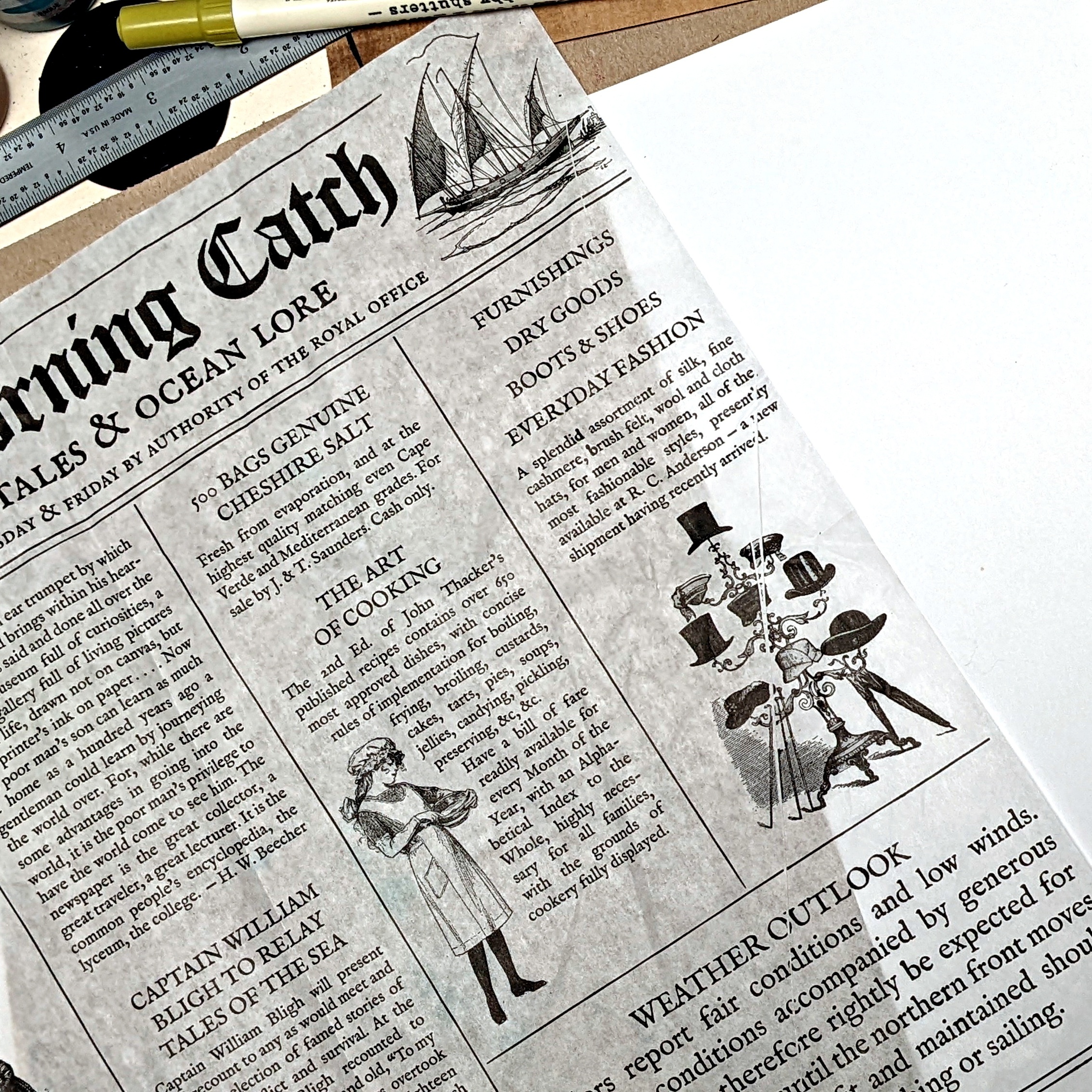

Infusions create a beautiful color pop and texture against the tissue paper.


When it came to the actual journaling part, I decided to challenge myself and try something different. When browsing online for inspiration, I was inspired by journals that were clean, organized and flat, without a lot of layering. This is very different from my usual style as I love tons of paint, texture and layers. Since the background was all white, I had to strategically  place my journaling and stamps so that there were not a lot of white gaps.


I repurposed PaperArtsy tissue paper as an embellishment at the bottom of the page. At the top, the hand lettered title was painted with Fresco paints. With a ruler, I drew lines to section off areas and then I found stamps I liked that fit in the area, almost like a puzzle. The small amount of collage that I did do, was scaled back to only a few items.


On the journaling spots, I used a ruler to draw lines so I could keep the text straight. This worked especially well when placing text around images. After I finished writing, I erased the pencil lines


As you can see, I used various PaperArtsy stamps throughout my layout. I classify them as leftovers as they were sitting on my desk, unwashed from a previous project.




I always love a challenge to use up my leftovers, think of it as creative time as well as cleaning your desk. While I really enjoyed the "clean" look to this journaling style, I found that I didn't use as many leftovers as I hoped due to a lack of layering. Maybe next time I can mix the two styles to get the best of both worlds.

Kate

Saturday, 19 June 2021

2021 Topic 7: Stamp Mash Up JOFY, EEG, ESN, I&D minis {by Keren Baker}

2021 Topic 7: Stamp Mash Up


Hi everyone, it's Keren Baker with you today, and I'm here to share with you an exploration into going vintage (or not) via creating an art doll.

I'd created a bag recently with some children's dress forms on and quite fancied recreating something similar in a papercraft style using the 4 different designers in the Mash-Up topic. The whole idea began with the shells! When I was looking through Sara Naumann's collections I saw the seashells, thought 'wings' and then set about trying to find all the other elements that would be roughly the correct scale.

I had it in my head that this might be the time for a little foray into a more vintage style. I've always drooled over those people who seem to do it so effortlessly (like Jennie Atkinson). So I'd made a sketch and thought 'what would Jennie do?' and decided she probably wouldn't be using bright white mercerised cotton to stamp onto. So I tea dyed it (another first).


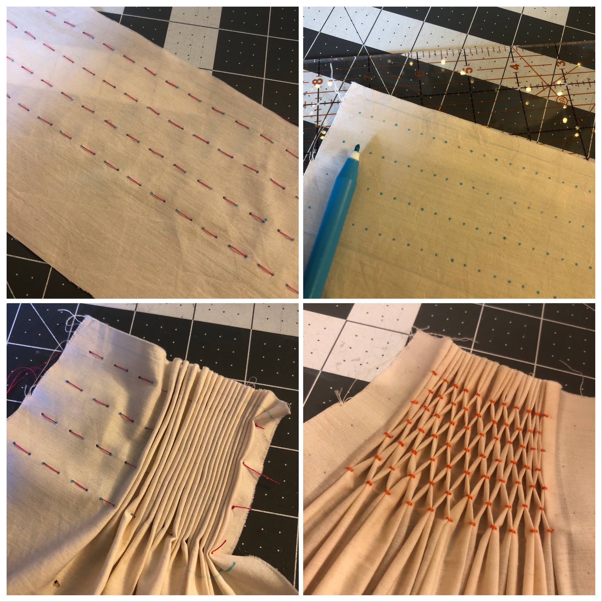
Truth be told, two things scare me (artistically). One is the colour cream, beige, nougat etc. and the other is 'too much'. To soothe the whole 'this isn't white' thing I thought I'd attempt my second new thing; smocking. I love texture and wanted to stamp images on the dress but thought a little sewing might get me back to my happy place. As this isn't about sewing- here's one picture showing the whole smocking process.


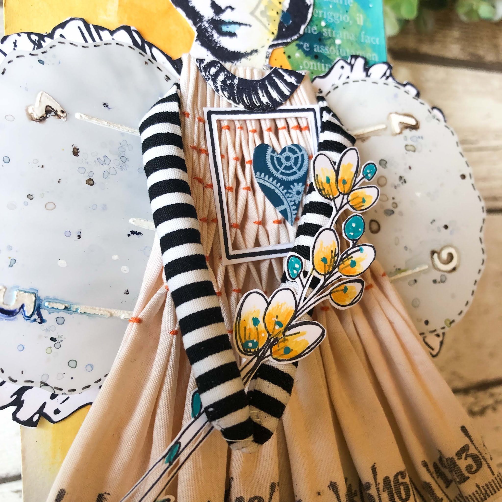
After creating some arms from striped fabric, I got to the wings. I stamped the beautiful shells from ESN48.


After stamping the shells, I loved the simplicity of it, but really wanted to add more layers.


I added some stencilling and then really disliked it, so stamped the shells in black and thought I'd add a Duralar Matt layer over that, that had some Grunge Paste stencilled over and perhaps..(experiment no.3) adding some Infusions onto the non-porous surface. (You can see my dotty disasters in this next photo).


I used Royal Blood & Sleight Blue Infusions, sprayed them over the stencilled Grunge Paste using PS247. I love the way that the Infusions just seep around the Grunge Paste.

Stockists for this product can be found at the base of this post


Assembly was altogether more tricky than I realised. I had stamped the bottom of the dress (which I realised I should have done before but I didn't know what length the smocking was going to be; I'd thought the smocking would just be on the bodice but it ended up being a natural dress shape) so I stretched the fabric and just went for it using the Mini MN48 which I also cut in half so I didn't ink past the measuring part.
 

I adore the randomness of the unravelling fabric threads.


My challenge was how to present the art doll. This is where I sadly left Jennie behind. I just wanted to add colour to some mountboard, so grabbed some Mid Century colours (that's vintage, right?!).


Using my next designer Jo Firth-Young, I chose one of her new sets JOFY102.

This product is available from stockists listed at the base of this post

With some blending and dry brushing, I added the colours and stamped using Stazon Pigment White which is a brilliant newer Stazon white and much less messy than the previous White. By the time I'd finished it, I didn't want to cover it up!


Adding some Fresco Finish Chalk Acrylic Haystack to the face of the doll helped make the project more unified. I used the Mini MN10 and overstamped with the tile image from EEG26- bringing in Emma Godfrey's stamps into the project. I also added the curved image from the Mini to act as a necklace and help disguise the raw edges of the smocking.


Deciding on the middle of the dress- I wanted to add her heart. She doesn't wear her heart on her sleeve, but in a more literal place. This doll is all heart! I've used the Mini 60 (MN60) stamped in white over some Baltic Blue and surrounded by a cut out frame from the ESN48 set.


You can also see the flowers from the JOFY102 set, and those flowers were added for a headdress and also tucked under the skirt. 
This was a real up and down project. I got to this point (shown below) in the project and wanted to stop and maybe just add frilled cap sleeves and no wings, but then it wouldn't have been a mash-up project. 


However, I still love the final result plus I got to use the shells we'd had some food in as a bonus for staging the photos! If you look closely, you can see the sentiment 'life is good' at the bottom of the mount using another Emma Godfrey set EEG02.


Have you made any art dolls? It's a great way of letting your hair down creatively and anything goes really. Next time I'd like to try dolls with moveable limbs and a way for them to pose. I didn't quite manage vintage, but it's more muted than I'd usually do and I have tried to embrace off-white! Experimentation doesn't always bring perfect results but it allows you decide differently next time and you never know when you'll discover something incredibly exciting.

See you soon,

Keren x

Blog:
Twitter:@craftstampink
Instagram: @craftstampink
Pinterest: @craftstampink