Showing posts with label EEG26. Show all posts

Monday, 18 September 2023

2023 Topic 10: Tags {by Liesbeth Fidder de Vos} with Emma Godfrey stamps


Hi everyone!

It´s Liesbeth here, and I´d love to show you my 'Tag book shelf tag' ;-) ! 

The topic Tags speaks to me, I love tags so much and use them a lot, in every size. Inspired by the two stamp sets I chose, I got the idea of creating a little tag book that´s placed on a bookshelf, and the 'wall' behind the shelf is a big tag itself.


The theme for this quarter is Typography, so nice and usable in so many ways! For that I used paper from an old book, I used it in three different ways.
I hope you will enjoy the process and get inspired too!


My starting point was these wonderful PaperArtsy Eclectica stamp sets designed by Emma Godfrey: EEG25 and EEG26. I really love the Portuguese atmosphere of the stamps!


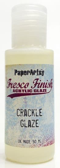
At this stage I never know where the projects ends... I was only sure about these things: I needed thick grey-board to make a big tag with a shelf, some wood grain paper for the shelf, cardstock tags for the tag book. For a vintage effect I chose PaperArtsy Fresco paints in off-white (Nougat) and brown (Chocolate Pudding). I also knew I would need some PaperArtsy Crackle Glaze.


First I cut a big tag out of a piece of 3mm thick greyboard. I used a big paper tag as a template and cut it out. My tag is 23 x 11 centimetres tall.


Now that the basic tag is ready, let's decorate it!


To prevent the paint from soaking in the greyboard, I started with two layers of gesso, I covered the entire tag with it at both sides and let dry well. Paint both sides also stops the board from curling. After that I painted the tag with two layers of PaperArtsy Fresco paint Chocolate Pudding.


In some places I smeared a bit of PaperArtsy Crackle Glaze, not on the whole surface..., and let that dry well.


Now the magic starts! I painted the entire surface with PaperArtsy Fresco paint Nougat. It's best is to paint this in a quick movement with a generous coat of paint. The thicker the top coat of paint, the thicker the cracks will be!


As soon as everything was dry and crackled well, I stamped the beautiful big tiles stamp from PaperArtsy stamp set EEG25 here and there with waterproof brown ink. I used Tsukineko StazOn ink-Spiced Chai. I also glued some small torn pieces of old book paper onto the tag. The first Typography themed item!


As it was a bit to clean, not vintage enough for me, I sponged the tag a bit with Distress Ink-Vintage Photo, and sprayed a little water to give it an old look. I also sponged the edges with the brown StazOn ink. I think it looks much better now.


From the thick greyboard I cut out a strip for the shelf, 9 x 2 cm, and also two small triangles. I rounded off two corners of the shelf.


Using tacky glue I covered the pieces with wood grain paper (Ranger-Tim Holtz) and sanded the edges with a sanding block to make them smooth and to round them off. After that I sponged them with Distress ink- Vintage Photo and StazOn ink-Spiced Chai. Now it looked like real wood!


I assembled the shelf and glued it onto the tag at 3,5 cm from the bottom. I used tacky glue for it and let everything dry overnight.


The big tag with shelf is ready! Here I added two metal embellishments to finish it off.


That bookshelf needs a book, a tagbook of course, and so that's what I made next. My idea was to create a small leporello tag book. Using my Big Shot and a die, I cut out 7 white tags, 16 x 8 cm. Seven later turned out to be a mistake haha! I write about that later. I decided to add some colour to let everything pop a bit more. I chose a wonderful blue one: PaperArtsy Fresco paint-China.


I temporarily fixed the tags in row with a tiny bit of glue, easy to remove them again, onto a big piece of paper. Using PaperArtsy stencil large PS234 and Fresco paints China and Nougat I made some motifs at the edges of the tags with a small piece of foam.


I think this stencil works perfect with the stamps I used! Those tiles!


After drying I sponged the tags with Distress inks Vintage Photo and Broken China, played with water spray to create beautiful waterspots.


I took the same PaperArtsy stencil PA234 again and sponged the circles with dark brown Distress ink (Walnut Stain) here and there.


Time for some more backgrounds and also focal points! I used almost every stamp of the stamp sets PaperArtsy EEG25 and EEG26 using black waterproof ink. (Tsukineko StazOn-Jet Black) I chose the beautiful door for the front of the book.


Using Distress ink-Walnut stain, I stamped the bricks stamp here and there, and I stamped the city name boards Tavira and Lisboa on a piece of old book paper and cut them out. With  bleach, a synthetic brush and a bit of water I bleached most of the black images to highlight them and let them pop out.


At this stage I looked what the book was going to be and what it still needed now. I tried to fold them together the way I wanted and than I realized seven is to much! Six tags is perfect so I took away the least beautiful tag. :-) Oops


When I was thinking about a nice cover for the backs of the tags I was inspired by our new quarterly theme -  Typography, and I thought : why not continue with the old bookpaper?? So with my tag die and old book pages I punched out 6  perfect book page tags.


Using Distress inks Vintage photo and Walnut stain and a blending tool I coloured them, especially the edges, to make them look very old and antique.


I flipped them over to backside up and glued a long piece of brown  ribbon on the middle of the book paper tags, leaving 2 or 3 millimetres between the tags. The overhanging ribbon is at both sides about 25 centimeters, enough to close the book with, later on.


Then I glued the stamped tags onto the bookpage tags, the ribbon in between. And.. a foldable and closable leporello book appeared!


When I looked at the little book at this stage I was almost satisfied...only some small things were missing.

As the finishing touches I made some accents with a white gel pen: some details of the stamped images, a white spot onto the brown circles, and  highlighting some letters. A black fine liner is used for some accents as well. 

I also used my charcoal pencil for shadows behind the bigger stamped images. I used the charcoal at the edges and wiped it out with my finger. I finished with three lovely ladies (paper art dolls) and small metal ornaments onto the holes of the tags.

I finished by adding the bookpaper city boards I stamped and cut out before. Here below you can see the finished tags better.


Here you see the tag book neatly folded, closed and stored on it's shelf! Here I put it on a small easel.


This 'tag book on a shelf tag' was so much fun to make! And if I may say so I am very happy with the result! I love the colour combination of the three PaperArtsy Fresco Paints: Nougat, Chocolate Pudding and China. I tried to continue that colour combination using the inks and in my opinion it turned out well! And how I love the stamps I used! The Portugal stamps PaperArtsy EEG25 and EEG26 worked perfect here!

I was also very educational: next time I will practice how to fold a tag book before just starting! ;-)
I hope I inspired you to play with tags too, there are so many possibilities! Can't wait to see what you create! Enjoy!

Liesbeth XX


Instagram: liesbeth_fidder

I will teach four different workshops, stamping techniques,  in Finland 6-8 October 2023!
Seinäjoki Areena, Kirkkokatu 23, Seinäjoki
Read everything about it HERE  or HERE (Finnish language)

Saturday, 11 December 2021

2021 Topic 15: Journaling Gratitude with EEG {by Autumn Clark}

 2021 Topic 15: Journaling Gratitude


Do blank pages scare you? Afraid to make mistakes? Autumn has the perfect solution to inspire us to start creating using the junk around us. Check out her creative use of hands and twine on one of the pages too!
~ Keren

Hi everyone, it's Autumn Clark from SewPaperPaint with you today, and I'm here to share with you a fun & messy handmade journal project that you can make from recycled packaging. The beauty of this type of project is that you can really let yourself loose and play because if you mess up, you've only wasted what was already garbage. But often working with "junk" releases a creative freedom and the results are far greater than we could have imagined...

I have wanted to paint every single page of a journal for some time now, because that blank page feeling can be overwhelming. I thought why not have a gel print session onto journal pages themselves? But as you know, everything is harder to find and more expensive these days so rather than purchase a new journal, I made one from thick white corrugated cardboard that came in linens packages. As a bonus, I got this pile of cardboard I'd been hoarding out of my way, saving space in my small studio.


I always have the most fun choosing a color palette. For this journal I wanted to use earth tones because I knew I wanted to grunge everything up. I chose a gorgeous array of PaperArtsy Fresco Chalk Acrylics to include: Toad Hall, Space Cadet, Brown Shed, Toffee, Caramel, Jade, Midnight, Sage and Heavy Cream. I went about gel printing the front and back of each piece of cardboard. They measured about 8x5.5" so I used an 8x10 gel plate and was able to print two pieces per painted plate.


Now, the prints didn't cover every bit of the white cardboard because it was uneven in texture.  When I didn't like how it looked, I just printed it again. In the end I decided that I had too much white along the edges, so I decided to dip each page's edges into PaperArtsy Infusions. I used The Sage for the blue/green pages and Golden Sands for the red/brown pages. I spritzed the painted area with water to let the Infusions bleed out so I wouldn't have hard lines. I always use the backs of my 11x17" paper pads for a drying surface when doing batches like this. Here's a peek at the entire book. I've bound the pages with rings for now for ease, but will do a nicer binding after the pages are finished. See how those Infusions add the grunge factor?!


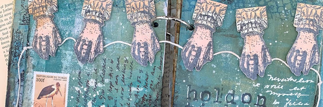
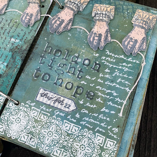
For this spread, I found gel printed paper I made for THIS Lynne Perrella post using PaperArtsy Fresco Chalk Acrylics in Blush and Caramel on which to stamp the hands from PaperArtsy Eclectica³ {Emma Godfrey} Collection (EEG26). I cut them and mounted them holding a length of string.  Beneath I stamped the bricks in blue. Below I embossed the tile repeatedly in white.


Back when these Emma Godfrey stamps were released I shared THIS post detailing how I cut the sign stamp apart. I also explain the tissue stamping techniques used below in greater detail. I stamped the modified sign onto gessoed book page to make my own sign for this spread. It's ironic that the stamp had the number 22 in it and I was writing to encourage myself in the coming year, 2022. I stamped my focal sentiment with  PaperArtsy {Ink & the Dog} Collection (Words Plate 2). I added journaling in my messy script using a white paint pen and a black fountain pen.


For my next spread, I had some awkward streaks in the paint from printing, so I used some torn book pages I had used to mop up stenciling when printing to cover those areas. I used a baby wipe to apply more PaperArtsy Fresco Chalk Acrylic in Heavy Cream through the same stencil at the top of the page for continuity. PaperArtsy Eclectica³ {Sara Naumann} Stencil (PS092) is one of my most used stencils!


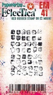
I used the abovementioned tissue technique for the door stamp from PaperArtsy Eclectica³ {Emma Godfrey} Collection (EEG25). I filled in with the tile stamp and pattern from PaperArtsy Eclectica³ {Seth Apter} Mini Stamp (EM41), along with more journaling.


Throughout these pages I incorporated some of my postage stamp collection in the collages. On this spread I attached an old glassine envelope, which flips up to store a tea stained paper with more journaling to continue the theme of using leftover bits from previous projects. I tea stained a pile of paper for my journal in THIS post. Part of my journaling gratitude is recording how events have transpired and led me to something beautiful, though at the time I was confused or afraid of what was happening. What better way to do that than by using pieces from my past?
 

I have lots more room in this journal on which to play! But for today's final spread, I used the window stamp from PaperArtsy Eclectica³ {Emma Godfrey} Collection (EEG26). Oh I love this window! The white tiles were embossed onto tissue. Yes! You can stamp and emboss on tissue. The main reason to take this extra step is so that a large image doesn't stamp improperly onto an uneven surface OR because you want to add color to the image with Fresco paint (painted on the back side).


I just had to incorporate one more stamp set, PaperArtsy {Ink & the Dog} Collection (At Home 2). I love how this sentiment works with the windows and doors from Emma Godfrey's sets! I used it with tissue behind my envelope pocket and then embossed it, adding some embossed handwriting with an embossing pen to completely change the saying. I used the postage collage stamp in the corners of this spread for texture.  For even more texture, I applied Grunge Paste through PaperArtsy  Eclectica³ {Sara Naumann} Stencil (PS218).


The tag was made with mop up paper from using The Sage Infusions. I used it as a large journaling space. I covered the back with tea bags so it feels luxurious when pulled out. These torn envelopes were saved for me by my coworkers, as well as some of the white cardboard book pages. Those little details fill my heart with joy in remembrance. And that's just what a journal should be, a place to reflect on moments and feelings in this busy life.


So what's calling you to reflection these days? Please, let me encourage you to get it out on paper!  It's funny how sometimes we ponder the day to day and find new ways of seeing things that maybe we missed while we were busy living it. When we force ourselves (through a gratitude journal perhaps?) to ask what good things are happening, we are often surprised that the list grows as we start writing. I started this project in hopes of getting one good journal page off of my chest and onto paper and ended up with three spreads! And each one reminded me of another thing I am thankful for that I could add to the next page! 

Regular journaling will help you define your artistic style. Your  journal will probably look nothing like mine, because you will hone in on your own likes and dislikes and refine yourself creatively as you go. I truly hope you are encouraged from the posts of this topic to get started.
xx  Autumn

Blog: SewPaperPaint
Facebook: Autumn Clark
YouTube: SewPaperPaint
Instagram: @SewPaperPaint
Pinterest: SewPaperPaint