


Hello everybody!
Mi Mii from France with you today. I am so happy to be back on the blog to shre with you my interpretation with Mattints, and the Theme 'Glazed'.
I was so curious to discover the new tinted glazes.
In this Art Journal page, I played with 2 new colours: Mattints The Pink (MT08) and Dragonfly (MT07).
Salut tout le monde !
C'est Mi Mii, aujourd'hui avec vous ! Contente de vous retrouver ici, pour illustrer le Thème 02 "Mattints", et toujours "Glazed".
Je découvre avec beaucoup de curiosité ces nouveaux glacis PaperArtsy Fresco Tints. Dans cette page d'Art Journal, je vais utiliser 2 nouvelles couleurs : les Mattints The Pink (MT08) et Dragonfly (MT07).

Having not tried the Mattints before, I had a lot of questions. How should I use them? What results could I achieve? How to best showcase this new medium?
I chose to go with an Art Journal Page, a format I particularly like and perfect for experimentation.
Ne connaissant pas encore les Mattints PaperArtsy, je me suis pas mal questionnée. De quelle manière j'allais les utiliser ? Quel rendu j'obtiendrais ? Que pourrais-je vous proposer pour mettre au mieux en valeur ce nouveau médium ?
Je décide de partir sur une page d'Art Journal, support que j'affectionne particulièrement et propice à l'expérimentation.

I actually made a special Art Journal to go with me on my creative journey and collect all my future PaperArtsy pages.
Let's get going! Let me take you along my creative process.
Je me suis d'ailleurs confectionné un Art Journal pour y glisser toutes mes pages PaperArtsy, il m'accompagnera au gré de mes créas.
Allez c'est parti ! Je vous fais découvrir mon processus créatif.


My main inspiration is this amazing stamp set Eclectica by Clare LLoyd (ECL03). It has everything I need for my page!
I decided to build my composition to illustrate the quote "The prettiest smiles hide the deepest secrets". For that, my idea was to layer both faces: they are so expressive and complement each other! Clare Lloyd PaperArtsy Stencil (PS173) goes great with them to bring a bit of texture.
Mon inspiration première est cette fabuleuse planche de tampons Eclectica de Clare LLoyd (ECL03). Tout ce dont j'ai besoin pour réaliser l'essentiel de ma page se trouve dans ce jeu de tampons. J'ai voulu créer une mise en scène qui illustre la citation : "Les plus beaux sourires cachent les secrets les plus profonds". C'était une évidence, je tenais mon idée ! J'allais superposer ces 2 visages. Ils sont tellement parlant et se complètent à merveille. Le pochoir de Clare LLoyd (PS173) vient aussi s'accorder parfaitement pour un peu de texture.

To colour my background, I chose the Paperartsy Fresco Finish Antartic (FF67), Chartreuse (FF81), the recent Bermuda (FF224) and a touch of Kiwi Gold (FF230) to chime with the Mattints "The Pink" (MT08) and "Dragonfly" (MT07). I also added some scraps of the PaperArtsy Printed Tissues by Scrapcosy (PT05) and Seth Apter (PT06), a bit of Grunge Paste (GP190) and Just Walnut Infusion (CS25).
Pour la mise en couleur de mon fond de page, en plus des Mattints "The Pink" (MT08) et "Dragonfly" (MT07), j'opte pour les Paperartsy Fresco Finish Antartic (FF67) Chartreuse (FF81), la toute nouvelle Bermuda (FF224) et une pointe de Kiwi Gold (FF230). Pour le reste j'ai utilisé des chutes de PaperArtsy Printed Tissue Scapcosy (PT05) et de Seth Apter (PT06), et pour ajouter une pointe de Grunge et de vintage l'Infusion Just Walnut (CS25) et la Grunge Paste (GP190).


I started by stamping all my pieces.. I like having all the parts before starting, to try different compositions. I play until I find positions that I like and that correspond to my initial idea.
Je commence par préparer mes tamponnages. J'aime avoir tous les éléments avant de me lancer pour pouvoir faire des essais de compositions jusqu'à trouver la disposition qui me convient et que j'avais en tête.

Then, it's time to get cracking on the background... I started with Chartreuse (FF81), a light and translucent green, then balanced it with Antartic (FF67), an opaque greyish blue.

Je termines avec ma couleur la plus profonde, Bermuda (FF224) un joli bleu vert opaque également.

Here is my background! I like the texture, reminiscent of old peeling walls.

It is now time to bring some contrast and texture to make the background a bit more interesting!
Il est temps d'enrichir un peu tout ça et d'apporter à ce fond un peu de contraste et de texture.

It is time to bring out the Mattints! I used the new vibrant colours "Dragonfly" (MT07) and "The Pink" (MT08) to glue craps of Scrapcosy (PT05) and Seth Apter Tissue Paper (PT06) on my background.


I love the result with the Mattints! Their transparency leaves the designs of the printed tissue, or stamped images, completely visible, while still providing incredibly intense tints. I am 100% won over by "The Pink", I really love its almost neon brightness.
J'aime beaucoup le rendu de ces Mattints ! Leur transparence n'altère en rien la qualité d'impression du papier de soie ni même des tamponnages et de plus elles ont une intensité dans la couleur incroyable ! J'adore ! 100 % conquise par la couleur "The Pink", elle a ce petit côté fluo que j'aime beaucoup.

However, I was still not completely satisfied with my background. I though it lacked texture.I remedied that with some Grunge Paste (GP190) through Clare Lloyd's PaperArtsy Stencil (PS173). The hearts could have worked just as well but I went with the stars. I really like stars and it is quite rare for me not to sneak a few in my projects!
Par contre je ne suis pas encore totalement satisfaite de mon fond. Je trouve qu'il manque un peu de matière. Je décide de lui apporter un peu de relief en appliquant de la PaperArtsy Grunge Paste (GP190) avec le pochoir PaperArtsy de Clare LLoyd (PS173). J'aurais tout aussi bien pu mettre le motif cœur mais je choisi de partir sur celui des étoiles (oui, j'aime beaucoup les motifs étoiles et il est très rare que je n'en glisse pas dans mes créations!).

For the stars to really pop off the background, I painted them the PaperArtsy Fresco Finish "Kiwi Gold" (FF230). This vibrant golden yellow gave them the brightness I was looking for.
Pour que ces étoiles se détachent un peu plus du fond, je décide de les peindre avec la peinture PaperArtsy Fresco Finish "Kiwi Gold" (FF230). C'est joli jaune doré et vibrant qui leurs donne ce côté lumineux que je recherchais.
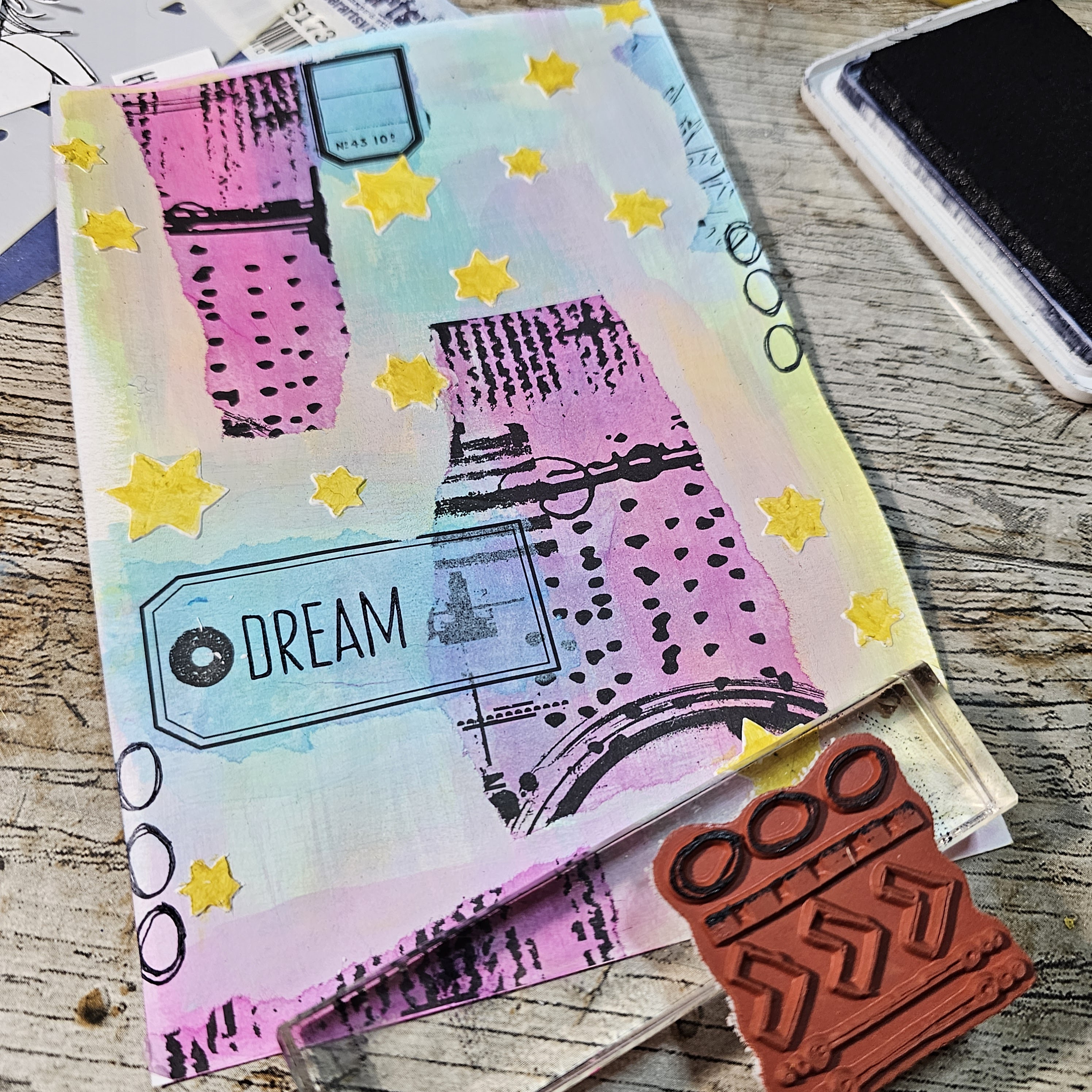
Then I only needed to define and frame my piece, creating borders with some absract stamping. For an easy harmony, I use the background stamps from Clare Lloyd's set (ECL03)...
Il ne me reste plus qu'à bien définir les contours de ma page, en créant une bordure avec différents tamponnages. Pour harmoniser, j'utilise les tampons de fond de la grande planche de Clare Lloyd (ECL03)...

...mais également le mini tampon PaperArtsy de Seth Apter (EM46).

I then needed touches of shine to perfectly fit into the current Theme "Glazed". Time to break out the Stickles and glitter pens! No holds barred!
J'ajoute maintenant, cette touche de brillant nécessaire pour coller parfaitement au Thème 1 de ce trimestre, qui est "Glazed". C'est le moment ou jamais ! Stickles à volonté et stylos gel dorés et pailletés sont de rigueur !

The result is not easy to photograph, but the glitter is doing its job! Shiny!... Still one little detail is still missing...
Ce n'est pas très parlant sur la photo (pas simple de capturer le réel rendu) mais les paillettes font leur Job ! ça brille !... Mais il me manque encore un petit détail ...

Ce sont ces fameuses éclaboussures qui donneront à mon projet cet aspect grunge que je recherche. J'ai utilisé cette nouvelle infusion, devenue incontournable pour moi, la PaperArtsy Just Walnut (CS25). Même avec ce fond coloré, elle apporte un peu de vintage à ma page. Je complète avec des projections de gouttelettes de Mattint "The Pink" (MT08).

And tada! my background is complete! time to work on my focal!
Et voilà ! mon fond terminé, prêt à accueillir mon sujet !

I love working on faces, I even draw my owns regularly; it is a must have for me. Almost all of my creations have a portrait in them. That's why this stamp set (ECL03) immediately caught me eye and inspired me; it offers quite the collection of cute faces! My chosen base was the big portrait, that looks quite melancholy and lost in thought.

My idea is to use the smiling face in a frame on top of the big one, fusing them to create the illusion of only one image. That way one face is the 'prettiest smile' and the other one is the 'deepest secret' of the quote.

To add the flap, I first chose where to place the main stamp, then layered the framed face on top and drew a few references lightly with a pencil...
Pour la mise en place de ce volet, j'ai tout d'abord placé mon image principale. Ensuite je viens superposer le cadre avec le second visage. Je marque des repères au crayon gris...

... allowing me to cut a precise slit to slid the end of the flap in.
... afin de découper une encoche pour pouvoir intégrer la languette de mon volet.

With just a strip of glue to hold it in place, the flap is fonctional!
Un peu de colle pour le maintenir et voilà cela fonctionne !

I did not forget to decorate the inside of the flap too. I stamped another quote on a scrap of paper coloured with Fresco paints. I added a bit of stitching around the words for a finished look before gluing them in place.

I then added my finishing touches: more golden stitching here... Some details with gold gel pen there... A bit of shadowing with a grey Prismacolor pencil to add depth...
Je peaufine les finitions...un peu de couture dorée, de ci...des ajouts de détails aux stylos gel, de là... et quelques ombrages avec un prismacolor gris afin de donner de la profondeur à certains éléments.

It was finally time to colour the pretty faces, which I did with my beloved Prisma color Premier pencils.
Je passe à la mise en couleur de ces jolis visages, et pour ce faire je décide d'utiliser mes crayons de couleur Prismacolor Premier.


Voilà! Here is the finished page! I am thrilled with the result, it is exactly what I was looking for.
Et voilà ! ma page est terminée ! Je suis ravie du résultat obtenu, c'est exactement ce que je recherchais.


And she is in my new homemade PaperArtsy Art Journal.
Elle prend place dans mon nouveau Art Journal fait maison et dédié PaperArtsy.


I hope the step by step was useful and that this page inspires you.
I am looking forward to our own creations.
See you soon!
J'espère que ce pas à pas vous aura plu et que cela vous aura inspiré.
J'ai hâte de voir vos futures réalisations.
A très bientôt
Mi Mii xx


