Showing posts with label EM39. Show all posts

Sunday, 21 March 2021

2021 Topic 3 The Creative Laboratory with ESA {by Autumn Clark}

 The Creative Laboratory - Infused {by Autumn Clark}


Autumn's on a slippery experimental slope here, and vaseline is the product she's been stamping with - yes! You read that right! Read on to find out how she used it with infusions! Mind Blown.
~ Leandra

Hi everyone, it's Autumn Clark from SewPaperPaint with you today, and I'd like to share with you a new technique that I'm over the moon excited about, stamping with Vaseline.  Yes, you heard that right, stamping with Vaseline or petroleum jelly.  

Many of us have learned that Vaseline can resist paint to create layered effects.  This got me wondering if it could be used as a stamping medium to resist ink.  And folks, let me tell you, YES it can!  Follow along and see just how easy it can be...


Lately, I've fallen in love all over again with PaperArtsy Infusions.  I recently did a post (HERE) for a PaperArtsy stockist on using Infusions mixed with embossing ink to create embossing resists.  This got my wheels turning at other new concepts for using Infusions.  The current topic, Creative Labs, was all the push I needed.  Today I'm working with the new Seth Apter stamp designs, which are primarily background types of stamps, the perfect accompaniment to Infusions.  


My goal was to determine if Vaseline could be spread in a thin layer and used for stamping, and if it would repel ink as a result.  I find the gel plate is a good surface for spreading out mediums with which to use for stamping.  So I brayered a glob of Vaseline onto a portion of my small gel plate to use as an "ink pad".  But first I wanted my resist to show through a secondary color, not just plain white.  I colored my panel by spritzing water onto my kraft mat and adding a generous sprinkle of Golden Sands Infusions into the water.  I then dipped my panel into the wet powder until I covered it completely.  I sprayed the panel with water where needed to help it bleed.  


As demonstrated in the video HERE, I used the same dipping method over top, this time with The Sage Infusions.  The resist effect worked right off!  I let the panel partially dry, then gave it a zap with a heat tool.  Here's the magic: the heat tool melts the Vaseline into the paper's surface so that it virtually disappears, no shiny or gooey residue.  
 
I tried the same process again with Seth's new alphabets from PaperArtsy Eclectica {Seth Apter} Collection (ESA21).  It resisted perfectly, and after heating I could go in with a pen and outline the letters, without any residue to clog my pen.  I added further dimension to my background by stamping in PaperArtsy Fresco Chalk Acrylic in Concrete, and other stamping in Fossilized Amber Distress Ink.  I used one of Seth's die cuts and finished with a mop up panel, stamped with PaperArtsy {Ink & The Dog Collection} Mini Stamp 17 (MN17).

Note* I cleaned all of my tools & stamps with dish soap.  Note, any paint on the gel plate will be washed off.  It can be conditioned with baby oil after if needed.  


Of course, I was eager to try another color palette...


This time I layered using the same color, for a tone on tone resist.  For those of you who want to try PaperArtsy Infusions, here's a great way to test only one color!  I dipped my panel into watery The Sage Infusions, then stamped the rectangular pattern from PaperArtsy Eclectica {Seth Apter} Collection (ESA20) with Vaseline, then dipped my panel into more The Sage Infusions for a tone on tone resist.  After heating, I stamped more patterns with Gathered Twigs Distress Ink, spritzing with water to let the shapes bleed out, and added contrast by stamping PaperArtsy {Ink & the Dog} Collection Mini Stamp 18 (MN18) with PaperArtsy Fresco Chalk Acrylic in Concrete.  I chose PaperArtsy {Ink & the Dog} Collection Mini Stamp 31 (MN31) as my focal image.  I layered it over Seth's Letters stamp, stamped softly in the background.  I added a handwritten sentiment using a sepia fountain pen. 


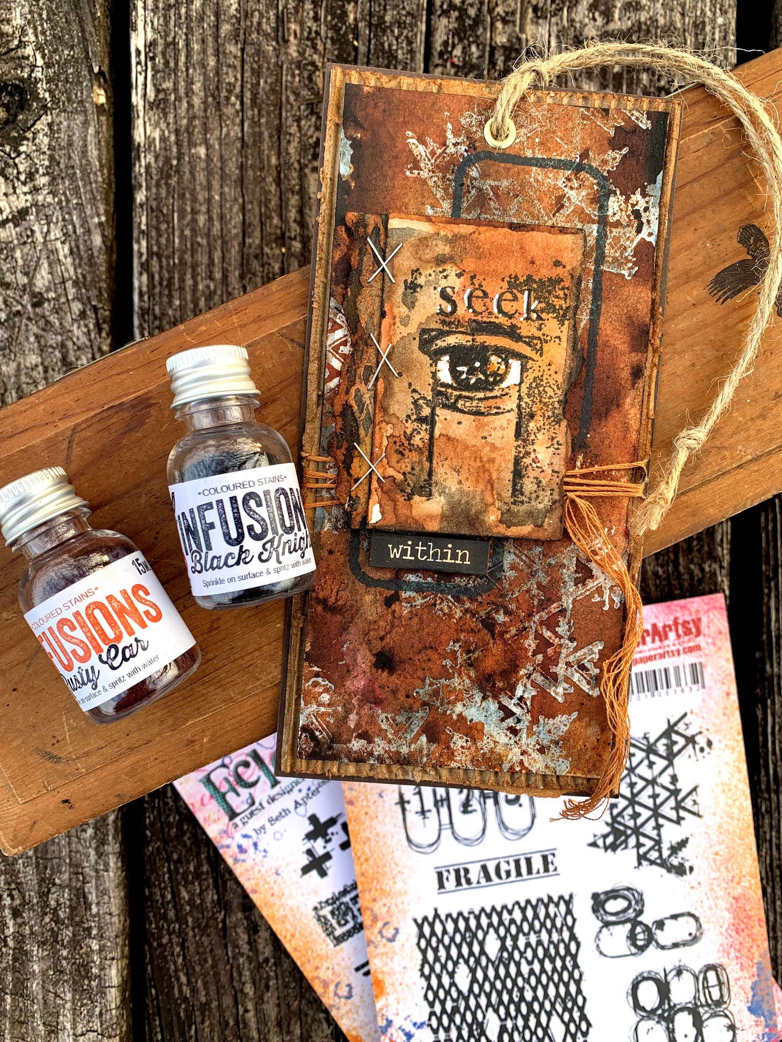
It was hard to stop once I got going.  I wanted to try a really unusual color combination next.  I first used Black Knight, and atop of my resist (my personal favorite) Rusty Car InfusionsThe colors worked perfectly together.  Tip: You can control the richness of color by the amount of water you add.  Here my black is rather grey, but I kept the rust very saturated.  This is all due to the amount of water vs. pigment.  


I inked a small mop up panel with both colors, then stamped PaperArtsy Eclectica {Seth Apter} Collection Mini Stamp 39 (EM39) onto it.  I added white details with a paint pen.  The little piece sticking out beneath the staples was made by using Rusty Car first then Black Knight over my resist, the opposite of my main background.  You can flip flop the technique to achieve a wide variety of pieces with which to collage.  I like to add water to what's left on my kraft mat and mop up a shade lighter.  


I carefully cut out the words from the label stamp in set ESA19 with an exacto knife.  This is one of my favorite ways to make the most of my stamps.  When you cut apart stamps, like I did in "Find Your FIRE" and the label, you can use them separately but still piece them together on your block to have a whole stamp again.  I knew I would use the frame stamp a ton and think cutting is easier than masking in the long term.  Do you ever cut your stamps?  

I hope the topic of Creative Labs has inspired you in more ways than one, mainly to make some experiments of your own!  I encourage you to try a new technique at least three times, seeing how you can alternate colors or mediums each time.  These variables will often produce new and exciting results.  Not only did I discover a new way to use a household staple here, I actually discovered that I enjoy dipping panels into Infusions (the way I do with ink pads) more than sprinkling it onto my panel.  Why have I never done this before?  Perhaps because I haven't given myself enough time to experiment.  


If really hope you'll try this technique!  Please leave us a link so we can ogle over your creations.  I will try to add another video tutorial to my IGTV this week so you can see this process in action.  Thanks for joining, Autumn

Blog: SewPaperPaint
Facebook: Autumn S Clark

YouTube: SewPaperPaint

Instagram: @sewpaperpaint
Pinterest: Autumn S Clark


Saturday, 23 January 2021

2021 Topic 1 Stamp Mashing - FP ECF I&D ESA: Concertina Mash {by Autumn Clark}


A delightful concertina booklet from Autumn here, allowing her to showcase lots of stamps from all 4 of our mash-up designer challenge! I adore this colour palette, and the elements and their surfaces are all so touchy-feely looking! Once you have a bundle of elements, the fun starts putting them together. Autumn has a knack of doing this beautifully. 

~ Leandra


Hi everyone, it's Autumn Clark with you today, and I'd like to share my new little accordion book filled to the brim with gorgeous imagery from our "mash up" of designers.

I knew right away I wanted to create a book with this variety of images to make each one a focus on the many pages.  I hope you'll read along to see the tricks I discovered in the process...


I tried so hard to use a new palette (because blues always call to me) and though I didn't use a single blue paint, somehow my book ended up with a blue tint.  Ha ha!  I actually chose browns and greens to work with: PaperArtsy Fresco Finish Chalk Acrylics in: Caramel, Hint of Mint, Gold Rush, Toffee, Winter Green, Cloud 9 and French Roast.  Oh how I love this combination!


I used the Sizzix Notebook die and white mat board, cutting the covers down to 3.75 x 2.75".  I then cut two long pieces of PaperArtsy Smoothy Card to 3.5 x 11.75"  I then did some random painting with my brayer onto my gel plate.  After the pieces were dried, I scored the long strips at 2.5", cutting off the excess and adhering the two panels together to form one long accordion, which I adhered inside of my book after stamping/collage.
 

I wanted to add dimension to the pages, but couldn't bulk up the accordion too much or it wouldn't close properly, so I made a batch of tea dye paper on plain copy paper.  This allowed me to distress and wrinkle up my edges, but was thin enough to fold up flat.  I stamped my images in Ground Espresso Distress Oxide.  (Tea stained paper, French Roast paint, Espresso ink... Do you see a theme here?)  I used my water brush to wet around each image and carefully tore them apart. 

 
AH5

WGS2

EM39
 
I am always so excited when I get a chance to share Ink & the Dog Collection stamps!  I  knew right away I could use the funky old bird from I&D Eclectic Plate 5 with its counterpart from I&D Wings Plate 2 and a host of other wing stamps.  And since I was making a book I added the "do not look inside" stamp from the I&D At Home Plate 2, which worked perfectly with Eclectica Mini Stamp 39 by Seth Apter
 

ECF05

Since Courtney's stamps were in the mash up, I wanted to turn the leaves from PaperArtsy Eclectica (Courtney Franich) Collection {ECF05} into wings.  I cut them out and scrunched up the stems, then cut out a second shirt for the dear old gal and tucked her new "wings" beneath it, stitching around the shirt to finish it off.

FP007

I found a new favorite (and super easy) way to paint with my stamps.  I brayered paint onto my gel plate then used it as an "ink pad".  I stamped the funky flower shadows from PaperArtsy France Papillon Collection {FP007} onto my panels then stamped the outline over them with black ink.  I added some journaling to one of the flowers for contrast.  My gel plate had a very cool impression from doing this, so I made a quick print (below) to use in a future project.  I can't wait to experiment more with this!

 
I decided to use more Seth Apter stamps, PaperArtsy Eclectica (Seth Apter) Collection {ESA018}, by doing some light stamping on my backgrounds, mixing with other backgrounds from the sets and adding a little stitching.  I added a few old postage stamps from my stash to blend in with the postage stamp from Courtney.
 
I dyed some seam binding with Distress Inks to make a closure for my little book.


It is small, but mighty in its message and filled with all of the quirky things I love!  I hope you love it too! 
 

It is so satisfying to sit and create something from nothing; a few sheets of paper, paints, inks and stamps can easily become a mini treasure.  Have you allowed yourself time to play?  I highly suggest creating a little book in which to do so.  I truly love taking the mundane or discarded things and turning them into art!  After all, what's to lose?

It's been a pleasure being with you on the PaperArtsy blog today and I will be seeing you again soon!  Hugs, Autumn

Blog: SewPaperPaint
Facebook: Autumn Clark
YouTube: SewPaperPaint
Instagram: @sewpaperpaint
Pinterest: Autumn S Clark
 

Wednesday, 8 May 2019

2019 #7: Turquoise with ESA 'Experiment' [By Etsuko Noguchi}

2019 Topic 7: Turquoise


In this wonderfully layered post, Etsuko creates some stunning layers, all of which she explains so clearly for you below. I love to see how she brings her pieces together, she makes such a wide variety of crafty creations, a very talented lady! ~Leandra

Hi everyone, it's Etsuko My Favorite Things with you today, and I'd like to share with you Topic Turquoise using fabulous Seth Apter's stamps, paints and Baked Textures.

I love Seth's mixed media fine art, his unique work of art always fascinates me and it is amazing to see that the materials the deals with will magically transform. Today I tried the mixed media configuration using his stamps and so on.


First, I made turquoise color background.


I collaged pieces of book paper and painted them with white gesso. Then I painted them with Turquoise, Green Patina and Hey Pesto.

Also I used EM35, EM36 and some Seth's stamp with his Baked Textures: Chunky Rust, Rocky Road and Ancient Amber, this made the background a bit thicker with the lovely texture from the embossing powders.


And repeatedly I also added Neocolor pastels and Fresco Paints to get a satisfying turquoise color.

This is the finished background work.


Next I made three pieces for layers. 


First I painted mixed Mud Splat, Mahogany and Buff on White Smoothy Heavy Card then I randomly splatted Turquoise and Green Patina. And I embossed ESA07 stamp with DeepSea Baked Texture.


This photo is focal point, I stamped ESA06 by Sepia Archival on Smoothy White Card. Then I made the SEEK EYE watch frame using Rocky Road and Beeswax Baked Textures with ESA11 and EM39.


Finally I made word Experiment from ESA08 and third piece of layer from ESA06. The word Experiment embossed by Rocky Road on tissue paper and embossed ESA06 item with Chunky Rust on another black painted paper. Both of them cut and pasted to the place shown in the photo. I embossed by Patina Oxide Baked Texture with some splat stamp the overall. And I painted by London Bus Fresco on the book paper then rip it thinly and stuck it vertically to be the point.


I made the combination of turquoise and brown, but the brown tone was difficult. I thought that it would be fun if I tried various colours to be the medium, and I put the word 'EXPERIMENT'. I think the combination of colours is a very enjoyable task and turquoise is a very attractive color. Please try and challenge it everyone.

Thank you so much for visiting.
Etsuko xxx

Blog: My Favorite Things
Facebook: Etsko Noguchi 
Instagram: Pixienest
Pinterest: Etsuko N.