Showing posts with label The Creative Laboratory. Show all posts

Sunday, 26 December 2021

2021: PaperArtsy - A Year in Review {Topics 1 to 3}


Hello from PaperArtsy HQ,

At this time of the year, we take a look back at some highlights of the 2021, and the amazing projects our bloggers have shared with you. 

I guess we could all agree that 2021 has be a year of living life a lot more 'virtually' than we normally do. Systems are more automated, education and online classes have become more accessible to us all. Did you learn something new this year? Did you achieve a personal goal, or tick something off the bucket list? 
 
It has been a tricky year for many of us. Less travel, less contact with loved ones, and a lot less hugging and physical contact! Were you challenged in ways you least expected? I guess all these things help us appreciate what we do have, as well as those we have lost, or things we can no longer do so easily. no one thought it would all go on this long, yet here we are. It is amazing how resilient we can be when we have no choice.

I suggest you grab a mug of something hot, some leftover food from yesterday, no doubt we all have some of that, and settle in for the first of a few days of review posts.

Today we are sharing my picks from Topics 1: Stamp Mash-Up {France Paipllon, Courtney Franich, Seth Apter and Ink & the Dog},  Topic 2: A Pocketful of... and Topic 3: The Creative Laboratory.
 
A big thanks to Dounia for curating these posts.

~ Leandra 

Topic 1: Mash Up {FP, ECF, ESA and I&D}
We started the new year with a new concept: stamp mash-ups... Lots of us often mix designers when creating, but this time, we are doing it on purpose! We tried to select distinct and different styles that we could see working together, from France Papillon's clean details, Courtney Franich's collaged textures, Ink & the Dog's vintage layers and Seth Apter's grungy abstracts. This topic is all about looking at those stamps (and stencils) to find out how they might interact differently, and maybe stepping a little outside of the comfort zone of your usual style to have some experimental fun!

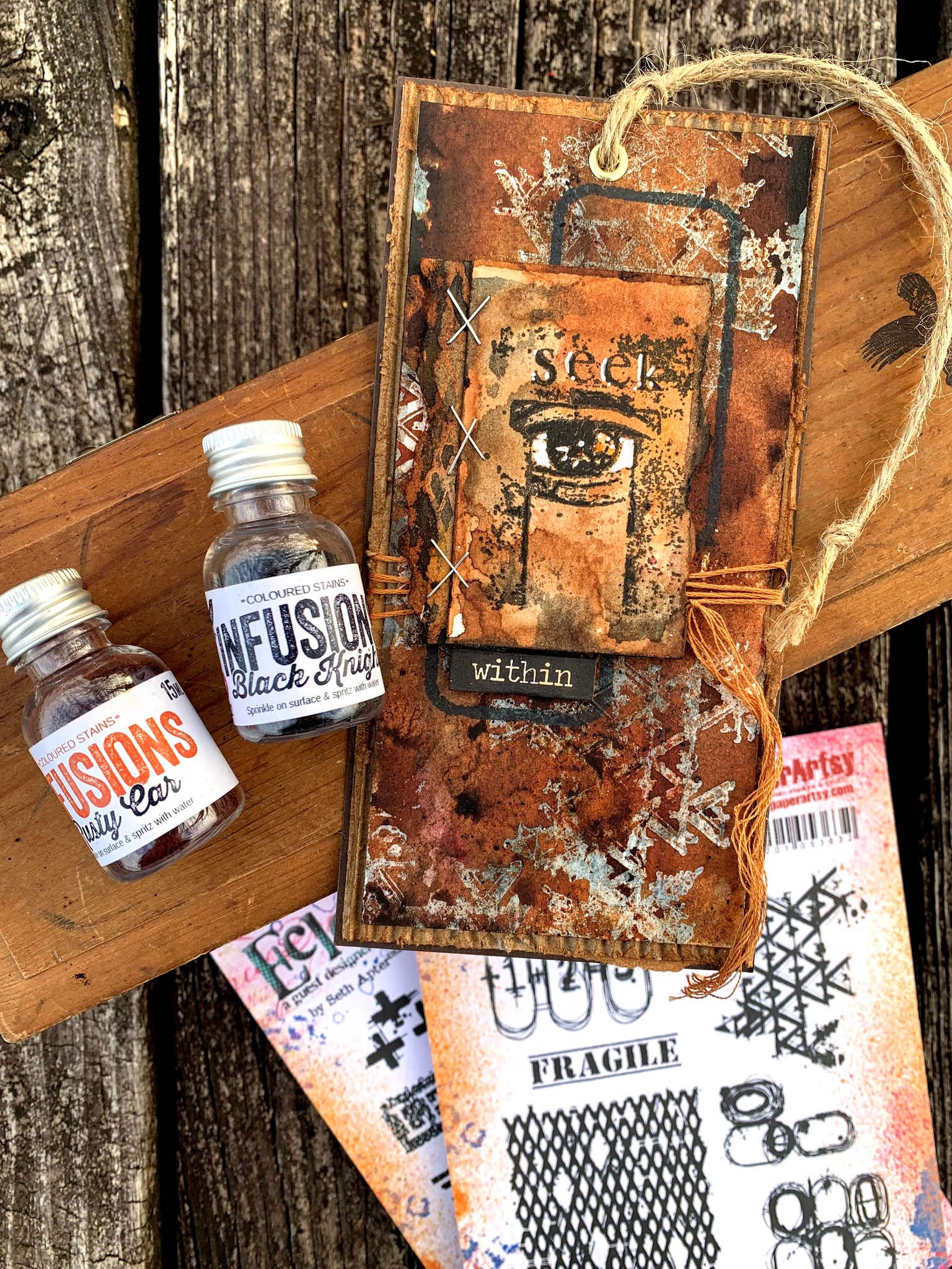
My first pick is this amazing project by Nikki Acton which I feel really represents the mash-up concept on one small tag. Each collection is recognizable and has a place to shine, while still creating a cohesive whole. Playing on geometry, Seth's circles work really well with the I&D clock, despite being pretty much opposite styles. Nikki's explanation of her process is also an enlightening read, give it a go (link to original blog post)!


And I hope you didn't miss Corrie Herriman's very mad project (her words...). A true undertaking! On striking, striped backgrounds, the stamps coordinate beautifully, helped by the consistent use of the same background stamps and the careful choice of focal images. The recurring pointy hats really emphasize the fun vintage circus vibe. Corrie's attention to detail is amazing, so check the original blog post to see all sides of this gravity-defying project.


Now for something truly out of the box ... Keren Baker decided to paint a violin (and not for the first time either)! This is truly a study in layers, from the subtly crackled 'sky', to the transparent leaves and the number-stenciling across the focal images. The limited colour palette really makes the stamped images stand out and the pink really 'pops'. Be sure to go to the original blog post for more detail pictures of this project, as it is difficult to do the post justice with just one image.


Topic 2: A Pocketful of...

This topic was originally inspired by pocket journaling. It is quite a long-serving trend and several of our designers enjoy bullet journalling, or mini journals and have created stamps perfect for this theme. However we purposefully left the topic vague enough that other interpretations could be explored, from actual fabric pockets to a 'pocket of time'. Our idea was mainly to explore the relationship between the outside and the inside, the exposed and the secret. Our bloggers were sometime a bit mystified by this title but rallied quickly with wonderful ideas on how to squirrel secrets into pockets of all sizes.

Carol Fox obviously got the pocket journal inspiration for gorgeous tag book in sunset colours. Sara Naumann is a fan of journaling and pockets herself, making her stamps perfect for this type of project. Carol's balancing of warm and cool colours is masterful. Her careful layering of stencils and stamps results in backgrounds soft enough for her to record her vacation, yet striking enough to add and complement her photographs too. (original blog post)


Now, pockets do not have to hold cards or pictures, for Leandra Franich they can also hold... paper artdolls. Frankly I suspect Leandra really wanted to make the dolls and then made her pocket dollhouse to fit the topic. Art dolls and Lynne Perrella stamps is a concept that goes hand-in-hand from years ago, in fact most of what Lynne designs are a form of Art doll, but earlier this year it became a bit of an Instagram craze thanks to Meghan Whisner-Quinlan. With Leandra's make, we can still appreciate how transparent layers create both softness and complexity, while the recurring use of script in different forms allow the girls to link to each other while each has her own personality. Check the original blog post to meet them!


And now for a pocket party! Helen Chilton took Zinski Art's new Alpacas & Llamas collection and ran away with it. These stamp are made for bold and bright colours and this bunch seems to be having all the fun! The black and white phrases contrast beautifully with the pocket designs for maximum impact. This is actually an altered book and Helen describes the technique in detail in her original blog post.

 
Topic 3 : The Creative Laboratory

Another one of those open-to-interpretation topics... Aren't we creative each time we craft? So, let's bring some science in our creativity! This was an invitation to play around with scientific imagery but also to experiment. Maybe it is the occasion to try a new product or to attempt a unusual technique, to compare brands or contrast processes to get just the result you want, and maybe discover other things you like along the way. Of course, like our precise bloggers, you need to write your experiments down, that's what makes it science! 

First up, Jenny Marples played with clean colours and the science-inspired 2021 Hot Picks release for this striking pocket book. It is a gorgeous example of layering and balance of colour, as well as a great use of white as a contrast. This booklet is also filled with everything a little chemist might need, so do not hesitate to check Jenny's original blog post for more pictures.


Autumn Clark went with the 'experiment-and-discover' interpretation of the topic. You might call it a happy accident process! Following the scientific method, she theorised that the resist effect of Vaseline against paint could be applied to Infusions, then proceeded to very thoroughly prove her hypothesis with extensive experimentation, with amazing results! Truly a must try on your next 'lab' day, so go over to her original blog post to learn all the details.


I loved how Miriam Grazier reflected on the topic and built this 3D piece referencing school experiments. It melds science and craft beautifully, with the France Papillon DNA image and the magnifying glass along side the detailed shrunk animals and layered background. Miriam, like a scientist, also thinks beyond the obvious and employs ingenious upcycling. Her original blog post is an insight into her creative process, with its twists and turns and flashes of inspiration.


It is fun to look back on what our genius bloggers have shared with us over the course of a year. This year seems to have zapped by in a blink, but at least the blog remains the perfect reference tool.
 
Don't forget to save the posts that float your boat on pinterest. No excuse now, you'll hit the New Year with a dozen ideas to crack on with!

Leandra 

Sunday, 21 March 2021

2021 Topic 3 The Creative Laboratory with ESA {by Autumn Clark}

 The Creative Laboratory - Infused {by Autumn Clark}


Autumn's on a slippery experimental slope here, and vaseline is the product she's been stamping with - yes! You read that right! Read on to find out how she used it with infusions! Mind Blown.
~ Leandra

Hi everyone, it's Autumn Clark from SewPaperPaint with you today, and I'd like to share with you a new technique that I'm over the moon excited about, stamping with Vaseline.  Yes, you heard that right, stamping with Vaseline or petroleum jelly.  

Many of us have learned that Vaseline can resist paint to create layered effects.  This got me wondering if it could be used as a stamping medium to resist ink.  And folks, let me tell you, YES it can!  Follow along and see just how easy it can be...


Lately, I've fallen in love all over again with PaperArtsy Infusions.  I recently did a post (HERE) for a PaperArtsy stockist on using Infusions mixed with embossing ink to create embossing resists.  This got my wheels turning at other new concepts for using Infusions.  The current topic, Creative Labs, was all the push I needed.  Today I'm working with the new Seth Apter stamp designs, which are primarily background types of stamps, the perfect accompaniment to Infusions.  


My goal was to determine if Vaseline could be spread in a thin layer and used for stamping, and if it would repel ink as a result.  I find the gel plate is a good surface for spreading out mediums with which to use for stamping.  So I brayered a glob of Vaseline onto a portion of my small gel plate to use as an "ink pad".  But first I wanted my resist to show through a secondary color, not just plain white.  I colored my panel by spritzing water onto my kraft mat and adding a generous sprinkle of Golden Sands Infusions into the water.  I then dipped my panel into the wet powder until I covered it completely.  I sprayed the panel with water where needed to help it bleed.  


As demonstrated in the video HERE, I used the same dipping method over top, this time with The Sage Infusions.  The resist effect worked right off!  I let the panel partially dry, then gave it a zap with a heat tool.  Here's the magic: the heat tool melts the Vaseline into the paper's surface so that it virtually disappears, no shiny or gooey residue.  
 
I tried the same process again with Seth's new alphabets from PaperArtsy Eclectica {Seth Apter} Collection (ESA21).  It resisted perfectly, and after heating I could go in with a pen and outline the letters, without any residue to clog my pen.  I added further dimension to my background by stamping in PaperArtsy Fresco Chalk Acrylic in Concrete, and other stamping in Fossilized Amber Distress Ink.  I used one of Seth's die cuts and finished with a mop up panel, stamped with PaperArtsy {Ink & The Dog Collection} Mini Stamp 17 (MN17).

Note* I cleaned all of my tools & stamps with dish soap.  Note, any paint on the gel plate will be washed off.  It can be conditioned with baby oil after if needed.  


Of course, I was eager to try another color palette...


This time I layered using the same color, for a tone on tone resist.  For those of you who want to try PaperArtsy Infusions, here's a great way to test only one color!  I dipped my panel into watery The Sage Infusions, then stamped the rectangular pattern from PaperArtsy Eclectica {Seth Apter} Collection (ESA20) with Vaseline, then dipped my panel into more The Sage Infusions for a tone on tone resist.  After heating, I stamped more patterns with Gathered Twigs Distress Ink, spritzing with water to let the shapes bleed out, and added contrast by stamping PaperArtsy {Ink & the Dog} Collection Mini Stamp 18 (MN18) with PaperArtsy Fresco Chalk Acrylic in Concrete.  I chose PaperArtsy {Ink & the Dog} Collection Mini Stamp 31 (MN31) as my focal image.  I layered it over Seth's Letters stamp, stamped softly in the background.  I added a handwritten sentiment using a sepia fountain pen. 


It was hard to stop once I got going.  I wanted to try a really unusual color combination next.  I first used Black Knight, and atop of my resist (my personal favorite) Rusty Car InfusionsThe colors worked perfectly together.  Tip: You can control the richness of color by the amount of water you add.  Here my black is rather grey, but I kept the rust very saturated.  This is all due to the amount of water vs. pigment.  


I inked a small mop up panel with both colors, then stamped PaperArtsy Eclectica {Seth Apter} Collection Mini Stamp 39 (EM39) onto it.  I added white details with a paint pen.  The little piece sticking out beneath the staples was made by using Rusty Car first then Black Knight over my resist, the opposite of my main background.  You can flip flop the technique to achieve a wide variety of pieces with which to collage.  I like to add water to what's left on my kraft mat and mop up a shade lighter.  


I carefully cut out the words from the label stamp in set ESA19 with an exacto knife.  This is one of my favorite ways to make the most of my stamps.  When you cut apart stamps, like I did in "Find Your FIRE" and the label, you can use them separately but still piece them together on your block to have a whole stamp again.  I knew I would use the frame stamp a ton and think cutting is easier than masking in the long term.  Do you ever cut your stamps?  

I hope the topic of Creative Labs has inspired you in more ways than one, mainly to make some experiments of your own!  I encourage you to try a new technique at least three times, seeing how you can alternate colors or mediums each time.  These variables will often produce new and exciting results.  Not only did I discover a new way to use a household staple here, I actually discovered that I enjoy dipping panels into Infusions (the way I do with ink pads) more than sprinkling it onto my panel.  Why have I never done this before?  Perhaps because I haven't given myself enough time to experiment.  


If really hope you'll try this technique!  Please leave us a link so we can ogle over your creations.  I will try to add another video tutorial to my IGTV this week so you can see this process in action.  Thanks for joining, Autumn

Blog: SewPaperPaint
Facebook: Autumn S Clark

YouTube: SewPaperPaint

Instagram: @sewpaperpaint
Pinterest: Autumn S Clark


Saturday, 20 March 2021

2021 Topic 3 The Creative Laboratory "Puzzled" {by Lynn Good}

The Creative Laboratory - Puzzled  {by Lynn Good}


I'm a sucker for bright colours, and Lynne has really taken her vibrant colour selection to the max with addition of a contrast 'colour'. This journal page will brighten up anyone's day when they view it. The gradation of colours really adds dynamism to the page.
~ Keren
 
Hi everyone, it's Lynn with you today, and I'd like to share with you an art journal page that I have created using France Papillon's new stamps 

I chose this technique as I wanted the stamps to be popping off the page- and no better way to do that than using black with colour!


I began by applying the Paper Artsy Fresco Acrylic Paints across the page.  I have used Byzantium, Bubble Gum, Banana, Red Lipstick, Cayenne and my favourite - Slimed.


I  then stamped the selected images from the sets FP017 & FP018 onto the page and using a paint brush and Little Black Dress paint, covered the areas that I did not want to show in order to make the stamped images pop.


In order to "tie" the page together I stamped around the layout in white paint using the stamp from the same set - FP018


The final touch is to add the title, again from the same stamp set.  I  stamped it onto cardstock and then backed with 2 colours of cardstock - I thought that this fitted perfectly with the page.  


I hope that you have liked my art journal page for this topic - The Creative Lab and have a go yourself at making the colours "pop".

Lynn Good


Thursday, 18 March 2021

2021 Topic 3 The Creative Laboratory Shadow Box with Hot Picks {by Etsuko Noguchi}

Etsuko's imagination is in another galaxy! what a creative and imaginative piece full of little details that you'll want to leisurely pour over. From amazing rusty painted effects to some wonderful intricate layers, this is one project you'll really want to explore.
~ Keren.
 
 
Hi everyone, it's Etsuko My favorite things with you today, and I'd like to share with you Shadow Box Lab using fabulous new Hot Picks stamps.

I love imagining and creating something from vintage objects and junk. The theme of Creative Lab is perfect for this and with Hot Picks images too!! So I immediately created a laboratory in the garage.


I had the framed box with the embellishments in it, so I added a few more frames to it and made it the right size, then gessoed it.


I stamped HP2101EZ and HP2102EZ stamps randomly on kraft colored tissue paper with Sepia Archival ink.These stamps re new, and therefore available exclusively from our approved retailers (list at the bottom of this blog post)


The tissue paper was torn and pasted with matte gel.


I also applied a mixture of Pumpkin Soup and matte gel to deli paper (the deli paper is semi-translucent), crinkled the dry paper and applied the matte gel to create an uneven surface. I wanted to use the tissue paper, but when I crumpled it up it turned white and didn't blend in with the original base, so I used deli paper instead.


The boys and jars are painted with Chocolate Pudding Fresco paints to give them vintage colors, sepia-toned look.


The gears, cogs, and some of the machines were made from Smoothy White card  with a base of black gesso, Chocolate Pudding, Mahogany, Truffle, Smoked Paprika and Pea Coat Fresco Paints to give a rusty look.


On the top shelf you will find a variety of apothecary bottles.


The boy who is so passionate about his research may well be a robot!


The commanding woman from an unknown planet?? Planets stamped with Snowflake StazOn Pigment on the acetate and the blue frame was painted with Deep Sea Fresco paint.


the numeral '8' from the large numbers on HPXT06EZ is embossed with platinum powder, and I made a clipboard with documents too.


Here are rusty looking gears and cogs. The No5 is the same using the HPXT06EZ stamp.


Boys for hire... Boys, planets, blue motif and words 'fear less' HP2101EZ and HP2102EZ. The tiny tags and bottles are from HP1109EZ


An Energy generator... mostly made of the paper painted the rust color, wire and some junk.


An Extractor... I thought these 'balloons' were interesting and combined them with tubes to create this machine. Then I made the window in acetate and stamped the image in white with the chemical equations model of HP2102EZ.


Finally a small clocks trim was added around the frame to complete the look.

I had a lot of fun making this shadowbox and I hope you all enjoyed looking at it.
Thank you so much for visiting by.
Etsuko xxx

Blog: My favorite things
Facebook: Etsuko Noguchi
Instagram: Pixienest
Pinterest: Etsuko N