Showing posts with label Eclectica Seth Apter. Show all posts

Saturday, 18 September 2021

2021 Topic 11: Twinkle Twinkle with ESA {by Jenny Marples}

   2021 Topic 11: Twinkle Twinkle


With a really achievable 'painting over an image' technique from Jenny, this lovely fairytale inspired page has layer upon layer of lovely ideas. The twinkle of stars from embroidery and a night-time paint effect adds a clever emanating glow
~ Keren

Hi everyone, it's Jenny (Pushing The Right Buttonswith you today, and I'm here to share a collage piece which took a decidedly fairy-tale twist as the Twinkle Twinkle theme pushed through. 

Seth Apter stamps were used to enhance the main image, picking up on the theme and helping to suggest what may be around it rather than needing to draw in the whole scene.


Continuing to focus on architecture I experimented with a different method for creating the focal image of a window, one which doesn't require you to draw the initial image.


Before we take a look at that let's begin with the collage style background which made use of stamps from two of Seth Apter's stamp sets, ESA02 and ESA18.


Having kicked off with layers of manuscript, white gesso, asemic writing in pencil and brown ink I wanted to add some stars to evoke those that might be seen in a night sky. To give some control over where they would be on the page I stamped the stars onto wet strength tissue using Sour Grapes Fresco Finish Paint before applying this to the background with a generous amount of matte gel medium.


To emulate the look of bricks on the edge of a tall building I stamped Seth's interconnecting blocks border in a continuous strip down the centre of the page using a dark blue ink.


It's always good to add extra layers and textures to build a 'frame' around your focal image and draw attention to it. I'm sure I am not the only one to have an ever-growing collection of unused scraps which can be called on to do this. Try dividing those scraps into colour families and putting them into transparent page pockets so you can find them more easily. I chose some leftover teabag paper stained with Limoncello Infusions and a crumpled piece of tissue that had turned brown on the edge.


Now for the window; I wanted to try painting over a printed image rather than drawing one this time. Several years ago I took a photo of this window on a visit to Auxerre in France. After printing it onto photocopy paper I stuck the image onto card with matte gel medium and applied some Grunge Paste around it to replicate the look of an aged wall. The photo was taken during the day but I wanted to make it look like night had fallen so I began by adding a base layer of Slate Fresco Finish Paint around the bricks framing the glass. Alternate layers of Baltic Blue and Slate Fresco Finish Paints were then applied on top, with less and less paint used each time until I had the depth of colour required.


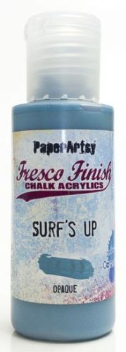
The bricks around the window were painted with Surf's Up Fresco Finish Paint, dry brushed and edged with more of the Slate to deepen the colour. In my original photo the walls around the window were 'pebble dashed' with no bricks exposed. To leave it this way made the window look like it was floating so I added some bricks beneath to emulate those stamped onto the background, giving them the same paint treatment as those around the window. Finally the dark glass in the window was over-painted with Sand Fresco Finish Paint to make it look as though a light inside the building was shining through. I added extra highlights with an iridescent gel pen and Snowflake Fresco Finish Paint, also applying tiny touches to the bricks and window ledge before outlining the main elements with a fine black pen.

 
To add an extra touch of texture I coloured some cotton fabric with Wolf Eye Fresco Finish Paint before over-stamping it with the large text stamp from Seth Apter's ESA13 stamp set in Iceberg Fresco Finish Paint.


Prior to adding the cloth and window pieces to the background I layered them together and hand stitched the three stars around the window. Once in place on the collage background splattered the whole piece with dilute Snowflake Fresco Finish Paint to give the impression of a starry night sky - it was at this stage that the collage turned from having a simple architectural feel to one that looked more like an illustration in a fairy tale book.


Going with this fairy tale theme, and as a way of finishing the piece I stamped a phrase from Alison Bomber's EAB16 Magic & Wonder stamp set onto card and cut around it before mounting it at the base of the window.


Here are some final photos of the finished piece.


If you feel less confident with drawing a window I hope you have a go at painting over a printed one, remembering to take time to build up the layers of paint and drawing around the finished elements to make them stand out. And if you are then going to add your painting to a background try using your stamps to suggest other parts of the building and surroundings.

Thank you so much for stopping by.

Tuesday, 13 October 2020

2020 Topic 18 Rule Of Thirds With ESA (by Nikki Acton)

  2020 Topic 18: Geometric


Whilst it's true that art can be completely random, many artists do employ design principles in their work. If you find a piece of art pleasing, you can often trace some elements of design on it and Nikki has given us a great look at one of those rules today. The contrast of the black border and beautifully executed design starts our Geometric topic off perfectly ~ Keren.

Hi everyone, Nikki here today (Addicted to Art) with you today, sharing my geometric journal page.

One of the simplest 'rules' of composition is the rule of thirds which I have adopted here. By dividing the canvas/photo/page into thirds, you don't need to actually draw the lines like I have Frequently the most pleasing composition is where the points of interest are at the cross section of these lines.


I did start by lightly drawing in pencil lines at one third from the left and the bottom. I wanted to create a light to dark with my paints so needed a guide! I started around the cross over of the lines with the yellows and worked my way out to the darker reds. As Fresco acrylics dry quickly I added a little Satin Glaze to add time for blending.  I used Banana, Haystack, Terracotta, Tango and Claret Fresco Acrylic Paints.


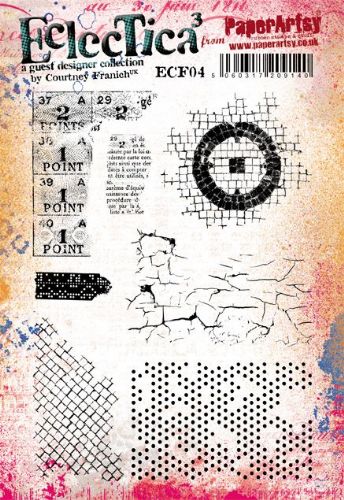
The blending doesn't need to be perfect as I added some stamping and stencilling. The stencil is the brickwork from PS016 (Emma Godfrey) and background stamps include the square grid stamp from ESA01 (Seth Apter) and dots from ECF04 (Courtney Franich).


The focal point is from one of Seth Apter's earliest PaperArtsy sets - ESA03. I stamped on some extra card that I painted with the same colours. This card was also used for the strips  that I have used.


I mounted my 6inch square onto black card (well in my black journal) adding a few extra bits of card to the edges of the page to balance the composition.


I added the lines back in at my one third from left and base using a Stabilo All pencil and smudged it lightly. I always like to think about composition in my artwork, although I don't always get it right! The rules of thirds is so simple; it doesn't need to be quite as strict and constructed as I have done here, but try it - it works!

Nikki x

Instagram: @Nikki_Act
Pinterest: nikacton

Thursday, 30 January 2020

2020 #2 A Hint of Spring: A Piece of Art with ESA Minis {by Amanda Pink}

2020 Topic 2: A Hint of Spring


Amanda's post showing us step by step how she's created her multi layered piece is a really useful resource for those wanting to get more texture into their art. The addition of the heat embossed accents provide a real fabulous depth of focus to the piece.

Hi everyone, it's Amanda ( ink-a-pink) here with you today, and I'd like to share with you the project I have created for the current topic: 'A hint of Spring!'.

It seems that as the New Year came in one door, my creative mojo walked out the other so I welcomed the opportunity to create something for this topic using some of PaperArtsy's fabulous products. I was sure they would help the mojo return. So, I had no real direction or definite plan of what I would actually create I simply 'played' around and enjoyed the products. From doing this my mojo returned and my finished project was realised. It is a multi-layered mixed media art panel that features some of PaperArty's Jan 2020 new release paint and stamps.


Have you seen PaperArtsy's Jan release of new Fresco Finish Acrylic Paint colours? They really are something special. Be sure (if you haven't already) to stop by here to see them in all their beauty! From the newbies I chose to work with the blue and pink shades: MarblesBlue MoonBlue BayouMauveGlobe Thistle and Grape.


I also added a couple of oldie but goodies PaperArtsy Fresco Finish Acrylic paints: Snowflake and Inky Pool.
All these colours evoke thoughts of Spring for me.

The Jan 2020 new release stamps are just as fabulous as the new paint colours. Something for everyone; the choice is yours! I was very happy to have the chance to work with some of PaperArtsy new Eclectica (Seth Apter) mini  stamp collection (EM49, EM51, EM52).


Both the larger and smaller background panels were created in the same way. They each have layer upon layer of detail, colour and texture all of which were created using Seth Apter's mini stamp designs and the Fresco Finish Paints mentioned and shown above.

There was a lot of repeat stamping involved and as I stamped with paint there was also plenty of cleaning up the stamps with water (a necessity when using stamps with acrylic paint!).
I worked on PaperArtsy Heavy Smoothy card which I later adhered to PaperArtsy Heavy Grey/ White Board to give the panels some sturdiness for display. 


For the first couple of layers I simply brayered the card with PaperArtsy Fresco Finish Acrylic Paint: Marbles and Mauve. This added just the right amount of colour and texture to then build upon. It also prevented any chance of 'blank page/ white fright' syndrome setting in!

To create all the subsequent layers I used one of Seth Apter's mini stamps with one of the Fresco Finish colours.


EM51 stamped with Blue Bayou (LHS), EM51 stamped with Snowflake(RHS).


EM49 stamped with Globe Thistle(LHS) ,EM49 stamped with Blue Moon (RHS).


EM51 stamped with Grape(LHS), EM49 with Snowflake (RHS).


EM49 with Inky Pool. I love how Inky Pool seem to 'lift' the whole piece and bring it to life.Inky Pool is a translucent paint so it added some deeper tones without hiding any of the other colours.

So that's 9 layers so far, just one more to go.


EM49 (just the circle part of the design) stamped with Snowflake. I really like the almost 'ghost' stamped impression that the circle/ snowflake stamping created. The addition of EM49 to the background panels also helped unify them with the circle embellishments that I created to use as part of the focal feature.


I painted some off cuts of PaperArtsy Heavy board with two of the PaperArtsy Fresco Finish Acrylic paints I used in the backgrounds: Grape and Inky Pool.
I then heat embossed the painted board multiple times (maybe 5 or 6) and stamped the circle part of the EM49 into the molten powder.


After cutting out the embossed circles I accentuated the grooves of the circle design with  Snowflake Fresco Finish Acrylic paint. I was really pleased with how these turned out. The matte finish, all the peaks and troughs of the circles within the stamp design would not been achievable if I had simply stamped the design onto painted card.

With the backgrounds and embellishments created all that remained was to bring them  together in a cohesive design. Here's a a few close ups of the finished Art Panel.


I hope by getting you a little closer, you will be able to see the layers and depth of colour, detail and texture that can be created by using some of PaperArtsy stamp designs with their Fresco Finish Acrylic paints.

I enjoyed creating this piece, especially seeing the layers develop and the anticipation of whether the next one I added would work or not. Had I chosen the right stamp? Had I chosen the right colour? Of course, it didn't matter too much really as there was always the option for another layer! 

Thanks for joining me today.
Keep on Creating
Amanda
x

Blog: ink-a-pink
Facebook: Amanda Pink
InstagramKynapi10
Pinterest: PinkArt