Showing posts with label Bubblegum. Show all posts

Thursday, 4 August 2022

2022 Topic 11: Stamp Mash-up {by Laurie Case} with Tracy Scott, Nicci Battilana and Scrapcosy stamps


Hello and welcome!! It's Laurie with you today to share a project full of twists, turns and ups and downs! When creating, sometimes things don't go exactly as planned and that's okay! At the end of this process, I learned a lot, ended up with THREE finished designs and most importantly, had so much fun "Mashing Up" three different designers!!


Recently I came across the technique of altering playing cards. I've done a couple of standard sized cards which were fun and quite simple due to their size. However, while perusing Amazon one night, I discovered large playing cards, 5X7 inch cards!! I thought, how fun! I must alter these!!!


These are the supplies I initially gathered. You'll find as I go on, I've either added product or not used it at all! This was a highly evolving project!!


I want to start by showing you the first card I created. I didn't end up using this card on my feature project because there were a few things I didn't like about it.


I love the colours and the collage! Downside Number 1: my Copper paint seems to have settled a little bit, so when I mixed it with Grunge Paste, it gave this gorgeous pink colour but this was not the look I was going for. Downside Number 2:  I felt that I covered too much of the card. I really wanted people to know that this was a large playing card, not just a piece of cardstock or card board!

So it was back to the drawing board!!
 

I pulled another card from the deck and chose a different area of the Printed Tissue. This area was less densely packed with images. I used gel medium to adhere.


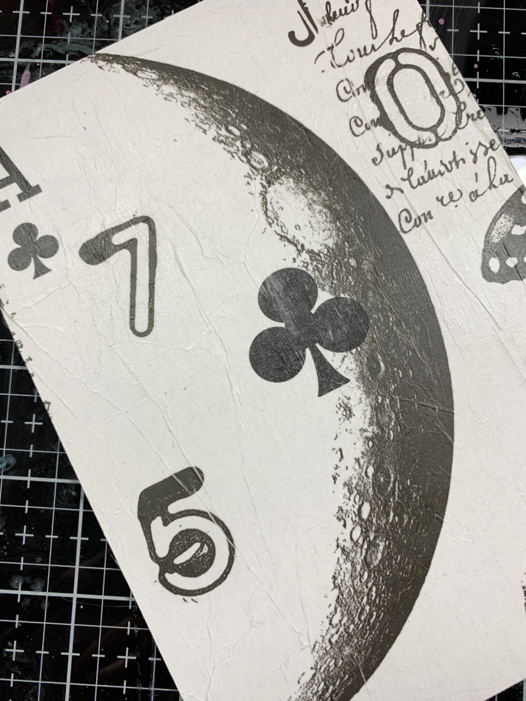
I love that you can clearly see that this is a large playing card! I also love the images I was able to get from the tissue!


This is a regular sized card. I thought it would be fun to create some layers using the exact same card and suit.


I place the regular playing card in the centre of the large card, trying to match the centre club as best as I could. I laid the PS290 stencil over the top and applied Grunge Paste in a diagonal from top left to bottom right.


Now, this is where I thought I'd try something new. I sprinkled some embossing powder over the top of the Grunge Paste. I've seen this technique done before but in this case, it came out with mixed results, haha! Some of the powder flaked off the paste, some stayed on...at this point, I just went with it!!


I added some Mouse Ears and Bubble Gum Fresco Finish Paints. I used A LOT of water to get that splotchy look!


After the paint was applied and dry, I added a thin layer of white gesso to dull the colour slightly. I rubbed away whatever embossing powder that wasn't set into the Grunge Paste. This actually gave a very nice, matte look.


You can see some subtle stamping on the background. This comes from the AMAZING new set by Scrapcosy (ESC33). This stamp set is a must have!!

It was finally time to add the "wow" factor to this project!  I stamped a few images from TS043 and ESC33 onto some white cardstock. I heat embossed the large frame using the same embossing powder I used on the background. I didn't end up using most of these but it never hurts to have extras!!


I used alcohol markers to colour everything in but chose to use only the floral images. I fussy cut around the large flower. I also coloured two of these!


I placed a small circle die, cutting side up, with tape already on it over the Club on the large card. I lined the regulation sized card up with the stencilled Grunge Paste and pressed down, making sure the die adhered. I ran this through my die cut machine. It's not perfectly centred but close enough!  I thought this looked super cool!


Before adhering everything together, I added some finishing touches with a white paint marker. I love the look of stitching! I really must try it with a sewing machine one day, hahah!
To make each layer stand out, I added some black ink around the edges. Now let's put this together...


I used A LOT of foam adhesive on this! I wanted each layer to pop from one another. The small card, the frame and the flowers all have dimension!  You can also see that I stamped a small quote in the middle of the circle. This comes from the ESC33 set and was gold heat embossed.


This project turned out nothing like what I had in my mind. I started, then started again then started AGAIN!! I made 4 of these playing card backgrounds! This is the one I just happen to like the most. Never fear, I did keep the other backgrounds and actually finished them.


I always have to remind myself that the idea I start out with isn't always what I'll end up with. In the end, I wound up with 3 beautiful, altered playing cards and an extra one to play with! 

Thank you so very much for spending some time with me today!


Laurie


Blog:  https://itsallcutanddie.blogspot.com/
Instagram: crazycardlady


Thursday, 17 June 2021

2021 Topic 7: Stamp Mash UP JOFY, EEG, ESN, I&D minis {by Claire Snowdon}

 2021 Topic 7: Stamp Mash Up


Love how Claire has pulled this journal spread together, the kraft paper makes a rustic, distressed border at the edges, framing her gorgeous arty layers beautifully.
~ Leandra

Hi everyone, it's Claire Snowdon with you today, and I'm here to share a spread I created in my kraft paper art journal for the mash up topic.  I used JOFY, Emma Godfrey (EEG) and Sara Naumann (ESN) stamps together with a little JOFY mini stamp too.

I love creating art journal pages - but sometimes when I just don't know how to start I find a plain white page is a little daunting!  But over the years I have come to realise that I don't have the same issue when using kraft pages......I'm pretty sure I can't be the only one - kraft paper seems to allow more freedom and expression!
 

I started fast and furious with this one - PaperArtsy Fresco Chalk Acrylics (Bubblegum, Butternut and Zucchini) were scraped on with a palette knife.  I tried not to overthink it but I did want to keep the Zucchini towards the bottom to act as a semblance of grass.  I added Cloud 9 over the top - I used a variety of techniques; the palette knife, my fingers and also a baby wipe to soften it slightly. 


I added some detail to my background using the flower stamp from Emma Godfrey set 22 (EEG22) stamped with Fresco Chalk Acrylics in Bubblegum and Butternut.  I also added some stamping using the quote stamp from Sara Naumann set 33 (ESN33) - I used Versafine Smokey Grey and Ranger Archival Jet Black inks to create depth and shadows.


I started to build up my composition - using the flower stalk on the left hand page from Jo Firth-Young set 14 (JOFY14) and the stem from Jo Firth-Young set 54 (JOFY54) on the right - which is to become the main focal point of the page.  I stamped flowers all along the bottom of the page to create a 'meadow' feeling using the Jo Firth-Young mini 33 (JM33).  You can see I had trouble stamping near the ring binding of my journal - I was using an acrylic block, so in the future I need to try to remember to take the stamp of the block to make it a little easier.


I stamped the large flower head from Emma Godfrey set 22 (EEG22) again onto a piece of scrap card that was leftover from a previous project (if you look closely you can make out a little bit of Kim Dellow's stamps - just to make this an even bigger mash up!)  I added it to the JOFY stem using foam pads just to lift it off the page a bit.


I used watercolour markers to colour in the JOFY flowers and stems, with a tiny bit of white paint pen added as highlights. This fabulous quote is from Emma Godfrey set 22 (EEG22) stamped using Ranger Archival ink in Jet Black, cut out and edged with the same black ink.  I love the way it stands out from the page as it's so bold and pretty large for this size of art journal.
 

I added some white highlights to the Emma Godfrey flower head which I think really make it pop.  This photo really shows how the background layers work together - the overlapping of multiple paint colours, stamp sets and ink colours adds a real textural feel. 
 

I decided to glue the quote directly onto the page as it's so bold that it doesn't need anything extra.  I also didn't want to detract too much from the lovely Emma Godfrey/JOFY flower.


The last step was the add some splatter - I used two paint pens in pink and blue, just to give a little bit of contrast to the page.  A few white paint pen dots here and there and I decided it was finished!
  

 I made the choice not the edge the pages like I typically would - I am really enjoying seeing the kraft colour showing strongly at the edges.
 
 
One final comment is to point out that I added the final section of the quote over the top of my messy stamping near the ring binding - it doesn't quite cover it totally but it definitely draws the eye away from the stamping underneath it.
   

I hope you enjoyed my art journal pages today. Art journaling is a wonderful way to express your creativity and just have fun - it doesn't have to be perfect.  Just relax and have fun with it! 

Claire x

Saturday, 13 February 2021

2021 Topic 2 A Pocketful of ... Happy with ZA {by Tracey Springer}

 2021 Topic 2: A Pocketful of ...Llama Love {with Tracey Springer}


We have a new blogger on the team, meet Tracey from New Zealand. It was a bit of Llama drama getting these stamps to her in time for the blog post, but we did it and wow hasn't she created a totally fantastic post ?! I'm sure you'll look forward to seeing more from Tracey in the months to come! With a tonne of colour and a creatively stitched pocket opening, Tracey has made a pocketful of fun vibrant cards with a tonne of delightful details.
~ Keren

Hi everyone, it's Tracey Springer with you today. I have had the immense pleasure of playing with Elena Zinski's new stamps, and created a 'Pocketful of....Happy!'. 

Making crazy, colourful cards has become my 'Happy' in this insane world we are in at the moment. I hope these make you smile like they have me!


I started out, as I usually do, by just stamping and colouring a pile of images. I am colouring with Copics but slowly bringing more paints in. 


I spent an afternoon just playing with the Fresco Finish paints as backgrounds. I loved the very light watery finish to then stencil over. Backgrounds to build your cards on, really pull the whole thing together. This Jofy stencil - PS139 - really stood out for its versatility. I painted a heavier coat of Coral over the stencil, and then once it was dry I used a black pen to draw around the whole image. 


Next step was having a play with a pocket folder type holder for some cards. I never have a set idea, things just evolve as I go. I used Fresco Finish Bubblegum and mismatched stripes for the front of the pocket. A couple of Coral strips snuck in, then this gorgeous pompom trim handstitched on, combined with pre-stamped and coloured images. Then a bit of sanding around the edges and pen line drawing to finish off. 

I ended up with a concertina pocket with three slots to hold cards. 


Then came the fun of creating cards. I like to use a heavy coat of gesso around the edges of my backgrounds to add a frame. I then start playing around with all of the stamped, pre-cut images, layering them till I'm happy before I adhere them. (I admit to not being able to do minimal; crazy, electric scenes are my happy.)


The black and white background card was something I don't normally do, but the stamps from ZA60 & ZA61, lent themselves to white heat embossing with just a couple of pre-cut images. 


Al Paca Picnic; this card had to have a pocket to hide the 'Peek a boo' Alpaca.  He is such fun! A simple slit cut in the side of the background, distressed edge, and then adhered to the card makes a simple pocket to slide in and out of.


The final card, 'The Lama Queen', she speaks for herself really!


I hope you have enjoyed my play with these gorgeous stamps, and that you have been inspired to play. 'Think outside the box' and just enjoy the creative process.

Tracey Springer.

Instagram