Showing posts with label Art Journalling. Show all posts

Wednesday, 26 November 2025

Art Journal & Tags with NEW Scrapcosy products {by Tracy Hickman}

Hi everyone, nice to be back with you!

(Tracy Hickman, @anonymous.palette here with you today.

This year on the blog, we have free rein to do a deep dive into a PaperArtsy product ranges of our choosing. For this post I have been exploring the brand new Scrapcosy products that we just launched last week! Plus I have something brand new from PaperArtsy to share that hasn't even been released yet!

Today my journal spread is all about a layered approach to stamping, embossing and using color to create depth; my first real deep dive into multi-layered hand painting onto stamped images.


I created a two page art-journal spread adorned with two oversized tags that really celebrates the stamps and stencils in this new release by Scrapcosy.

Plus, look closely and you might spot the amazing postcard tissue paper used on my background! More on that soon.

I ‘tea dyed’ doilies using 'Just Walnut' Infusions for a vintage look and loved how that small repetitive pattern turned out on these (shown above) while the large doily doubled as a pocket for 2 oversized tags. Also, I employed an ombre effect with inks and embossing powder using two of these great stencils for the background on the tags that you’ll see later in the post….


I used all 3 fabulous Scrapcosy stamp sets:  PaperArtsy Eclectica Sets - ESC53, ESC54 and ESC55, 2 of her new gorgeous stencils: PS491 and PS493, and finally: New PaperArtsy Post Card Colored Printed Tissue (releasing on Dec 8th) which I’m somewhat obsessed by…..


Can you spot the 'patch' above?  I used Liquitex Matte Medium to adhere the Post Card Tissue, to both pages and didn’t have enough glue on the bottom half of the center spine, so it created a tear, but using leftover tissue to cover the exposed white of the page was a quick bandaid ;) 

I really wanted to highlight the tissue with  all that beautiful script so decided not to do my normal batch of layers and instead just edged with some beautiful glittered embossing powder using one of the border stamps in set ESC54 by Scrapcosy. Wait till you see the tags!


To repeat that vintage vibe, Distress Oxides by Ranger were used for the backgrounds of both tags using the colors above in order from the top smeared through a watery inky mixture on my craft sheet.


The ombré effect was created using the lighter color embossing powder which is somewhat translucent over the whole design (Lindysgang Embossing Powder in Oakleaf Olive), heat set over clear embossing ink.  Then, to ombre, simply replace the stencil over your first layer and re-ink only the flower petals (WOW Embossing Powder in Gilded Patina by Seth Apter) and finally the lower part of the leaf motif (Lindysgang Embossing Powder in Fairy Garden Green)


A host of PaperArtsy Fresco Finish Chalk Acrylics, Mattints and Infusions were used to color the stamped images fussy cut from PaperArtsy heavy card stock above.  

Infusions were used on Initial layers, followed by watered down Fresco Finish paints to create a watercolored effect. Embossing Powders added some depth and hits of sheen and color for impact on the final layers.


The final Tags are adorned with stamped sentiments from Scrapcosy's stamp Set - ESC53 on Transparency Film and attached with brads. Interestingly, here in Michigan, the month of May is growing season for both strawberries and morel mushrooms so a duo of tags seemed quite appropriate for this project.


A butchers tray with water is prepared to dye these doilies with PaperArtsy 'Just Walnut' Infusions. I prefer using these walnut crystals, but you could use tea or coffee to dye papers as well.


Here we are stamping and stencilling onto the dyed doilies with oxide inks and that delightful crisp background stamp to create a repeating pattern.
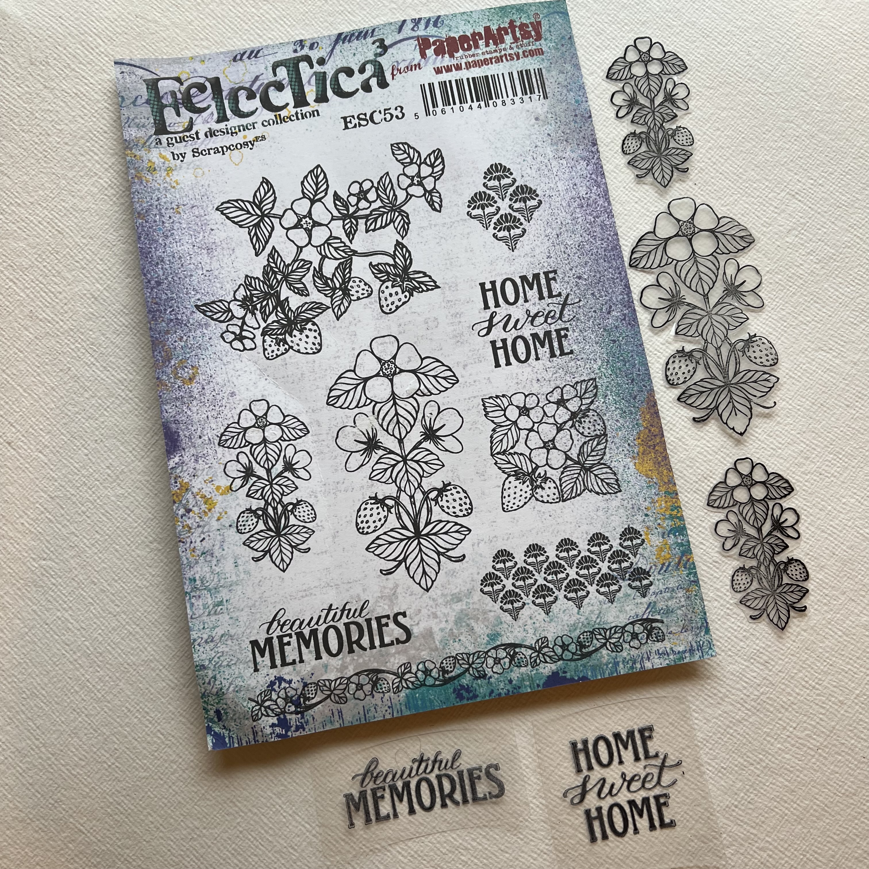


Some more stamping on Transparency Film to highlight these gorgeous motifs and sentiments.


A more traditional color palette was used for this spread as I was going for a vintage vibe to tie in the tissue, but I’m looking forward to experimenting with a less expected color palette for my next project with this beautiful new release. These stamps and stencils are SO versatile and are perfect for scrapbooking card making, junk journaling, art journaling, and yes labels for canning!


Creative Wishes to All!

Tracy
@anonymous.palette


Thursday, 16 December 2021

2021 Topic 15: Journaling Gratitude with ECF {by Jenny Marples}

2021 Topic 15: Journaling Gratitude


Have you tried stitching on your projects? Jenny has several options for you here, including a really fail-proof faux stitching one, that you can hardly tell isn't real! With lots of ideas for layering and beautiful paint effects, this flip up journal page will keep you engrossed for quite a while! 
~ Keren

Hi everyone, it's Jenny Marples (Pushing The Right Buttonswith you today, and I'm here to share a journal page which celebrates the Autumn and Winter seasons, helping to make me feel more grateful for them along the way.

Inspired by the beautiful needlework often seen in Keren Baker's work I've had a go at 'drawing' with machine stitching as well as coming up with a way of turning 'a negative into a positive' to create colourful Autumn leaves with Courtney Franich's gorgeous stamps.


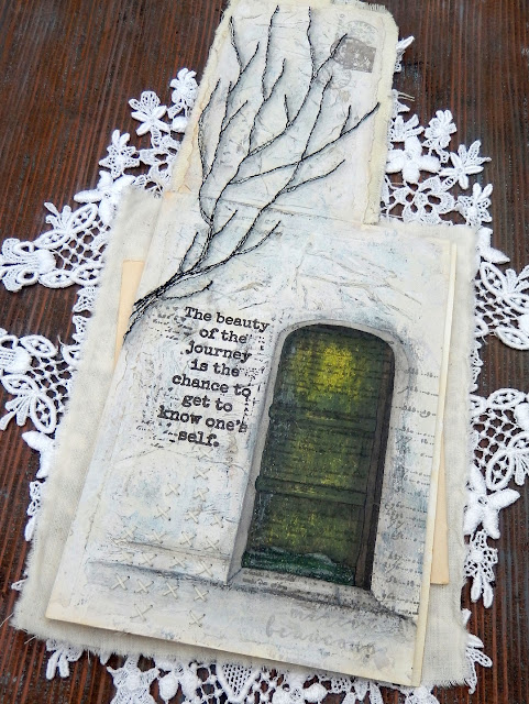
Flip up those Autumnal leaves to reveal a Wintery scene beneath.


This piece all started after an October morning walk where the leaves were changing colour from their familiar Summer green to jewel-like shades of yellow, red and brown. They brought to mind a photo of an old green door I'd seen the previous day and an idea was sparked.


Wanting to capture the visual magic of both the Autumn leaves and the door I came up with a layout 'sketch' which involved adding a 'flip up' element to a journal page using the smallest leaves from Courtney Franich's stamp set ECF05.


The main journal page was already prepped with a scrap of book page and some white gesso. To create the flip up piece I took a blank index card torn along the edges and cut some fabric to a similar size with the idea of sticking those two together. A way of adding extra texture to the surface of all of these is to apply wrinkled tissue paper with some gel medium; once paint is added those wrinkles come to life. When dry the index card was stuck to the fabric and attached to the top of the journal page with masking tape.
 
 
Laying down layers of paint that won't be totally visible in the end is key to getting surfaces with a look of depth and interest (think Seth Apter's incredible pieces as a perfect example of this). Adding a little Sand PaperArtsy Fresco Finish Chalk Acrylic Paint with a spatula over the crumpled tissue revealed the texture beneath: I avoided the area where the door would eventually go.


Up close you can see where the Sand paint was used through Kay Carley's PS061 stencil multiple times on top of the fabric to mimic the illusion of further tree branches being behind the stitched ones.


The doorway was drawn on the right side of the page to make sure part of it would be visible beneath the leaves; by providing a 'sneak peek' at what lies on the next page you encourage viewers to turn over (or in this case flip up!) and see more.


That layer of crumpled tissue really comes into its own at this stage. Add layers of paint (in this case from darkest to lightest shades) unevenly over the top, allowing some of what lies beneath to remain visible. For this page I chose French Roast, Stone, Heavy Cream and finally Cloud 9 PaperArtsy Fresco Finish Chalk Acrylic Paints. When dry use a sanding block to gently rub away the upper layers and reveal those wrinkles - be brave and rub harder to get the most out of those lower layers.


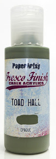
When it came to painting the door I found applying very thin layers with a small spatula helped control the application and allowed lower layers to show through - try scraping away some of the paint as well as adding more and think about leaving lighter areas as 'highlights'. I chose to use Guacamole, Toad Hall and Winter Green PaperArtsy Fresco Finish Chalk Acrylic Paints for this process with Hyde Park added over the kickboard at the bottom and French Roast used on the door frames.


You can 'shift' the colour and give the door a richer glow by painting on a very thin layer of the translucent Pumpkin Soup PaperArtsy Fresco Finish Chalk Acrylic Paint over the top - that's the beauty of having opaque, semi-opaque and translucent options. I added dimension using Stone around the edge and stopped the door from 'floating' by drawing a smudged line of French Roast below it.


Going back to the original sketch I'd drawn branches onto a piece of tissue and liked the design. Rather than transfer it with carbon paper and risk adding ink onto the fabric beneath I ran lines of gel medium along the drawn lines on the reverse and stuck the tissue to the fabric.


Having lines to machine stitch over helps immensely, and accuracy is definitely discouraged because in that way your finished look echoes the feel of delicate branches. You can see I carried the lines onto the attached page too. Remember, underneath the tissue is another layer of wrinkled tissue with gel medium and paint over it so it is now resistant to water. That's important because it means you can use water on a thin brush to help tear away the excess above.


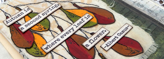
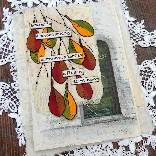
At the beginning I mentioned turning a negative to a positive - well here goes. Courtney's leaf designs are solid so when stamped they cover up what is below. I wanted the colour beneath to be visible so after painting a strip of paper with Blood Orange and Toffee PaperArtsy Fresco Finish Chalk Acrylic Paints I clear embossed them before painting over the top with the French Roast. Once dry rub over the leaves with a dry cloth to remove the paint from the embossed areas and reveal the design in reverse.


Repeat with Pumpkin Soup, Hey Pesto and French Roast PaperArtsy Fresco Finish Paints for the second set of leaves.


If you want to eliminate the shine of the embossing powder cover the leaves with layers of PaperArtsy Fresco Finish Acrylic Matte Glaze.


Glue the leaves onto the stitched branches using the sketch layout as a guide. I realised that it would look better to echo that stitching down the centre of the leaves but to run them through the machine at this stage could risk tearing them; in future would opt do this while they are still in situ on the painted strip. As the next best option I chose to 'fake it', using a tracing wheel to add indentations and drawing on the 'thread' with a narrow tipped black pen.


I love adding stamped detail over the top of hand drawn images to add extra interest; in this case I used the Courtney's script stamp from the same set over the door using grey permanent ink to keep it subtle.


Adding words can help to convey the intentions of the page; this sentiment from Sara Naumann's ESN42 stamp set spoke to my recognition of the understanding that whilst Autumn and Winter often fill me with a sense of sadness and dread these seasons have their own beauty, helping to make me even more appreciative of Spring and Summer. By stamping the words under the tree (in brown permanent ink) also means they are hidden from view until the leaves are 'removed'/raised. From a design perspective they also help lead the eye from the tree down to the door.


More words from Sara Naumann's ESN36 stamp set spoke to the beauty of the leaves seen on those October walks mentioned at the start of the post.
 

Here are some close ups of the finished journal page;


The hand stitching at the bottom of the page peeps out beneath the leaves.


Here you can see how the stitching was extended down from the index card flip onto the page underneath. Grey shadows were also added to one side of the stitching to give the branches more of a sense of dimension.


I stamped the postage stamp from Courtney's set in the top corner, blotting the brown ink to knock it back a bit. I also chose to over-stamp it with a postmark image from another of Courtney's stamp sets, ECF06, using grey ink. As an alternative you could re-use the circular element of the postage stamp on either side of the brown stamp.


Can you spot the 'hidden' expression of gratitude beneath the door? These words came from Sara Naumann's ESN43 stamp set and were deliberately made barely visible with blotted grey ink.


With lots of techniques and design ideas included in this post I hope you feel excited to give them a go. Whether drawing (or even tracing) a design on tissue and machine stitching over it or using crumpled tissue under your layers of paint and sanding it back, there are lots of ways to add texture to your journal pages. And if you have solid stamped images that you'd prefer to see through try using clear embossing powder as a paint resist.

Thank you so much for stopping by.
Jenny