
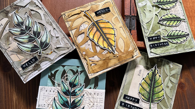
Hi everyone it's Autumn Clark from SewPaperPaint here with you today. I'm just delighted that we are doing Designer Focus topics on the PaperArtsy blog this year and just love seeing everyone using each designer's stamps in their own trademark style. I love considering what I define as my own personal style and it keeps right in with the theme for this quarter, texture. My style is "grunge meets elegance" and I love to display that through adding texture & layers in my work.
I'm looking forward to sharing with you today what I've been experimenting with a lot lately, dyeing papers. I mainly do this to make papers for my junk journals but had a blast dyeing one of Tracy Scott's Lace Books. I hope you'll enjoy the process and get inspired to do some ink dipping of your own.
It turns out, my Infusions-dyed Lace Booklet pieces really hit the grunge part of my style profile just right. It was hard to stop and I was tempted to try every color of Infusions in my stash!
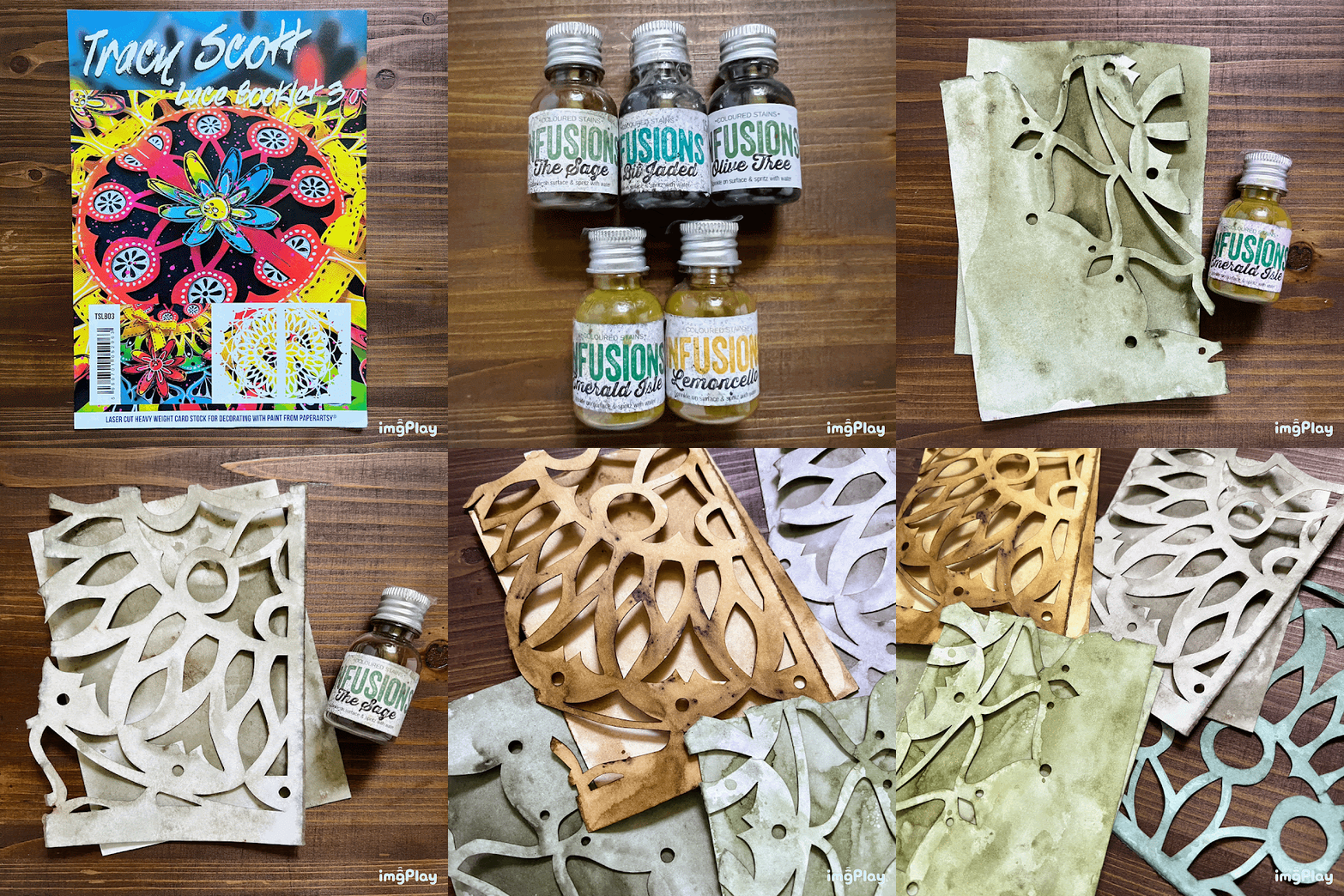
I chose to work with Tracy's Lace Booklet no. 3 (TSLB03) because it had a great, sturdy cut out shape that I thought would tear well. I began by tearing the first half of my book into fourths to create four cards. I then realized I would need a fifth panel for my card box. I decided to tear the remaining half in a different way, as shown.
I was unsure how the paper would react to water, but decided to jump in. I've had experience with some paper buckling when wet, but was pleasantly surprised that the Lace Booklet paper handled water very well.
Now, normally when I dye papers, I mix up a batch and submerge my stack of paper under enough dye to cover the paper, but I knew I wanted to try several colors so I reverted to the old ink dipping technique we use with dye ink pads. I began by spritzing my mat with water and sprinkling PaperArtsy Infusions onto the water, then spritzing again to let the color bleed out. I ended up with Emerald Isle, Olive Tree, The Sage, Lemoncello and A Bit Jaded (a discontinued color) and you will see how this analogous palette developed in the text below.
To control the saturation of color, I added more or less Infusions. I hit the happy spot with about 12 sprays from my Distress water mister and about 4 shakes of Infusions (which I had poked a hole with an awl in the lid of each).
I decided to cut card-sized panels from the extra sheet of card that encases the Lace Booklet as a cover, so as not to waste any portion. Here is the result from the Emerald Isle dip. This was the truest green, though the walnut crystals definitely modify each color.
My original goal was to stick with a green monochromatic color scheme. Green being my favorite color and monochrome a natural artistic tendency of mine. Here I tried Olive Tree, a beautiful olive, not too harsh and very earthy.
Next, I tried The Sage, which turned out a beautiful grey-green.
I had to decide on whether to repeat a color or switch gears. But it was such a thrill to see how different the results were so far among the same color family, I decided to branch out and tried Lemoncello. I'm so happy I did! What a beautiful result!
I needed one more panel for my box, so I picked A Bit Jaded. For those of you lucky enough to get this color before it became unavailable, I hope this will urge you to put it to good use and not hoard it as a precious treasure, which is so easy to do with some of our beloved art supplies...
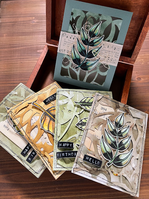
I got a bit giddy when I gathered all of the panels together!
I might normally lay my dyed papers under a stack of books to flatten, but I wanted to accentuate that amazing texture.
Next, it was time to get stamping! I stuck to using the leaves from PaperArtsy Tracy Scott stamp set (TS040) and stamped them onto heavy watercolor paper for its sturdiness and off-white color, because I knew I wanted to fussy cut a small white border around the images for contrast.
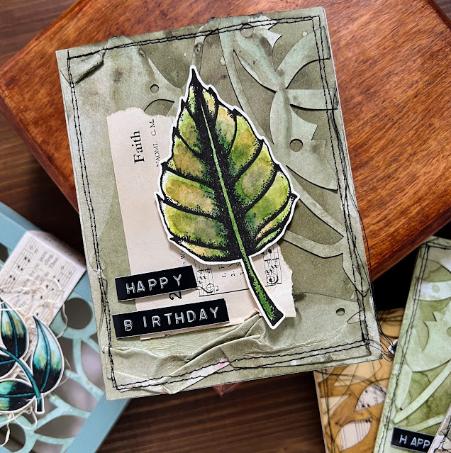
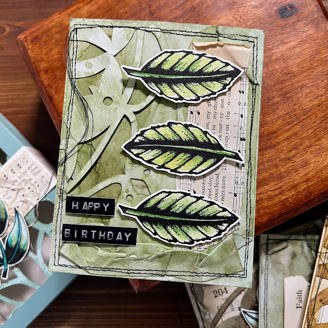
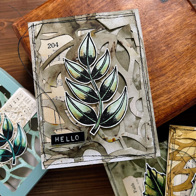
To created additional texture, I crinkled the edges of my lace panels and stitched them onto my base panels. I needed a little something more, so I added some torn hymnal strips.
You can see just how crinkled the edges are! I used a brayer to flatten the creases before sewing.
I really love how each background pattern is different. here I put the hymnal strip behind the lace for a different effect.
To create variation on each card, I turned one of the leaves upside down.
I love how that wonky stitching adds to the grunge effect!
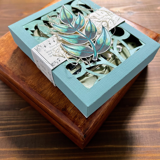
Finally, I made a box for my cards using my giftbox tutorial HERE. I cut a window in the top and adhered my fifth dyed panel inside of it.
I added a wrapper to hold the box closed and layered the stamped leaf over a bundle of sisal fibres.
I had such a great time making this giftbox of cards! I'm always enchanted by PaperArtsy Infusions. Do you remember The Creative Laboratory Topic where I shared a Vaseline resist using Infusions? You can read more about that HERE. I've personally never gone through an entire vial of Infusions and have used mine countless times. My only failed attempt was when I tried to dye a batch of handmade paper for THIS post, but experimenting is half of the fun with this fabulous product. And as we bloggers are trying to show our own personal style in these Designer Focus posts, I felt like I just had to mix up Tracy Scott with Infusions to truly represent my own approach. I'm thoroughly convinced that Tracy designs her stamps to lend themselves to any and all styles, trends and ideas. I believe they are among the most versatile of stamps and have personally used them in so many different ways. It's been a pleasure today!
Autumn
Blog: SewPaperPaint
YouTube: SewPaperPaint
Facebook: Autumn Clark
Instagram: @sewpaperpaint
Pinterest: SewPaperPaint












4 comments:
Gorgeous project and a fabulous tutorial.
Love these cards - the colours are fabulous. Elegant grunge is a great concept.
Brilliant post Autumn, so well written and presented and wonderful results. I love Tracy Scott but haven't seen her lace booklets so off to explore and to see your vaseline resist as well! X
One awesome project. Every card is just beautiful. THANKS for the fun and sharing your masterful techniques.
Post a Comment