Showing posts with label Lace Booklet. Show all posts

Thursday, 3 August 2023

2023 Topic 8 : Master Colour Wheel - Triadic Colours {by Autumn Clark} with Sara Naumann stamps


Hi everyone it's Autumn Clark from SewPaperPaint with you today and I'm totally delighted to share a really fun upcycling project with you.  When thinking of how to highlight the Tetrads topic and incorporate Transparent elements, my immediate thought was to create a painty junk journal with fun window elements.  I really enjoyed this creative time and exploration into the topics and hope you will follow along and get inspired to create a flip flop folio of your own, using the humble file folder as a substrate.


I truly adore Sara Naumann's gorgeous newest stamps and how they softly stepped out of the busy, yet mild backgrounds of this album.


When I sat down to create I realized I did not order PaperArtsy Fresco Chalk Acrylic in Aqua Duck Egg, which was the basis for the entire topic of this color theory post.  I had no choice but to swap in a new paint color and chose Lake Wanaka to compliment the other two colors, Butter and Candy Floss.  I kind of freaked my freak, so to say, but had to breathe and just let it go.  I'm so happy I pressed forward because I truly loved the palette created and was so pleased with the truer blue of Lake Wanaka versus the greener variation in Aqua Duck Egg...


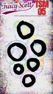
I chose a beautiful pair of PaperArtsy stamps by Sara Naumann, {ESN66 and ESN64} and a few background stamps by Tracy Scott {TSM08 (formerly EM64)TSM05 (formerly EM61) and TSM02 (formerly EM58)}.


Because I went with a bluer primary color, using Lake Wanaka, I ended up with a more blue green version of of color 10 and a less pinky purple of color 8.  It's not a very dramatic change, but it just goes to show how easily you can make variations in color using whatever Fresco Finish Chalk Acrylics you have on hand.  I painted out my color wheel using the free template you can find HERE in the PaperArtsy People Facebook Group.


Here you can see my actual mixed paints.  I was just so pleased and welcomed by the beautiful pastels.


I decided to go for a Triad scheme with three spaces apart, the most equidistance achievable.  Here were my four choices for that route and the one I chose is highlighted.  I picked the three colors because they are out of my normal "go to" scheme and I thought it would be a fun experiment.

Now it was time to get my file folder folio base cut and folded.  I cut away the portion nearest to the file label to square the folder, then folded it into 8 equal sections, using the center fold as a guide.  I cut away portions of the file folder, indicated by the slashed lines and used those to assemble the flaps and pockets, as demonstrated in the video tutorial at the bottom of the post.  Next, I printed the front and back of all the file folder pieces, starting with gesso and continuing with my mixed colors.


I lifted my chosen tetrads with a palette knife onto my 12x14" Gel Press printing plate and then brayered them loosely with a small brayer, taking care not to over mix the colors and let them touch but not blend.


Here you can see one of my layers of the printing process.  I repeated with printing until I was pleased.


As I show in the video, I incorporated PaperArtsy Fresco Finish Chalk Acrylic in Cloud 9 by brayering some paint onto the side of my gel plate and using it as an "ink pad" for stamping using a beautiful combination of dotty stamps from PaperArtsy Eclectica Mini Stamps by Tracy Scott {TSM08 (formerly EM64), TSM05 (formerly EM61) and TSM02 (formerly EM58)}.


I used more Cloud 9 to lift the layers of paint remaining on my gel plate onto Tracy Scott Lace Booklet 4 (TSLB04).  I tore pieces of my printed Lace Booklet and layered over my printed file folder for a subtle texture and contrast.


Once I had my folder painted completely, it was time to dive into the stamping!  I had a blast incorporating PaperArtsy stamp set by Sara Naumann (ESN66) as the focus of my folio.  Here is the left notebook flap.  I adhered the two-panel cut off section of my file folder to the left after stapling a bundle of tea-dyed notebook paper inside to make a little book.


The panel opens to stamping from PaperArtsy stamp set by Sara Naumann (ESN64).  I used a white Uniball pen to add highlighting and journaling.


Our theme this quarter on the PaperArtsy blog is Transparency, so I thought it would be a great accent to the overall book to had a flap/window and cut out a circle and glued in a larger vellum circle for my transparent contribution.  I was really drawn in by the subtle nature of these colors and thought the vellum gave an angelic halo to the stamped bird.  I adhered the focal circle from my Lace Booklet over this tag to further frame the bird image.
 

Here is the front of the notebook that folds out on the right side of the folio.  I just love the contrast and texture created from adding in small bits of music sheet and the printed Lace Booklet.


Last of all, I worked on a tag for the pocket for the front cover of my folio.  I decided to use Distress Oxide in Dusty Concord with Distress Ink in Tea Dye and Evergreen Bough to color the tag.  These colors are very close to my mixed palette, but were a little more vibrant and I thought it was nice for the pull out to have a punch.


I layered with my final remnant of the printed Lace Booklet for the two-sided tag.
 

Here is the back cover of my book.  You can see I used my paint cloth, which I wiped my palette knife upon repeatedly throughout the process and then stamped with more Dusty Concord Oxide using TSM02 (formerly EM58) to create a closure for the book.
 

And here is the whole folio folded out.  It's just so much fun to flip through!  And it will be a great journaling space for me.


I always love getting paints smooshed on my gel plate and had a blast working in these muted tones.  Creating books from file folders has become somewhat of a fetish for me in recent years and this one is one of my favorites yet!  There is just something about using non-precious things to create art that is both liberating and joyful.  And it always makes me super happy to dip my stamps into paint.  Is that something common in your art practice?  I'd love to know!  I truly hope this little flip flop folio has inspired you to get creative today!

xx, Autumn


To find out how to create the folio, please visit my video HERE.  I do go into detail on the printing process and finish with a flip through of the folio.  I hope you'll enjoy it!


YouTube: SewPaperPaint
Facebook: Autumn Clark
Instagram: @sewpaperpaint
Pinterest: SewPaperPaint

Thursday, 15 June 2023

2023 Topic 6 : Tracy Scott Designer Focus {by Keren Baker}


Hi everyone it's Keren Baker, here with you today.

I'm a big fan of Tracy's artistic painterly, dimensional and doodled style. Her use of colour is always carefully considered and exuberant and her love of colour resonates with me.
I wanted to use Tracy's Lace booklet as part of this project and it also fitted perfectly with our running theme of texture. I had a bag in mind for my project - inspired by a style I'd seen in New York a few years back by the designer Issey Miyake. The tiled and textured bags that move beautifully as the wearer moves.


As you'll see- there's little similarity with my final piece other than the connected tessellated shapes.


It turns out that it was more of a clutch bag and way more 'involved' than I usually do...and how did I manage to connect all of those shapes?!


Getting started was relatively straightforward. I didn't get any more paints, as I knew I had enough bright colours in my stash already...(I've been collecting for years!). So I laid out as many bright rainbow-y Fresco Finish Acrylic paints and thought I'd let the colours speak to me.


I knew I wanted to add stencilling, a Lace booklet and some stamped focal images to the piece, so I just needed to take the plunge and get some colour down.


To begin, I needed to create enough surfaces to be able to create a tessellated pattern with. I wanted to use Tracy's Lace Booklet along with some stencilling too. The main stencil was PS208.


I began by creating a number of surfaces that I'd eventually cut out using a die. So I began with adding some embossing ink over the stencil and pressing carefully over every part.


Once you've done that- the stencil will be pretty caked in ink, so simply flip it over, grab your brayer (PaperArtsy do such a lovely small sized one here) and press firmly into the cardstock.


So two stencilled pieces for the price of one. Granted, one will be back to front, but if you're chopping them up anyway, it doesn't really matter. I added white embossing powder and heated to set for one and then to the back to front piece, I added black embossing powder and a variety of paint colours to each panel.


Truth be told, I didn't love these but decided to press on regardless, hoping that something would come good. I stuck to these Fresco Finish colours plus Berry Nice.


Next I moved to adding paint onto Tracy's Lace Booklet. If you've never used these before, they are laser cut shapes on folded quality cardstock. You can use them folded (they create interesting shapes looking through to the next layer, or simply cut the folded page into two so I could use them separately. If you're a scrapbooker, journaller or simply want to change up your arty habits, these lace booklets are pretty cool. I just dabbed paint on them and ended up being glad later that I'd left the outer edge an uneven mess!


I now needed to create more colour and start adding little details to the 'lace' to add details and texture.
 

Give me a white gel and I'm perfectly happy. I love adding dashed, dotted or crossed elements. To get a little more interest, I also wanted to add a unifying repeating image and the TSM04 was perfect.


I stamped the Mini over and over using Oxide ink, added white gel pen inside the circles and added lots of black dots too. I mounted the piece onto some turquoise cardstock and traced around the apertures too. Just don't think about it too much, enjoy the doodling!


I wanted to use some similar colours to the ones on the stencilled panels to act as a contrast. All very relaxing.


I also needed to prepare some of my focal images. Roughly sizing up your stamped image, estimating where the different colours needed to be, painting and then stamping over them is a quick way to get lots of bold colour without worrying about painting within the lines.
The main images came from TS027 and TS015


Now I'd got my main stamped, stencilled and painted sections- it was time for the chop! If you don't have a die-cutting machine, it really doesn't matter, simply download or draw a symmetrical shape and use as a template. I just die cut hexagons.


Now the project took a turn....for the worse!!


If I'd paid proper attention to my gathered 'building blocks' I'd have seen that there was, in fact, no real sense of unity. Colours vaguely went together, and the shapes all correlated, but it just didn't gel. So instead of giving up (which I was tempted to do), the project needed a radical edit. Dump the red/pink lace booklet hexies and also most of the white embossed pieces. I'd also done a 'clean-up' on my craft mat using satin finish sellotape (by pressing the sticky side onto the dried paint). So I glued some of those pieces to black cardstock hexagons that I also stamped and painted on. You can see the roughly painted edges of the lace booklet which provided some nice white areas.


I used one of the leftover pinky hexies to act as a template to mark where I'd need to punch holes. I'd planned from the start to use jump rings and got a selection of different sizes. The larger ones fitted perfectly. It's a little fiddly, but I enjoyed linking them all together.


In order to make the bag, I wanted a gusseted side, so made an accordion fold from some more black cardstock and angled the ends so they'd butt up to each other when at 90 degrees to each other.


This next photo shows how I lined up the edges, attaching them using double sided tape. What I haven't shown, is that once I'd done that step, I slid in a smaller piece of cardstock to support the hexies, which were sagging a little in the middle. I only secured the tops and bottoms to allow for a little movement when you pick it up.


After creating a back and securing it to the front, it was time to pull the project together.

To add a little movement, I wanted some leaves, so used the PS388 stencil.


I added the extra focal points by adding using foam pads. I added a little glitter to wings and elements- because just a modicum of sparkle is always a good thing!


I trimmed the back piece small enough so that I could add some hexagons to the same height as the front panel and have a matching top. I had planned to add a handle (as it's a bag) but it looked too twee.


I loved the look of the jump rings, adding more texture and a little shine too.


Here's the finished piece!


I loved the evolving nature of the project. It was supposed to be a bag- although it's probably more useful as an envelope. I'd have to REALLY love someone to give them this as an envelope or bag! I did find the busy-ness of the final piece a little overwhelming as I'm normally more of a clean and simple vibe, but the richness of the colours and textures has won me over (or nearly ;-) ). Taking a simply painted piece and adding details such as small stamped images or doodled details with white or black pens (or choose your favourite colours) can give more interest than simply paint alone.
Do investigate Tracy Scott's Lace Booklets; so many ways to create with them. Try tessellating shapes; it's a great way of using up scraps of leftovers too!

Keren xx