Blue - Pastel
Main Colour: Blue (FF Mermaid)
Complements: Apricot, Rustic Pink
Type: Classic, Pastel
Created from Frescos: Mermaid, Vanilla, Cherry Blossom
Hi everyone, it's Amanda (ink-a-pink) with you today, and I'm here to share with you a mixed media 'Art on the Round' project I have created for our current 'Split Complementary' colour wheel topic.
The colours for today's post are Mermaid, Cherry Blossom and Vanilla. As you know, the complement of any blue is orange (the colour opposite on the colour wheel). In today's post I have mixed Cherry Blossom and Vanilla to make a soft orange. To that colour I added a splash more vanilla or a splash more cherry blossom to create the 'split complementary shades. These are the 2 'starred' shades you can see either side of Orange (position 3 in the image above), in effect we make a Pinky-Orange and a Vanilla-Orange to contrast with Mermaid Blue. I will explain how to colour mix these shades in more detail below!
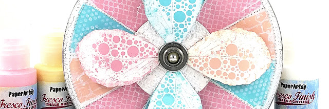
I wanted the design of my project to play to the design of the colour wheel in that it is circular in shape with individual segments each coloured differently. I felt this would enable me to put emphasis on the 3 individual colours of the Blue-Pastel palette I'd be creating with as well as allow them to shine as split complements of each other.
I also thought this circular segmented design would give some of Courtney Franich's texture stamps their own personal space while a few of her gorgeous leaf stamps would make for a lovely focal feature.
Let's see how it all played out ...
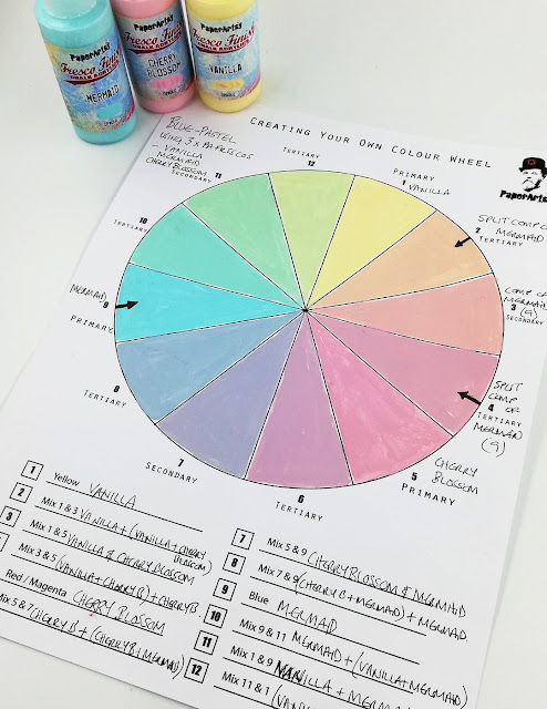
I thought I'd start by making a Blue-Pastel colour wheel to help familiarise myself with the colours I was using as my 3 'primary colours' for this project: PaperArtsy Fresco Finish Chalk Acrylics - Mermaid (FF44), Vanilla (FF65) Cherry Blossom (FF117). and the colour mixing of the split complementary colours Apricot and Rustic Pink.
The colour wheel template is one of PaperArtsy's that is available to download and print from the files section of their Facebook Group 'PaperArtsy People'. Its a great resource as it not only includes a colour wheel but it also has clearly written and understandable guidance as to what colours to mix together (working with a classic red, yellow, blue palette) and where to paint them in on the wheel with space to record your mixings. Thanks for designing and making this accessible to us PaperArtsy.
It's worth mentioning too at this point that Leandra hosted a Facebook live at the start of the year about using PaperArtsy Fresco Finish Chalk Acrylics to create your own colour wheel. Did you see it and play along? For anyone who didn't or for those of you who did but don't have the link you can find it here. It's informative, interactive (you can play along) and a fun way of spending some creative time. Thanks Leandra.
My main colour was PaperArtsy Fresco Finish Chalk Acrylic- Mermaid (FF44) with its split complementary colours being 'Apricot' and 'Rustic Pink' as they are the colours that sit either side of the colour that is directly opposite my main colour ( Mermaid) on my colour wheel.
Isn't this Blue Pastel palette gorgeous and all those gorgeous extra colours made from just 3 PaperArtsy Fresco colours !! Impressive, right?
The split complementary colours Apricot and Rustic Pink I would need to mix myself.
To do this I referenced the guidelines given on the colour wheel template so I knew which of the 3 PaperArtsy Fresco Finish Chalk Acrylics I was working with I'd mix together.
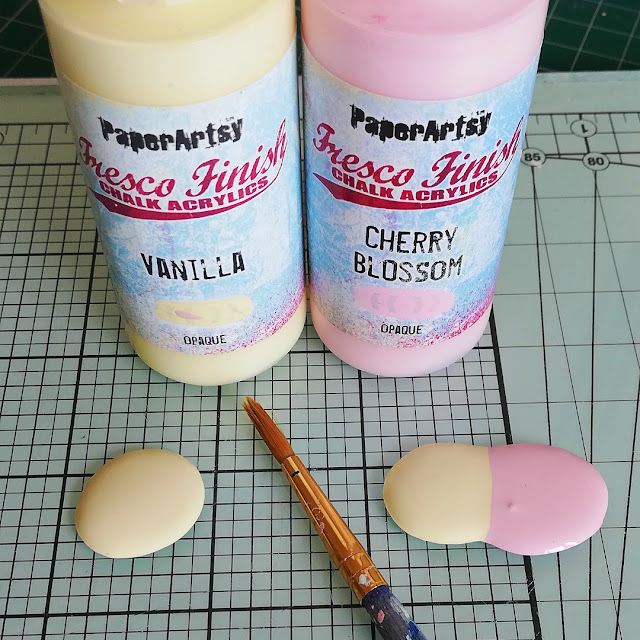
As I understood it for Apricot I'd mix PaperArtsy Fresco Finish Chalk Acrylic - Vanilla (FF65) and Cherry Blossom (FF117) (which actually makes the compliment colour of my main colour, Mermaid) and then mix into that some more PaperArtsy Fresco Finish Chalk Acrylic- Vanilla (FF65)

For Rustic Pink it would be PaperArtsy Fresco Finish Chalk Acrylic -Vanilla(FF65) and Cherry Blossom(FF117) and then mix in to that some more PaperArtsy Fresco Finish Chalk Acrylic-Cherry Blossom(FF117).

I found
the way that worked for me to get the Split Complementary colours I wanted (Apricot , Rustic Pink) was to squeeze similar size droplets of each of the fresco colours onto my glass mat, mix them together and then add small amounts of either PaperArtsy Fresco Finish Chalk Acrylic -Vanilla(
FF65) or Cherry Blossom (
FF117) if I felt they were needed.
I think I'm safe in saying that no two people or no two mixings even by the same person will create exactly the same colour each time. To do that you'd have to use really accurate measurements of the colours you are mixing together. Also, a lot is down to our own personal interpretation of the colour we are mixing and our own creative intuition. So I'd say lean on those after your initial mixing and adjust accordingly. Plus some pigments are more dominant that others, so sometimes you need to add more than you might think to find the 'middle' spot, but this is where the fun lies, follow your instinct and play!
Being mindful of this I made some little swatches that I could use to 'match up' the Split Complementary Colours I'd mix for my project. I could use my colour wheel to do this but I felt this handy size with no white space around could be held much closer to my colour mix and therefore give me a better chance of a good match. Both these swatches and the colour wheel system are great tools to help you get back to a 'bespoke' colour that you created.
Seeing the swatches in this way also really helped me see just how well they look and play together.
Now I was all set to create my project, starting with the background.
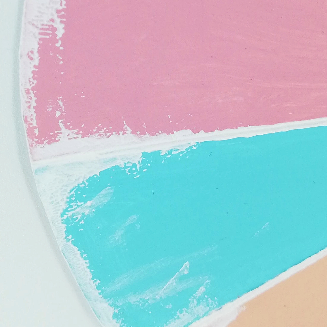
I drew out my colour wheel design (a segmented circle) on PaperArtsy Heavy Smoothy card and painted the segments with my Split Complimentary colours: Mermaid, Apricot, Rustic Pink mixing the latter two colours in the same way as I explained above. Those handy swatches came in very useful!
I wanted the 3 colours to flow around the circle within the segments in a 3 way repeat pattern as I thought this would be visually more appealing so I had to make sure the number of segments was divisible by 3.
Rather than use a pen and ruler to draw in the dividing lines of the segments I used what I call my 'score and brayer' technique: score the lines of each segment, then run some paint down each of the scored lines using a brayer. Not a 'trail blazing' technique but its one I use a lot for things like this.
I used PaperArtsy Fresco Finish Chalk Acrylic - Snowflake (FF15) as I felt it would be more suited to the pastel palette than something darker like black, my usual 'go to'.
At this stage I cut round the circle so I could edge the circumference with PaperArtsy Fresco Finish Chalk Acrylic - Snowflake (FF15) too. I did think about using a sponge to do this to keep things looking clean and tidy but my inner 'grunge' and the brayer were temptations too much for me to resist so the brayer won. This gave a much rougher finish but I was ok with that - definitely more me!
Courtney Franich's stamp set 04 (ECF04) has some great texture stamps which I thought would be good to use to add detail to each of the segments. Much like I worked to a 3 way repeat pattern when painting the segments, I did the same with the 3 stamps to help maintain the 'flow' around the circle, and keep a continuity of colour and pattern running through the overall design.
This continuity also carried over to the PaperArtsy Fresco Finish Chalk Acrylic - Snowflake (FF15) stamping.
A colour wheel print out with a segment cut out worked as the perfect mask to isolate the segment I stamped in.
(Don't forget to clean your stamps straight away when using them with paint).
I hadn't originally planned to do any more to the background than where it was at now but I felt it still needed something else. I just wasn't sure what?
The more I looked at it the more it made me think of patchwork with its coloured pattern segments (mmm, now there's an idea for a future project) so I dusted off the old sewing machine and hit the treadle.
It's been a while since I did any machine sewing either with paper or fabric so lets say I 'proceeded with care' sewing down the dividing lines of the segments and even braving it to sew around the circumference!! Wahoo! Get me!
Although, I did wonder while sewing if this was a good move, would it add that 'something else' I thought was missing? I think it did.
Focus now turned to my focal feature.
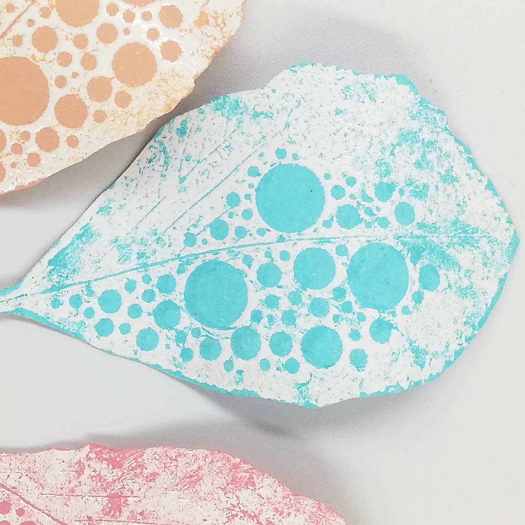
There's some lovely leaves on Courtney Franich stamp set (ECF06). I thought the one with all the circle detail would compliment the circular design of my project.
As I used PaperArtsy Fresco Finish Chalk Acrylic - Snowflake (FF15) for the background stamping I initially reached for that to stamp the leaves but then hesitated thinking it would give a matt finish, maybe too matt against the already matt background so I embossed them instead to give them that lovely molten low gloss finish you get with embossing.
The leaves looked gorgeous embossed in white against the split complementary colours but I felt they were a little too white, too smooth for my project since it took a turn from being really clean and tidy earlier. Dabbing a bit of colour lightly and randomly over the embossing helped knock back the whiteness and add a subtle touch of grunge.
The design and size of the leaves make them easy to shape too.
Almost there (I promise). Just one last element to make before I moved on to pulling everything together and adding the finishing touches.
I needed something to 'ground' the leaves when I came to arrange them, a kind of platform that would offer a bit of distance between them and the background. A small grey-board circle would work but painted white it looked too crisp and clean so instead I
Grunge Paste stamped it with one of the stamps I'd used earlier from Courtney Franich stamp set (
ECF04)
I had to be careful though that I didn't go too heavy on the Grunge Paste as I only wanted a subtle almost suggested texture. Heavy texture I felt would be too much for my project.
Painting the textured stamping with PaperArtsy Fresco Finish Chalk Acrylic - Snowflake (
FF15) also helped keep things subtle.
Although I've Grunge Paste stamped a good few times now I do still consider myself relatively new to the technique and by no means an expert. From what I understand to get the best results it helps if you lightly spritz the stamp you're using with water first. Also using an acrylic block can help as it allows you to firmly press the stamp into the paste. Give it a try sometime if you haven't already. You can get some really impressive results.
Like with paint its important to clean your stamps straight away after using them with Grunge Paste.

I thought I was all set to bring everything together but then I made a last minute decision to mount my project onto a crackled mdf 'bauble'.
PaperArtsy Crackle Glaze between PaperArtsy Fresco Finish Chalk Acrylics - Koala (base coat) (FF141) and Snowflake (FF15) (top coat) all applied with a sponge worked its magic to create the small round cracks.
I shared more about PaperArtsy Crackle Glaze on my blog post here and a lot of designers have shared about this fabulous product too throughout the blog so if you search PaperArtsy Crackle Glaze (in the sidebar) you'll be able to find lots of info, hints and tips etc. You can also watch Leandra doing a great PaperArtsy Crackle Glaze tutorial here on PaperArtsy You Tube channel.
Now I was finally ready to bring everything together.
The sewing proved to be a really good move as after I'd adhered the segmented circle background to the crackled bauble it looked liked I'd actually sewn them together!
A metal word plate with the word 'Create' highlighted in white found its place on the neck of the crackled bauble...
...while a piece of metal hardware with a Tim Holtz Ideology bauble dropped in the centre held the leaf arrangement in place.
The built up layers and Courtney's gorgeous shaped leaves gave some lovely depth and dimension to the finished project.
Oops! Nearly forgot! I made a super quick 'baby' wheel too.
I'm sure I'll use it in a future project but for now it seen happy to sit alongside big Sis!

I've loved being part of this colour wheel topic. I've not only had fun creating my project but I've also enjoyed exploring the colour wheel and colour mixing with PaperArtsy Frescos.
I'll certainly be doing more Fresco colour mixing from now on and printing off those templates so I can paint lots of PaperArtsy colour wheels.
I hope you'll have a go at making your own PaperArtsy colour wheels too and/or join us in this colour wheel topic.
We'd love to see what you make with your choice of Split Complementary colours so don't forget to share them either in PaperArtsy's facebook group "PaperArtsy People' or use the hashtag #PaperArtsy on Instagram.
Thanks for spending time with me today/ tonight.
Keep on Creating
Amanda
x


.jpg)


3 comments:
Amanda, this is stunning, I love those gorgeous pastel shades, and the end project with Courtney's leaves is beautiful.
Thank you so much Helen for your kind words and for stopping by . Appreciate xx
This is Beautiful Amanda!! Calculated 3-color combination and lovely idea of a color wheel with Courtney Franich's stamps great project. xx
Post a Comment