


Moikka, it's Riikka Kovasin from Paperiliitin blog here today with you. I'm sharing my project for the "Mail Art" topic. Yes, I know it may not look anything like mail art connected at the first glance, but I assure you, there's a connective element in there!

You probably remember by now that this year the posts have two things running in them - the topic like here, "Mail Art" and then a theme, which in this case is "Texture". I mainly played with the feel of different materials in these, adding fabric and jewellery parts into the mix but there's also dimensional texture in the form of a texture paste. And I guess you could think of the collaging in the middle part as visual texture, too.
I love to combine different materials into my make and nowadays quite often draw inspiration from my past as a seamstress in theater wardrobes!
But without further ado, let's get going!

When thinking about the topic, "Mail Art", my thoughts first went to decorated envelopes. But that route didn't take me anywhere interesting in my head so I decided to open my mind and think about what the mail art could be in a broader sense.
One of the things that then popped to my head was messages in a bottle - a different way of communicating! I played with the idea a bit, but as the main part would have been sending a message out and I didn't want to litter the sea, I opted out of that as well. I also thought about making something else, more traditional to be mailed, like ATCs or cards, and then sending those out, thus covering the mailing part. That led me to letters and especially stamps, those tiny works of art by themselves and my collage stash.
I'm not sure how my mind then made the leap to collaging stamps and pieces of letters to brooches, but that's the idea I ended up pitching! Maybe it was the tones of the postage stamps in my mind or the combination of the postage stamps and the blooms in this Scrapcosy stamp set that made me think about jewellery, miniature paintings and prize ribbons. The intuitive leap between letters and brooches might have also been the memory of seeing the most peculiar jewellery in an exhibition in my home town long ago - pendants, beads and elaborate lace-like pieces made out of human hair. The choice of material was strange at first, but when reading the display info made more sense. Those pieces on the display case were mainly used for mourning or worshiping. Such a personal connection! Maybe my mind went from the personal connection in the letters via that hair jewellery route. (If you want to read more about that specific jewellery, here's a link to Wikipedia article about this height of fashion during the Victorian era.)

It was clear from the start that I would use kind of a dusty pastel palette in my pieces. I saw the ready ribbons as something rococo looking in my mind's eye. The 18th century connection is something I can pinpoint more accurately as I've always been intrigued by the fashion of that century. I even did my thesis out of that and visited a couple of costume collections while studying for it.
While I had the old stamps and letters in my stash already, I didn't have the fabrics that fitted into the palette I was striving for. So, into a fabric store I went and bought 10 cm, the minimum amount, of three fabrics. First to catch my eye was this peachy toned silk, just the fabric I had in my mind all along! I would have wanted a similar blue one, but all the blue ones the store had were of the totally wrong colors. Instead I chose this ornate polyester, which to me echoed the right look. By chance I also noticed this thin, flowing tulle that reminded me of a fine lace. So, I picked that one as well.

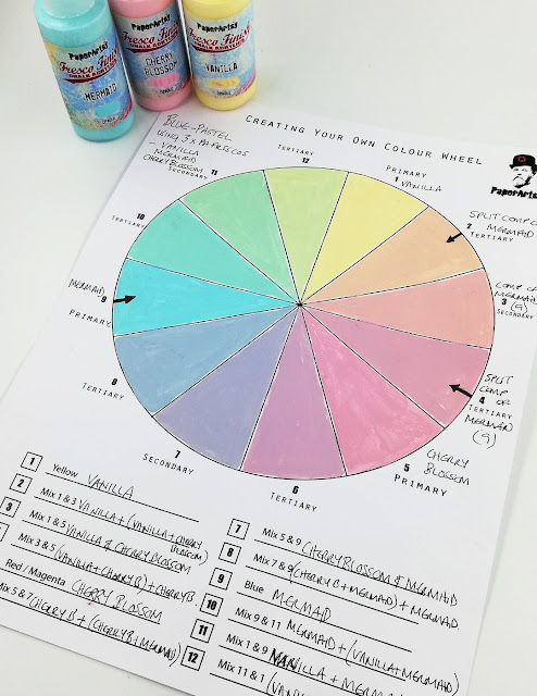
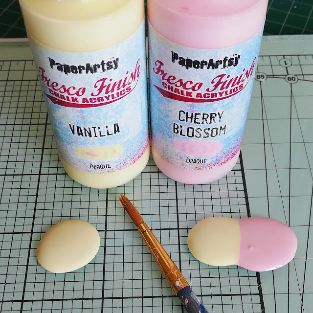
As I now had fabrics in the color scheme I was striving for, I then matched them to Fresco Finish paints. I have made myself this color chart of the paints I have and with it I sought for perfect pairing. I picked Glacier Ice (FF132) to match the blue and Cherry Blossom (FF117) to match the peachy tone. As I was going to color the blooms using the same paints, I also picked up a green color, Sage (FF66). It matched the dusty, old air of the color palette.
I was invested in this stamp set early on. The beautiful blooms of the Scrapcosy stamp set (ESC01) perfectly fitted my idea of miniature flower paintings to decorate the brooches.


To have a sturdy but smooth surface for the pieces, I immediately thought of using large wooden buttons. I've used them before to make brooches and they do the trick perfectly. I also love the little dome they have, kind of echoing a cabochon.
The first thing I did was to paint the substrates. Even though I was going to add some collaging on top, I thought it was nice to have the surface kind of primed and also this way I didn't need to cover the whole area. I chose to use the blue (FF132) and green (FF66) from my chosen palette in the coloring.

Next I then collaged the pieces of the old letters and stamps on top of the wooden bases. As they weren't that big, even though I picked the biggest size available in the craft store, I needed to tear the letters into really small pieces and also cut the stamps. I used a matte gel medium to adhere the pieces on top of the substrates.

While the bases were drying, I then turned my attention to the flowers. I was pondering between two options for a really long time. The first was to stamp the flower onto the base directly and then color it there. But as I had picked pastel paints that were opaque, the coloring of the flowers would have needed a steady hand indeed. The other option would have been to stamp the flower, color it and then stamp again, but there was no way I could have stamped the flower twice on exactly the same spot on a curved surface. If I had chosen a flat surface, that would have been possible using a stamping tool, but as I loved the curved, domed look of the buttons, that wasn't an option here.
So I went with a roundabout solution - stamping the images on top of another surface and collaging them in. I chose to stamp them on top of white tissue paper knowing that this way I could get almost the look of them being stamped directly to the substrate. As I was going to use wet media to color the blooms, I chose an ink that would endure the moisture once heat set.

I had been thinking about the way to color the blooms before starting the project and continued debating with myself even after I had stamped the flowers. At first I was thinking of using watercolors or markers, but then decided against it as I didn't want to add more mediums to the make!
So, when I chose to go with the tissue paper, an obvious coloring method provided itself. I flipped the tissue paper and colored the blooms with the chosen acrylics from the behind the stamped image. This way I got a nice covering with paint and crisp lines! The messy, speedy crafter I enjoy the haphazard coloring so much! I used the blue, Glacier Ice (FF132), and peach, Cherry Blossom (FF117), to the blooms and the green, Sage (FF66), to the leaves and stems.

I was really pleased to have found a coloring method that ticked all the boxes! Or so I thought...

Next was to combine the elements, the building blocks, I had created. I tore the flowers out of the big sheet of tissue with the help of a wet brush and before collaging them, trimmed most of the white paper away. Why I just didn't cut them, you might ask. Well, I thought that the torn edge would be so much easier to "hide" than a straight cut one! And, well, also tearing was easier than cutting all the little stems and leaves.
If you are not familiar with this tearing technique, the idea behind it is simple. Cellulose paper is most brittle when it's wet. So when you are tearing, the paper will want to pull apart from the wet bit rather than the dry one as there's less resistance. You just take a wet brush, go around the shape you want to tear and then watch the magic happen when you are tearing! Remember though that the tissue paper is delicate and absorbing so leave some room between the wet line and design as the paper absorbs the moisture and the line thickens. Try a few times and you'll get the hang of it.

As I tested the torn out flowers on top of the backgrounds, it seemed that while I picked pastel colored postage stamps, the collaged background was still competing with the impact of the flower. So, before I added the blooms on top of the backgrounds, I added a thin coat of white gesso on top of the background collages to allow a soft contrast. In case you don't have gesso, you could try white acrylic paint as well, just a thin, thin coat, paperartsy paint is chalk, so all the white available are very much like gesso anyway.

When picking up the materials for the project, I had also added a stencil to my craft table. I was torn between using or not. In the end, I'm happy that I did, but now looking back the process, with a twist coming along, I probably would have added the stenciled piece a bit later.
The stencil I picked was this eclectic one by Scrapcosy (PS064). It had a great postage stamp styled frame on it, one more connection to the topic. To add more texture to the brooches, I used a dimensional texture paste through it. I chose a golden glitter paste to give the jewellery a touch of regal luster. The tricky part was pushing the stencil hard enough to the domed surface, but as I was using a gritty paste, that was really forgiving when it came to the neatness of the edges.

As you can see, I didn't use the whole frame in the make, but instead tried to highlight the flower, just adding a corner around it. The corner point of the two intersecting lines is a natural focal point, so that corner then effectively lures the eye in.

Now the centers needed some drying time, so I turned my attention to the fabric bits and jewellery parts!
First I cut strips out of the bought fabrics. Well, I say cut, but that's true only in case of two materials, the tulle and the blue fabric. When it came to the silk, I did something you're not supposed to do and tore it into strips. I did that because I really wanted that frayed edge there! It echoed something I saw in the beautiful gowns I was looking while making my thesis - the decorating ruffle trims, undulating on top of the surface weren't hemmed. That shouldn't be such a surprise after all, but I especially remember this sulfur yellow gorgeous gown with a multitude of thin ruffles spiraling across the surface of the dress and all of them had an edge that looked like something cut with pinking shears.
I also rummaged through my bead and pearl stash and picked out elements that I thought fitted the rococo feel. I also did a quick Google search of actual rococo brooches to get some inspiration for the choice of beads. It seemed that tear shaped pearls were the thing, dangling from the bottom of the jewellery and lucky enough, I had one such thing in my stash!

The next step was the one that took the longest. Even though I'm a clothing designer by education and have been a seamstress, it always humbles me to sew by hand. Nowadays it's easy just to make ruffle using a sewing machine, but thinking back to 1700's no such thing was available and all the decorative ruffles, not to mention the whole seams and hems, were done by hand. Sewing by hand also makes up as a way of meditation for me.
This long stage I'm referring to is making ruffles. I added a gathering stitch line to the other long edge of the fabric strips, tightened the thread and made circular ruffles out of them. I layered two strips together and sewed them tightly to a piece of felt I had cut to the same size of the center wooden piece. I tried to use neat little stitches in the attaching as I knew those would be visible on the back. If sewing by hand isn't your cup of tea, you can use a machine as well to make the ruffles and even glue the parts together.


When I had the ruffles done and secured to the base, I tested the center pieces on top. Something seemed to be missing from them! I wanted an air of days gone by more prominent. An easy way to add that, I thought, was to add a crackled surface on top. So I painted all of the centers using a clear one phase crackle paint and let that dry.
The hard part came when it was time to choose a paint to highlight the cracks. Now looking back, it would have been wise to make a little test pieces, but I tested the two color options directly onto the centers. I picked Squid Ink (FF56) and Vintage Lace (FF18) to try. You can see the tests underneath.

I was so certain that the dark color was the way to go! But after applying the layer of paint and then rubbing most of it off, so the color only rested in the grooves, I saw how wrong I was. The look changed from rococo to baroque! The center looked heavy and also the sharpness of the flowers was lost as the dark cracks carried the same contrast as the blooms.
Luckily I had tried that other color as well, though thinking that was definitely not it. And yes, you guessed it, it definitely was just the one for these. The whitish cracks created a dusty effect on top of the flower, giving it that right aged look but kept the color palette light and lovely.
The rubbing off part, with the raised frame in there, was a bit tricky as I covered the whole surface with the paint and getting it off the gritty paste was harder than I thought. So, if I would now do the same project again, I'd add the crackle paste first, highlight the cracks with the Vintage Lace (FF18) and after that add the frame. The look would be different then, though. The gold would be more prominent.

After finishing the centers, I then made the dangly bits for the brooches. For those I used pearls, beads and bow shaped jewellery parts as well as eye pins and jump rings.

As I now had all the elements done and treated, it was just adding them together that was left to do. First I sewed a brooch back to the felt and then adhered the wooden button on top of the ruffles on the other side. I used a sturdy craft glue for that.

While the glue was a bit wet still and I had a chance to manoeuver the center part, I then sewed the dangling bit in place. I felt that by sewing it in place instead of gluing, the feel of the piece would be more loose. I also felt it echoed the era better.

Many of the jewellery pieces I had seen while googling had an edge or frame of little rhinestones around the central piece. I was thinking of doing that with small beads or rhinestones in the end, as the last detail, but when trying that out, the piece started to look too heavy. Instead I then used these tiny rhinestones to decorate the blooms - kind of echoing those rhinestones around the edge. By the way, you know where these tiny ones are from? A diamond painting! Such a perfect size to finish these brooches off!

I chose to go with just white with the tiny rhinestones, not adding any more colors in and also to mimic the pearls that I saw in the jewellery of the era.
Maybe that pearly connection is also the reason why the brooch my daughter is wearing in the picture below is my personal favourite! It's the only one that has that tear shaped pearl hanging.


I really like how these brooches turned out! They have that airy, light feel but still have references to the period - at least I feel they do! I especially love the juxtaposition of the soft, delicate colors and the roughness, grunginess of the torn edges. I also love the personal connection by adding pieces of letters in the background. Kind of hiding in plain sight.
If sewing isn't your thing, you could draw inspiration from these brooches and just do the center part! By changing the color scheme you could then make them more vibrant, muted or even monochrome, suiting your way of dressing. To tell you the truth, I'm not totally sure I'm going to wear these brooches, but I really wanted to make them just this way, to repeat the visual image I had in my head when thinking about the topic.
I kind of skimmed through the jewellery making part in the steps. If jump rings and eye pins don't mean anything to you, not to worry. If you want to add a dangly bit to your creation, you can always add a piece of ready jewellery. Maybe give a new life to a broken favorite? Or something you found in a jumble sale? Here the idea of the personal connection was in the collaged bits of letters, but what if the connection was the jewellery part instead!
Oh, and remember the pinking shears? I actually ended up trimming one of the brooches with them, as an homage to that yellow dress that still is so vivid in my imagination even though I studied it some twenty-odd years ago!
Thank you for stopping by today! I hope you find these pieces inspirational and managed to get through the wall of text telling the story of them and behind them.
Xoxo Riikka


.jpg)


.png)

