Hi everyone, it's Jennie (Live The Dream) with you today sharing a mini paper and textile book in an unusual mix of colours - light orange and blue lilac.
I am more used to taking a single colour and creating different tones within that one colour, so the opportunity to create with two colours, albeit muted, lying directly opposite on the colour wheel, was always going to be quite a challenge. I love both of these colours and would feel very confident in creating with them on their own, so ..... how to combine them.
I recently discovered some long lost crinoline I bought for making flowers, but this gave me the idea that the individual layers could be seen through the open weave fabric and without being on full show. In the event I only used the crinoline for the outside cover, but I did follow the technique through to the inside pages using lace.

The critical element of this theme was to match the colours. My first go to were PaperArtsy Infusions Golden Sands and Violet Storm. I always love how just one pot can give such a wide range of different hues and finished textures over ribbons, lace, muslin and cardstock.
I have used PaperArtsy Smoothy Cardstock 240gms and for the darker colour painted diluted colour straight onto the cardstock (the trick is to keep the brush running in the same direction). For a lighter effect the cardstock was first painted with PaperArtsy Fresco Finish Chalk Acrylic - Chalk and when dry sprinkled with Infusions and sprayed with water. For the lace, ribbon and muslin it works well to dilute the colour in a little pot and let things soak for a while. I also love how a gesso coated button can also be sprinkled with Infusions! (a great technique learnt from Scrapcosy).
It was more difficult finding paints to match given the wide range available but I decided on PaperArtsy Fresco Finish Chalk Acrylics Lavender (FF104) and Pumpkin Soup (FF33) with some added Chalk (FF83) to lighten the colours. My usual go to for combining colours is the gel plate and I had some ready pieces of cardstock for the brayer roll off cleaning which amazingly gave me some lovely combined colours (although in the end I didn't use them). Scrapcosy Stamp Set ESC28 provided the first layer of images directly onto the gel plate.
By the end of this first stage I had got a lovely selection of papers and textiles to work with, although still had no particular idea in my head as to where I was going with it all !

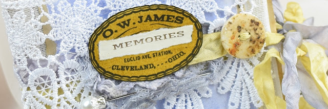
I knew my main colours needed the addition of some "negative" colour so gathered some supplies which still had a golden hue in the form of old text paper and some tea dyed papers, along with the lace which I would use for my colours to emerge through. Scrapcosy Stamp Set 29 has so many wonderful labels and titles and the idea was forming of a vintage memory book.
I normally start with a page inside the book to try out my ideas - then if they don't work they can get lost in the book. I used PaperArtsy Stencil by Scrapcosy (PS293) to add some texture, but at this stage I was only working with one colour with the intention of using the single colours side by side.
I experimented with torn pieces and shapes, along with the textiles using a sewing machine to pull it all together.
But then I started getting braver and layered stamped images over the gel plate paper. I had to experiment as the light orange ink is very harsh against the purple blue, but diluting the colour by stamping off and then adding a second layer of the darker colour over the top gave me confidence to combine the colours. It was helped further by the stamp images all being of the same design although different shapes.

Once the basic book had been sewn together I then experimented with the colours and surprised myself with how well the darker colours worked together well over the more muted tones of the gel plate. Scrapcosy Stamp Set 29 (ESC29) gives so many options for labels and small words it was delightful to add these along with some vintage photographs which maintained the golden hues.
The original idea of colours peeking through lace and the crinoline gives a lovely vintage feel.
Even the pages which I intended to be a single colour were transformed with the addition of the opposite colour - once I realised that a stronger colour worked best.
I have really enjoyed the process of combining two opposite colours and was pleased that I got braver the more I started putting the colours together. I didn't just dive in but spent some time experimenting, and adding in the negative elements (old book and tea dyed paper) along with the lace really helped.
I also set out without any real idea of what I would create and loved the way the stamps spoke to me of vintage holidays but they could just as easily have worked in a more modern project. The crinoline provided an interesting outer structure to the book and I am sure I shall be using it again (now I have found it !!).
As always thank you for joining me.
Jennie x


3 comments:
Beautiful project Jennie! Delicate and fresh! I can imagine it must be a real challenge working with opposites! You rocked it! I have to try it...
Big hug!
Raquel
Absolutely delightful, Jennie! Only you could manage to make contrasting blue and orange so delicate and ethereal. Love those lacy inserts too in this lovely lighter than air mini-journal!
Alison x
This is such a lovely booklet Jennie. I'm not a huge fan of purple, but these soft lavenders against the buttercream yellows have me smitten. A gorgeous combo and beautiful project. xx, Autumn
Post a Comment