


Hi everyone, it's Etsuko (My Favorite things) with you today, and I'm here to share with you The flip tags folder in Opposites Attract colours - Dark orange and Turquoise.

The relationship between complementary colours is very dramatic and energetic, and my choice of Dark Orange and Turquoise here is a colour combination that has always fascinated me. I wanted to put some fun into the project so I used this combination to create The flip tags folder that was inspired by very imaginative Gwen Lafleur. Mainly I used here were talented Tracy Scott's stamps, stencils and her Fresco Chalk Acrylic colours.

First I will show you the outline in the image.

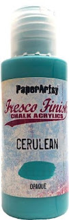
Now I did make a masterboard for the folder using Smoothy (Heavyweight) A4 white card. In this case, paint both sides with different colours of turquoise and orange, I was careful not to smudges on both side. I used gel-plate with Fresco Chalk Acrylic ( Cerulean, Sargasso, Deep Sea ) and Tracy Scott stencil ( PS187 , PS235) to make the one side, after it dried I stamped Tracy Scott set ( TS064 ) fern in Ranger Distress Oxide ( faded jeans ) to keep it down.


For the interior of the folder, I used very inspired Autumn Clark's Vaseline Resist technique. I applied Vaseline to the TS064 flower and randomly stamped it on the other side paper, sprinkled Infusion ( Orange County ) on it, sprayed it with water and dried it with heat tool. I was worried that the Vaseline would be sticky later, but it was completely dry.


Turn the A4 paper sideways and fold 5cm from the bottom, put the thin layer of glue on both sides. Now the folder is completed.

Next I worked on the tags. I used mainly Fresco Chalk Acrylic ( Cerulean, Sargasso, Deep Sea, Nougat ) and Tracy Scott stencil ( PS242, PS187, PS208 ) to make the background of the tags with gel-plate on the Smoothy ( Heavyweight ) A4 white card. ( I always enjoy making a lot of gel-plate papers but I keep the leftovers in stock. )


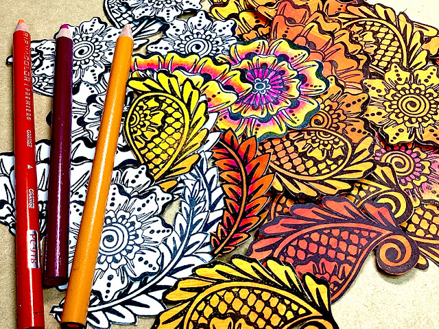
For the orange theme I painted Fresco Chalk Acrylic ( Cerise, Firebird, Tangerine Twist, Banana ) on another Smoothy A4 white card, Then stamped (TS064) on top of it with Ranger Archival Ink ( Jet Black ) and used colored pencils to create shading and fussy cutting. Also made same pieces on white paper and colored pencils.


I also did a couple of kinds stamping on the vellum paper with Ranger Embossing powder ( white ).

The tags were laid out in roughly this process. The size of the tag was 14cm long, 6cm wide, cut diagonally across the top both edges. Layout each piece, add the Alison Bomber quotes, back it with thick black cardstock, tie the fibers together, and Voila!!


Here are the four tags, and I'm closing each one with beautiful Alison's quotes stamps. I used Alison Bomber set ( Tags from left EAB09, EAB03, EAB01, EAB07 ). Also I added Tracy Scott mini ( EM57, EM60 ) tag's background.


Until I decided on a final idea, I would make various tests to visually see what made sense to me and fit the theme. This is an early version, and I wasn't close to the final idea yet.

Finally I was wondering what to do with the belly band--all beads or fibers or Sari-ribbon. I thought I would like the handmade ribbon, using TS064 with Fresco Chalk Acrylic ( Gold ) added paper beads and some beads.

It's all done!! These are the detailed images of The flip tags folder.


I used this Tracy Scott set ( TS064 ) as the centerpiece, the same goes for added Tracy's stencils for variety, and added Alison Bomber quotes to give it meaning. Tracy's work matches the vivid colours of this complementary colour scheme, making it much fun project to work on. If you like this project please give it a try too. That's my pleasure. Thank you so much.
Etsuko xxx
Facebook: Etsuko Noguchi
Instagram: Pixienest
Pinterest: Etsuko N


7 comments:
What outstandingly beautiful tags Etsuko! a beautiful use of the colours.
Oh Etsuko. How fabulous! You have excelled in this wonderful post. Must try the Vaseline technique. Thankyou for lots of inspiration. You are a star. Xx
Fabulous bold blue and orange contrasts, and I also love the black and white contrast in the lettering. A wonderful post full of inspirational techniques (like Hazel, I love the Vaseline resist).
Alison x
Thank you so much for lovely comments Helen, Alison and Hazel. xxx
So many details to get lost in making! My kind of project. Can’t wait to give that Vaseline technique a try!
Stunning, very talented, I remember an outfit in the 80's turquoise and orange I thought I was the bee knees wearing it 😍
This is such a WONDERFUL post Etsuko! I absolutely loved reading how you achieved this layering and think your chosen colors really work beautifully for this project. I love how you built up your backgrounds and am especially excited to see that you tried my vaseline resist technique! Thank you for the shout out my friend! I'm saving this post to make a tag book in the future. xx, Autumn
Post a Comment