
Hi everyone, Keren here with you today to talk about colour / color!
There are some people who always seem to have the whole 'colour choosing' thing down pat. Is that because they're talented at picking combos? Possibly, but it's more likely that they actually understand colour theory and use their colour wheel at points.
Lots of you will know this inside out, so hopefully you will be inspired by what we're showcasing and maybe find a colour combination that speaks to you that you might use in your next project. But if you're a little newer in thinking about colour, this is a great topic for looking at the theory and cementing those colour basics in your head.
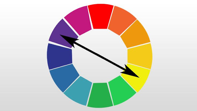
We're going to be doing a few colour wheel deep dives as 2022 topics, and this one is the simplest - take your colour wheel and pick two colours directly opposite each other on the colour wheel. You've just chosen a 'complementary' colour scheme. But let's pull back a little and talk about the colour wheel itself first.
If we want a colour wheel using our Fresco paints, (so that we can choose colour combos) the first thought might be to gather whatever paints you have, pick colours matching a classic colour wheel and you're done...but...is there a better way? Will these colours actually work well together?
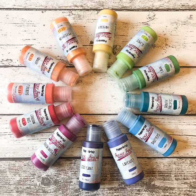
Well they might, but how about ensuring that you do get colours that work well and what if you're just starting out? Which colours do you need to pick to get the most bang for your buck? If you only chose 4 or 5 colours, could you have the potential for a whole rainbow? Or perhaps you've seen a colour and you'd love to replicate it with your own stash of paints. Whether you have PaperArtsy Fresco Finish Chalk Acrylics or different brands, we want to encourage everyone to have a go at making new colours. More on that a bit later.
So, this introduction post will be different. Instead of the usual photos using inspiration from textiles, home decor, other artists and nature, we're going to show you some experimentation and we also have some freebie files to help you with your own explorations too.
Getting back to the wheel- did you know that the first colour wheel was invented by none other than Sir Isaac Newton in 1666? He eschewed the popular colour theories of the time and set about proving that light was in fact made up of a spectrum of colours. The first wheel contained 7 colours, not equal in segment size (because it related to the proportions of colour that Newton saw.) Did you also realise that he invented the ROYGBIV, naming the colours he saw in the prism?
Theories of colour were adapted and improved and we got this next colour wheel from Claude Boutet.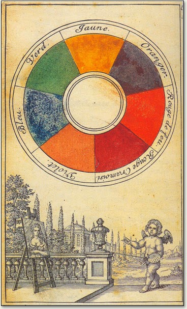

Happy mixing!
Eventually, we ended up with our current colour wheel which was developed for artists and in particular to aid mixing of colours. Not every one has the same colour starting at the top, but all contain the primary, secondary and tertiary colours.
So how do we start? Easy. Pick 3 colours; the primary colours. You might want to plump for a bright red, bright yellow and bright blue, or start with with a magenta, a cyan and a yellow. If pastels are your thing, then pick those. The idea isn't to replicate a traditional colour wheel, it's to create your own and become more familiar with the way that your colours interact and mix.
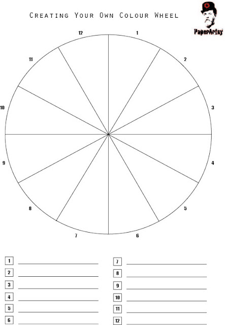
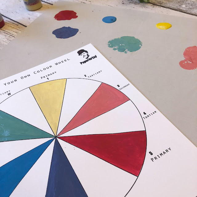
We've created a series of colour wheel pdfs that you can download and we have put them in the file section of PaperArtsy People (which is our Facebook group if you're not a member yet). We've got a whole set of them starting at the beginning and ending up with the sheet where how to create each segment from primary to tertiary colours is explained.
So the colour wheel, if you look closely, is half cool and half warm...see the reds, oranges and yellows? That's the warm side, and opposite with the blues, greens and violet/purples is the cool side. The complementary colours are directly opposite each other and so it's pretty much a cool with a warm colour. These colours when placed next to each other will give the greatest contrast to each other of any of the colour wheel colours- but when mixed together, will nearly cancel each other out and create a neutral desaturated colour. If you want to see someone talking through the theory, mixing colour and then going further, this is a really informative video by Kyle Heath. If you're just interested in the colour mixing, he starts with that, but you may want to keep watching, as there's so much useful information.
Onto the exploring. Leandra and I talked about different colours- and unsurprisingly as she has the complete range of Frescos, she's provided more combinations. We wanted to explore what would happen with earthy tones, pastel colours, translucent trios and also mixing up opaques and translucents. The main take home point is that you only need THREE colours. It's as simple as it's complex. The more you play (and there is a little playing as you discover whether you need to add a little more of one colour to get a colour that you like), the more you'll have an understanding of how the colours blend and in time, you'll be blending specific colours like a pro.
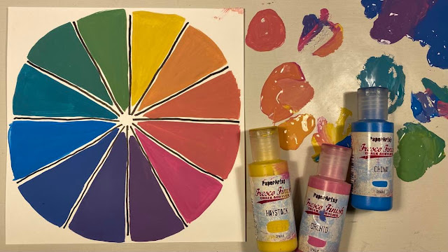
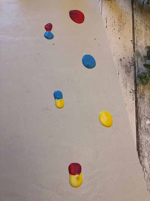
So to begin with, Leandra picked a blue, a yellow and a pink that's veering toward magenta.
Where's the red you might ask? Well, as long as there's a pink or pinky red, it will work well. The difficulty comes when you have a red that's more orangey, as it tends to create more of a brown rather than a purple in mixing, but we'll talk about that a bit later. You can see the mixing and the final colour wheel that this combo created below. Notice that these are opaques.
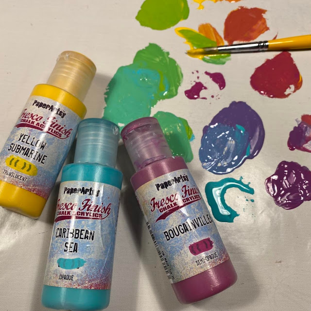
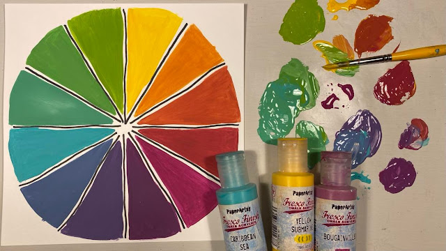
Next up, we have a brighter bunch,
The ensuing wheel is bolder, brighter and you can see the slight difference in the translucent Yellow Submarine and the opaque colours.
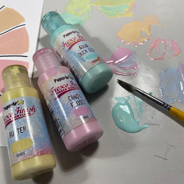
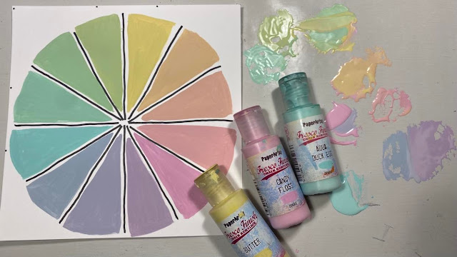
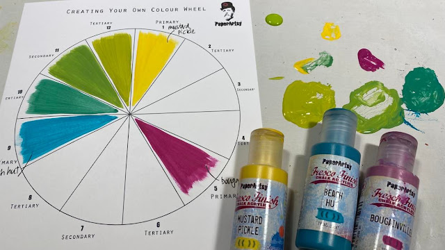
We've gone bright, so let's turn it down and try the gentler hues.
..and look at the beautiful icecream collection of colours these 3 'primary' shades create!
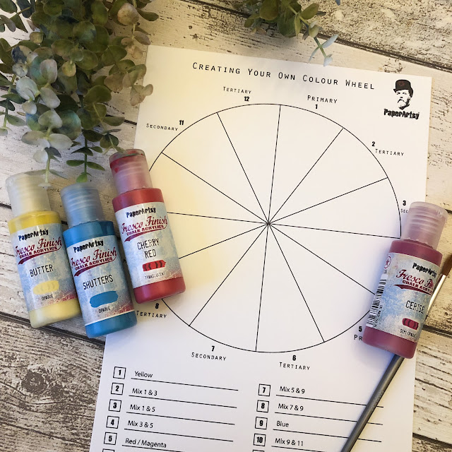
We developed the pdfs to make it easier for you to have a go yourself. I used them to create a mix of translucent and opaque rich colours. You might have noticed I've snuck in a 4th colour...that was to help the red along, but it turned out I didn't need to have used it, the Cherry Red has enough pink in it.
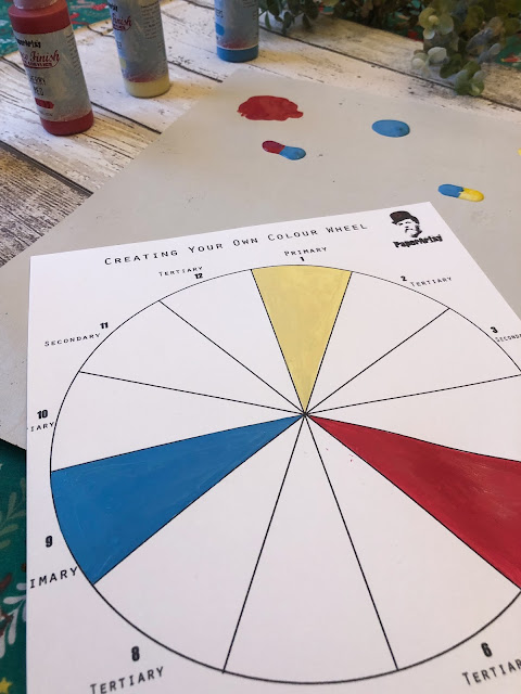
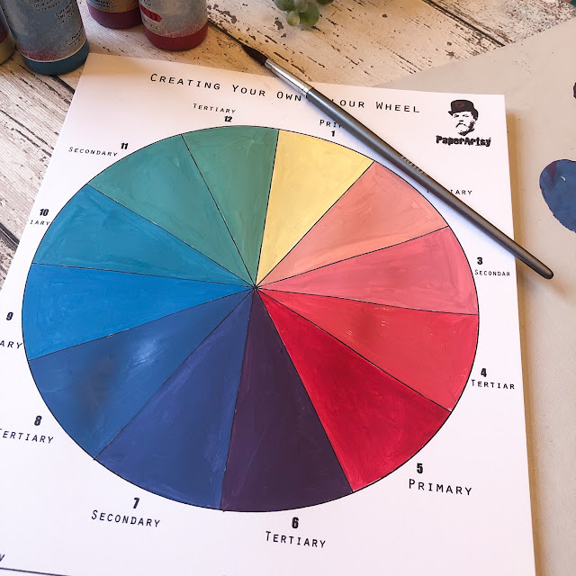
First, paint your primary colours on the sheet. If you download the 'Create Your Tertiary Colours' pdf, it has everything from primary through to tertiary mixes.
Next we need to add each primary to each other, to create 3 secondary colours. No doubt this might bring back memories of school art class....red and yellow make oragne, blue and red make purple, and blue and yellow make green. Actually DOING it yourself helps these 'colour theories' hit home!
All that's left is to use those 'Secondary' colours you just made, and add to them to the nearest Primary colour on the wheel. So, in order to get the Tertiary colour (green/yellow) you mix the Secondary 11 colour with the Primary 1 (yellow). You might have to play a little, preferring to add a little more yellow or green (secondary) to find your preferred mid-point, which is why, when you DO this exercise, it's well worth making plenty of the 'secondary' mix colours so you have enough to mix. Also have your journal or 'underpapers' nearby nearby so any leftovers can add a bit of zing to your pages or left over papers! Here's what I ended up with. Isn't it amazing how a red and blue create purple colours darker than the 2 primary colours!
You might want to try this but perhpas not painting to the very edges. Leandra noticed that with a slice of white showing between each segment it's a bit easier to see the differences in each colour.
Now it's your turn. Truthfully I had never tried to create my own colour wheel, and it's a lot of fun but really enlightening too. Be warned, you might need lots of Smoothy (just pick the standard Smoothy, not the Heavyweight if you're wanting to print these sheets out!) as it's a little addictive.
We thought that a paint-along was in order and want to invite you all to do your own colour wheel. Whatever paints you have, try to create your own colour mixes and please share your results in PaperArtsy People or post on Instagram tagging us and adding #paperartsycolourwheel. It will be fun seeing what you all come up with! The colour-wheel Paint-Along starts today and we'll run it until January 16th.
Does this topic push your creative buttons? We would LOVE you to share what you get up to with us! A great place is tagging us on Instagram @paperartsy or why not join us and post in the PaperArtsy People Group on Facebook. We love to see what you make!


1 comment:
really enjoyed watching the paint-along colour wheels and there are some fab colourways in the group album.
Post a Comment