


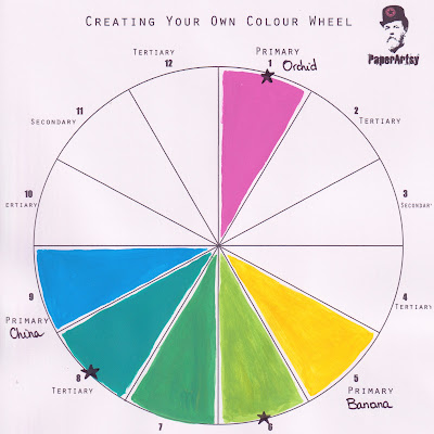
Magenta - Bright
Main Colour: Magenta (Fresco Finish Orchid)
Complements: Green Gold, Turquoise
Type: Classic, Bright
Created from Frescos: Orchid, Banana, China
Hi everyone, it's Martha (@CraftingMartha) with you today, and I'm here to share with you my set of ATCs inspired by this new topic all about Split Complementary Colours.

When it comes to colours, I certainly don't shy away :) and so when I saw this topic, I was immediately attracted by this combo, which is my favourite one: Green Gold and Turquoise, perhaps I would not have thought of using Magenta as well, which is why I am glad I accepted this challenge.


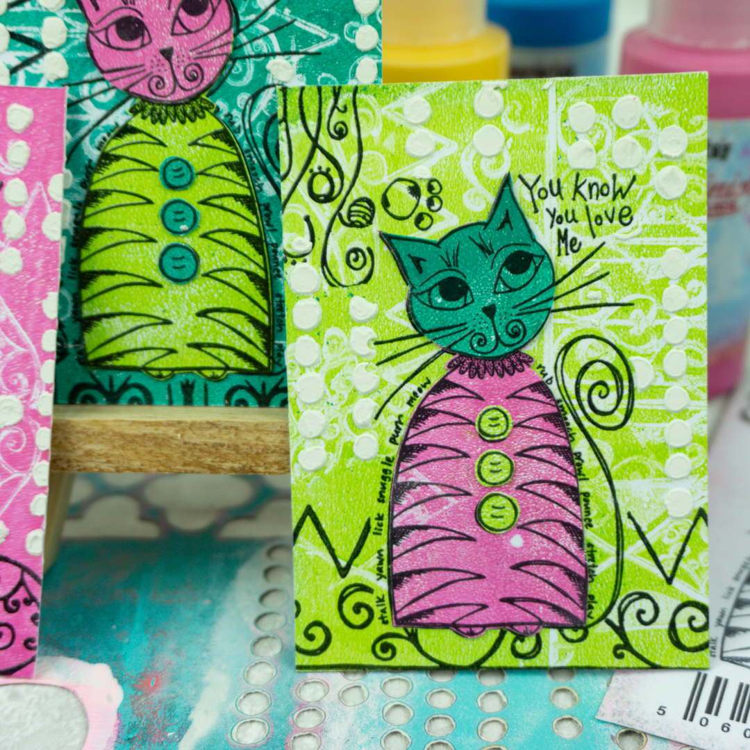
Having to use these 3 colours, it occurred to me that I could do something Andy Warhol-esque and so I decided to make ATCs to play with the different combinations.
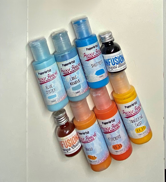
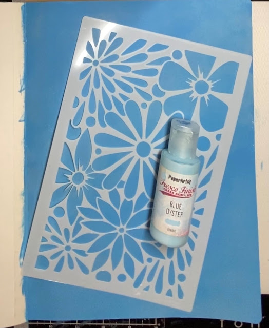
I grab some mixed media cardstock, my gel printing plate and the three Fresco Finish Paint to play with : Orchid, Banana and China, as well as a few cute stamps from the Squiggly Ink line.

Let the fun begin by mixing and creating new colours, first I created my green, from Fresco Finish China and Banana.


Then I split it in two and added some more China on one side and some more Banana on the other and voilà: I created my own Turquoise and Green Gold.


I rolled my colours, one at a time, with a brayer on my gel printing plate and stamped a part with the Swirls & Curls 4 (SISC4).


Remember to clean the stamps immediately after stamping.


Now I have enough room to cut my ATCs and to stamp my focal image, which is this cute cat from the Squiggly Mini 25 (SM25).


As I often do, I like to emboss with Clear Gloss Embossing Powder, not only because I find that it gives an interesting touch, but also to avoid ink smudging.

I stamped and embossed my cat three times, one directly on the ATC and other two times on the remaining gel printed cardstock, so that I could fussy cutting the body from one and the head and buttons from the other.


There are my lovely three cats, ready to be glued on the ATCs, but not before completing the background.


To finish my background I stamped the cat a last time on a piece of paper and cut a mask, that allowed me to stamp with the same stamps used on the gel printing plate without creating a mess and....

...to apply with a palette knife some Grunge Paste through the


Once the Grunge Paste is dried, I applied in alternating colours the cats on the ATCs.
The finishing touch is to stamp the lovely ATC stamp (SM06) for the back , I decide to stamp it on another piece of cardstock to get a sturdier ATC, and... I know I'll shock you...without heat embossing this time :)
The finishing touch is to stamp the lovely ATC stamp (SM06) for the back , I decide to stamp it on another piece of cardstock to get a sturdier ATC, and... I know I'll shock you...without heat embossing this time :)


It was so much fun playing with colours and creating my own personal shades. When it comes to colours, I leave room for improvisation, but it was interesting to discover rules thanks to the colour wheel, this one of the split complementary colours was not at all obvious to me, and I invite you to give it a try, creating ATCs is an easy and inspiring way to experiment new colour wheel rules.
Have fun.
Martha xxx
Instagram:craftingmartha
Facebook:Crafting Martha
YouTube:Crafting Martha
Blog:alazyscrapper
Pinterest:alazyscrapper


.png)

