2021 Topic 14: Mash Up LPC EGL EEV EAB
With
some fab ideas when using tissue paper and a creative combo of
characters, Dounia has a band of 'fierce' on her desk; totally useful
and thoroughly striking! If you follow her tips about blending the
background with the focal images, you're sure to end up with a
wonderfully cohesive mashup - just like her.
~ Keren
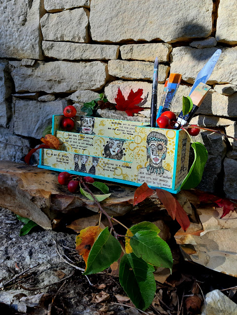
Hi everyone, it's Dounia with you today, and I'm here to share with you a desk organizer I customized with a whole PaperArtsy Tribe!
I sometimes struggle crafting or making art just for the sake of it so I love making something both useful and beautiful.
This project involves fierce warriors, also fierce ladies, a limited
colour palette and me getting out of my comfort zone!
I
have been wanting something to tidy up my work space for sometime now.
Not really knowing what it was, I bought a pile of MDF pieces in a
thrift store. Once home, I built it and it took me an hilariously long
time to realize it was a desk organizer (I was holding it upside down!).
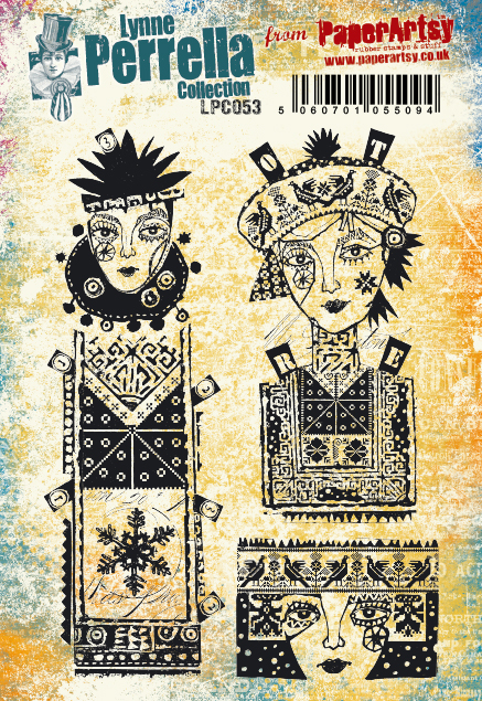
I immediately knew I wanted to populate it with some of Lynne Perrella's characters. I particularly fell in love with her 'modern' stamp sets, LPC053 and LPC054.
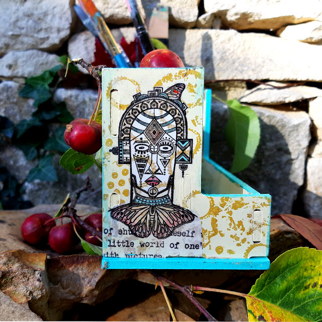
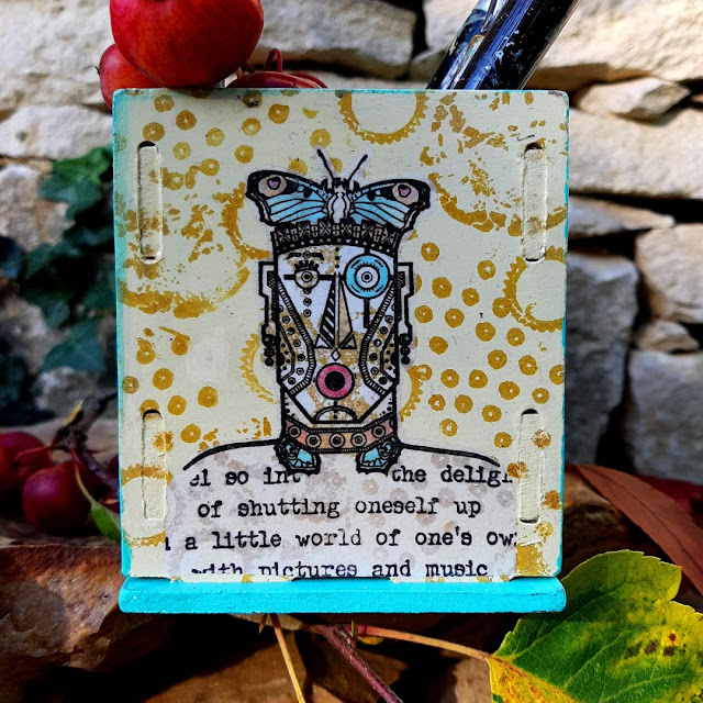
I then remembered this Mash-Up topic, and I thought the ethnic Warriors from
Gwen Lafleur's
EGL09
would be a perfect complement to the lovely Lynne Perrella ladies. They
are comparative sizes and can totally belong to the same 'Intricately
Patterned' tribe!
When
crafting, I generally tend to go with the flow and make things up on
the spot but considering I was going to work on the disassembled pieces,
this time I decided to make a placement plan.
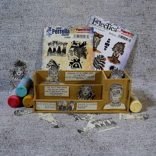
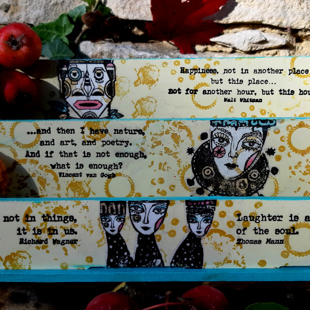
I love the patterns made by letters and I must admit I often struggle to connect with quotes not in my native language so I had originally planed to use the Alison Bomber's quotes in this Mash Up to build the background. I
did not want to crowd the surfaces too much and with people alone, it
looked a bit bare. The quotes then got a leading role! I chose EAB14: The Happiness Edition, because who doesn't want to be happy at work?
To help creating a cohesive look among all the collections, I decided on a very limited colour palette of Fresco Finish acrylic paints. I mainly used warm colours, my favorites, with light base of Vanilla to showcase the black stamping. Pumpkin Soup is darker but in the same family, so I was sure they would work well together. I added Cherry Red to pop against the creamy yellows and Caribbean Sea for a strong contrast. After
disassembling the organizer, I coated all the pieces in my chosen
colours. I find that two thin coats works better for me than one thick
one. As the base is not going to be seen a lot, I painted it blue for
maximum contrast. Ellen Vargo's texture stamps are amazing to give interest to a background. One of my favorite is EEV06 with all its bubbles and circles.
I
wanted the stamping to be visible but not too loud so I used the
coordinating Pumpkin Soup for a tone on tone effect. I had initially
planed a much more involved background but I realized I had vastly
overestimated the size of the substrates compared to the characters! I
ended doing only one round of stamping.
It
was then time to focus on my characters. I was not confident enough to
stamp and colour directly on the wood pieces so I stamped everybody on
tissue paper. I had to do quite a bit of masking, especially for the
family on the back. Thankfully I had already fussy-cut all those pieces
to to make my mock-up!
Nothing
brings life to a character like colour so I painted on the backside of
the tissue paper. I was at times a bit frustrated with my limited choice
of colours but I persisted! It was interesting as it forced me to
really think about colour placement and I ended leaving a lot more
uncoloured spots than I otherwise would have. To be sure that the faces
would be differentiated from the background, I decided to cover them with opaque Cloud 9.
I was however worried they then would not integrate enough with the
rest so I first added a few of the same Ellen Vargo's stamps.
Here are the back of my characters, very blank faced...
And here is the front, a lot less creepy but a lot more muted.
I then fussy-cut the images and glued them to the substrates with lots of Satin Glaze.
Adding the wet medium on the top of the tissue paper thankfully bought
some the colour back. As my tissue paper is on the thicker side, the
result is not as bright as the original paint colours but I like the
overall effect. I feel the characters melt into the background.
Now
a few personal details about my tribe members. I was worried some of my
warriors would look like floating heads, so I 'dressed' them with
Alison's quotes. I like the concept but feel my execution is not always
the best.
While
I love the details of the design, I felt the sleigh on the top of the
big lady from LPC054 did not really go with the theme. Instead I used
the flower in Gwen's set to make her an ethnic crown. They really meld
together very well and I really like the resulting composite image.
I
then steadied my nerves with some chocolate and began rebuilding the
organizer. It involved a lot of frustrated huffs, some heart
stopping moves and a hammer but I got there... only to realize I had
forgotten to deal with the sides of the pieces! That thing was not
coming apart again so I painstakingly painted those with a tiny brush. I
really really should have done that before but I love how the turquoise
contrast with the yellows and brightens the whole project.
I
slathered the whole thing in gloss varnish to protect and deepen the
colours. I was lucky to get some winter sun the next day for pictures in
natural light.
I like the placement
and the balance between text and faces on the front. That layer of
Cloud 9 really makes all the difference for those face details to be
seen!
Those guys have so much personality!
I
am very happy with my organizer; it has already found its place on my
desk! With a plan in place, things went relatively smoothly. I mainly
had to remind myself 'Simple, Dounia, keep things simple!'. Tissue
stamping is a oldie but a goodie, especially when you are not good at
precision stamping and/or your substrate does not fit in your stamping
platform (or both, like me!). I also really recommend the limited colour
palette as it pushes you to think differently about your colouring. Of
course, it can be on a less involved project, like a card or journal
page!
Stay creative!
Dounia x









6 comments:
So cool, Dounia - love the words hovering within the layers and all those fabulous characters.
Alison x
The combination of Linne and Gwen is fabulous and Alison's use of Quote is full of ideas, love your work. xx
Bravo pour ce super beau projet Dounia !!!
J'aime beaucoup la manière dont tu as joué et mixé ces tampons différents, et ton choix de rester sur un ensemble restreint de couleurs est excellent !
It's a wonderful piece and useful too! Gotta love that.
I never would have thought to combine Lynne's and Gwen's face stamps together, but they work so very well together!
Enjoy your new desk organizer!
OOh, what an awesome mix of characters. I love practical art. This is sure to be an inspiration. Hugz
Dounia, what an excellent cast of characters you've arranged for this awesome holder. The idea is really cool and the colors and defined imagery really bring it to life. I love this project and am delighted that you shared! xx, Autumn
Post a Comment