The Creative Laboratory - Chemical Folio
I'd
heard that the chemists in Jenny's family were pretty impressed with
the new Chemistry-inspired Hot Picks, this folio has made a great
little holder for that all important periodic table ! I remember
learning all those elements at school, anything to make it more fun must
be helpful!
~ Leandra
~ Leandra
Hi everyone, it's Jenny Marples (Pushing The Right Buttons) with you today, and I'd like to share a folio designed with a chemist in mind.
Having
a few chemists in the family gave me a little bit of an 'inside track'
for creating this folio to suit their needs; this one is small and
portable but opens out to reveal some 'essentials'.
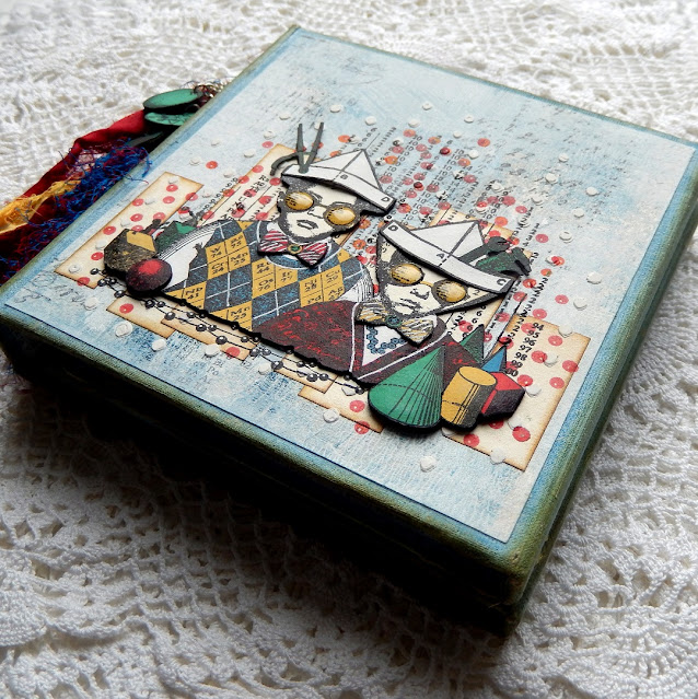
As
you will be able to see from the photos below a little dimension has
been included on the front (and back) cover but not so much that the
folio won't lie flat when open. I loved being able to choose little
elements from this image of the two junior chemists that could be
decoupaged with some foam tape.
A couple of people were curious to find out how the background paper was created for my last folio journal for the PaperArtsy blog so I recreated it here with different colours and stamps to explain the process step by step.
Keep it in the family: onto a large piece of cartridge paper I applied the set of six Grey Blues Fresco Finish Paints (Iceberg, Wolf Eye, Blue Smoke, Surf's Up, Blue Jeans and Baltic Blue)
in turn from dark to light using different brushes, a spatula and a
brayer to add a range of marks. It's important to leave some bits free
of paint and to add the colours in a random and uneven way.
Time for a brew: the 'still hot' teabags left over from making a cuppa were dabbed over the paper. Areas free from paint soaked up the liquid whilst those with paint applied resisted it. As it dries the tea staining colour pales to leave a delicate vintage shade.
Time for a brew: the 'still hot' teabags left over from making a cuppa were dabbed over the paper. Areas free from paint soaked up the liquid whilst those with paint applied resisted it. As it dries the tea staining colour pales to leave a delicate vintage shade.
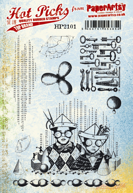
Make your mark: using text/numerical stamps from the new set HP2101 (available exclusively from PaperArtsy stockists - list HERE) combined with older sets HP1602 and HP1501
I stamped the images with black permanent ink randomly across the
paper, ensuring that they were all lined up in a vertical plane.
Take it down:
to ensure the stamping didn't overpower the layers that were to come I
lightly brayered Snowflake Fresco Finish Paint over the whole surface,
again working unevenly to create that patchy look.
Build the base: the
thick mount-board pieces were cut using the Eileen Hull Designs Sizzix
Scoreboards XL Die 'Folio Journal'. I used the two smaller spines (with
one split down the middle) to make a thinner gate fold folio and joined
them to the covers with Architape for flexibility.
Decorate it: in my last post here
I showed how to get the worn fabric effect on the covers so that's not
being repeated here. The Fresco Finish Paints used to colour the fabric
were Surf's Up followed by a little Wolf Eye. Brown permanent ink was
blended onto the edges to give the whole folio a more vintage feel.
After sticking magnet closures to the two inside covers I added the
painted paper over each of the folio covers, inside and out.
Turning
attention to the outside of the covers. Thin strips of tea stained
copier paper were glued in place to form an undulating pattern.
I used Sara Naumann's new stencil PS219 (stockists listed HERE)
to add vertical dots over the top; the dots on the outer covers were
made using Grunge Paste and the ones on the inner covers with Snowflake
Fresco Finish Paint.
Over
three of the covers I stamped the text/number image from set HP2101 in
permanent black ink and the dots from set HP2102 in permanent red ink.
For
the remaining front cover I stamped the image of the boys from set
HP2101 in permanent black in and then repeated the red dots over the
top.
To
layer over the top of this image I stamped it again a couple of times
onto more tea stained copier paper (this time strengthened with a
backing of kraft card) and painted in the details with a combination of
Surf's Up, Snowflake, Haystack and Green Patina
Fresco Finish Paints. Re-stamping over the top with more permanent
black in and adding in details with a white gel pen helped to make the
final image pop.
I
cut out some of the pieces from the second stamping to decoupage on top
and add that dimension. It's worth shaping them a little with a ball
tool or similar and adding foam tape behind to support them. The same
process was used on the little border added to the remaining three
covers.
Below you can see how one of the inside covers looks when the folio is opened.
Acting as a useful way to record bond diagrams and various equations/figures I added some white Craft Plastic panels to the inside centre covers which can be wiped clean and reused time and time again.
A pocket on the right side of the folio holds a copy of the Periodic Table for reference and has the quote from Marie Curie in set HP 2102 stamped onto it.
Finally
to add an extra touch of colour and fun to the folio I made a tassel
with sari silk, beads, and little charms made from the circular images
in set HP2102, all attached with a removable clip.
On
the inside there is a small notebook with tea stained graph paper
signatures hand bound using Japanese binding. The image on the cover
comes from set HP2102 (available exclusively from PaperArtsy stockists - list HERE) and has been painted with the same colours as the image of the boys.
Acting as a useful way to record bond diagrams and various equations/figures I added some white Craft Plastic panels to the inside centre covers which can be wiped clean and reused time and time again.
A pocket on the right side of the folio holds a copy of the Periodic Table for reference and has the quote from Marie Curie in set HP 2102 stamped onto it.
The
images in these new Hot Picks stamp sets work so well with previous
releases and would look good decoupaged in a similar way to that shown
here with layers of stamping and stenciling on cards, tags and other
projects.
Thanks so much for stopping by.
Jenny


10 comments:
Wonderful project Jenny
Wow, such a wonderful project!!! Love it, thank you for the beauty and inspiration of it Jenny! xx
Wonderful, Jenny!
Oh so cool!
Alison x
Such a clever idea. And with a wipe clean board too!! Wow!
This is amazing!
Beautiful work Jenny
Wow- what a magical journal Jenny! I love how you created the background- those little chemists are definitely up to something :-) All of the elements work so well <3
Fabulouso!!!
This is truly amazing Jenny and such a wonderful take on this topic. I just love how you mix pops of color with muted backgrounds; it's striking and so inspiring! Hugs, Autumn
Post a Comment