Wednesday, 27 December 2017

PA 2017: Blog Year in Review: Topics 9-12


Hello again from PaperArtsy HQ,

we are mid-way through our look back at some highlights on this blog over the past year. And boy have we had a year of fantastic inspiration for you all to enjoy. Throughout the year I get emails, from people telling us how fantastic our bloggers are, and how inspirational their posts are. I love that we have such a large team who represent lots of different approaches to being creative!

Tonight I'm sharing my picks from Topics 9-12. Read on to see what happened.

Leandra 

Topic 9: Aqua

I think Aqua has to be one of the most popular colours EVER! Blue matches every other colour; its bright, pretty, and soft versions are cool and soothing. It's perfection!

My first pick is this amazing beauty by Dounia Large. She always has a wonderful way of reinventing, well, anything!The ways he trapped her fairy under the sea was pure magic!


And I hope you didn't miss this excellent pocket book from Carol Fox!


I really liked how Miriam made this  into a masculine themed card, the contrast of browns with blues is always a great mix!


Alison used teabags as the basis for this canvas! Yes, really! She has been so out-of-the-box creative this year on the blog, she's brilliant! I love this canvas!


Topic 10: Dark to Light/ Contrasts

I think when you moved into the world of mixed media, the biggest lesson to learn, and the only lesson that really helps you come to grips with all the other elements of being creative, is contrast. If you can get 'contrast' right, then everything else falls into place so much more easily. When you have no clear contrast, that is when whatever you make can look like a muddled mess. So eve though it sounds like an odd topic, I think this is a great concept to understand, and the principles apply to interior decor, gardening, even how you present food!

My first pick is this amazing beauty; a beautifully decorated wooden box by Carol Fox. The colour contrasts are clever, and the tones fun and fabulous.


And I hope you saw this Seth Apter inspired panel  by Nikki Acton


I adored how Alison faded her colours from one into the next, very different by blending her contrast, and her stamps as the quote accent fitted the brief perfectly too.


Additionally we saw all sorts of contrasts with Chris's gelli printed flowers! She goes on to turn these into a stunning journal page, the whole piece is totally wonderful!


Topic 11 : Books

Summer is upon us at this point in the year looking back, and the topic was all about books. Never have so many ideas been so different, binding, page sizes...you name it they all had a blast with this topic!
Wendy Malls has a thing for books, and she executes them exquisitely! This Japanese stab binding was superb, and I loved the colour palette and the stamps she chose too.


My heart skipped a beat with Chris's wonderful JoFY book! The bright colours are totally what I adore, but she aslo found hidden birds in Jo's doodled flower heads!!


I fell in love with Kate's Japanese fabric book - stunning layers! Gorgeous colours. Serene Perfection!


Anneke chose a super-soft palette whihc reminded me of ice-cream and she layered up Emma Godfrey's stamps in the most wonderful manner! I love the pop of black in the binding of washi tape between all the pages! Do take a look, its a fun idea with all the pages differing sizes!


Topic 12 : Hybrid Inks

I knew this topic was going to be a pleaser! With Ranger's new Distress Oxide Inks causing a stir, and there are other brands of hybrids too that hit the market in 2017, so we figured it all needed some clarification! At shows this year I was constantly asked about the Ranger inks, and so we demoed a load of ideas and techniques all year long, ending up with some super cool re-inker techniques. Let me share with you how the bloggers got on with them!

My first pick is Etsuko. She shared several ideas with them within her post, all fascinating! Take a look for yourself! Here is just one below.


If you follow Sarah Anderson on Instagram, you will know how much of the year she spent using Oxide inks for her fabulous, minimal mini journal spreads. This card is a reflection of that, many more ink pad tests on her post too.


Helen tried the re-inkers onto all kinds of fabrics, with amazing results!! I adored how the colours looked so vibrant, and when you colour with them, it really is like using paint - except non permanent of course!


Additionally Wanda amazed with this embossing over the inks to create a vibrant pop! 


It is fun to look back on what our genius bloggers have shared with us over the course of a year. This year seems to have zapped by in a blink, but at least the blog remains as the perfect reference tool Don't forget to save the posts that float your boat on pinterest. No excuse now, you'll hit the New Year with a dozen ideas to crack on with!

Leandra 

Tuesday, 26 December 2017

PA 2017: Blog Year in review: Topics 5-8


Good Evening again from PaperArtsy HQ,

Over the next few days we are taking a look back at some of the magnificent posts we featured over the Spring period of 2017 on the PaperArtsy blog. 

Tonight I'm sharing some highlights from Topics 5-8. Grab some Xmas foodie leftovers and a cuppa, and lets take a look!

Leandra 

Topic 5: Blue and Ochre

As I explained yesterday, every round in 2017 we kicked off with a 'colour combo', as featured in Stampington's True Colours publication. Another combo in there which I use time and time again is blue and ochre.  It does take some care, because mix those 2, and you create a lovely green, which is fine if you want green, but if you perfer the contrast these 2 colours offer, then you do need to work with dry layers to maintain each colour's integrity. Let's see what some of the bloggers got up to...

My first pick is this incredibly detailed journal spread by Chris Cresswell. I could stare at it for an absolute age! Interactive doors, beautifully layered flowers, and all the colours pop and contrast so well!. Caramel and Toffee are 2 of our paint colours that often get overlooked, but those with Pumpkin Soup, and tadaaa....Chris has created a range of ochre  tones so perfectly!


And I hope you didn't miss this booklet by Claire Snowdon. She brayered her backgrounds, used masks with Distress Inks for added depth.


You can see the contrasting shades just sit together  so well. At the end of the day we are talking blue and orange, but if you take orange into the rustic ochre direction, you can also change your blues too, creating a softer contrast.


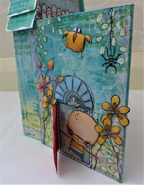
So are you ready for a Lauren doozy? One of her weird and whacky zinski-world creations?


Well we were so busy with Ally Pally when this published, that it really did not get the attention it deserved! A 3 dimensional, interactive Zinski zone!


Her flower-puffing technique fascinated people, but can you see how she does it to the Zinski birds too! She even has roof shingles and stained glass windows!


Topic 6: Resin and UTEE

For many people, melting embossing powders is thier first 'wow' crafty experience. When you see the powder melt, perhaps it's a shiny raised pop, or a molten metallic medallion, but it just is super-cool when you start to learn the myriad of techniques this product offers. Then, when you get hold of the larger UTEE crystals, OMG, the things you can do!!
Resin is a pretty broad term, and at the other end of the scale we have those 2 part mixes that set up hard, and are wonderful for jewellery, small niches, and even seal floors , canvases or tables!

My first pick is this striking panel of tiles by Nikki Acton. Not only is the colour contrasting, but that tile is very clever in the way she floats a stampled image in the top layer so delicately.


Not everything went exactly to plan for Jennie, but she always pulls it together so perfectly, that in the end you can't imagine it any other way. See here for more.


I don't think I have ever seen anyone master UTEE so elegantly as Lin Brown. In this post she shares a few samples, here is just one of those, where she buries embossed metal into her UTEE. Her finishing touches are always so well executed. How dare she retire! We still crave to see more of her creative exploits!


And it must be in the genes of Lin's/ Lynne's - are all L's this good at UTEE exploration! Lynne Moncrieff is well know for her use of resin papers, and here she shares one such trinket composed to perfection!


Topic 7 : Found Objects

Well I'm pretty good at losing things, it has to be said, and how frustrating is that! THe number of times i take off my glasses before after showering, and cannot see them to find them again!! Finding things is so much more fun! This topic sent our designers into a spin of activity.

Kim Dellow contrasted the delicacy of acetate, with some rusty washers in this post
 

And we all loved Ellie's forest walk which turned up a range of items that she re-purposed into a forest floor canvas so beautifully.


And Raquel re-purposed all sorts of items to create this coffee puck dispenser for her kitchen!


Jennie altered a tin to create a new home for a little found boy! He looks very happy! 


Topic 8 : Assemblage
Assemblage. It's an artsy kind of word, but isn't that what we do no matter what we create?? We are basically assembling layers, textures, colours, embellishments until they are arranged in a way to suit our personal taste. I guess 'assemblage' could infer more of a 3D composition, but lets see what everyone got up to for this one!
First up check out this lovely piece that Autumn Clark entered in the challenge for this topic. I love the minimal use of colour, yet there is so much to see. She always gets that light-dark balance just right! Go to her post and check out the textures in her base layer. Beautiful!


And this by Alison took my breath away. 


It has to be one of my favourite pieces of the year! It was this piece that inspired me to make 'shades of white' a colour option later in the year! She started with a base layer of tags!! Just go and look again here, it is beautiful!!


I really liked this from Alison Hall too. Such a great idea to use a piece of slate stone this way as her substrate.


Carol Fox created this Zinski inspired garden sign! 


And Keren decorated a violin - as you do!! Yes you do get spoiled people!!


I hope you have enjoyed this trip down our memory lane of 2017 with me. I'll be back tomorrow with some more treat and reminders of how clever and creative our talented bloggers are! Don't forget to save the posts that float your boat on pinterest. No excuse now, you'll hit the New Year with a dozen ideas to crack on with!

Leandra 

Monday, 25 December 2017

PA 2017: Blog Year in review: Topics 1-4


Hello and a very Merry Christmas from PaperArtsy HQ!

The next few days ahead are the time of year that we reminisce and look back on the topics this blog has explored during 2017. 

Did you learn something new this year? Did you achieve a personal goal, or tick something off the bucket-list? Were you challenged in ways you least expected? 

I think for all of us there have been numerous unexpected twists and turns in international terms for us to absorb throughout 2017, lets hope for calmer waters in the year ahead! I'd love for us all to move towards a more fulfilled and content future!


We've all been provided with the highest quality and widest variety of artistic styles on the PaperArtsy blog this year. We deliberately strive to bring you bloggers with different styles, strengths and experiences and this melting pot suits the equally broad array of products available from the PaperArtsy brand.


Tonight I'm sharing a few reminders from 2017 Topics 1-4. Read on to find out more. 


Leandra.


Topic 1: Pink and Orange

In 2017 we decided to add a subtle structure to our topics. Each round of 4 topics started with a colour theme, and the first of these colours was based on the True Colours Publication, curated by Lynne Perrella.


My favourite and a real turning point for me, was the chapter on Pink and Orange by Teesha Moore. And, so it naturally followed that this would be the first topic of 2017, a burst of enthusiasm and boldness!

Wendy Malls kicked off her year with this perfect representation of those zingylicious colours and made a Book of Pockets! 


We have come to rely on Keren pulling rabbits out of hats. On this occasion she was on a clever transparent kick, which was sublime ....


or is that subpink (and orange)!


Honestly, I could show you every post for this topic - they were all astonishing, which really is the story of the entire year on this blog! Here, Chris Dark lobbed Kay Carley's stamps out of the park...look at this in-progress shot!! Stunning!


OK Just one more...Jennie Atkinson interpreted the colour theme as led by Infusions. Her palette was soft and subdued, as is her style... I love that any colour combination can be re-worked to suit personal preference. So now you know,  Pink and Orange certainly doesn't have to be HOT! It can be dusky too!


Topic 2 : Masks

Do you know the difference between stencils and masks? Well, it is fascinating how the lines have blurred. But a mask hides things right !? So let me leave that with you and you figure it out!

Anneke is a masking guru. Layer upon layer of soft and delicate paints with a poweeee-pop of orange! I love how she uses colour in such an effortless way. And I love how this picture links the last topic to this topic!!!

OK, I'll admit it, sometimes you feel like you have to turn your brain inside out to understand how stancils and masks can be used. And our own, very lovely Missy Jo is very good at turning my head inside out on an annual basis! This post fascinated me, and the stencil she created to do this is ACE!!!


Another of our talented in house designers, in fact a newbie 2017 PaperArtsy designer, is Alison Bomber. I think we are all a bit scared of white, but look at how masks make this box pop!


Sue's canvas used masks in several ways...can you count the ways??? There's 3 very obvious techniques, on 3 separate layers....


Topic 3 : Paints and Infusions

We all know the basics of using infusions now ...well if you don't yet, just use the search bar on the sidebar of this blog and you'll be bombarded with posts from the past 2 years! Our Fresco paints are chalk, so this can inherently provide a really good tooth for infusions to grab onto, it can also offer up other creative options too, let me share a few with you now!

Take a deep breath those 'cleanies' out there...infusions WILL stain your fingers, but that's part of the fun right?!! Hey it scrubs off, so don't panic....Xmas parties are O-V-E-R you're allowed to get messy!! Helen used bleach! Not to clean up (sheesh! silly!!) noooo... to knock back her infusions in the most stunning way....Look!! You know you want to sprinkle just like her!!!


I think this is one of my fave's from Hazel. She got so excited when she was layering up this book of Seth's newest products: wood, paint, rusting powder, and of course infusions all feature within the covers. It's a bit like those interactive books you buy for kids to poke and prod...except it's for us grown ups!!


I adored how Clare Messenger made this piece ready for the wall, how cool would 4 of these look for a fabulous statement piece in your house!

Boy are we lucky that Kay Carley is getting out and about in 2018 teaching her skills to us all! Check this out!! An amazing amount of detail to bring this sample together, lucky for you she shares the steps in great detail too in her blog post! Go and check it out!


Ok, how about this! Ruth Mescall is also an infusions guru! I adore this post too...I love them all, how can you choose just a few to share !!??.... this is torture!...but look, it's so lovely!!! On the back of this I was demoing Lin's flora stamps with infusions all year at the shows we do! Love love, love. If you haven't yet tried infusions, take a minute to absorb the colours, the tones, and the depth. They make you feel awesome!


Topic 4 : Doors and Windows

I have a secret fascination with doors. Every time we head over to the fabulous continent of Europe, my first photo is ALWAYS a door, or wrought iron covering a window, or gates...all those elements always look more romantic on the continent than here, in the generally dull, grey-skied Britain! Who wants a shiny red or black or cream spick and span door, not me! Give me a rusty peeling hardy old well-loved door any day!!!

Julie Ann has been creating astonishing miniature hinged art blocks and they are a delight! My first pick to remember is this, she writes gorgeous back stories to them too!


I think this was the best thing from Emma Godfrey with her stamps! Not only has she created windows, she's also used infusions as 'pops' of colour - you know you want to sprinkle those things ... yes you doooo....(I digress - I'm under the spell of infusions). Where were we, oh yes, Emma's super-cool frame. Go take a look!


So this next sample not only do I love, but the colour follows on perfectly from Emma's sample above!! Yup, it's Seth with one of his original doorways...he makes a lot of interactive art! Love the pop of color inside the doors, and his masterful painty layering ideas.


It is so much fun to look back on what our genius bloggers have shared with us over the course of a year. This year seems to have zapped by in a blink, but at least the blog remains as the perfect reference tool Don't forget to save the posts that float your boat on pinterest. No excuse now, you'll hit the New Year with a dozen ideas to crack on with!


See you again tomorrow with more!

Leandra