Showing posts with label Doors Windows Architecture. Show all posts

Thursday, 7 July 2022

2022 Topic 10 : Up my Street {by Renata Peley} with Seth Apter stamps


Hi everyone, it's Peley Renata with you today, and I'm here to share a project with you which is a bit different than those you might have seen from me before. This time my skills were challenged a bit more, and my mixed media-oriented mind was put to the test. Also, you will see how some ideas fail terribly even for me and how I deal with that. And how sometimes even when you have a set idea in your mind, you have to change the whole approach to achieve what you originally intended. Anyway, if you are in the mood to see a very crazy creative session, do keep reading. J


Whenever I took a look at Seth Apter stamps, I always thought how amazing they were for making really interesting backgrounds. But hey, why only backgrounds?! This time I will use these stamps as key elements, points of interest, exciting textures and building blocks of my quirky architectural design.



There is a challenge and excitement in drawing with ink, making the whole thing permanent and learning to embrace your mistakes and make them to be those loveable elements of your drawing. But this time, for the start of my project I decided to take the safe route and start with a pencil and an eraser.


So, at the beginning, my idea was to stamp some images on a parchment paper, glue them on my building sketch, then color them. I thought this way I will have some more room for mistakes and that I can plan out the placement of my elements better.


I guess you are thinking now: ok and what was the problem? Well let me tell you, since there were several problems with that plan. J First of all, I stamped my images with Archival ink, since I thought it is a dye ink, it should be permanent, and it should dry fast. But no, it just wasn’t drying on it. The mistake wasn’t the ink, it was the paper. I should have either left it to dry more, be more careful or use a different paper. So, what happened is that I started accidentally transferring and smudging ink all over with my fingers and the sides of my palms. And it all got worse when I started adhering the images with matte medium. Then of course, the stamped images got more pale and smudgy, since now I wasn’t removing ink just with my fingers but with my brush as well. This way the whole project looked a bit too messy for my taste. Now I realize that you might not see on the image below how messy this page became, but trust me it was there.


If you can believe it, the whole project got even worse when I started coloring my buildings. That was the moment when I realized I have to put the whole thing aside and start all over the next day, with a fresh mind and a new approach.

The following day I changed my strategy altogether. I redraw my sketch and used this opportunity to alter some tiny details as well. On a separate piece of paper (regular mixed media paper this time) I measured, drew and cut out my building sections. I stamped and heat embossed each of these sections with a different Seth Apter stamp. I chose to heat emboss my elements because this time I planned to have some more texture. And for that same reason, I decided to raise the level of the building floor separators. I refer to those long thin stripes between floors. For each separator I used 3 thin stripes of paper and glued them together. That way it truly stood out against the other elements.
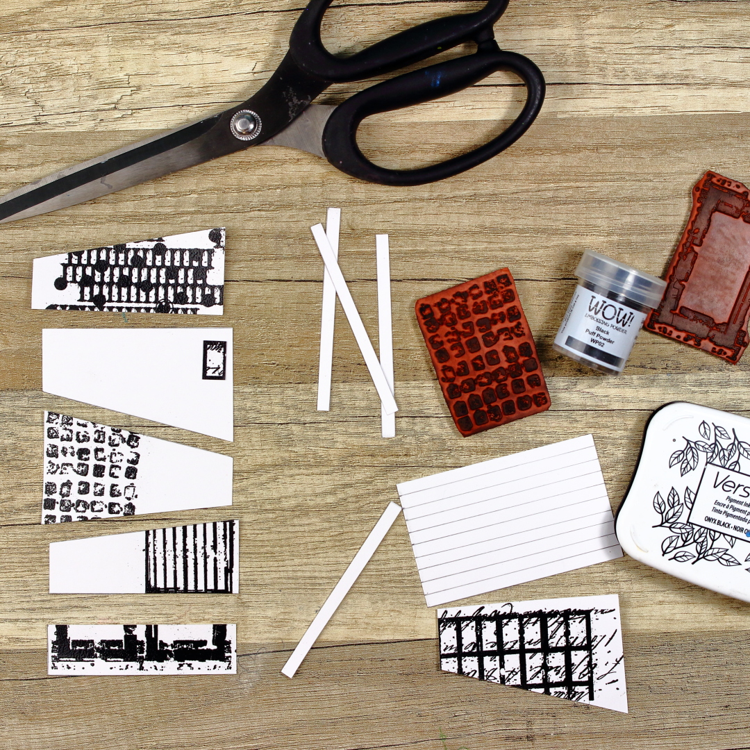


As you can see, I used that rectangles stamp from the ESA26 set as windows, EM41 and EM68 as textures, EM53 as the big gate or passage, EM71 as antennae etc. How you see and choose to use these stamps all depends on your imagination.


At this point, I wanted to position the elements that would stick out of my buildings, such as antennae, fences and cables. I used Archival Ink in black color. I also used two small pieces of paper to mask the areas that I didn’t want to stamp on by accident. As you might notice, at that moment I wasn’t thinking properly and I stamped some images on the places that I would cover later, but I guess that just happens. At least I had them planned out. J


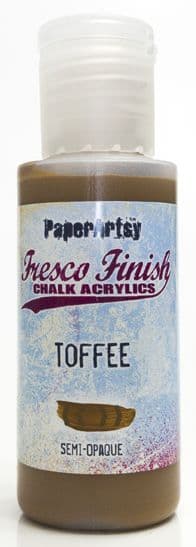
The next step was to color my elements. For the buildings, I chose to use PaperArtsy Fresco Finish Acrylic paints: Toffee and Chocolate PuddingYellow Submarine and Tango paints for my tree. Why is my tree yellow and orange? Well, I just like how it looks and how it stands out against other elements. I wanted the windows and background to be subtle so I used just a light wash of blue watercolor for that. Oh and of course I didn’t forget to add some splatters.


A tiny, but important detail is that I like to frame my cutout pieces. That serves two purposes: first, if you cut out your elements a bit unevenly, it can cover that to a certain degree and second, it gives it a bit of that desired feeling of shadow and dimension. For this, I used an archival ink brush pen in black color.


My elements were mostly done, but I just couldn’t resist adding some more depth. To achieve that effect, I used india ink brush pens. Now, since I used acrylics for coloring, that made my surface non-porous and I could apply this technique, since it’s so fast and simple. But you can always go with watercolors or even colored pencils for this purpose.
So, how I tend to do this is just use a few shades darker brush pen than the base color and smudge it with my fingers. You have to do this somewhat fast, because india ink dries rather quickly.


Now the time came to assemble my project. For this, I used simple paper glue that dries transparently, just in case it overflows. I had enough mishaps on this project as it was and didn’t want to risk some more.


With my building done, I went on to draw some doodles. I think doodling is kind of a very personal thing. What tools you like to use, what style, etc. I like this architectural kind of vibe, so I added some geometrical shapes, lines, numbers and scribbles, but you can always go for some whimsical or quirky designs, or even floral. Just do whatever makes you happy. I also didn’t skip using a white gel-pen for emphasizing some details and adding highlights.




We all have that bad day, days, or even a week when you really want to do something good with your time or you want to be creative but it is just not working out. At that point, it is the easiest just to let it go and watch some tv series or eat a bowl (or a tiny cup J) of ice cream. But one thing that I can promise you is if you manage to push through just a bit, you will manage to make something that you will like and the feeling of a “bad day” will just go away. This project started unlucky for me, but at the end I am pleased with how it turned out and I got that feeling of success. Even though I can still imagine some tweaks that I would do. J

Renata 💜


Facebook: Renata Peley
Instagram: @renata_artjournaling 

Thursday, 16 December 2021

2021 Topic 15: Journaling Gratitude with ECF {by Jenny Marples}

2021 Topic 15: Journaling Gratitude


Have you tried stitching on your projects? Jenny has several options for you here, including a really fail-proof faux stitching one, that you can hardly tell isn't real! With lots of ideas for layering and beautiful paint effects, this flip up journal page will keep you engrossed for quite a while! 
~ Keren

Hi everyone, it's Jenny Marples (Pushing The Right Buttonswith you today, and I'm here to share a journal page which celebrates the Autumn and Winter seasons, helping to make me feel more grateful for them along the way.

Inspired by the beautiful needlework often seen in Keren Baker's work I've had a go at 'drawing' with machine stitching as well as coming up with a way of turning 'a negative into a positive' to create colourful Autumn leaves with Courtney Franich's gorgeous stamps.


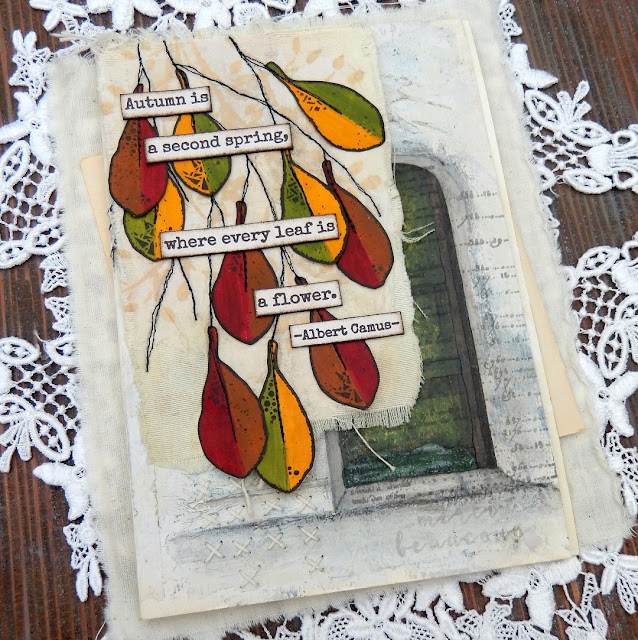
Flip up those Autumnal leaves to reveal a Wintery scene beneath.


This piece all started after an October morning walk where the leaves were changing colour from their familiar Summer green to jewel-like shades of yellow, red and brown. They brought to mind a photo of an old green door I'd seen the previous day and an idea was sparked.


Wanting to capture the visual magic of both the Autumn leaves and the door I came up with a layout 'sketch' which involved adding a 'flip up' element to a journal page using the smallest leaves from Courtney Franich's stamp set ECF05.


The main journal page was already prepped with a scrap of book page and some white gesso. To create the flip up piece I took a blank index card torn along the edges and cut some fabric to a similar size with the idea of sticking those two together. A way of adding extra texture to the surface of all of these is to apply wrinkled tissue paper with some gel medium; once paint is added those wrinkles come to life. When dry the index card was stuck to the fabric and attached to the top of the journal page with masking tape.
 
 
Laying down layers of paint that won't be totally visible in the end is key to getting surfaces with a look of depth and interest (think Seth Apter's incredible pieces as a perfect example of this). Adding a little Sand PaperArtsy Fresco Finish Chalk Acrylic Paint with a spatula over the crumpled tissue revealed the texture beneath: I avoided the area where the door would eventually go.


Up close you can see where the Sand paint was used through Kay Carley's PS061 stencil multiple times on top of the fabric to mimic the illusion of further tree branches being behind the stitched ones.


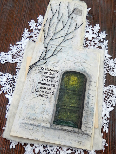
The doorway was drawn on the right side of the page to make sure part of it would be visible beneath the leaves; by providing a 'sneak peek' at what lies on the next page you encourage viewers to turn over (or in this case flip up!) and see more.


That layer of crumpled tissue really comes into its own at this stage. Add layers of paint (in this case from darkest to lightest shades) unevenly over the top, allowing some of what lies beneath to remain visible. For this page I chose French Roast, Stone, Heavy Cream and finally Cloud 9 PaperArtsy Fresco Finish Chalk Acrylic Paints. When dry use a sanding block to gently rub away the upper layers and reveal those wrinkles - be brave and rub harder to get the most out of those lower layers.


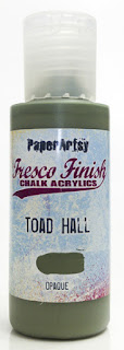
When it came to painting the door I found applying very thin layers with a small spatula helped control the application and allowed lower layers to show through - try scraping away some of the paint as well as adding more and think about leaving lighter areas as 'highlights'. I chose to use Guacamole, Toad Hall and Winter Green PaperArtsy Fresco Finish Chalk Acrylic Paints for this process with Hyde Park added over the kickboard at the bottom and French Roast used on the door frames.


You can 'shift' the colour and give the door a richer glow by painting on a very thin layer of the translucent Pumpkin Soup PaperArtsy Fresco Finish Chalk Acrylic Paint over the top - that's the beauty of having opaque, semi-opaque and translucent options. I added dimension using Stone around the edge and stopped the door from 'floating' by drawing a smudged line of French Roast below it.


Going back to the original sketch I'd drawn branches onto a piece of tissue and liked the design. Rather than transfer it with carbon paper and risk adding ink onto the fabric beneath I ran lines of gel medium along the drawn lines on the reverse and stuck the tissue to the fabric.


Having lines to machine stitch over helps immensely, and accuracy is definitely discouraged because in that way your finished look echoes the feel of delicate branches. You can see I carried the lines onto the attached page too. Remember, underneath the tissue is another layer of wrinkled tissue with gel medium and paint over it so it is now resistant to water. That's important because it means you can use water on a thin brush to help tear away the excess above.


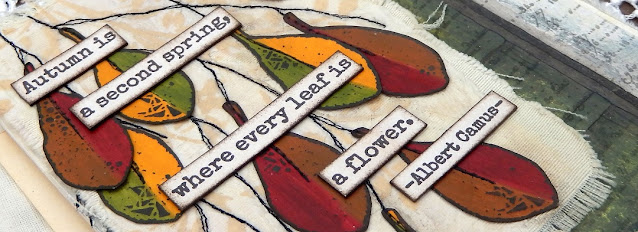
At the beginning I mentioned turning a negative to a positive - well here goes. Courtney's leaf designs are solid so when stamped they cover up what is below. I wanted the colour beneath to be visible so after painting a strip of paper with Blood Orange and Toffee PaperArtsy Fresco Finish Chalk Acrylic Paints I clear embossed them before painting over the top with the French Roast. Once dry rub over the leaves with a dry cloth to remove the paint from the embossed areas and reveal the design in reverse.


Repeat with Pumpkin Soup, Hey Pesto and French Roast PaperArtsy Fresco Finish Paints for the second set of leaves.


If you want to eliminate the shine of the embossing powder cover the leaves with layers of PaperArtsy Fresco Finish Acrylic Matte Glaze.


Glue the leaves onto the stitched branches using the sketch layout as a guide. I realised that it would look better to echo that stitching down the centre of the leaves but to run them through the machine at this stage could risk tearing them; in future would opt do this while they are still in situ on the painted strip. As the next best option I chose to 'fake it', using a tracing wheel to add indentations and drawing on the 'thread' with a narrow tipped black pen.


I love adding stamped detail over the top of hand drawn images to add extra interest; in this case I used the Courtney's script stamp from the same set over the door using grey permanent ink to keep it subtle.


Adding words can help to convey the intentions of the page; this sentiment from Sara Naumann's ESN42 stamp set spoke to my recognition of the understanding that whilst Autumn and Winter often fill me with a sense of sadness and dread these seasons have their own beauty, helping to make me even more appreciative of Spring and Summer. By stamping the words under the tree (in brown permanent ink) also means they are hidden from view until the leaves are 'removed'/raised. From a design perspective they also help lead the eye from the tree down to the door.


More words from Sara Naumann's ESN36 stamp set spoke to the beauty of the leaves seen on those October walks mentioned at the start of the post.
 

Here are some close ups of the finished journal page;


The hand stitching at the bottom of the page peeps out beneath the leaves.


Here you can see how the stitching was extended down from the index card flip onto the page underneath. Grey shadows were also added to one side of the stitching to give the branches more of a sense of dimension.


I stamped the postage stamp from Courtney's set in the top corner, blotting the brown ink to knock it back a bit. I also chose to over-stamp it with a postmark image from another of Courtney's stamp sets, ECF06, using grey ink. As an alternative you could re-use the circular element of the postage stamp on either side of the brown stamp.


Can you spot the 'hidden' expression of gratitude beneath the door? These words came from Sara Naumann's ESN43 stamp set and were deliberately made barely visible with blotted grey ink.


With lots of techniques and design ideas included in this post I hope you feel excited to give them a go. Whether drawing (or even tracing) a design on tissue and machine stitching over it or using crumpled tissue under your layers of paint and sanding it back, there are lots of ways to add texture to your journal pages. And if you have solid stamped images that you'd prefer to see through try using clear embossing powder as a paint resist.

Thank you so much for stopping by.
Jenny