Showing posts with label 2017 Topic 5. Show all posts

Tuesday, 26 December 2017

PA 2017: Blog Year in review: Topics 5-8


Good Evening again from PaperArtsy HQ,

Over the next few days we are taking a look back at some of the magnificent posts we featured over the Spring period of 2017 on the PaperArtsy blog. 

Tonight I'm sharing some highlights from Topics 5-8. Grab some Xmas foodie leftovers and a cuppa, and lets take a look!

Leandra 

Topic 5: Blue and Ochre

As I explained yesterday, every round in 2017 we kicked off with a 'colour combo', as featured in Stampington's True Colours publication. Another combo in there which I use time and time again is blue and ochre.  It does take some care, because mix those 2, and you create a lovely green, which is fine if you want green, but if you perfer the contrast these 2 colours offer, then you do need to work with dry layers to maintain each colour's integrity. Let's see what some of the bloggers got up to...

My first pick is this incredibly detailed journal spread by Chris Cresswell. I could stare at it for an absolute age! Interactive doors, beautifully layered flowers, and all the colours pop and contrast so well!. Caramel and Toffee are 2 of our paint colours that often get overlooked, but those with Pumpkin Soup, and tadaaa....Chris has created a range of ochre  tones so perfectly!


And I hope you didn't miss this booklet by Claire Snowdon. She brayered her backgrounds, used masks with Distress Inks for added depth.


You can see the contrasting shades just sit together  so well. At the end of the day we are talking blue and orange, but if you take orange into the rustic ochre direction, you can also change your blues too, creating a softer contrast.


So are you ready for a Lauren doozy? One of her weird and whacky zinski-world creations?


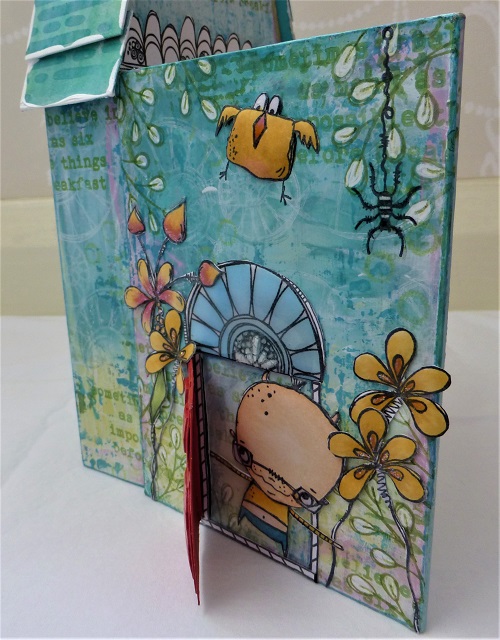
Well we were so busy with Ally Pally when this published, that it really did not get the attention it deserved! A 3 dimensional, interactive Zinski zone!


Her flower-puffing technique fascinated people, but can you see how she does it to the Zinski birds too! She even has roof shingles and stained glass windows!


Topic 6: Resin and UTEE

For many people, melting embossing powders is thier first 'wow' crafty experience. When you see the powder melt, perhaps it's a shiny raised pop, or a molten metallic medallion, but it just is super-cool when you start to learn the myriad of techniques this product offers. Then, when you get hold of the larger UTEE crystals, OMG, the things you can do!!
Resin is a pretty broad term, and at the other end of the scale we have those 2 part mixes that set up hard, and are wonderful for jewellery, small niches, and even seal floors , canvases or tables!

My first pick is this striking panel of tiles by Nikki Acton. Not only is the colour contrasting, but that tile is very clever in the way she floats a stampled image in the top layer so delicately.


Not everything went exactly to plan for Jennie, but she always pulls it together so perfectly, that in the end you can't imagine it any other way. See here for more.


I don't think I have ever seen anyone master UTEE so elegantly as Lin Brown. In this post she shares a few samples, here is just one of those, where she buries embossed metal into her UTEE. Her finishing touches are always so well executed. How dare she retire! We still crave to see more of her creative exploits!


And it must be in the genes of Lin's/ Lynne's - are all L's this good at UTEE exploration! Lynne Moncrieff is well know for her use of resin papers, and here she shares one such trinket composed to perfection!


Topic 7 : Found Objects

Well I'm pretty good at losing things, it has to be said, and how frustrating is that! THe number of times i take off my glasses before after showering, and cannot see them to find them again!! Finding things is so much more fun! This topic sent our designers into a spin of activity.

Kim Dellow contrasted the delicacy of acetate, with some rusty washers in this post
 

And we all loved Ellie's forest walk which turned up a range of items that she re-purposed into a forest floor canvas so beautifully.


And Raquel re-purposed all sorts of items to create this coffee puck dispenser for her kitchen!


Jennie altered a tin to create a new home for a little found boy! He looks very happy! 


Topic 8 : Assemblage
Assemblage. It's an artsy kind of word, but isn't that what we do no matter what we create?? We are basically assembling layers, textures, colours, embellishments until they are arranged in a way to suit our personal taste. I guess 'assemblage' could infer more of a 3D composition, but lets see what everyone got up to for this one!
First up check out this lovely piece that Autumn Clark entered in the challenge for this topic. I love the minimal use of colour, yet there is so much to see. She always gets that light-dark balance just right! Go to her post and check out the textures in her base layer. Beautiful!


And this by Alison took my breath away. 


It has to be one of my favourite pieces of the year! It was this piece that inspired me to make 'shades of white' a colour option later in the year! She started with a base layer of tags!! Just go and look again here, it is beautiful!!


I really liked this from Alison Hall too. Such a great idea to use a piece of slate stone this way as her substrate.


Carol Fox created this Zinski inspired garden sign


And Keren decorated a violin - as you do!! Yes you do get spoiled people!!


I hope you have enjoyed this trip down our memory lane of 2017 with me. I'll be back tomorrow with some more treat and reminders of how clever and creative our talented bloggers are! Don't forget to save the posts that float your boat on pinterest. No excuse now, you'll hit the New Year with a dozen ideas to crack on with!

Leandra 

Saturday, 8 April 2017

2017 #5 Bible Journaling Page {by Wanda Hentges}

2017 Topic 5: Blue and Ochre

Journalling has become such a big trend, and in the last 2 years, journalling directly onto bible pages has also become extremely popular. Companies are now making products specifically for Bible Journallers, and our own Wanda is one of those clever ladies! Here's the clincher...fresco chalk paints are so nice to use on those paper thin pages, they don't even buckle them! Lets see how Wanda does that!

Hi everyone!!  Wanda Hentges, Art by Wanda blog, here.

It's always exciting to be here on the PaperArtsy Blog and I hope you are glad to have me back!!!  I've decided to share something that I haven't shared here before, a Bible journaling page.  Even if you don't do Bible journaling, the same techniques can be done in an art journal or even on a card.  

I started Bible journaling about 1 1 /2 years ago and really enjoy digging into a scripture and then doing some art while meditating on it.  The color theme of Blue and Ochre seemed perfect for doing a page for my post. Fresco Finish paints work great for Bible journaling!!! The translucents are wonderful if you don't want to obscure any words and the others work great in the margins.  Plus they dry quickly minimizing any wrinkling.    


I'm using Kay Carley stamps from set EKC06 and the Lin Brown stencil PS044. 


I prefer to prep my page with some clear gesso to prevent any bleed through of product on the thin pages.  The picture below is the backside of my finished page.  You can see some shadows but nothing came through even though I've used layers of paint including some thinned with water.  I applied the gesso with Tim's large Collage Brush.  


Pumpkin Soup is a great ochre color and a translucent paint making it wonderful for the background.  Most of the time I work so everything can be read (or most everything).  Using a brayer to put the paint on created faux texture and even in the heaviest areas you can still read the text.  (a mini brayer would also work)


I love this new stencil!!!


I didn't want to have to do a lot of precise painting for the flowers.  Stamping with a light ink (Sky Blue) gave me an outline to follow but was also easy to cover using a brush just to dab the paint in the general area of the flowers.


I stamped over them with black and got a bit off at the top of the flower to the right.  I told myself it was not a big deal and all would be well.  I really do tend to stress when things are not just so.  Then, when I had stamped the small flower on the left with blue, I hadn't pressed well enough for the whole image to show so in my attempt to stamp all of it in black I pressed too hard, slid the stamp since the book wasn't completely flat there and smeared the black ink.  I almost painted over it but then decided it doesn't have to be perfect, it's ok, it just looks like a lot of shadow.


I used a wet brush and extra water when adding in the Glass Blue paint so that I could just dab the brush down and let the paint move on it's own giving the flowers a more realistic look.


A dab of Pumpkin Soup in the centers worked well.  I also painted roughly around the flowers with Pumpkin Soup partly for shading and dimension which worked well but also because that excess blue where I was off with the black stamping did still bother me just a little and I was hoping somehow the Pumpkin Soup would make it all better and it did.  It really knocked it back and made it look more like a shadow.  Yay!!


The center of each flower has a dot of glitter marker (plus a few stray spots because I got a finger in the wet glitter and smeared it).  


I stamped several of the small flowers with black, used the back of a paint brush to put blue dots over the black spots, added extra blue dots around the flowers, and once the blue was dry used a white gel pen for a little highlight dot on each one.  I love how this makes you think there is a whole field of flowers!!!


Dina Wakley Media Tape, paint and stamping makes for custom washi tape that matches my page.


Usually when I'm going to journal a verse or passage I like to take some time to do a little research.  This gives more meaning and helps me to spend more time thinking and putting the information into my heart and life.  Quite often the English word being translated from the Hebrew or Greek word/words doesn't convey the whole meaning or we get used to thinking a certain way about a word and forget it can be more.  To finish a page I like to include notes about what I have learned or want to remember. 


I hope you've enjoyed today's post!!  I certainly had fun!!!  Blue and ochre are a wonderful color combination and there is still a little time to whip something up and enter it into this current topic.  Happy Creating!!!

Until next time!!!  
Hugs, Wanda

Blog:  https://artbywanda.blogspot.com/
Facebook:  https://www.facebook.com/wanda.hentges
Twitter:  https://twitter.com/WandaHentges
Instagram:  https://www.instagram.com/wandahentges/  
Pinterest:  https://www.pinterest.com/wandah/  

I'm amazing how the paint performed onto such delicate paper Wanda! And the pages looks beautiful! Thanks for sharing this with us ~ Leandra


We always hope that you  learn something interesting from our blog. Our bloggers deeply appreciate your comments so much, so please take time to let them know you've been inspired! Why not join our challenge by blogging your interpretation of the current topic and link it here?

The current topic link will close 17:00 (London Time) Sunday, April 9th 2017, and the winner will be announced 2 hours later at 19:00.

All links go in the draw to win a £50 voucher to spend on products of your choice from the PaperArtsy online store.

Friday, 7 April 2017

2017 #5 Ode to Ochre {by Lauren Hatwell}

2017 Topic 5: Blue and Ochre

A gorgeous post here from Lauren with lots of interactive loveliness! She always manages to create something a bit unusual, and she's done it again! Enjoy!

 
Hi everyone Lauren here again and, as always, it's lovely to be here on the PA blog tonight with my take on our Blue and Ochre challenge. 

Blue, green and blue-y green (or green-y blue, even) are my absolute favourite colours, as you may well have guessed already. I like blue in all it's forms and never tire of it. Conversely, I always think of yellow as one of my least favourite colours. Once I started playing, though, I realised I actually use it an awful lot without even realising it. I soon understood that I couldn't do without it.  This little exercise has made me realise just what a useful colour it is. In fact I think I am learning to LOVE IT!

I do actually use Ochre an awful lot, but mostly for shading. It works beautifully, both in natural schemes for hair, fur etc and, to add depth to brighter colour schemes too.  Ochre makes the perfect companion for blue and, when mixed with blue, it makes the most delicious shades of green and blue/green. Try mixing a dab of Haystack with a dab of Mermaid and you get a gorgeous shade of pale green. Add it to a rich blue/green like Beach Hut and it will ramp up the colour enough to knock your socks off. Stamp an ochre shade over a blue shade and you'll get a gorgeous green. It's a really versatile colour.

So, though you might look at my project and think "where's the Ochre?";  It is, actually, pretty much everywhere in some way, shape or form.

I've been dying to use Elena's gorgeous flowers and monsters with stamps from Tracy Scott, Emma Godfrey and Kim Dellow.  They all chime so beautifully; it's a marriage made in heaven...just like blue and ochre.

.
I started, as I always do, by picking out a small palette of  Fresco Finish paint colours to suit my scheme. I do this just because it's an easy way to eyeball the colours to see if they're really what I want and check they go together. I chose Haystack, Pumpkin, Brown Shed (light ochre, ochre and burnt ochre), together with Mermaid, Beach Hut and south Pacific for the blues. (The pink was a bit of an accident (that will teach me not to clean my stencils properly!? tsk tsk) but actually looks okay AND made a beautifully pink-y orange when I mixed it with Haystack, so not a complete loss though, admittedly, slightly off piste. I used Candy Floss, Bubblegum and Bougainvillea)


I love making houses. This one is a mixture of Heavy Smoothy and Greyboard. The base painting was done like a masterboard, building up layers of colour with stencils  and masks.
(PS036/ PS046)

... and stamping until I was happy with the overall effect. This sort of technique is perfect for playing around with colour mixing. You never know exactly what you're going to get until you get to the end, but you can see that the blue and the yellow have mixed to make lots of different shades of colour throughout. I really like the way the colours change again each time you add stamping or stencilling.


Emma's quote from Alice in wonderland was perfect for this project.


Now for the fun bit... adding the detail. I coloured and cut out my characters in the usual way, puffing the paper and glazing with PaperArtsy Gloss Glaze on the outside of the house. I love the way Kim Dellow's flower circles look like windows. All I had to do was add a dab of colour with a combination of Crackle Glaze and Glossy Accents to give the effect of glass. The door and window frames were made with the stem stamp from Tracy's ETS06


Look who's inside... I've used the Haystack to create a sort of yellowish skin shade for my little Zinski monster. 

It is brilliant for skin tones. I used Candy Floss with Haystack to create the deeper shade and softened it a bit with vanilla for the lighter skin shade. I've also used Bougainvillea with Haystack in the flower centres on the left of the door to add a nice pop of colour. It's a lovely combination and makes the yellow seem brighter to me. On the right, I've used Burnt Ochre (Brown Shed) in the flower centres.


Open up the front of the house and you find a secret garden. I'm still madly in love with Elena's "cake flowers" and quirky monsters. They give everything a magical, other-worldly feel that I always want to bring to life. Tracy Scott's border stamp from ETS01 is also perfect for a little garden wall. I haven't puffed the paper on the inside of the house because I wanted everything to fold away neatly when you close the door.  


I made do with a simple concertina effect background this time, but I will definitely be researching techniques for making pop up features in my projects going forward. I love the idea of everything springing to life when you unfold it. 


It seems silly, but I do often forget to mix colours and see what else I can get out of them. It's so easy to fall into the trap of using what you see in front of you, particularly if you're short of time. I'm used to adding white to ting and black to shade, or picking a light, medium and dark shade to add depth and light to my colouring, but there is so much more to colour than that. This was such a nice way to remind myself what is possible when you think slightly laterally and spend a little time playing with colour. Of course it's only the tip of the iceberg. I used Distress ink in Fossilised Amber to stamp the words because I wanted the letters to change colour. If I'd stamped them in the new Oxide Ink they would have stayed yellow. I could also have used Infusions in Lemoncello or Golden Sands to add further interest. They both have a hint of ochre in them too.

Wow what a feast of stamps you have incorporated into this project!Love all your clear windows, and how you  have pulled so many stamps into such a cohesive project! Thankyou! ~ Leandra


We always hope that you  learn something interesting from our blog. Our bloggers deeply appreciate your comments so much, so please take time to let them know you've been inspired! Why not join our challenge by blogging your interpretation of the current topic and link it here?

The current topic link will close 17:00 (London Time) Sunday, April 9th 2017, and the winner will be announced 2 hours later at 19:00.

All links go in the draw to win a £50 voucher to spend on products of your choice from the PaperArtsy online store.