Showing posts with label 2017 Topic 1. Show all posts

Monday, 25 December 2017

PA 2017: Blog Year in review: Topics 1-4


Hello and a very Merry Christmas from PaperArtsy HQ!

The next few days ahead are the time of year that we reminisce and look back on the topics this blog has explored during 2017. 

Did you learn something new this year? Did you achieve a personal goal, or tick something off the bucket-list? Were you challenged in ways you least expected? 

I think for all of us there have been numerous unexpected twists and turns in international terms for us to absorb throughout 2017, lets hope for calmer waters in the year ahead! I'd love for us all to move towards a more fulfilled and content future!


We've all been provided with the highest quality and widest variety of artistic styles on the PaperArtsy blog this year. We deliberately strive to bring you bloggers with different styles, strengths and experiences and this melting pot suits the equally broad array of products available from the PaperArtsy brand.


Tonight I'm sharing a few reminders from 2017 Topics 1-4. Read on to find out more. 


Leandra.


Topic 1: Pink and Orange

In 2017 we decided to add a subtle structure to our topics. Each round of 4 topics started with a colour theme, and the first of these colours was based on the True Colours Publication, curated by Lynne Perrella.


My favourite and a real turning point for me, was the chapter on Pink and Orange by Teesha Moore. And, so it naturally followed that this would be the first topic of 2017, a burst of enthusiasm and boldness!

Wendy Malls kicked off her year with this perfect representation of those zingylicious colours and made a Book of Pockets! 


We have come to rely on Keren pulling rabbits out of hats. On this occasion she was on a clever transparent kick, which was sublime ....


or is that subpink (and orange)!


Honestly, I could show you every post for this topic - they were all astonishing, which really is the story of the entire year on this blog! Here, Chris Dark lobbed Kay Carley's stamps out of the park...look at this in-progress shot!! Stunning!


OK Just one more...Jennie Atkinson interpreted the colour theme as led by Infusions. Her palette was soft and subdued, as is her style... I love that any colour combination can be re-worked to suit personal preference. So now you know,  Pink and Orange certainly doesn't have to be HOT! It can be dusky too!


Topic 2 : Masks

Do you know the difference between stencils and masks? Well, it is fascinating how the lines have blurred. But a mask hides things right !? So let me leave that with you and you figure it out!

Anneke is a masking guru. Layer upon layer of soft and delicate paints with a poweeee-pop of orange! I love how she uses colour in such an effortless way. And I love how this picture links the last topic to this topic!!!

OK, I'll admit it, sometimes you feel like you have to turn your brain inside out to understand how stancils and masks can be used. And our own, very lovely Missy Jo is very good at turning my head inside out on an annual basis! This post fascinated me, and the stencil she created to do this is ACE!!!


Another of our talented in house designers, in fact a newbie 2017 PaperArtsy designer, is Alison Bomber. I think we are all a bit scared of white, but look at how masks make this box pop!


Sue's canvas used masks in several ways...can you count the ways??? There's 3 very obvious techniques, on 3 separate layers....


Topic 3 : Paints and Infusions

We all know the basics of using infusions now ...well if you don't yet, just use the search bar on the sidebar of this blog and you'll be bombarded with posts from the past 2 years! Our Fresco paints are chalk, so this can inherently provide a really good tooth for infusions to grab onto, it can also offer up other creative options too, let me share a few with you now!

Take a deep breath those 'cleanies' out there...infusions WILL stain your fingers, but that's part of the fun right?!! Hey it scrubs off, so don't panic....Xmas parties are O-V-E-R you're allowed to get messy!! Helen used bleach! Not to clean up (sheesh! silly!!) noooo... to knock back her infusions in the most stunning way....Look!! You know you want to sprinkle just like her!!!


I think this is one of my fave's from Hazel. She got so excited when she was layering up this book of Seth's newest products: wood, paint, rusting powder, and of course infusions all feature within the covers. It's a bit like those interactive books you buy for kids to poke and prod...except it's for us grown ups!!


I adored how Clare Messenger made this piece ready for the wall, how cool would 4 of these look for a fabulous statement piece in your house!

Boy are we lucky that Kay Carley is getting out and about in 2018 teaching her skills to us all! Check this out!! An amazing amount of detail to bring this sample together, lucky for you she shares the steps in great detail too in her blog post! Go and check it out!


Ok, how about this! Ruth Mescall is also an infusions guru! I adore this post too...I love them all, how can you choose just a few to share !!??.... this is torture!...but look, it's so lovely!!! On the back of this I was demoing Lin's flora stamps with infusions all year at the shows we do! Love love, love. If you haven't yet tried infusions, take a minute to absorb the colours, the tones, and the depth. They make you feel awesome!


Topic 4 : Doors and Windows

I have a secret fascination with doors. Every time we head over to the fabulous continent of Europe, my first photo is ALWAYS a door, or wrought iron covering a window, or gates...all those elements always look more romantic on the continent than here, in the generally dull, grey-skied Britain! Who wants a shiny red or black or cream spick and span door, not me! Give me a rusty peeling hardy old well-loved door any day!!!

Julie Ann has been creating astonishing miniature hinged art blocks and they are a delight! My first pick to remember is this, she writes gorgeous back stories to them too!


I think this was the best thing from Emma Godfrey with her stamps! Not only has she created windows, she's also used infusions as 'pops' of colour - you know you want to sprinkle those things ... yes you doooo....(I digress - I'm under the spell of infusions). Where were we, oh yes, Emma's super-cool frame. Go take a look!


So this next sample not only do I love, but the colour follows on perfectly from Emma's sample above!! Yup, it's Seth with one of his original doorways...he makes a lot of interactive art! Love the pop of color inside the doors, and his masterful painty layering ideas.


It is so much fun to look back on what our genius bloggers have shared with us over the course of a year. This year seems to have zapped by in a blink, but at least the blog remains as the perfect reference tool Don't forget to save the posts that float your boat on pinterest. No excuse now, you'll hit the New Year with a dozen ideas to crack on with!


See you again tomorrow with more!

Leandra

Saturday, 4 February 2017

2017 #1 Art Journalling {by Tracy Scott}

2017 Topic 1: Pink and Orange

Tonight we have some inspiration from Tracy Scott, showcasing her stamps in such an eye-catching , colourful style. Tracy is well known for using colour in this fabulous way, so sit back and enjoy. 

Hi everyone Tracy here.
Great to be here on the PA blog tonight. For tonight's project I have chosen to show a page in my 365 mini art journal.

At the end of last year I thought it might be fun to keep a mini journal for 2017, a small journal that I could create in everyday, that wouldn't be too overwhelming or time consuming. I'm loving playing with different products and trying out new techniques in my little book.... it has certainly got the creative juices flowing again !!!


 Although I tend to use pink a lot when I create I very rarely sway towards orange although I'm never quite sure why this is as I absolutely love the vibrant combination of the two together (for this journal page I used a combination of two of the colours in my new fresco paints 'Prawn' and 'Tangerine Twist'... "don't they look fabulous together?"


For my 365 journal I decided not to go for an expensive journal with nice paper but to go for a small diary type journal, I wasn't sure how the pages were going to hold up to my usual wet mediums of acrylic paints, modelling pastes, collage etc but have found that with a coat of gesso first every page has withstood everything I've thrown at it so far !!


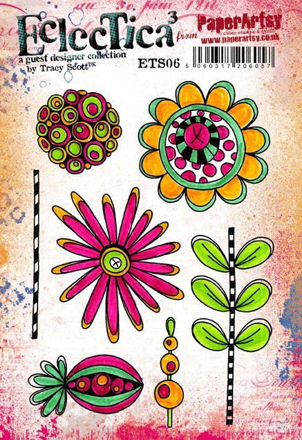
Background stamping with stamps from ETS08 and flower head stamp from ETS06, I'm loving using metallics on my pages at the moment, whether it be gold and silver paint splatters or using my metallic gel pens to add some details... I just cant get enough of them...


My other soft spot at the moment seems to be for scribbling....I seem to be doing some sort of scribbling on every page I do.... its just so freeing and makes me so very happy !!!


And of course who doesn't love a bit of glitter, I never used to be a glitter girl but to be honest I just cant get enough of the stuff nowadays...


This little book has certainly given me the freedom to try new things, new colour combinations and new techniques, I find that as the book is inexpensive and lined I don't have the same fear of the blank page that can sometimes occur in a more expensive journal. 

What a fabulous way to play and express creative freedom !!

Some of the ideas I've explored in my little book have gone on to be expanded in my larger journals so its the perfect place for practising !!! Why not give it a go, grab yourself a little notebook and experiment to your hearts content...... but be warned......it's addictive !!!!!

Thanks for stopping by and joining me tonight, if you want to check out more of my work including more of my 365 journal pages you can find me at the following links....

www.instagram.com/Tr4cy1973

What a great idea Tracy, we all lead such busy lives that to have something like this that is simple and achievable is just the perfect way to get an arty fix each day. 


We hope that you  learn something interesting from our blog. Our bloggers deeply appreciate your comments so much, so please take time to let them know you've been inspired! Why not join our challenge by blogging your interpretation of the current topic and link it HERE?

The current topic link will close 17:00 (London Time) Sunday, Feb 5th 2016, and the winner will be announced 2 hours later at 19:00.

All links go in the draw to win a £50 voucher to spend on products of your choice from the PaperArtsy online store.

Friday, 3 February 2017

2017 #1 No Place Like Home {by Chris Cresswell}

2017 Topic 1: Pink and Orange


It's lovely to have Chris with her vibrant art on the blog tonight. Chris is a master of creating layers and contrast, and she always throws herself enthusiastically into all she makes. Enjoy, she has lots of tips for you tonight!

Hello PaperArtsy Blog followers, it’s Chris Cresswell here, sharing a post on this fabulous Pink/Orange challenge theme, using Stamps designed by Ellen Vargo. Anyone who follows my blog will know that these are my favourite ‘Go-to’ colours, and Ellen’s stamps are perfect for art journaling. Therefore, the colour theme and stamps dictated my project choice: mixed media/art journaling on a 10” x 12” canvas.

I love to use bright colours in my art journaling (my art work is seldom subdued!), and I love adding lots of layers despite the fact the first layers seldom make an appearance in the completed project. I don’t mind that. I never have an ‘end view’ in sight when I begin. I start with paint and I just keep layering! I love the process and learning more about the products I’m using as they mix with, blend or cover the layers underneath.


For this project, I first created a collage of various torn pieces from my stash, to deliberately create different textures. This is an idea I’ve borrowed from Birgit Koopsen who tends to use all her gelli-prints to create a collaged layer.


I chose quite a few Fresco Chalk paints in various yellows, oranges and pinks (I’ve listed these on my blog), and starting with dry brushing but ending with my fingers, I blended the colours, layer upon layer until I was happy with the result. My art journaling style is very influenced by Kate Crane, so I tend to add layers in a similar way to her: paint, stencil, stamp, spray or drip, not necessarily in that order.


As Ellen hasn’t produced any stencils for PaperArtsy, I looked through my PA stencils for designs that would match her stamps: PSO15 by Emma Godfrey was perfect.


I first used Emma’s stencil to push through some  Prima 3D gel before using the same paint colours to stamp randomly over the canvas with a variety of Ellen’s stamps: 


I also used a Tim Holtz Distress crayon, Picked Raspberry, to highlight the raised gel, screwed up tissue and corrugated card. I stamped again using Snowflake before watering it down slightly to flick the paint across the canvas.


I was very aware at this stage it was very bright and needed more contrast. I was longing to bring in some blue to create a contrast and cool down all of this orange. However, I wasn’t ready to do that yet, so I introduced some of the darker pinks; and of course my favourite, Bougainvillea. I added more stamping, this time using Little Black Dress to produce an even bolder contrast to the pinks and oranges. Ellen’s stamps are great for this. However, it was still too bright, even for me! So a little further dry brushing with DecoArt translucent white toned it down to a level I was happy with. But this meant that some of the original stamping had been concealed by the further paint layers. Luckily, some added doodling brought them back into the arena.


Now to prepare the main focus which was to add collage papers to three of the little wooden houses I’d bought from PaperArtsy at Port Sunlight. This is where I was going to introduce some blue. I chose some papers from my stash that would complement the background but add some contrast, be in keeping with the subject but also draw the eye of the viewer. Some corrugated card painted with Autumn Fire was glued to the roofs and some doodles with a white gel pen were added onto the house fronts. In  true Kate Crane style, I added little numbers to each house. Love that idea!  I deliberately left the little wire hooks in each roof to represent chimneys as I knew I was going to add twisted wire to these at the end.


Before adding the houses to the canvas, I doodled a little more with black and white pens, used a black Posca pen to darken the black circles, added some washi tape and rubbed around the edges of the canvas with a mix of archival inks and Distress crayons. Now, it was just a case of gluing the houses to the canvas and deciding on some text.


Originally I was going to title this: The Blue House, as I intended the middle house to be a much more vivid blue. However, it didn’t seem to match the finished result, so the old cliché came out! I used a mix of Tim Holtz’s Alpha Parts and Block letters for the title. The border ‘flags’ were created using the triangular block stamp from EEV03. I sprayed some card with a mix of Dylusions spray inks, using oranges and pinks, then stamped on top with Ranger Jet Black Archival ink. I cut the triangles out individually and glued them in twos and threes to the sides of the canvas. I wound some thin blue wire around a pencil three times  to represent curling smoke and attached these to the wire loops on the roofs.  Finally, I added some Treasure Gold (Renaissance and Classic) around the edges of the canvas, over the raised parts and on the wooden letters.


I was very much in my comfort zone with this project. I realise that not all of you may wish to work with such bright colours and some will be horrified that I haven’t left an inch of white space (I really struggle there) but that is not me! I love what I do. Bright colours make me happy. In fact, I loved this challenge so much, I actually made two projects. Photos and information about my second project (a Heart-shaped Wall Hanging/Note holder) using these colours and stamps can be found on my blog, if you’re interested. Do join in with this challenge if you haven’t already, you might be surprised at just how happy it makes you feel!

Chris Cresswell
Blog: www.loopsandlines.blogspot.co.uk
Facebook: Chris Cresswell
Twitter: @artmadnana
Instagram: @artmadnana
Pinterest: Chris Cresswell

Ohh another bold and beautiful piece from Chris. I love your explanation of how you make your decisions, it's so interesting to see how we all approach a project in our own way! This is such a great piece Chris, thankyou! ~ Leandra


We hope that you  learn something interesting from our blog. Our bloggers deeply appreciate your comments so much, so please take time to let them know you've been inspired! Why not join our challenge by blogging your interpretation of the current topic and link it HERE?

The current topic link will close 17:00 (London Time) Sunday, Feb 5th 2016, and the winner will be announced 2 hours later at 19:00.

All links go in the draw to win a £50 voucher to spend on products of your choice from the PaperArtsy online store.

Wednesday, 1 February 2017

2017 #1 Pretty Planning {by Christine Dark}


2017 Topic 1: True Colours – Pink and Orange 


This evening Chris joins us with a walk through of this fab project, Chris has such amazing attention to detail and the joy she gets from creating is so very obvious in her finished projects. 


Hello PaperArtsy Blog followers, its Chris Dark here, sharing with you a post on Topic 1: Pink & Orange, inspired by Stampington's True Colours Publication. Colour is a starting point for most of my projects, after the stamps of course, but I hadn’t really thought about it much before writing this post. When I did, I realised it’s a big part of my creative process; I have the stamps in my hand and then I’m in the paint and ink drawers thinking about colour combinations. So this topic was an obvious choice for me. 

Usually I’m attracted to bright colour for my makes but I’m also quite a seasonal creator, the colours I see around me outside can inspire colour choices. Coming into spring and with a true colour palette of pink and orange I was immediately visualising brightly coloured Azaleas and Camellias which are a welcome burst of vibrancy after winter. Kay’s beautiful floral stamps from Eclectica Kay Carley set 1, (ECK01) are actually summer flowers and still work perfectly for me. I’ve created a varied palette of paints using Fresco Finish Chalk Acrylic paints.


I recently bought an inexpensive supermarket planner and realised I’d find it more appealing to write in if I gave it a cover treatment. I’m pleased with the results and of course the Fresco Finish Chalk Acrylic paints work perfectly on the plastic cover and are great for building up layers which is how my projects tend to develop. 


I knew straight away that I wanted to work with Fresco Finish Crackle Glaze. So I chose several shades of Fresco Finish paints and mixed them on the cover, not worrying too much about perfect blending, I just wanted a variance in shade so that what showed through the cracks later wasn’t a solid colour; I think it’s more pleasing for the eye.


The next layer is a thin application of Fresco Finish Crackle Glaze. If you haven’t used this before then I can highly recommend it as it’s the easiest way to achieve a lovely crackle finish. It's a 2 step process, with the top coat cracking over the bottom one. I love varying the size of the crackles by making the paint application thin or thick and I like leaving some areas with just a hint of paint for a distressed effect which is ultimately the finish I want.

I enjoy building up layers with paints and mediums and even though I’m going to cover up a lot of the crackle effect and rub some of it away it still adds texture and richness to the project.


I like to create more varied palettes I’ll add lights and darks together for variety but I particularly love to add the translucent colours to my mixes for extra zing. 
What I’m looking for in this layer is a hint of something which will show through a bit in the subsequent layers so I’m stamping the flowers in black and block painting them very quickly not worrying about it at all. I also might have stamped with a couple of sneaky new stamps..shhh!


Next layer and what I want now is the look of plaster or paint over old fresco. A church local to me has some beautiful 1,000 year old Saxon fresco’s which have always inspired me and have the distressed partly revealed appearance that I want. Yes, it can be difficult to cover up what you’ve just painted but hardly any time was spent on the previous layer. 


Now I’m preparing painted and stamped tissue pieces and a panel of chipboard for the next two layers, using the brayer is a great way to apply paint quickly and if your brayer has build up like mine the bonus is a lot of added texture!


With stamping around the cover in paint and ink with additional stamps from Eclectica Kay Carley Set 2 (EKC02) for more interest the layers are building up nicely and everything is ready to be glued down. The fussy cut flowers are applied with Fresco Finish Gloss Glaze and there’s a sponged application of paint to the centre of the panel as a ground for the die cut and painted letters. This is the time to play with layout and move things around before gluing down.


The above photo is taken in artificial light so you can hopefully see the gloss finish created by the glaze, the glaze also seals everything, gives the colour a bit more vibrancy and protects the cover in use.


Final finishing touches are an important for me and the part I find relaxing as they usually involve doodling of some kind. I’ve added a little bit of pencil in blue tones to tie in with the planner divider tabs, some doodling with black and white pens and some glitter glue.

In conclusion, I thoroughly enjoyed giving myself a planner cover that will hopefully encourage me to open and use it. Working with lots of painty layers is one of my favourite processes and hopefully will show how building up these layers over each other gives the end result lots of depth and interest. I found the flowers were very quick to cut out due to their shape and I would definitely repeat this collage with the flower heads, it would be great as a border for an art journal spread or canvas. 

Thanks for joining me tonight, I hope you’ll join us in Topic 1 True Colours and zing up your projects with some pink and orange!

Have a creative week,

Chris 
Find my classes at The Craft Barn

I love this Chris, such a fun way to start our day writing lists in this bright,funky planner. We usually see Kay's stamps done with cooler,muted shades, but you have shown spectacularly how they work just as well with these stunning zingy colours. ~ Darcy


We hope that you  learn something interesting from our blog. Our bloggers deeply appreciate your comments so much, so please take time to let them know you've been inspired! Why not join our challenge by blogging your interpretation of the current topic and link it HERE.?

The current topic link will close 17:00 (London Time) Sunday, February 5th, 2017, and the winner will be announced 2 hours later at 19:00.

All links go in the draw to win a £50 voucher to spend on products of your choice from the PaperArtsy online store.