Showing posts with label Topic 15. Show all posts

Wednesday, 26 December 2018

PA Blog 2018: Year in review Topics 13-16 with Miriam Grazier

  PaperArtsy Blog year in Review (Topics 13-16)

Hello from PaperArtsy HQ,

Tonight's curator is Miriam Grazier! She's here to take you through the next few topics of 2018 as we look back on the year and try to pick a few highlights for each topic we explored on the blog. Enjoy! ~Leandra

Tonight I'm sharing my picks from Topics 13-16: Mint, Sage, Claret and Gold; Baked Texture; ATCs and Re-inkers.

Topic 13: Mint, Sage, Claret and Gold
Colour combos are always inspirational for me, especially when they are combinations that I would not normally think about.  This combination was certainly one of those for me.  But wow.  The projects from the bloggers were amazing and it was hard to choose my favourites.

My first pick is this amazing beauty by  Anneke de Clerk. A very bright and colourful booklet using ETS stamps.


And I hope you didn't miss Ellie Knol's gorgeous home decor project. I just loved how Ellie used white stencilling in the background.


Additionally we saw all sort of beautiful ways of using this colour scheme.  I am sure you will agree that they all make the same colours look totally different.  It really was inspirational.

Topic 14: Baked Texture
2018 had everyone in a spin when Seth Apter announced the release of his Baked Textures.  I remembered thinking that they couldn't possibly be much different to other embossing powders on the market.  Then I tried them.  And I was hooked.   The introduction to this topic showed some amazing videos.  Likewise, Raquel (Scrapcosy) produced two really helpful and informative videos on her experiments with Baked Texture. 

My first pick is this amazing beauty by Autumn Clark, using the wonderful Ink and Dog stamps. . A very textured project that I really wanted to reach into the PC and touch.  Autumn really captured the beauty of the Baked Textures in this project.


And I hope you didn't miss Nikki Acton's wonderful geometric canvas which showed how wonderful and versatile Baked Textures are.


Additionally we saw all sort of techniques using the Baked Textures.  There were so many beautiful ways to create texture and they were so easy to use.  After the topic ended I still couldn't decide which Texture was my favourite - and I still can't.  I really hope that we ill see more of these released.

Topic 15 : Artist Trading Coins
Artist Trading Coins burst onto the scene from nowhere - one minute I had never heard of them and next minute they were everywhere I looked.  They are a great alternative to the classic Artist Trading Cards and are so fun to create.  I enjoyed seeing so many ways of using these coins over the duration of the topic.

I loved the Tea Bag art created by Alison Hall.  This was an amazing way to create ATC's.  I love drinking tea and was so inspired by Alison's coins.


And I hope you didn't miss Chris Cresswell's bright and colourful ATCs. Chris started her ATCs by using a masterboard, which was a great way to make mini and individual works of art. 


I adored how Claire Snowdon created beautiful works of art using Kim Dellow stamps - perfect for ATCs.  I loved the colour scheme that Claire used for her Coins.


The inspiration over this topic was truly amazing.  And I must admit that I am now a little addicted to creating Artist Trading Coins.

Topic 16 : Re-Inkers
I knew this topic was going to be a pleaser.  Who would have thought that you could do so much with the humble re-inker that's main purpose is to re-ink an ink pad!

My first pick is from Scrapcosy.  You can see the original post here. Raquel shares an informative video of how she created her project .  I certainly picked up a few great tips from this.  

And I hope you didn't miss Keren Baker's wonderful tag.  This really got me in a festive mood.


I adored how Lucy Edmondson demonstrated how to use re-inkers to create a custom ink pad.  I did make sure I tried this technique and loved it!


Additionally we saw all sort of wonderful ways to use re-inkers.  Truly inspirational.  It was really difficult to choose projects to review with you.

Miriam

Monday, 17 August 2015

2015 #15 Inspired By Fibre Paste {By Liz Borer}

Topic 15: Gels and Mediums


Hi there everyone, Liz here. Tonight I’m back again playing with something new to me! I went to Stamperama recently where I bought some Golden Fibre Paste on Leandra’s recommendation. I’ve not used this before so I started playing with it to see what I could do with it. I have to say that I love this paste because of the textured finish and the fact that it is very light when dry. It does take a while to dry even when helped with a heat gun but it’s worth the wait.


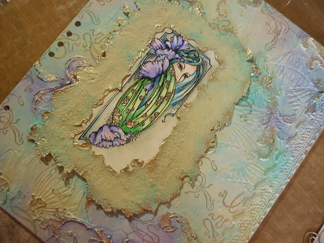
I decided to use the paste to make some embellishments and frames that I could then use on a book cover. When making these pieces I spread the paste onto some palette paper because this is non stick and could be put to one side while the paste is drying. Once dry run a palette knife under the edges of the paste to start to lift it off the paper – it will then peel off easily.


I spread the paste through two different flourish stencils. I didn’t try to get a smooth surface – I wanted texture and some depth. In fact when I removed the stencils I found that the paste was raised around the edges of the design adding texture. When dry slide a palette knife under the flourishes to remove them from the palette paper.


To create the Fibre Paste frames I drew an outline onto the palette paper that was slightly bigger than the stamp that I wanted to use. I used this as a guide when spreading the paste. I used a palette knife to spread the paste around the guide line to create a frame. This is fun because you can create and shape you want with as much texture as needed. After the paste had dried I removed it from the paper and painted it with Honeydew and a little Mermaid .


Here are some other ideas I had while playing with the paste. The top two pieces are fabric; on the right I just stamped into the paste to make a texture and on the left I used the end of a paintbrush to draw a design into the paste. The bottom two pieces are both on Grey Board and again I drew into them with a stylus this time. When the were dry I sanded the top to smooth it a little.


The book is made using two canvas covered boards as the covers. To start with I spread Grunge Paste as smoothly as I could through two different stencils. I wanted to create layers of texture on the covers. I stencilled Grunge Paste onto both of the covers. When this was dry I stuck some lace down the edges of both the covers.


I then stuck the FibrePaste flourishes onto the covers using a strong glue. When dry I painted everything with white Gesso .


To add some colour to the covers I painted small areas of different colour randomly onto the covers. While the paint was still wet  I blended the edges away from the main colour using a wet wipe and my fingers. I used Nougat, Honeydew, Mermaid and Wisteria. In between these colours I blended some Antarctic which seemed to ‘pull‘ all the colours together. I also used this colour around the edges of the covers. When adding the clours don’t forget to spread the paints over the lace.


I used some flourish stamps from EEB03 and EEB05 which I stamped around the edges using Mushroom Pigment Ink. I then rubbed White Fire Treasure Gold over the raised flourishes and around the edges of the cover. This is a picture of the back cover to show that I had not forgotten to decorate it as well!

EEB03

EEB05


The stamps that I had chosen when making the Fibre Paste frames where then stamped onto cream card and coloured with colours that toned with the background of the book covers. I rubbed the edges of the frames with more Treasure Gold and attached the stamped images behind the frames. I stuck the main image onto the front of the book using silicon (or similar) glue because the background is ‘lumpy’.


I painted the second frame with Wisteria and then rubbed Antarctic over it to catch the texture. Then I rubbed Treasure Gold around the edges before attaching the frame onto the stamped image. This picture was stuck on the inside front cover of the book, which I had lined with some patterned paper .


To finish the front cover of the book I die cut some ivy leaves and flourishes out of craft metal (I wanted the embellishments to be tough enough to be handled as this is not a decorative item). I painted the leaves with Honeydew and then washed some HeyPesto over this to get a variegated effect. Finally I rubbed Treasure Gold over the leaves and the flourishes. I painted two fabric flowers with Wisteria and Lavender and rubbed Treasure Gold over the paint and then attached the flowers, leaves and flourishes onto the front cover as shown.


This photo shows part of the top of the cover to show the layers of texture and the frame.


I made pages for the book using various materials. Some of the pages are heavy watercolour paper ready to be used. I also made a couple of large envelopes out of patterned paper. This picture shows a stamped and embossed piece of vellum and an embossed piece of acetate which I rubbed Staz On Ink over and then some Treasure Gold.


Finally I bound the book with all the pages inside it. I hope that you have enjoyed my adventure into book making! I really liked using the Fibre Paste and will go on experimenting with it. I’ll be back soon with more ideas.

What a fantastic experiment Liz, great to see the different contrasts using the two pastes. The fibre frames look like they have just literally been ripped from old paper adding so much depth to the centre focal image. The soft colour hues and Treasure Gold add the perfect finishing touches. Thank you for sharing your creativity with us.
We would love you to join in with challenge #15: Gels If you are inspired by any of our guests who blog with us over the fortnight, then please join in and link up your creativity HERE.

All links go in the draw to win a voucher to spend on products of your choice from the PaperArtsy online store. The Gels link will close 17:00 (London Time) Sunday, Aug 23rd winner will be announced 2 hours later at 19:00.

Sunday, 16 August 2015

2015 #15 Masterclass {By Leandra Franich}

Topic 15: Gels and Mediums


Hi Everyone, Leandra here.

Tonight I'm showing you an in-depth look at mediums and gels. I did a rough overview at the start of this topic, but there really is not a lot of specific nitty gritty info for crafters working with gels and mediums comparing brands. So I wanted to explain some of the products we stock, how they differ from each other by actually opening up the tubs to show you the consistency and texture, and I'll finish with an abstract journal background that I've gradually built up using lots and lots of layers of tinted glazes, and showing you how that came about via a series of pictures.

I could spend every day making backgrounds with texture, colour and layers. That is my go-to zone when I want to relax. It has always been this way since I first started crafting, and so I have been drawn toward texture products like gels, pastes, and mediums for many, many years. I hope you get hooked too. They are kind of addictive I find!

These conclusions and statements summarise how I prefer to work with them, as an experimental crafter, NOT as a fine artist. I have no fine artist training, I don't know the 'proper' rules... I just love exploring these products. You may have similar or different experiences to mine, and that is exactly how it should be... there is no right or wrong in mixed media...it's more about... 'what happens if...?'

To recap what have have been learning in this topic so far.... I have filmed some videos to show you in detail the gels and mediums that I work with regularly. You can find our gels and other products here in the online shop.

A medium is a pourable runny product that is designed to be added to paint to extend the colour, working time, or change the acrylic paint to make it more glossy or matte, 2-tone (interference mica) or perhaps alter it to be fabric friendly. Glazes, as top coats also fall into this category, as do tinted glazes for scumble effects, both dark and light on top of texture.


A gel is a thicker product (compared to a medium) it is translucent once dry, but milky when wet. It is primarily used to alter the viscosity of paint to make it thicker (eg a fluid acrylic can be made into a heavy body acrylic) or thinner (heavy body acrylic paint can be made into a much softer product). Gels have matte, semi -gloss and gloss finishes that can also alter the finish of your paint. So you can easily make a chalk paint glossy and thicker with a gel while not compromising the colour integrity. Gels also can be used to alter the translucency or a paint, for resist techniques, or used on their own as an adhesive for thin tissue through to awkward dimensional objects such as pebbles, buttons, and metal charms. Gels also can have inclusions - mica, chunky or fine beads, glitter. And don't forget about Clear Tar gel for making skins or goopy tinted drizzles. Normal gels also work for toner based image transfers too.


Here are some of the close up photos of samples shown in the video...

Dreamweaver Translucent Embossing Paste - applied very thick, stencil lifted creating suction, dropped to leave ridge at edges.

Golden Granular Gel. These are the larger of the 2 bead gels, They are plastic, and a dye spray on top highlights the texture nicely.

Still very hard to see, but at the top centre is the Glass Bead Gel (very fine small beads that reflect more light than the Granular Gel), and the lower centre is the Granular Gel.


Prima 3D Gloss Gel (admittedly I did not apply the gel as thick as I could have, but it does not have the strong structure I expected for a 3D Gel)

Prima Clear Crackle Paste - a Brucey bonus sample. Not shown in the video as this is weirdly called a 'paste' even though it is a clear product, and the consistency in the tub is odd... reminds me of curdled egg, certainly not a paste, more like a soft, sloppy, almost lumpy gel. But I really wanted you to see how fine the cracks are, much finer than I expected. There is no variety in the crack size in this sample. Very difficult to highlight the texture, as you need a runny product to sink into the cracks like a dye spray. But, very delicate, subtle and pretty.

My favourite.. the skin from paint and Golden's Clear Tar Gel. Here is how it dried after the second application of paint as demoed in the video. Very easy to peel off the embossing folder, and no release agent required.


This just shows you how flexible the skin is. It can even be stretched!

So now you need one of everything right?? They are just so much fun! Remember, pay the price you are comfortable with, and get the size that suits your style of crafting... but if you need archival/ UV resistant properties, then you will need to use Artist Grade products.

So lets finish with my journal pages...I had nothing in mind except that I knew I wanted to see how much depth I could build with glazes

Step One: The page had Golden Gesso and Grunge Paste randomly applied with a palette knife, I made sure to leave some parts of the pages directly exposed (my journal is a Finnabair one). Then Golden Glaze (Burnt Sienna and Violet Earth) were added and blended about. Heavy Body Gloss Gel was tinted with South Pacific Fresco, and applied through the 'Art Is' stencil. The deep blue dried with a glossy finish.

The facing page had some Prima Clear Crackle Paste applied generously, and was left to dry overnight. I was please to see more variation in cracks then I got in the stencilled sample above. French Roast was made into a glaze with PaperArtsy Gloss Glaze, and applied to the cracks to highlight them. Along with some South Pacific Glaze to the edges.

Step Two: I added the same glazes all over again, and you can start to see the depth build already. 


Step Three: Then I decided I needed more contrast at the top and bottom of the pages. So I added a Cheesecake Gloss Glaze at the foot, and kept building depth at the top with shades of orange glazes: Pumpkin Soup, Tango, Brown Shed, Autumn Fire, Blood Orange. This was then topped with Bora Bora mixed into a Gloss Gel and scraped over for patches of gloss and colour contrast.


Step Four: Now I decided it was too dark at the top, so I added some greens to soften it back.


Step Five: So when you build these glazed layers, you have to be a bit more careful about what colour you put where, and if you want to lighten, I did use a bit of Cheesecake (glaze) and then started to build on top again but the colour depth you get with the warm orange shades is wonderful and very easy to do.


Step Six: Then finally I added some Golden Iridescent Bronze (Top) and Cheesecake (Bottom) Clear Tar Gel drizzles, but I was still learning how to control it, in hindsight, I would now prefer drips coming down from the top of the page. But I think I am going to continue and add some French Roast Glaze around the drizzles, to get more shadowing around the texture. I'm still not finished with it. I want to doodle something and block out part of the background too! So its still a WIP. Just need to decide what I'm going to draw on top.

NB. Those last 2 pictures I took in different light the following day so the Orange colours look different to the previous ones, but IRL they are still the same as the earlier shots.

To be honest, I liked these backgrounds at all stages. There were penty of times when I could have stopped, but I wanted to deliberately push myself to keep going, just to see what happened. 

I love how, with a Fresco Paint and a gel or a medium you can easily morph it into a soft gloss, matte heavy body, shiny drippy gel, or fabric paint with the addition of the right product. Gels and Mediums open up a whole new world, and I hope you find time to explore all the doors that are now open to you. Just jump in the deep end! What's the worst that could happen???
We would love you to join in with challenge #15: Gels If you are inspired by any of our guests who blog with us over the fortnight, then please join in and link up your creativity HERE

All links go in the draw to win a voucher to spend on products of your choice from the PaperArtsy online store. The Gels link will close 17:00 (London Time) Sunday, Aug 23rd winner will be announced 2 hours later at 19:00.