Showing posts with label Eclectica³ Liz Borer. Show all posts

Friday, 22 June 2018

2018 #11 Enshrined: Captured Fairy with EEB { by Carol Fox}

2018 Topic 11: Enshrined


PaperArtsy HQ intro to the post / and the blogger... 

Hi everyone, it's Carol here from Welcome 2 My World with you today, and I'd like to share with you a sardine shrine. I adore the shape and size of sardine tins and to me they just scream to be altered.

I have altered mine to a fairy theme, well a bit fairyish !! this poor little thing has been caught in perpetual winter.The season clock is stuck on winter with her hopefully looking at it to see if it will ever move onto spring. All it needs is one more turn of the key and that clock will ping onto spring. But that is never going to happen. I hope you enjoy reading how I created my project.


I used a real mixture of products on this, from Fresco Paints, Grunge Paste and Infusions along with Elizabeth Borer's great stamps.


Before I did anything else I gave my tin a coat of Snowflake Fresco Finish paint, while this dried I dug around and found a few bits and pieces I thought might be useful to use.


I decided I wanted to layer tissue paper over my tin, so I brayered Fresco chalk paint in shades of Blue Lagoon, Double Denim and Magic Moss (all from FFSA3) onto my craft mat, gave it a good spritz with water to really wet and mix it and then picked up the colour with a piece of tissue (I used the piece that my Stamps had come wrapped in - PaperArtsy often ships products wrapped in tissue).


Once it was dry I tore a strip long enough to wrap my tin and stamped one of the Decorations from Stamp Set EEB01 onto it.

 Eclectica Elizabeth Borer Set 01 (EEB01)

I used Jet Black archival ink and holding the stamp in my hand and rotating it to get a really random look.


Using Multi medium as glue I tore the tissue up and covered the tin in it.


I had painted my wings and crown with the same paints I used on my tissue but I now decided to add grunge paste to my crown so I used stencil PS052 as it fitted onto the crown really well.
PaperArtsy Stencil 052 (PS052)

Next I applied the PaperArtsy Grunge Paste with a pallet knife. I repainted it when it was dry, adding some Gold and Little Black Dress Fresco Paint to my crown and my wings to distress them a little.
 

I made a little four seasons clock from an old watch face, some typed words and a metal spinner. Popped this in the corner with some white glass beads and then added my stamped image layering it up a little higher with some sticky fixers.


My roses were cheap little ones that you buy in bunches and I coloured them by adding a little bit of Infusions to water and then dipping them in. I had never done this with Infusions before, but I was pleased how they turned out. I found the colours Rusty Car, A bit Jaded and Sleight Blue worked well for my project. I coloured a few fabric petals in the same way.


I layered some Stamped and coloured ivy leaves (from the same Stamp set by Elizabeth Borer) around the outside of the tin as the edge looked a bit empty and I then added a couple more roses so they came down over the edge a little bit. This does nearly cover the little crowns I put on the bottom as feet, but never mind.


I have not made a project like this for a while as I now mainly Journal or do flatter things so it was lovely to do a 3D item again.  You can tell a story with your projects and really have fun with them. I did realise after I stuck them on, that crowns on a sardine tin as feet are not a good idea as the bottom is a bit to rounded and it does tip slightly and the weight of the key on one side is not helping, but it will stand which is the main thing, but you may have noticed I photographed it laying down just in case if fell over mid shot.
I really look forward to seeing your entries for the challenge as I found this a really fun topic and I hope you do too.

Carol

You can find me at the following places.

Facebook: Ginger's Altered Bits
Instagram: Carol Fox
Pinterest: Carol Fox


To join our challenge and win a NEW Zinski apron:
Simply make something arty relevant to the topic, and link your creation from any social URL (eg. Instagram, Pinterest, Blog Post etc) sharing your original make to this challenge page.

The current topic link Topic 11: Enshrined will close 17:00 (London Time) Sunday, July 1st 2018, and the winner will be announced 2 hours later at 19:00.


All links go in the draw to win a PaperArtsy creative apron. Please make sure we can contact you as a prize winner - it helps if you share your contact info from the platform you opt to use.

Good Luck! If you have any questions, don't hesitate to ask!

Wednesday, 15 November 2017

2017 #17 White: French Boudoir with Squiggly Ink {by Liz Borer}

2017 Topic 17: Shades of White


Liz has created one of her trademark projects for this post. Lots of wonderful details. If you want something to get your teeth into, this is a great idea and works so well in this colourway.

Hi there everyone I'm so glad to be back with another blog post for PaperArtsy. 

I've been very quiet recently due to many things happening in my life which include my daughter's wedding and moving house! Needless to say my craft stash is in great disarray due to the move so I had to use the stamps I could find. As for the embellishments, well again I had to use what I could find in the chaos.

Instead of my normal style of describing how I did this I am writing it as an inspirational piece as well as some description of what I did.This is mainly because I made the box I used into a kind of printers tray with apertures. I did this because I wanted wide, flat divisions between the apertures so I could decorate them. I used greyboard for this and white foam board behind the divisions to create the 'walls'. The added advantage to this was that I didn't have to paint them as they were already white!


I decided that I would need some colour in this project to make the white stand out. Therefore I painted the frame with London Night. Once dry I applied Crackle Glaze randomly and once dry I painted the whole frame with Chalk. This allowed a little variation in colour but kept the frame basically white.


Next I found a floral stencil and spread Grunge Paste through it onto the frame. Again it's white so I didn't have to paint over it. I rubbed a little Treasure Gold in White Fire over the raised areas. Frame finished!


The greyboard panel was painted with Lake Wanaka and then with Chalk. I then sanded the white off in places to get a subtle grey colour before using more Grunge Paste through a different stencil. I added more Treasure Gold as before. 


I stamped some script (from Stamp Set HP1303) using Watering Can Archival ink which I used for all the stamping as it blended with the colour scheme. I also created a very subtle effect stamping flowers from EEB03 and iridescent embossing powder.


The backgrounds for each aperture were cut from a piece of card that I had painted first with Chalk. After that was dry I applied Lake Wanaka, London Night and Mermaid paint randomly over the white base coat using a wet wipe and just swirling the colours over the card. To add some gold I mixed the Treasure Gold with alcohol ink blending solution to make a paint and rubbed this here and there over the card. Finally I swirled more Chalk paint with a wet wipe over the colours to lighten them.


So that's really all I wanted to say about the box and frame.

To complete the backgrounds of each aperture, I stamped and embossed with Ivory embossing powder various designs onto the card prepared above.


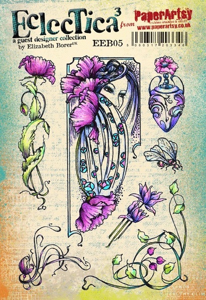
Top left and middle left  used EEB05. Middle behind lady I used HP1305. Top right I used HP1009 and Lower right behind bucket I used EEB03.
I left the others plain because they were covered by embellishments.

Before I started this project I had decided to decorate the frame as I have described but I hadn't really thought about how I would finish it. When I looked at the colours and the finish it reminded me of a French ladies boudoir which is why I have set out the embellishments as they are .

I made the bookcase out of greyboard and painted it with Chalk paint. The books are also greyboard painted white. The beauty of these paints is that they adhere to glass so I painted the bottles white.


The stamping on the books and bottles is from  the stamp from HP1216 which is mainly words.  A tiny fragment of this stamp looks great on these little pieces.


Most of the embellishments are painted with a base colour before adding white on top. In this picture the bucket was painted with Lake Wanaka and Crackle Glaze before the white. 

The poppy seed heads were painted with London Night before dry brushing with white. I added a little glitter embossing powder to them.
 

Frame: I stamped the face from EEB03 onto a scrap of the background paper and embossed with gold.

The gold 'jar' was a Christmas glass Bauble painted with White Fire Treasure Gold and while painting it I also painted the bottle gold. When that was dry I added Crackle Glaze with white paint over it. I liked the effect of the gold showing through the cracks.


Again I made the table from greyboard and a wooden knob, painted white. I stamped the little bottles as before using HP1216.

Obviously I have added other embellishments but I just wanted to comment on how I coloured Some of them.l hope you have enjoyed my ideas and perhaps they have inspired you. 

Bye for now.
Liz

Wow, what a stunner Liz! I love how the tiniest elements all come together perfectly. This is simply beautiful!! ~Leandra


We always hope that you  learn something interesting from our blog

Our creative team love to read your comments so much, so please take time to let them know you've been inspired!  

Why not join our 2-weekly challenge by blogging your create response to the current topic and link it here?

The current topic link Topic 17: White will close 17:00 (London Time) Sunday, 26th November 2017, and the winner will be announced 2 hours later at 19:00.

All links go in the draw to win a £50 voucher to spend on products of your choice from the PaperArtsy online store.

Saturday, 26 November 2016

2016 #22 Wild Flower Frame {by Caz Newton}

2016 Topic 22: Alcohol Inks and Pens


Hi Everyone! Caz here tonight with my project using alcohol inks in various forms and Elizabeth Borer stamps. I’d not done much with alcohol inks recently, so this was a good excuse to break out the pens, ink bottles, ink pads and various papers/cardstock and remind myself how these inks perform!

I was pleased to be asked to work with Liz’s stamps again after the last piece I did for the Paper Artsy blog – I do love how they lend themselves to lots of layers and I decided to do a piece with a Creative Frame wooden kit from Anna Marie Designs.


Step 1: Planning! I thought this time I’d work in a different way to normal and actually ‘plan’ what I wanted to make rather than just going with the flow, especially as I was going to need so many flowers for what I had in mind.
 So I chose stamp set EEB05 as my main source of images, some small flowers and corner image from EEB08, the words from EEB05 and the flower spray and bee from EEB04.

EEB04
I stamped loads of images on plain card to start with and cut them all out. After playing around with the placement for a while, I decided on this layout and took the photo so I wouldn’t forget!


Step 2: To help decide on the colour scheme, I laid down some swipes of colour on Ranger Alcohol Ink Cardstock with a blending tool. I then pounced on some bands of pearl mixitive, blending solution and then some isopropyl alcohol, just to check what effects I got and if it was what I wanted for the background.

 I loved the way the blending solution and isopropyl each worked slightly differently moving the colour around which I thought would be particularly useful for the sky. 


Step 3: So this decided the possible ink colours for my background. Using some very glossy paper which has “decoupage printing” on the packet – I have no idea where it came from but the alcohol inks seemed to behave well on it - I pounced the inks on blending the stripes as I worked up the paper: Clover and Limeade together blending into Patina and Limeade together, blending into Limeade then into the sky with Sail Boat Blue.

I added touches of Pearl Mixitive and blending solution to the sky, and then the cloudy effect was helped with drips of isopropyl alcohol being allowed to spread where they wanted.


Step 4: On to the frame images - I stamped the focal image from EEB05 with archival ink on plain card and also the small flowers and corner image from EEB08. I coloured these with a mixture of Promarkers and alcohol inks.
The poppies were done with Poppy and Maroon Promarkers and then I blended them with alcohol inks – Flamingo, Mountain Rose and Valencia - and helped the colours to blend with some blending solution...all this done with the window open! I love how using the pens and inks worked but you definitely need plenty of fresh air!

I used a selection of Cool Greys for the hair and used silver Promarker for the border. I then used Promarkers for the smaller frame flowers in China Blue, Cornflower and Pastel Blue. Finally the corner flower spray was done with the same reds as before, and I used Clover and Limeade alcohol inks for the leaves.

EEB05

Step 5: Now, as I was happy with the colours I was using, I moved on to the flowers for within the frame. I wanted to achieve depth without using layers this time so I decided to use Whiteout Clearly for Art so I could heat and bend it. I worked out how big an area I needed for each colour by using the original flower templates that I’d made.

The poppies this time were Flamingo and Watermelon alcohol inks with a little dash of Pearl and then some Raisin towards the bottom and Clover and Patina mixed for the leaves area with some drops of blending solution to add interest.

The lilies were Valencia and Sunshine Yellow mixed and I dragged Clover down for the stem area. I also made a patch of Silver and Pearl Mixitive for the urns. So here’s the Clearly for Art ready for the images to be stamped with black Stazon ink. (memo to self...using cheap felt to make replacement pads for the tools is not always a good idea as it leaves fibres everywhere!)


Step 6: Once I’d completed all the fussy cutting of all the flowers and leaves, I then gave all the pieces some ‘movement’ using the heat tool and a wooden prodder to bend them over. I love using Clearly for Art as it gives so much scope to make things like flowers and leaves more interesting.


Step 7: I made the frame covering by using Silver and Pearl mixitive again pounced on the same ‘decoupage paper’ as the background....this time I dripped some of the isopropyl alcohol on the blending tool afterwards and made swirling shapes into the silver to give it a different texture.


Step 8: The final elements of the bees and the band of flowers along the bottom were made with some clear Clearly for Art – I decided I wanted a more delicate flower than using the Whiteout and also the bees wings needed to be on clear. This stage took a little bit of head scratching – until I had a light-bulb moment and added some Snowcap to the Valencia and Sunshine Yellow to make them opaque and show up better on the surface!! Sometimes the obvious takes a little while to work out!! J

Step 9: Lastly, the sentiment was stamped with black Stazon ink onto plain card, cut out and edged with Maroon Promarker, and the sprays of flowers for the sides (EEB05) were stamped on the same card and coloured using the same ink colours as the poppies 


So here is everything ready to be put together:


Step 10: Everything was put together according to my trusty photo of the prototype......apart from some people may notice the final piece has flowers along the bottom not the top of the piece as I decided to have more of the sky showing and extra bees. I also changed the words to be cut out as a block as I felt it looked better with all the flowers around it. I’ve used Cosmic Shimmer glue for flat sticking and Pinflair Glue Gel for the layering. Some fluffy garden string added for a hanger and it was time to step back from the piece and stop fussing with it!


I really enjoyed this project as alcohol inks are not one of my normal ‘go to’ things and it was good to try them out again on different surfaces and remind myself how they reacted and the interesting effects that can be achieved. I’d not tried colouring using the Promarker/Alcohol Ink combination before and that is something I can see myself using again soon as I found this way of blending colours a lot easier. I’d also not used the Isopropyl alcohol before (donated from hubby’s shed – I didn’t ask what he usually uses it for!!). It was interesting to see how it ‘moved the ink’ around compared to the Blending Solution – Isopropyl seems to leave a more pronounced colour edge to where it spreads. 

Lots of ideas now for future projects and I hope you will have a play with alcohol inks now too
Happy Creating
Caz

Blog: Candelle Creations 

Wow Caz, so much fussy cutting, you are a star for doing all that. Definitely worth it though as the end result is stunning, all those resulting layers really pack a punch when it comes to the wow factor. Beautiful colouring, and curling the flowers and leaves works brilliantly. ~Darcy


All of our bloggers love to see your twist on their ideas, particularly if you were inspired directly by their post; so please spare a moment to comment or make your own creative item. They all love to see your feedback and what you can do more than you realise!

We would love to see how you interpret this Alcohol Ink and Pens topic by linking what you make to our 2016 Challenge #22: Alcohol Ink and Pens on this page HERE. The Alcohol Ink and Pens link will close 17:00 (London Time) Sunday, Nov 27th 2016. The winner will be announced 2 hours later at 19:00.

All links go in the draw to win a £50 voucher to spend on products of your choice from the PaperArtsy online store.

Saturday, 24 September 2016

2016 #18 Autumn Plaque {by Liz Borer}


2016 Topic 18: Autumn Leaves


Hi there , Liz here with a project looking at the topic of Leaves and Autumn colours. At this time of year the colours of nature are glorious and vivid and I hope that I have managed to capture this in a small way in this project .


I started with an MDF plaque that I had and painted it with Little Black Dress. Then I started adding colour for the background. I dribbled blobs of colour onto the plaque and spread them using an old credit card .

I started with Haystack and Granny Smith because they are opaque and then added Smoked Paprika.I used Bora Bora next because I wanted a little contrast with the autumnal colours and then used French Roast .


The last colour was Green Olives. I went back and added some more of the colours until I was happy with the effect .

I then added to the background using stencil ELB002 . This stencil is a collection of lovely leaves and I used the vine like part to ' grow ' a vine over the base . I used Green Olives with a bit of Granny Smith mixed in it to lighten it first and then Granny Smith alone .
To add to the background I stamped the long grasses from ELB30 using a mix of Haystack and a touch of green paint .

ELB30

I then took a torn piece of corrugated card to create the centre panel and tore some of the flat paper off it to create texture. I painted it black and when dry I added Crackle Medium randomly.
Once dry I painted Vanilla over the whole piece.


I stamped the leaves from ELB29 and words from ELB30 randomly and then washed Blood Orange and Smoked Paprika over the card . Finally I rubbed White Fire Treasure Gold around the edges . By using a pale colour on this panel I have created a contrast between with the background so that it stands out .

ELB29

The panel can then be adhered to the base and in this picture you can see the stamped grasses . I rubbed some more Treasure Gold around the edges . I also distressed the edges of the plaque with Inky Pool to add depth to the design .


I used some patterned paper in autumnal colours and stamped the large leaves from the two stamp sets to create coloured leaves and then cut them out .


I then stamped the flowers from EEB 08 onto some yellow paper and rubbed Smoked Paprika and Blood Orange onto the paper with cut and dry foam to colour the flowers to tone in with the other colours . I cut the flowers out and cut off some of the petals from some of the flowers so that I could build them into dimensional pieces by curling the petals and sticking them together with dimensional glue .

EEB 08 
 .
I found some artificial berries which I painted with colours from the palette and rubbed with gold . Once all the paint was dry I adhered the leaves to the plaque ( using dimensional glue so that some of them were lifted off the surface) . I also added the flowers and berries .
I found the quote about Autumn and printed it onto printable canvas . I then washed colours from the palette onto the canvas and rubbed some gold around the edges before mounting it onto black card . This was then adhered to the plaque .


I don't often use these colours although I love them and I enjoyed working with Lin Browns lovely new stamps . I hope that you like this and it has given you some ideas . I'll be back soon with more ideas . Happy Autumn!
Liz. 
Blog

Thanks Liz, this is wonderful, such rich ,warm colours. The mashup of yours and lin's stamps works so well. The corrugated card and berries adds some great texture, that sits perfectly on that fabulously layered background. ~Darcy

We would love to see how you interpret this Autumn Leaves topic by linking what you make to our 2016 Challenge #18: Autumn Leaves, on this page HERE.
All of our bloggers love to see your twist on their ideas,  particularly if you were inspired directly by their post. 
All links go in the draw to win a £50 voucher to spend on products of your choice from the PaperArtsy online store. The Autumn Leaves link will close 17:00 (London Time) Sunday, Oct 2nd 2016. The winner will be announced 2  hours later at 19:00.