Showing posts with label Prima Marketing. Show all posts

Sunday, 16 August 2015

2015 #15 Masterclass {By Leandra Franich}

Topic 15: Gels and Mediums


Hi Everyone, Leandra here.

Tonight I'm showing you an in-depth look at mediums and gels. I did a rough overview at the start of this topic, but there really is not a lot of specific nitty gritty info for crafters working with gels and mediums comparing brands. So I wanted to explain some of the products we stock, how they differ from each other by actually opening up the tubs to show you the consistency and texture, and I'll finish with an abstract journal background that I've gradually built up using lots and lots of layers of tinted glazes, and showing you how that came about via a series of pictures.

I could spend every day making backgrounds with texture, colour and layers. That is my go-to zone when I want to relax. It has always been this way since I first started crafting, and so I have been drawn toward texture products like gels, pastes, and mediums for many, many years. I hope you get hooked too. They are kind of addictive I find!

These conclusions and statements summarise how I prefer to work with them, as an experimental crafter, NOT as a fine artist. I have no fine artist training, I don't know the 'proper' rules... I just love exploring these products. You may have similar or different experiences to mine, and that is exactly how it should be... there is no right or wrong in mixed media...it's more about... 'what happens if...?'

To recap what have have been learning in this topic so far.... I have filmed some videos to show you in detail the gels and mediums that I work with regularly. You can find our gels and other products here in the online shop.

A medium is a pourable runny product that is designed to be added to paint to extend the colour, working time, or change the acrylic paint to make it more glossy or matte, 2-tone (interference mica) or perhaps alter it to be fabric friendly. Glazes, as top coats also fall into this category, as do tinted glazes for scumble effects, both dark and light on top of texture.


A gel is a thicker product (compared to a medium) it is translucent once dry, but milky when wet. It is primarily used to alter the viscosity of paint to make it thicker (eg a fluid acrylic can be made into a heavy body acrylic) or thinner (heavy body acrylic paint can be made into a much softer product). Gels have matte, semi -gloss and gloss finishes that can also alter the finish of your paint. So you can easily make a chalk paint glossy and thicker with a gel while not compromising the colour integrity. Gels also can be used to alter the translucency or a paint, for resist techniques, or used on their own as an adhesive for thin tissue through to awkward dimensional objects such as pebbles, buttons, and metal charms. Gels also can have inclusions - mica, chunky or fine beads, glitter. And don't forget about Clear Tar gel for making skins or goopy tinted drizzles. Normal gels also work for toner based image transfers too.


Here are some of the close up photos of samples shown in the video...

Dreamweaver Translucent Embossing Paste - applied very thick, stencil lifted creating suction, dropped to leave ridge at edges.

Golden Granular Gel. These are the larger of the 2 bead gels, They are plastic, and a dye spray on top highlights the texture nicely.

Still very hard to see, but at the top centre is the Glass Bead Gel (very fine small beads that reflect more light than the Granular Gel), and the lower centre is the Granular Gel.


Prima 3D Gloss Gel (admittedly I did not apply the gel as thick as I could have, but it does not have the strong structure I expected for a 3D Gel)

Prima Clear Crackle Paste - a Brucey bonus sample. Not shown in the video as this is weirdly called a 'paste' even though it is a clear product, and the consistency in the tub is odd... reminds me of curdled egg, certainly not a paste, more like a soft, sloppy, almost lumpy gel. But I really wanted you to see how fine the cracks are, much finer than I expected. There is no variety in the crack size in this sample. Very difficult to highlight the texture, as you need a runny product to sink into the cracks like a dye spray. But, very delicate, subtle and pretty.

My favourite.. the skin from paint and Golden's Clear Tar Gel. Here is how it dried after the second application of paint as demoed in the video. Very easy to peel off the embossing folder, and no release agent required.


This just shows you how flexible the skin is. It can even be stretched!

So now you need one of everything right?? They are just so much fun! Remember, pay the price you are comfortable with, and get the size that suits your style of crafting... but if you need archival/ UV resistant properties, then you will need to use Artist Grade products.

So lets finish with my journal pages...I had nothing in mind except that I knew I wanted to see how much depth I could build with glazes

Step One: The page had Golden Gesso and Grunge Paste randomly applied with a palette knife, I made sure to leave some parts of the pages directly exposed (my journal is a Finnabair one). Then Golden Glaze (Burnt Sienna and Violet Earth) were added and blended about. Heavy Body Gloss Gel was tinted with South Pacific Fresco, and applied through the 'Art Is' stencil. The deep blue dried with a glossy finish.

The facing page had some Prima Clear Crackle Paste applied generously, and was left to dry overnight. I was please to see more variation in cracks then I got in the stencilled sample above. French Roast was made into a glaze with PaperArtsy Gloss Glaze, and applied to the cracks to highlight them. Along with some South Pacific Glaze to the edges.

Step Two: I added the same glazes all over again, and you can start to see the depth build already. 


Step Three: Then I decided I needed more contrast at the top and bottom of the pages. So I added a Cheesecake Gloss Glaze at the foot, and kept building depth at the top with shades of orange glazes: Pumpkin Soup, Tango, Brown Shed, Autumn Fire, Blood Orange. This was then topped with Bora Bora mixed into a Gloss Gel and scraped over for patches of gloss and colour contrast.


Step Four: Now I decided it was too dark at the top, so I added some greens to soften it back.


Step Five: So when you build these glazed layers, you have to be a bit more careful about what colour you put where, and if you want to lighten, I did use a bit of Cheesecake (glaze) and then started to build on top again but the colour depth you get with the warm orange shades is wonderful and very easy to do.


Step Six: Then finally I added some Golden Iridescent Bronze (Top) and Cheesecake (Bottom) Clear Tar Gel drizzles, but I was still learning how to control it, in hindsight, I would now prefer drips coming down from the top of the page. But I think I am going to continue and add some French Roast Glaze around the drizzles, to get more shadowing around the texture. I'm still not finished with it. I want to doodle something and block out part of the background too! So its still a WIP. Just need to decide what I'm going to draw on top.

NB. Those last 2 pictures I took in different light the following day so the Orange colours look different to the previous ones, but IRL they are still the same as the earlier shots.

To be honest, I liked these backgrounds at all stages. There were penty of times when I could have stopped, but I wanted to deliberately push myself to keep going, just to see what happened. 

I love how, with a Fresco Paint and a gel or a medium you can easily morph it into a soft gloss, matte heavy body, shiny drippy gel, or fabric paint with the addition of the right product. Gels and Mediums open up a whole new world, and I hope you find time to explore all the doors that are now open to you. Just jump in the deep end! What's the worst that could happen???
We would love you to join in with challenge #15: Gels If you are inspired by any of our guests who blog with us over the fortnight, then please join in and link up your creativity HERE

All links go in the draw to win a voucher to spend on products of your choice from the PaperArtsy online store. The Gels link will close 17:00 (London Time) Sunday, Aug 23rd winner will be announced 2 hours later at 19:00.

Wednesday, 14 January 2015

2015 #1 Her Light Extends {by Alison Bomber}

2015 Theme 1: Fragile Papers

Hi everyone, Alison here from Words and Pictures, joining you this evening with a post on the theme of fragile papers. I use tissue paper and book pages a lot in my crafting, so this was right up my street.  I thought of doing some tissue-paper stamping to add to texture, like my December journalling page, but then I got a sneak peek at the new Lynne Perella stamps - wow! - and plans changed.  It had to be stained glass with candlelight shining through... 


I started by hacking a book to pieces.  It's okay, it's a fairly pulpy hardback bought at a charity shop, so I feel fine about it.  I measured the size of the stamp I was using and used a sharp craft knife to cut an aperture in the front cover to fit.  And then began the slow but necessary task of slicing out the internal pages to create my candle nook.


I stamped my stained glass window lady onto some of the Waxed Tissue in White using Jet Black Archival ink and heat set it.  She's from one of the new Lynne Perella plates which will be coming your way in February.


At this stage, I could actually quite happily have stopped - there's something very appealing to me about the monastic simplicity of this - the stamp alone is so beautiful - or even of the candle nook without the "glass" in place at all, but that's for another day!!


I used Inktense pencils to colour her as I wanted a strong hit of colour to try to capture that intensity of tinted glass.  You can really make the most of the fine detail of a stamp like this, and with the water stage you can also get some really subtle shading.


For the cover, I wanted the light to emanate out from the window, so once I'd selected, arranged and glued my metallic pieces - mainly Finnabair Mechanicals with a few extras thrown in - I started by covering the whole lot with white gesso, and then drew some black gesso in from the outer edges before starting to add colour with translucent Fresco Paints. The first stage was Limelight coming out from the centre, and next I brought Inky Pool in from the outside edges.


I then continued to layer in colours - pale from the inside, darker from the outside - highlighting and shading with the Limelight and Inky Pool plus Zesty Zing, Beach Hut and South Pacific.


And once that was working for me, I added further highlights to catch the light using Treasure Gold in White Gold and Aquamarine.  I used the Treasure Gold on the page edges too, to create the look of aged, gilded book pages.


The words in the Ornate Plate form the other main inspiration behind the whole piece, along with the Lynne Perella stamp.  Illa lucem extendebat is Latin for "her light extends", and the phrase has been beautifully set to music by Helen Chadwick (the composer not the artist).  I was singing it in my head throughout the process.


Obviously, this would be a lot safer if you used a battery tealight - I shan't be leaving this one burning without being in close attendance!  You could try the simple b&w version if you don't fancy the colouring; or if you don't want to do the book carving you could simply cut an aperture in a tag and create your tissue paper window that way.  In any case, I hope you'll be inspired to play with tissue-paper-stamping and light, and with the graduating light to shade of the paintwork.  Thanks so much for stopping by today - it's always fantastic to hear what you think.  See you again soon!  Alison xx

Oh Alison, what a wonderful way to use this stamp as a lit-up niche! And you have blended the Fresco paints so marvellously well for your Finnabair inspired cover. I much prefer to use paints this way on the layered bellies, you have so much more control than a spray, and the specific and controlled use of Treasure Gold to carefully to highlight the texture of the embellishments is the PERFECT way to accent. you have done a truly beautiful piece here, thank-you so much!

We would love you to join in with challenge #1: Fragile Papers. If you are inspired by any of our guests who have blogged on this topic over this fortnight, then please join in and link up your creativity HERE

All links go in the draw to win a voucher to spend on products of your choice from the PaperArtsy online store. This link will close 17:00 (London Time) Sunday, Jan 18th 2015, winner will be announced 2 hours later at 19:00.

Sunday, 11 January 2015

2015 #1 Box Canvas {by Leandra}

2015 Topic 1: Fragile Papers

Hi everyone Leandra here, 

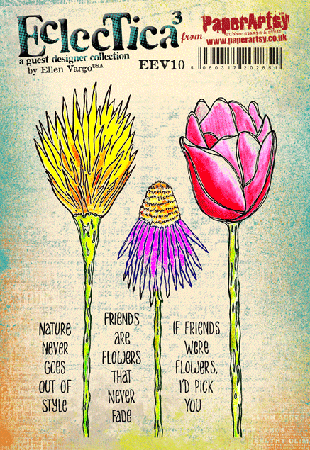
Tonight I've got videos and lots of pictures for you! I'm brayering left right and centre to show you Part 3 of the brayering series (lots of colours and lots of stamps this time), and then using the results and my Fragile Papers to make a gorgeous feature flower with the adorable Ellen Vargo Eclectica stamps.

If you want to see more ideas using the brayer, and Ellen's stamps, then please go and check out Ellen's blog, she really is the brayering guru! She uses bold bright colours with her wonderful stamps to great effect! Stunning backgrounds which end up quite different to my more soft pastel versions, yet using similar techniques.


Step One: 
As you probably realise already, if you've followed my brayering video series (video 1 here, video 2 here), brayering colour is such a quick, un-messy way to alter card, paper, even fabric. I'm not much of a purple girl, but I do love an ochre/ eggplant combination, and that is the gist of what I had in mind to do.

So first up we need to brayer shades of ochre colour onto our book page. I try to create depths of the same or similar tones with Toffee, Vanilla, Haystack, Caramel and Pumpkin Soup. Then stuck it onto a 4x6" Box Canvas with Ranger Multi Medium (Matte)

NB. A video showing how to make this ochre BG, is at the foot of this post.


Step Two: 
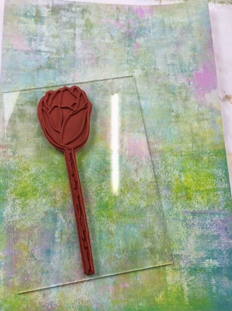
Well, its not like me to plan things to this extent, but the ideas were whizzing in my head too fast, and I just needed to commit to one of them. I grabbed some Prima Bellies, EEV10 flower stamp, and some charms. Then feeling a bit scatterbrained, I had the good sense to take a photo and thus committed to a plan.


....and then quickly, before I could change my mind, slapped Pansy (fantastic high coverage opaque) onto the bellies.


.... and then added the obligitory Bora Bora by dry-brushing to add interest and depth. Not one to drybrush once, I also dry-brushed Eggplant, Squid Ink, Mermaid and Snowflake

It is certainly true that the more layers you add, the happier you will be. More is more when it comes to dry-brushing! Of course, it won't end here, the finishing touch will eventually be Treasure Gold...but which one?? You'll find that out later...


...and then a quick check that the purple tones are looking good next to the ochre tones...


Step Three: 
Onto Ellen's lovely flower stamp set.
First up I grabbed the background I made in Video 2...see there was a masterplan all coming together in this blog post!


...and then stamped it in Archival Coffee Ink, a bit softer than Jet Black, nice with the Ochre too. Cut it out; this forms a nice base for what is to follow. I added some depth of green to the stalk with Hey Pesto and a tad of South Pacific.


...and slotted the flower into place on the canvas.


Step Four: 
As I said at the start, brayered and layers of the stamped Waxed Tissue Paper is the focal point of the flower head. 


Check out the video below to see how the paint was layered on the tissue with the brayer, and then I used a variety of stamps: EEV02 (scratchy), EEV06 (Spots), ELB04 (bold solid flowers), HP1304EZ (large script), in numerous Fresco Chalk Acrylic Colours to build up a striking and very easy to achieve, fragile paper.


Step Five: 
Now the background is made, I'm going to stamp it 6 times to make a layered flower head for the canvas, with Coffee Archival Ink. Heat set quickly, sometimes ink bleeds on tissue if you leave it for a bit. 


... like this..


...and then cut them something like this so the layers expose those sitting behind.


Step Six: 
Now it's just a matter of layering the tissue carefully with a touch of glossy accents as a fast glue, and tiny foam pads to add dimension. And always finish things off with a tickle to the embellishments of Brass Treasure Gold.


Here's a video showing the ochre background being made (back in Step One), and the tissue layers, plus a few finishing touches to the project with Fancolour Water Soluble Pens (the student version of Fibralo Pens)


And finally ... here it all comes together.


I hope you have been enjoying the fragile papers, and the new look to the blog? More fragile Papers projects keep on coming this week, I hope you can find some time to have a play yourself, and show us what you can do with Fragile Papers.

Leandra

We would love you to join in with challenge #1: Fragile Papers. If you are inspired by any of our guests who have blogged on this topic over this fortnight, then please join in and link up your creativity HERE

All links go in the draw to win a £50 voucher to spend on products of your choice from the PaperArtsy online store. This link will close 17:00 (London Time) Sunday, Jan 18th 2015, winner will be announced 2 hours later at 19:00.

Friday, 28 November 2014

Folio of Treasures {with Lynne Perrella Stamps by Lin Shields}

Good evening everyone Lin Shields here. I was more than a bit surprised when I received an invite from Darcy to appear on the blog tonight. Once I had accepted panic set in! I have loved all sorts of arts and crafts from a child. I’m not sure I have a favourite; I love to play around with all kinds of media from paints to inks, markers, fabric and so on. I usually have an idea on what I want to do when I start a project but then go completely off track and it ends up nothing like I intended. My inspiration comes from all different sources, my crafty friends, blog land you tube, magazines…all sorts.

Tonight I decided to decorate a small Idea-ology folio using a couple of my favourite Lynne Perrella stamps and some crunchy wax paper.


It started off like this…


I painted it inside and out with Little Black Dress, then covered the front and back in crumpled up tissue paper. When it was dry I took some cut and dry and started adding layers of colour using fresco finish paints in Chocolate Pudding, Cinnamon, toffee, French Roast, Marlin ,Pumpkin Soup and Hey Pesto. When it was dry I added Copper and Sapphire treasure gold and Fern Green Archival Ink.


I covered the inside of the folio using the prima script paper. On the left I used the Prima paper to create slots. On the right I set about making some pockets to go inside to hold tags atc’s altered playing cards or anything you like really. I folded some kraft paper, concertina style to form the sides then I embossed some Crunchy Wax Paper to put on the front of the pockets. I lightly brushed the front of them with some sapphire treasure gold and fern green archival ink. I used LPC006 stamped onto crunchy wax paper to add interest to the left side. 


 LPC006
{PaperArtsy Tip. This Script paper gives a wonderful background effect, however you could also achieve this by painting heavy smoothy with Little Black Dress and then stamping script using Snowflake or Chalk Fresco paint. Ideal script stamps would be HP1006, HP1304, ESN05 or ESN11}


As you can see you can fit in any size tag so it’s a handy little thing to keep all your little treasures in.


Back to the front I stamped the main image from LP026 onto Chatsworth Paper and heat embossed in black. I then cut her out and collaged the pen onto the image. I used some embellishments from my stash to make up the cover. Adding the final touches with copper treasure gold

LP026 

I thoroughly enjoyed this project once I got into it and love all the little pockets. I am really pleased with the way it turned out.
Lin. 

A huge thanks to Lin from all at PaperArtsy, so lovely to see another of our #PAtwits here. This folder is gorgeous, pockets are so much fun to create and tuck treasures into. You've made such scrummy texture on the outside and filled with arty treasure on the inside. The perfect place to keep all your challenge tags or ATCs. 

We would love you to join in with our monthly challenge. If you are inspired by any of this month's guests who have blogged between Nov 1st 2014 and Nov 30th 2014 then join in and link up your creativity HERE. You will go in the draw to win a voucher to spend on products of your choice from the PaperArtsy online store. You need to add your link by 19:00 (London time) Nov 30th 2014