Showing posts with label PS218. Show all posts

Saturday, 11 December 2021

2021 Topic 15: Journaling Gratitude with EEG {by Autumn Clark}
 2021 Topic 15: Journaling Gratitude


Do blank pages scare you? Afraid to make mistakes? Autumn has the perfect solution to inspire us to start creating using the junk around us. Check out her creative use of hands and twine on one of the pages too!
~ Keren

Hi everyone, it's Autumn Clark from SewPaperPaint with you today, and I'm here to share with you a fun & messy handmade journal project that you can make from recycled packaging. The beauty of this type of project is that you can really let yourself loose and play because if you mess up, you've only wasted what was already garbage. But often working with "junk" releases a creative freedom and the results are far greater than we could have imagined...

I have wanted to paint every single page of a journal for some time now, because that blank page feeling can be overwhelming. I thought why not have a gel print session onto journal pages themselves? But as you know, everything is harder to find and more expensive these days so rather than purchase a new journal, I made one from thick white corrugated cardboard that came in linens packages. As a bonus, I got this pile of cardboard I'd been hoarding out of my way, saving space in my small studio.


I always have the most fun choosing a color palette. For this journal I wanted to use earth tones because I knew I wanted to grunge everything up. I chose a gorgeous array of PaperArtsy Fresco Chalk Acrylics to include: Toad Hall, Space Cadet, Brown Shed, Toffee, Caramel, Jade, Midnight, Sage and Heavy Cream. I went about gel printing the front and back of each piece of cardboard. They measured about 8x5.5" so I used an 8x10 gel plate and was able to print two pieces per painted plate.


Now, the prints didn't cover every bit of the white cardboard because it was uneven in texture.  When I didn't like how it looked, I just printed it again. In the end I decided that I had too much white along the edges, so I decided to dip each page's edges into PaperArtsy Infusions. I used The Sage for the blue/green pages and Golden Sands for the red/brown pages. I spritzed the painted area with water to let the Infusions bleed out so I wouldn't have hard lines. I always use the backs of my 11x17" paper pads for a drying surface when doing batches like this. Here's a peek at the entire book. I've bound the pages with rings for now for ease, but will do a nicer binding after the pages are finished. See how those Infusions add the grunge factor?!


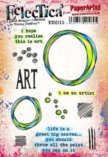
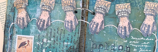
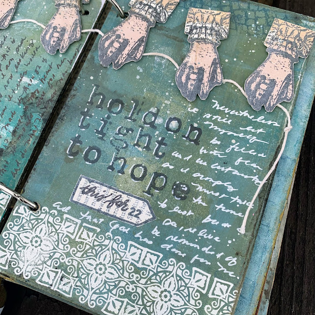
For this spread, I found gel printed paper I made for THIS Lynne Perrella post using PaperArtsy Fresco Chalk Acrylics in Blush and Caramel on which to stamp the hands from PaperArtsy Eclectica³ {Emma Godfrey} Collection (EEG26). I cut them and mounted them holding a length of string.  Beneath I stamped the bricks in blue. Below I embossed the tile repeatedly in white.


Back when these Emma Godfrey stamps were released I shared THIS post detailing how I cut the sign stamp apart. I also explain the tissue stamping techniques used below in greater detail. I stamped the modified sign onto gessoed book page to make my own sign for this spread. It's ironic that the stamp had the number 22 in it and I was writing to encourage myself in the coming year, 2022. I stamped my focal sentiment with  PaperArtsy {Ink & the Dog} Collection (Words Plate 2). I added journaling in my messy script using a white paint pen and a black fountain pen.


For my next spread, I had some awkward streaks in the paint from printing, so I used some torn book pages I had used to mop up stenciling when printing to cover those areas. I used a baby wipe to apply more PaperArtsy Fresco Chalk Acrylic in Heavy Cream through the same stencil at the top of the page for continuity. PaperArtsy Eclectica³ {Sara Naumann} Stencil (PS092) is one of my most used stencils!


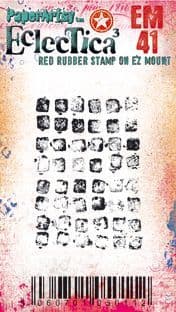
I used the abovementioned tissue technique for the door stamp from PaperArtsy Eclectica³ {Emma Godfrey} Collection (EEG25). I filled in with the tile stamp and pattern from PaperArtsy Eclectica³ {Seth Apter} Mini Stamp (EM41), along with more journaling.


Throughout these pages I incorporated some of my postage stamp collection in the collages. On this spread I attached an old glassine envelope, which flips up to store a tea stained paper with more journaling to continue the theme of using leftover bits from previous projects. I tea stained a pile of paper for my journal in THIS post. Part of my journaling gratitude is recording how events have transpired and led me to something beautiful, though at the time I was confused or afraid of what was happening. What better way to do that than by using pieces from my past?
 

I have lots more room in this journal on which to play! But for today's final spread, I used the window stamp from PaperArtsy Eclectica³ {Emma Godfrey} Collection (EEG26). Oh I love this window! The white tiles were embossed onto tissue. Yes! You can stamp and emboss on tissue. The main reason to take this extra step is so that a large image doesn't stamp improperly onto an uneven surface OR because you want to add color to the image with Fresco paint (painted on the back side).


I just had to incorporate one more stamp set, PaperArtsy {Ink & the Dog} Collection (At Home 2). I love how this sentiment works with the windows and doors from Emma Godfrey's sets! I used it with tissue behind my envelope pocket and then embossed it, adding some embossed handwriting with an embossing pen to completely change the saying. I used the postage collage stamp in the corners of this spread for texture.  For even more texture, I applied Grunge Paste through PaperArtsy  Eclectica³ {Sara Naumann} Stencil (PS218).


The tag was made with mop up paper from using The Sage Infusions. I used it as a large journaling space. I covered the back with tea bags so it feels luxurious when pulled out. These torn envelopes were saved for me by my coworkers, as well as some of the white cardboard book pages. Those little details fill my heart with joy in remembrance. And that's just what a journal should be, a place to reflect on moments and feelings in this busy life.


So what's calling you to reflection these days? Please, let me encourage you to get it out on paper!  It's funny how sometimes we ponder the day to day and find new ways of seeing things that maybe we missed while we were busy living it. When we force ourselves (through a gratitude journal perhaps?) to ask what good things are happening, we are often surprised that the list grows as we start writing. I started this project in hopes of getting one good journal page off of my chest and onto paper and ended up with three spreads! And each one reminded me of another thing I am thankful for that I could add to the next page! 

Regular journaling will help you define your artistic style. Your  journal will probably look nothing like mine, because you will hone in on your own likes and dislikes and refine yourself creatively as you go. I truly hope you are encouraged from the posts of this topic to get started.
xx  Autumn

Blog: SewPaperPaint
Facebook: Autumn Clark
YouTube: SewPaperPaint
Instagram: @SewPaperPaint
Pinterest: SewPaperPaint

Saturday, 12 June 2021

2021 Topic 7: Stamp Mash Up JOFY, EEG, ESN, I&D minis {by Ellie Knol}

2021 Topic 7: Stamp Mash Up


With some intriguing watercolour techniques using a glass, and real standout texture thanks to texture paste, this is a bold art journal cover. It's easy to pigeonhole watercolours as not having as much impact as other paints, but as Ellie cleverly upped the levels of white on the page, the subdued colours still take centre stage.
~ Keren

Hi everyone, it's  Ellie Knol with you today, and I'm here to share with you the making of a cover for an art journal, of course with product from four designers! I chose to use at least one stamp set from each and also a stencil. 

In order to mash up stamps and stencils from four designers, I chose to use most of them in the background, and only one for the focal point; the easy way I suppose.


I started creating a colorful background; it's basically watercolor added around three glasses onto watercolor paper. This way creates circles onto the background. The water will carry the color pigment around the edge of the glasses. After it had dried I chose to wet the white areas and let the color run into it a little. This is a technique I learned from a live from Ilse Hoekstra.


I LOVE how this creates color blooms, and also color mixing on the paper. By adding more, or less, water it will create beautiful unsuspected backgrounds, with basically room for three focal points.Having a colorful background as the start of a project gives a lot of possibilities, as it's not a blank page anymore; which can sometimes be a bit scary.


Using stencils in the background will add a useful layer. Choosing white is always a good choice, as far as I am concerned, because it will add a basic layer to which you can still add anything. Choosing structure paste adds so much interest.

 
The PaperArtsy stencil PS218 designed by Sara Naumann has been used as the main stencil. I applied structure paste through it, except for the bottom left section. 


I also added structure paste through parts of PaperArtsy stencil PS140 designed by Jo Firth-Young to fill the background even more.


While the structure paste was still wet I stamped into the structure paste of both the above stencils with the circles from EM60. LOVE this mini by Tracy Scott.. 


Next stencil I added structure paste through is the PaperArtsy stencil PS015 designed by Emma Godfrey.... 


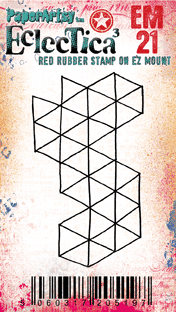
... and, yes, you might have guessed it, I stamped into it while wet also, with the stamp EM21 also from Emma Godfrey. 


Last, but not least (as this is such a beautiful and versatile stencil) I filled the last gaps on the background with PaperArtsy stencil PS204 designed by Sarah Naumann.


NOW, for the focal image...
I had some decisions to make: what ink color to stamp it with? On what substrate?
I stamped and fussy cut quite a few of these butterflies, lol...

These are the three that made the short-list, one in a dark brown, the other two with StazOn ink (Rusty Brown) on vellum, and on white cardstock. 


The butterfly and sentiment stamps are from PaperArtsy stamp set JOFY79 from Jo Firth-Young.
 
 
For the final steps I chose to stamp (with StazOn ink (Rusty Brown)) with quite a few stamps from various designers onto the background, also the ones I mentioned above. The scripts and postal images from Sara Nauman's stamp set ESN05 are so useful on any background. 


The alphabet from MN18 is like the cherry on the cake here.


I assembled it to the cover of an art journal... one that has to be filled yet. It's one of four inserts from the lovely art journal set from Julia Woning.


Enjoy looking at the pictures of the finished project... 


I mentioned that I had to fill the journal, still.. I did some cleanups of the stencils on three of the pages... a happy start.. 


As you can see it's quite fun to mash up stamps from different designers. 


Remember when creating: there should be a balance in any project as far as light and darks, white space and colored space is concerned. The focal point is always the most important part of it.
That is my goal, always, in whatever I create. It can be quite challenging sometimes, but the key word is to just try... and get experience. 


Tuesday, 8 June 2021

2021 Topic 7: Stamp Mash Up JOFY, EEG, ESN, I&D minis by Helen Chilton

  2021 Topic 7: Stamp Mash Up: JOFY, EEG, ESN, I&D Minis


It's fascinating how diverse images can meld so perfectly. Using an almost tropical colour palette and some beautiful stencilling, Helen has created a wonderland garden full of beauty. With some clever reversing tips plus some super glossy blooms, you might want to dig out your magnifying glass!

~ Keren

Hi everyone, it's Helen with you today, and I'd like to share with you my mash up project. I love doing these as you have so many stamps to choose from but that can also be a disadvantage as you're spoilt for choice.
With this project I was going to do something totally different, using very different JOFY stamps. However when I'd made the background it looked too tropical for what I was planning so I went through my stamps again! Actually it worked in my favour as I could make the Sara Naumann birds a focal point as well (plus I love those stamps).


Brayer two colours on to start with, if you brayer one layer over another while it's tacky it also pulls some paint off leaving an interesting texture.


Love this stencil and have used it in all directions.


I've chosen a circular pattern for the next layer - by chance it fits in well with the stamped and cut out circles later although I can't claim to have planned that far ahead!


I finished with zigzags and those large leaves; I can see that stencil becoming one of my favourites.


Use the Minis to stamp in paint - you've already built up six layers.


I used a Stamping Platform for the flowers simply so I could go back over the outlines once I'd painted them. Be careful with this stamp as it's easy to get ink on the open spaces.


The gloss glaze used here just gives the flowers a lift. While it's wet you can also add the beads to the centres.


I was thinking of creating a sun with this stamp of Emma's but in the end cut out the middle and used it as a frame and a perch for the birds.


Using black paint to stamp these meant I got a really intense image. As it's a silhouette stamp I just cut it out and painted the back to get my bird to face the other way.


Playing around with the layout, I added some smaller cut out circles in blue and yellow. I was going to use the pink again, but it was too much.

To finish, I used the Minis to frame the whole board - the script is lovely and loopy and the circles echo the circle frames.


Finish off with the text, stamped on a matte background to contrast the glossy flowers.


I love the contrast of the black paint with the bright background - it really stands out. In fact, apart from the flowers and text, I've used paint to stamp everything here - it gives a good opaque image, yet at the same time I'm not worried about it being perfect. The whole idea is to give an impression. Using all these different stamps has once again been great fun. If it's too daunting to have completely free rein, limit yourself to four designers as is done here. You could try pulling together the designers that seem most different for an even greater challenge!