Showing posts with label Nutty. Show all posts

Monday, 15 September 2025

Woodland Wanders with Lynne Perrella stamps {by Mags Woodcock}

Hi everyone, nice to be back with you again

Mags here with you today.

This year on the blog, we have free rein to do a deep dive into a PaperArtsy product ranges of our choosing. For this post I have been exploring two fabulous Lynne Perrella stamp sets

Today I'm looking forward to sharing with you how I use a faux wood slice to create a woodland plaque with lots of texture and dimension within the layers. Lots of PaperArtsy products came out to play and it was fun to use several products to add colour in a variety of ways.


 I used Grunge Paste (GP190) combined with some Fresco Finish Chalk Acrylics and Just Walnut Infusions (CS25) to add texture and vintage colour to my project. I also used quite a few Mattints to colour my stamped image, and I share how I achieved a lovely skin tone. 


 As you can see here, I chose some neutral colours along with a couple of greens to combine with the Lynne Perrella stamp sets.(LPC047 & LPC048) The stencil is by Kay Carly (PS061) and was the obvious choice for a delicate botanical feel. As it turned out, I didn't use the plain tissue or Fresco Finish Chalk Acrylic, Snowflake , but instead stamped directly onto my faux wood slice


I'll take you through the other supplies I used, as I use them.

 
I wanted to add quite a lot of interesting detail to the background of my project. So I started by stamping the lavender foliage from Alison Bomber's Lavender Edition stamp set (EAB47) available from a PaperArtsy stockist. I used Ranger, Archival, English Ivy to achieve a lovely crisp images


The background was a little bright for my liking so I sponged on Nutty (MT02), Fern (MT03) and Ash (MT10) Mattints, available from a PaperArtsy stockist , working in a circular direction to follow the wood grain. Using the Mattints to add colour as well as seal the surface allowed me to colour the leaves with Fern followed by a touch of A Bit Jaded Infusions (CS02), The Mattints stopped any bleeding of the Infusions outside the stamped lines


I wanted to use some Grunge Paste to add texture to the background, so mixing it with some Fresco Finish Chalk Acrylics , Magic Moss (FF130) and Castleton (FF231),available from a PaperArtsy stockists , achieved the colour I wanted.


I applied the coloured grunge Paste through the Kay Carly stencil, working in from the edges of the wood slice, and using various parts of the stencil to add variety. When the Grunge Paste was completely dry I brushed on a coat of diluted Just walnut Infusions (CS25) to add a vintage feel.


Whilst gathering supplies to possibly use on the project, I came across some gorgeous MDF leaves. They were perfect to add some more dimension. I used a sponge to add a base coat of Fresco finish Chalk Acrylic, Buff (FF96), followed by a mixture of Buff and Magic Moss. A touch of Castleton mixed into the mixture created a slightly darker shade, which I added to one edge of the leaves.


Continuing to add colour to nature themed elements, I had some chipboards that I thought would look lovely. There was one large circular piece that I wanted to include, plus some smaller elements. I used A Bit Jaded Infusions mixed with water and decanted into a spray bottle, and randomly spritzed the chipboards. I didn't actually use the large circular element in the project, but it will await it's turn to shine.


I was really pleased with all the elements and background I had created, It was now time to move on to the focal image for the project, and also decide on the colours to use. I had a couple of ideas, but as we all know things can change as we progress with a project.

My initial idea for the focal area of the project was to stamp out the two faces from the stamp sets, fussy cut them out, then layer them up to give the simpler one a "Beehive" hairstyle,  adding in the embellishments I had created. I experimented with this idea, but soon realised it didn't work to my satisfaction. I put my thinking cap on and soon realised that what was needed was a contrast. A contrast to the organic leaves, birds, feathers and other items.

I stamped the image from LPC048 on to Smoothy Card (SCA4) using Ranger Archival, Jet Black and created a panel with the image in the centre. The straight lines of the panel were just the ticket for adding in that much needed contrast.


Just Walnut Infusions came into play once more, to add a vintage vibe to the stamped image. I used a large brush to add a wash and then when it was dry, added a few extra splatters.
I coloured the face with watered down Ladybug Mattint (MT12) available from a PaperArtsy stockist and the cheeks with full strength Ladybug.


Now was the time for a big decision, which other colours to add to the image. I toyed with the idea of yellow, or green, but in the end Dragonfly Mattint (MT07) won the day. It would give the image the much needed pop of colour.


My focal image was taking shape very nicely, but it needed something to lift it from the background. I had always planned to mount it on something, but exactly what took a while to decide. I tried book pages, kraft card, and stamped card, none of which looked right. it was at this point I came across some small panels of wood veneers. They were just right for my purpose, only one problem, they were too small. After a bit of playing around I came up with the idea to layer up two panels to form a solid base for the image. Splitting the two remaining panels and distressing the ends before overlapping them worked perfectly.


It was now time to bring everything together on my wood slice background. I had some mini wood slices in my stash of possibilities, these were perfect to mount the focal panel on.


I used foam tape and Heavy Gel medium to layer up the focal panel on the slatted wood panel. This allowed for embellishments to be tucked in between the layers easily later.


I loved how everything was coming together and couldn't wait to add more. As always, I think it's the little details that make a project

The birds in the stamps were crying out to be used in the layers surrounding the panel. but also featuring on the nest, these were also coloured using Mattints, Glow (MT01), Nutty (MT02) and Dragonfly (MT07). I also added some grey board butterflies which had a base coat of Buff followed by a coat of Dragonfly Mattint, and the eyes from the face on stamp set LPC047 added


Coordinating buttons added some much needed colour to tie in with the Ladybug . A coat of Matte Glaze took away the annoying shine for a more vintage look


As you can see here, layering up the elements made the project multi dimensional and added lots of interest and texture.


The face on the seed packet stamped image was distracting so I covered it with some buttons from another stamp in the set, using Glow and Ladybug Mattint, and Just walnut infusions to add colour.


Colouring the white feathers from my stash was easy , I sprayed with just Walnut infusions and left to dry.


I have loved creating this project with all the little details. I hope you enjoyed seeing how it came together. I can imagine a set of tags or a journal cover using the elements and stamps I used in this project.

Take care and happy crafting................. Mags x 


Facebook: @Mags Woodcock
Instagram: @Mags Woodcock


Saturday, 25 January 2025

Suncatcher with Mattints {by Dounia Large}


Hi everyone Dounia here with you today.

This year on the blog, we are being given free reign to do a deep dive into one of the PaperArtsy product ranges, and for this post I have been exploring Mattints! I one of their main properties is their transparency so I decided to explore and exploit that in some semi transparent art, a fall inspired suncatcher mobile.


I really love how it transforms depending on the light! For the base of this project, I'm sharing with you one of my favourite technique with Mattints, making 'tissue skins'. It is is really simple and 'brainless' with gorgeous results. I hope you enjoy it too.


For transparency, the 'skins' are built out of tissue paper. The more transparent the better! I know all the PaperArtsy printed tissues will work, so I grabbed the Blank and Background Tissues (PT07 et PT10) I had on my craft table.

For a project about Mattints, I used... Mattints! also for their transparency. I somewhat limited my palette, to help create a united look. Any theme would work so I chose my favourite, fall colours! I love warm hues so went for yellow/orange/red with some greens and browns to completely cover the foliage range. I also added the 'wild cards' The Pink (MT08) et Dragonfly (MT07) to spice things up and create variety.


I first prepared the building blocks necessary, by colouring blank tissue with my chosen Mattints.


I painted roughly A4 pieces in all my fall colours, and half that in the 'wild cards'. The intensity of the colour depends a lot on the quantity of Mattint applied. Here I did two coats on one side and another coat over only half the other side. That way I had two shades of each colour, for more variety and depth.


Here is my very high-tech drying system. With the current weather, my projects are enjoying the wood stove with me! As the Mattints also work as a glue, you have to be careful not to let the sheets stick to one another!


I like to add opaque parts to all transparent projects, to create contrast & texture and highlight the transparency. For this one, I did some very basic mark making on more blank tissue with a opaque Fresco Finish Acrylic Paint. I chose Cloud 9 (FF149), a warm white, because white shows off colours the best and I thought warm version worked the best with my chosen colours.

As you can see, not much thinking is necessary for these steps, just fun playing with paint! Now it is time to start putting the layers together.
 

The principle to creating the 'skins' is to glue layers of tissue on top of each other with a transparent and wet medium, like Matte Glaze (FF52) or Mattints. For the tissue 'disappear', it is crucial to fully saturate it with glaze when gluing it. I like to apply the glaze on the back of the tissue and on the top of receiving substrate before connecting them, then apply another layer on top of the glued down tissue while it is still wet. Here you can easily see the difference between the already glued pieces and the still dry ones.


As my base, I used half of one the big sheets of painted tissue, this one is the Ladybug (MT12) one. I created a layer on top using pieces of the Backgrounds tissue as well as the tissue with white mark making. To create more variation and depth of colour, I decided to glue the pieces with Mattints instead of a colourless glaze. I chose Ladybug (MT12), Squeezed (PT06) and Nutty (MT02) to coordinate with the background. The limits of the tissue pieces are more noticeable that way but I did not mind for this project.


I repeated the process with Nutty (MT02), Glow (MT01) and Fern (MT03) backgrounds. This is the results after this first layer. The white opaque patterns will be softened by the following step.


On top of the 'pattern' layer, I added another one, this time with pieces of the coloured tissues, using coordinated Mattints to glue them. The picture seem to imply I planed their placement but in reality, I did not think too much and just glued stuff on top of each other. If the pieces overlay in some places, it just creates even more colour variation.


As the Mattints are also sealants, they make the tissue less absorbent. So I have found that you often need to 'work' the glue a bit more into the painted pieces, but they too end up disappearing.


Once all of that was a bit more dry, I repeated those two layers on the other side of the bases. This creates even more variations and also makes a stronger 'skin'. I really love how they turned out, with the bits of pattern poking out and all the different colours. However, I think their true beauty shine when seen in transparency.


There you can really see all the layers and the new colours they build. I like the darker touches created by the opaque white paint. I could just make those 'skins' for themselves and display them on my windows, but here I also wanted to show you a use for them.


All those colours had to become leaves! I roughly traced the shapes with Fresco Finish Chocolate Pudding (FF42) and cut in the middle of the lines. This both helped guide the cutting and created a border around the leaves. I think it gives them dimension and reminds me of fallen leaves starting to brown at the edges.


Here is my pile of leaves and my (also very high-tech) structure for the mobile: a cut open soda can. It then only needed a couple hours of threading the leaves onto fishing wire and adding them to the can...

I absolutely love the result. It is a bit messy and misshapen, like real leaves, and I am mesmerized by how different it looks in different lights.


The aim was to have light shine through the leaves, creating shadows and patterns, and here in the rising sun, it does not disappoint!


But I think it is also beautiful in the sun light, without transparency. The depth of colour really shows here and, I think, capture the feeling of an early autumn day.


With no direct sunlight, the colours are softer and more reminiscent of fallen leaves. I love how the golden beads pop then, adding even more whimsy.


Inside, lighted by a lamp, this thing moves with the slightest air currant and cast crazy wispy shadows. So moody!
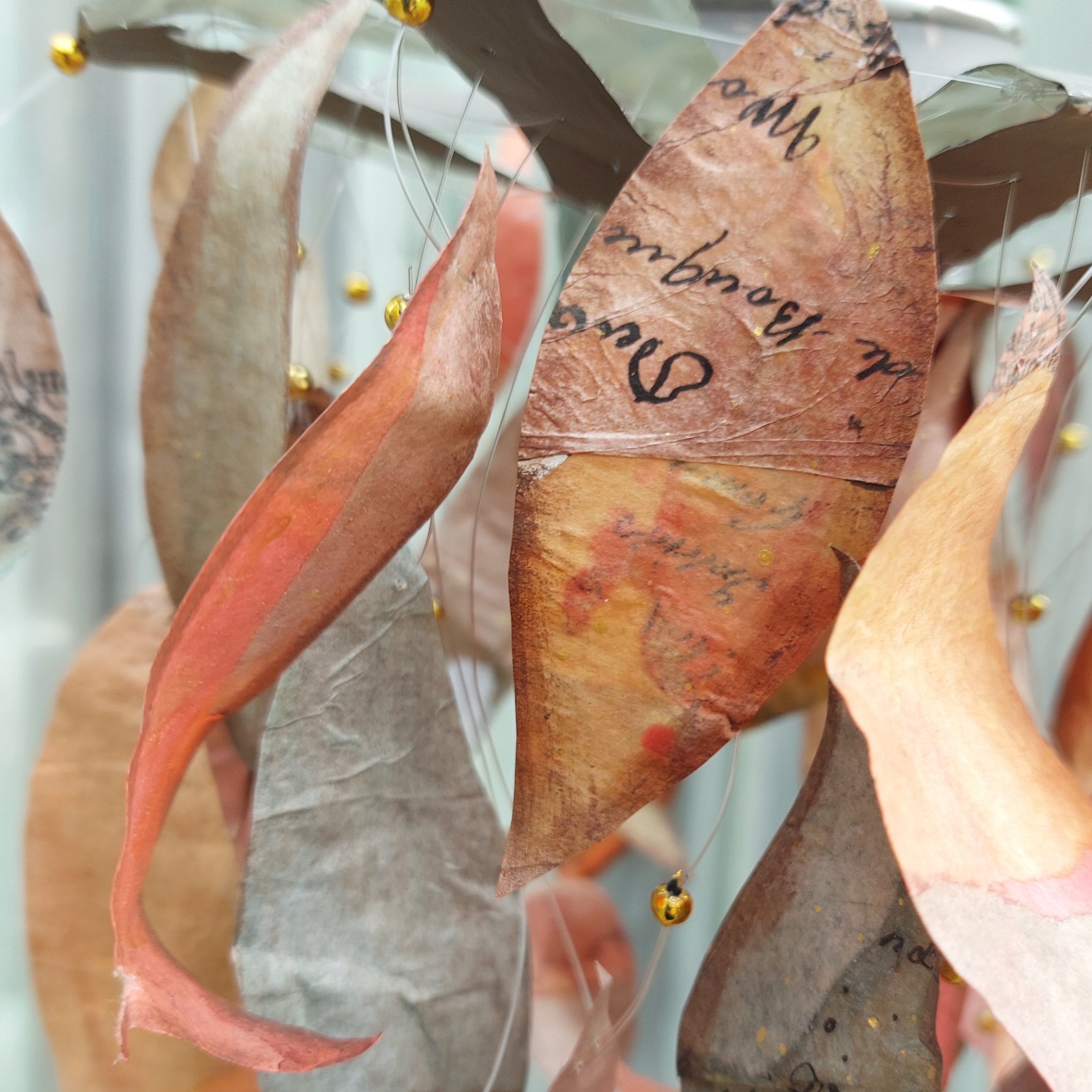
I leave you with a couple of detail shots of the leaves.


I love the snippets of pattern and texture that randomly show.


I prefer warm colours, but let's not forget the beautiful greens that bring depth and contrast.

I hope you enjoyed this journey in Mattintland and that it inspires you to try making tissue 'skins'. The process itself is easy and fun and the possibilities to use them are endless!

Keep creative
Dounia x