


Hi everyone Jenny Marples here with you today. I'm still dreaming of Japan and enjoying creating little sketches of houses, shops and other buildings I captured on camera.
This topic gilded had me thinking about the breathtakingly beautiful gilded/painted walls and ceilings inside the Nijo-jo Castle in Kyoto; a mix of hand painted scenes and graphic patterns cover gold leaf surfaces that have aged and faded slightly. So I decided to attempt to replicate that look, using gold as the main background rather than leaving it to the finishing touches.

Rather than go through the process of creating an entire book I am concentrating on using gold to create backgrounds for a set of journal pages that will be incorporated into a finished piece later.


Lots of Tracy Scott's recent releases have an Oriental theme to them so you can mix and match with these and her older designs using the methods I'll be demonstrating.
As for colour schemes my palette also reflects those seen on my travels, but since gold can be considered a neutral base you could in reality use any colours you choose over it.


Since Gold Fresco Finish Metallic Acrylic Paint has a translucent quality it's also helpful to start with a complimentary opaque base colour, hence my choice of Sand Fresco Finish Chalk Acrylic Paint.
TIP: You will find with more than one layer the gold builds in opacity, but you can impact the final shade of gold with an opaque underlayer and just 1 thin coat of gold paint. For example: if you want a more brassy look try using Kiwi Gold Fresco Finish Chalk Acrylic Paint as the base.

Apply a layer of Gold Fresco Finish Metallic Acrylic Paint over the top and don't worry if some of the brush marks remain visible.

To achieve that timeworn look I mentioned at the beginning to use a fine grain sanding block to add back some matte patches to the painted surface. And that's it - the basis of my approach to gilding each of the finished pages. These are now ready to be decorated.

I noticed some Oriental looking script in the PaperArtsy Frames Printed Tissue PT02 so tore it and applied with Fresco Finish Matte Glaze. As the gold is shiny, I could have used gloss or satin glaze as an alternative adhesive) But I chose to add back that shimmer by brushing over a little of the Gold Fresco Finish Metallic Acrylic Paint again.

I find using a stamping tool helps when you want to use opaque/semi-opaque paints to colour detailed images. These flowers from the Tracy Scott TS093 stamp set sweep across the page and add pops of colour against that gold background.
If you page can be secured in the stamping tool securely, you can stamp, add painted colour, then stamp in black again over the painted flowers to get the crisp and clear stamped outline.

I used a combination of Scottish Salmon, Verdigris and Squid Ink Fresco Finish Chalk Acrylic Paints, highlighting the centres with a white paint pen. Whilst I've used one of my sketches on the page too you could include a photo instead.

To finish the page try stamping lines of Little Black Dress Fresco Finish Chalk Acrylic Paint along the edges with a sharp edge like a ruler. And embellish your image with a gold heat embossed token from the Tracy Scott TSM29 stamp set; you'll see I've cut apart the 3 stamps images prior to using them. (they come to you closely trimmed so snipping them apart is not tricky)

So how else can we use the gold background to create journal/art book pages?

Inspired by the geometric shapes seen in Nijo-jo Castle I reached for the Tracy Scott PS443 stencil. Use a large stencil brush to apply the main coat of Front Door (or Verdigris) Fresco Finish Chalk Acrylic Paint. Then use a smaller brush to add a 'highlight' to the centre of each section with Peppermint Fresco Finish Chalk Acrylic Paint.

Finish the edges with more of those black lines and a gold heat embossed medallion from the Tracy Scott TS093 stamp set.
You might have spotted the text page on the left side of the page; this is also created with the basic techniques we've already used.

This time add text pages or Printed Tissue to a blank page then drag separate layers of first Sand Fresco Finish Chalk Acrylic Paint and second Gold Fresco Finish Metallic Acrylic Paint around the edges with a scruffy bristle brush. Sand the surface then brayer a thin layer of Peppermint Fresco Finish Chalk Acrylic Paint over the top for a worn look. You can then add embellishments/stamping of your choice and put those black lines around the edges to finish.

Now let's try using our layered gold technique in a different way, applying first the Sand Fresco Finish Chalk Acrylic Paint through a large stencil (in this case the Tracy Scott PS233 stencil) and then the Gold Fresco Finish Metallic Acrylic Paint.

Repeat stamp the Tracy Scott TSM26 stamp and add the black lines around the edges of the page. I also stuck a small piece of sewing pattern tissue over some of the stamping.

Include another of your focal point images (in my case another sketch) before stamping and painting a scattering of the flowers used on the first page across the stencilled leaves.
And you can also use your layered gold paper/card to frame your images as seen below.

Finally, and I just wanted to give a shout out to the new Mattints - they are awesome! I'd played around with some large sheets of paper, pastels, gesso, the Tracy Scott PS443 stencil, brayering and tea stain but wasn't convinced with the results. A couple of coats of the Mattints transformed it into something I could use as page backgrounds and frames for sketches.

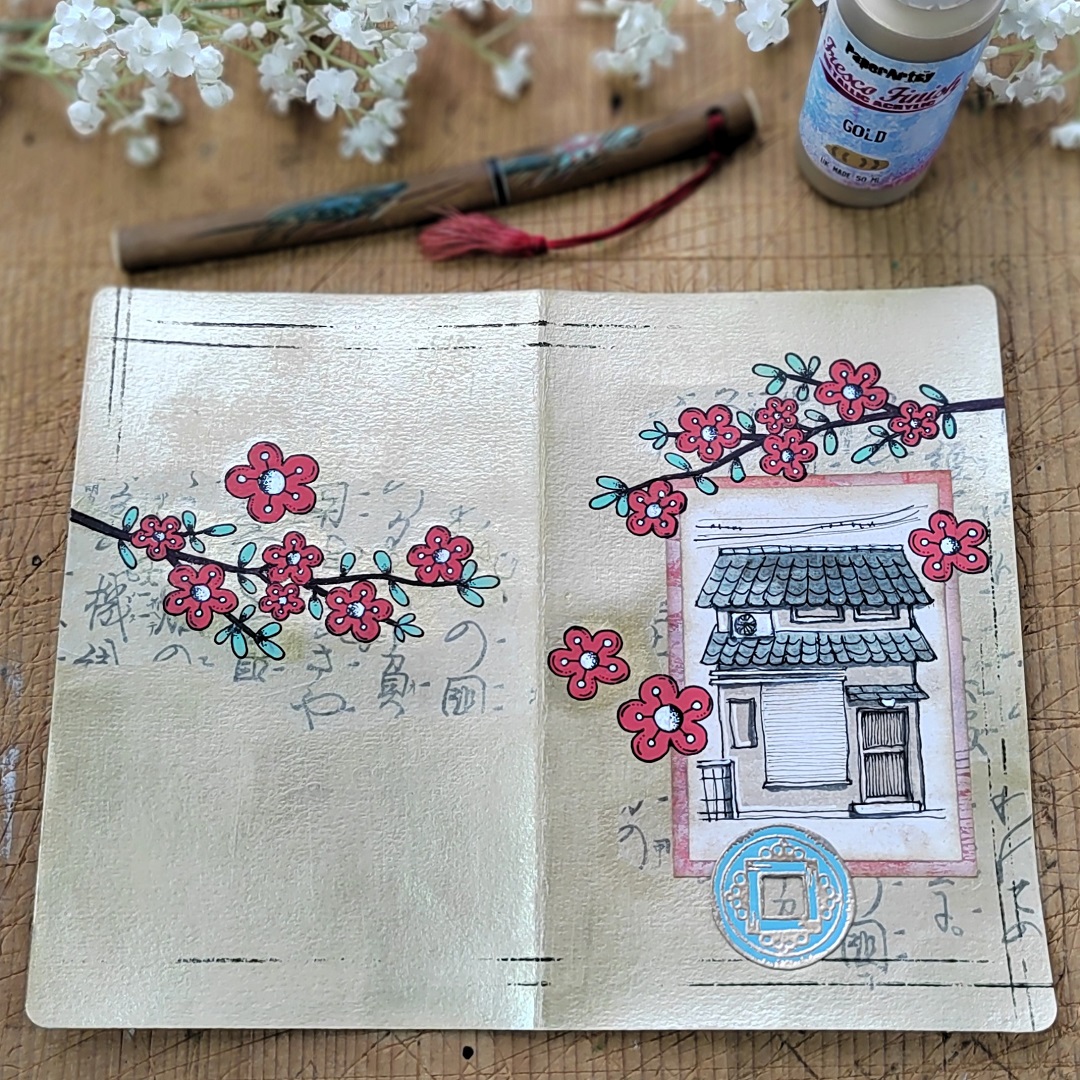
Let's take a look at the finished pages;


These gilded pages really remind me of those walls and ceilings back in Kyoto and I'm looking forward to completing more to finish the book now. Hopefully you'll consider using gold to create backgrounds for your stamping and stencilling as part of your creative endeavours.

Thanks for joining me,
Jenny


