Showing posts with label HP2103. Show all posts

Tuesday, 15 March 2022

2022 Topic 05: Stamp Mash-up {by Asia Marquet} with Zinski, Kay Carley and Hot Picks stamps


Hi everyone, it's Asia Marquet (Lemon Creation) with you today, and I'm here to share with you my very first project for PaperArtsy- Stamp Mash-Up.


I found this topic to be fun and challenging at the same time. It is not easy to create outside of your comfort zone. But it is rewarding at the end as it makes you to go through all this unusual process and often making you find new ways of expression, techniques or styles. Hopefully discovering something along the way which you will truly love to do?
use  for this project 3 completely different sets of stamps and stencil: ZinskiArt, Kay Carley and Hot Picks. The challenge for me came from the fact that some of these stamps I would not thought of using together at al! How can I possibly make an art journal page with quirky rabbits, industrial elements and very sweet looking stencil? I was not really sure I am going to pull that off. I was wrong and I am happy to show you that mixing between different genre/ styles is possible and fun.

The idea for this art journal page was a sort of welcoming of Spring- so there is this Rabbit family, standing in line in front of the very first blossoming tree. Waiting so impatiently for a Spring to come. I started by the easiest part - gathering all the products I was going to work with.  Baby steps.


It was important to me to start by creating my main characters, which were the rabbits from  Zinsky Art (ZA53) stamp. Based on them I could decide on the paper size (a little atypical as the stamps are quite big and I wanted to use at least 3 rabbits).


I stamped the Rabbits with Ranger Archival Ink (Jet Black) on a Paint On paper (250g). Even though this particular type of paper is very smooth and perfect for stamping, I wanted to be sure that the stamped lines are crisp enough, so I used stamping platform. Using a stamping platform is really important  if you need to colour your elements afterwards - if, by accident, you add colours over the stamped lines, at the very end you can always re-stamp on top of your image once again (but be sure not to remove your stamps from the platform until your colouring is finished).
I stamped all four rabbits thinking that I was not entirely sure if I am going to use them all and pretty sure that I will make some colouring mistake later on. At least I will have a choice in between all of these bunnies. I was right. About the colouring mistake that is.


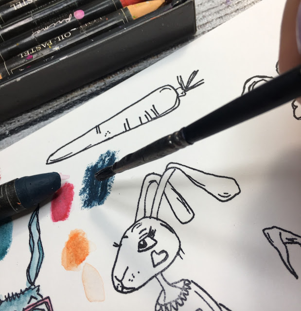
I used Prima Water Soluble Oil Pastels to colour all the rabbits. One of my favourite techniques of adding colour with water-soluble pastels is to simply apply them onto the piece of paper and then take a brush, dip it in water and pick the colour out from the paper.


Now I can  use colour-charged brush to paint with it like with watercolour. I find this is  the way which gives you the more control, as opposed to applying the crayon straight between the stamped lines and then diluting it with water to achieve a watercolour effect.


As for the colours I used - I decided to stay in more earthly tones, simply because I didn't want to steal the spotlight from the blossoming tree.
I did sometimes colour on the stamped lines, so at the end, when all my bunnies were coloured and dry, I re-stamped them again using my stamping platform. That may seem like such an unnecessary step, but believe me- the crisp, black outlines of the stamp adds much more coherence and contrast to the images. Finally I decided on not using the last and the tallest rabbit - I didn't really like the colours I used on it and I thought I made him look sad, even though he is cute and smilling.


After fussy cutting everything out I added some Ranger Glossy Accents to the noses, glasses and cheeks of the Rabbits- another small detail, but at the end it adds more interest to the whole project.


Let's move on to my background- this was the easiest part for me. I love creating backgrounds and stamping away as much as I can.  I was going to use PaperArtsy Hot Pick stamp (HP 2103)

True to myself I decided to stamp away until the bottom of my page was well filled with images and it looked quite busy (and grungy). I added small stamped images throughout the page to make a sort of link  and coherence all around.  The stamping may look l bit chaotic to you, but it's done on purpose. I wanted to create a "mess" with some blueprints and script stamps. I started  with a smaller and more intricate images, then added darker, more prominent stamping to create visually more "layers". Another great thing to do is to stamp an image and then stamp again a little bit off of the first one and without re-inking the stamp- the second image will be less  crisp. You can create this way a sort of deepness to the whole page. You can also use on the side a bit of scrap paper to remove access ink from your stamp. This messy background has also a huge advantage- small stamping mistakes are not really visible here. And even though I am crazy about stamping, it's important to me to leave a lot of negative (blank) space on my page. In my opinion that gives a lot of contrast and makes the whole project looks better.

After I stamped everything there was to stamp, I found out that there is not enough contrast on my page. I mean there was a black stamping, but to me it wasn't "loud" enough. So I grabbed PaperArtsy Fresco Finish Chalk Acrylic -Little Black Dress (FF19), some old plastic card and added some lines in between and on top of already done stamping. To add line like you could see on the photo below, all you have to do is put some paint on the flat surface (I used my flat palette), dip the edge of your card or palette knife in the paint, and then add it to the paper by pulling the card across the paper. Thanks to this beautifully rich black colour I got much needed contrast.


Let's move to my very important Spring part of the project - the blossoming tree. Firstly I wanted to use a stamp to add the tree to the project and then decided against it. Why? Simply because i wanted it to be a very important part of this page. Stamping the tree would probably not be a good solution on a very busy background. I opted for the beautiful PaperArtsy stencil by Kay Carley (PS079) and PaperArtsy Grunge Paste.


Here comes the tricky part - embossing still-wet grunge paste. Why did I need to emboss it? To get these beautiful flowers - all yummy and pink. My time-consuming way to do it was to take a small brush, pick up with it embossing powder (I used Lindy's Gang Hi-Maintenance Magenta EP) and sprinkle it over the flowers. I have to be honest- this took some time, a lot of precision and patience (which I am not known for). But after drying it with a heat gun, I was really happy with the end effect. Last thing to finish the tree was to paint its trunk and branches with the same Fresco Finish Chalk Acrylic (Little Black Dress)


It was supposed to be a Welcome Spring type of page, so I had to add some spring-y colours. Not too much as it is just a beginning of the Spring and Winter is still dragging on. That's more "poetic" explanation, but the truth is that between the rabbits and a tree there was already plenty of colours on the page. I choose to work with PaperArtsy Fresco Finish Chalk Acrylics (Weathered Copper and Deep Sea). I used small palette knife to add them only at the bottom of the page, kind of where the grass would grow. In the hindsight I think I should have add more blue on the right hand side (more wintery colour) and more green on the left hand side. Instead I mixed them a little. Also the palette knife was not a great choice and next time I would definitely go for the brush. But those were a small mistakes and I was happy to leave it at that. Later on,  with some make-up sponge I traced through the same Kay Carley stencil the word Spring (with Weathered Copper  Fresco Chalk Acrylic).


The best part is of course putting it all together. I took 3 beautiful bunnies and adhered them to the page with foam tape- once again to create extra deepness.


The last touches to the page was to draw outlines to the word Spring (with Uni Pin fineliner)- once again for more contrast, and to add one of my Messy Christmas Words to finish the page off.


Finally I felt like there was nothing more left for me to do! Here is the finished project:


I am really happy I chose  to create this project. It wasn't very easy, but I proved something to myself- mixing up between genres and styles and designers it's great! It gives unexpected effects and it's a great learning exercise. I know it is challenging to do something we are afraid of or never done before, but how otherwise can we learn? And anyway what's the worst thing which could happen to us? We can either throw away our project, or more likely learn something new and be happy with the end result! As I mentioned before- I am not totally happy with some small details and some steps were hard (painting, embossing), but I made a happy and grungy page at the same time and few weeks ago I was not even sure that this is possible!

Sending you hugs,

Asia

Tuesday, 9 March 2021

2021 Topic 3 - Creative Laboratory - 'Experimental' with France Papillon and Hot Picks {by Nikki Acton}

  2021 Topic 3: The Creative Laboratory - 'Experimental' - with France Papillon and Hot Picks {by Nikki Acton}


Wow, well this is an incredible series of samples and what a totally awesome concept. Nikki takes you through all kinds of product-science tests on this whirlwind of experimentation.
~ Leandra

Hi everyone. Nikki from Addicted to Art here today. What a great topic - so much opportunity to play with the new science themed stamps or experiment with products and stamps you have. I have mixed up all those things in my journal page creation tonight. 

I decided to to use the science / experiment theme in both my theme and content - mashing up some different techniques and some different stamps to create my science page. 


Like all experiments, I had an idea which changed and evolved as I progressed. Each of my little squares represents or celebrates - subtly or explicitly a different branch of science - eg cosmology, genetics, chemistry etc. The backgrounds consist of a mixture of Fresco Acrylic paints, Infusions, Izink Ice Glaze, Distress Oxides and Grunge Paste. 


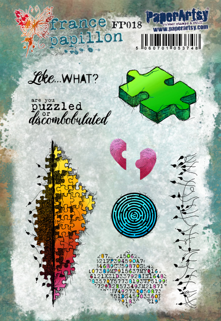
Hypothesis - the testing of an idea or theory! I wanted to know what happened when you added Infusions (Limoncello) to Izink Ice Glaze. First I stamped one of the images from the new Hot Picks Science backgrounds stamps - HP2103, before adding the glaze, sprinkling the infusions and lightly spritzing with water. Once dry I added France Papillon's jigsaw puzzle stamp from FP018.


Discovery - do explorers count as science, I am not sure - but this square is about Columbus discovering the new world! The background is stippled paints (Verdigris and Pea Coat plus Infusions again.) I stamped (on tissue paper) the northern / southern hemisphere stamps from a previous FP stamp set - FP012 in Versamark and embossed in white before cutting adhering.

Calculate - the vintage engineering image on FP012 is used here to celebrate those very clever folk who work things out I will never understand! My background is that old trick of adding salt to watery paint - I used Green Patina and Zesty Zing.


Process - to my distress oxide spray background I added the technical flow diagram from the new HP science set - HP2103 - adding a little collage for interest. I included some of the Platonic shapes from the same set (these make great little embellishments).

Solution - lets not forget the Chemists! I stole the bottles from an old HP stamp set - HP1109 to display my chemicals and added some mini letters for the formulae. The background is just a mop of Pea Coat and Zesty Zing off my craft mat.
 

Mathematical Genius - celebrating those Greek mathematicians, eg Plato and Pythagoras. Just an excuse to my coloured, scrunched tissue paper (see Cosmology!) to create the triangle and add more of the wonderful little shapes!


Cosmology - one thing I have used on a number of the squares is some scrunched up tissue paper smooched in Zesty Zing paint - so it only picks up paint on some of the surface due to the crumpled nature of the surface. I have added this to my square here which I had painted with Pea Coat. This gives the mottled effect and also the creases that are then highlighted with a some distress ink. I stamped my favourite image from HP2103. This will be used for lots of projects but here it represents the Big Bang.

Genetics - I added some grunge paste through stencil PS102 and then stamped (with the stencil still in place) with the jigsaw piece collage stamp from FP018. Once dry I added paint and dried before sanding to reveal the surface. The result gave me the impression of something through a microscope so this became about cells and DNA. I added the 'letters' of the DNA code - using Ink and the Dog Words 2 on my tissue paper.


Specimen - another distress oxide spray background and the fabulous circle / dots stamps from HP2103. On the scrunched, partly paint coloured tissue I stamped the leaf from ELB30 (Lin Brown). 


If there is a quote that fits - I am probably going to use it! Was happy to find this Ralph Emerson quote on Alison Bombers 'Life and Living' stamp set - EAB19. 


As a journal page I like this idea of lots of mini pieces added together. I forgot to mention my squares are 2.5inches so the 3x3 works perfectly in my 8inch journal - but this idea could be adapted to any shape and size. It's a fun way to play around with different ideas and then see what works together!

Enjoy!
Nikki x

Instagram: a2a.craft
Pinterest: nikacton

Saturday, 6 March 2021

2021 Topic 3 The Creative Laboratory with Hot Picks {by Keren Baker}

  2021 Topic 3: The Creative Laboratory with Hot Picks {by Keren Baker}


Hi everyone, it's Keren with you today, and I'd like to share with you an inspiring woman rather than an interesting piece of art.
 
I did do some experimentation with Golden Tar Gel, Gloss Glaze, stencils, rice paper, wax crayons and fabric. They both worked, but didn't have quite the right vibe for tonight's project.
Instead, I pulled out my new Hot Picks Stamp sets and stencils and came across a 2006 diary that celebrated women.
I was delighted to find an entry and photo of British physicist Hertha Marks Ayrton and learn her story.


I'm no scientist and don't remember learning about her in physics despite her being the Institution of Electrical Engineers first female member and prize winner. She received a medal from the Royal Society but they refused to admit her to the society because she was a woman. 
 
I decided to make a creative frame around her image, stamping it with the elements image from HP2101 with white Stazon ink.


I started off by grabbing the PS244 stencil, some Grunge Paste, Venice Blue Fresco Finish Chalk Acrylic and acetate.


I tinted the Grunge Paste with the paint, then put through the stencil.


I made some simple gel prints using Aquamarine, Slimed and Chalk. Then I printed the keys and spanners from HP2101 and trimmed them all out. 


Adding them onto the stencil added more depth but because they're not too different in colour, it doesn't clutter the space.


I don't know if she wore earrings, but I wondered if she'd approve of these! Ayrton worked with sand ripple patterns, electrical arcs, invented improved carbons and lamp houses even inventing a fan to dispel poison gas during World War 1.


The quote around the edge was one she wrote about her friend Marie Curie. As one of the new Hot Picks sets contains a quote by Marie Curie, it seemed quite serendipitous.


The butterflies (with the added keys on their abdomens) are from HP1506.


and the alphabet is from an Emma Godfrey set EEG02


You can also spy the 3d shapes from the set HP2103 in the above photo, stamped onto acetate and sewn into place.


I added the nearest image to an arc I could find from the set and then added the diagram from the HP2103 set. It's not a complex project, just weaving lots of little elements from the new stamp sets.

She's a woman worth celebrating, a woman who would have spent much time in whatever her laboratory looked like at the time and when she wasn't experimenting, researching or inventing, she had time to join in the suffragist movement!

I hope you've enjoyed learning about Hertha Marks Ayrton. I found her really inspiring. Starting with a different sort of image (like a photographic one) and building images around it so it was still the focal point was challenging as I had to enhance the image rather than distract from it. 

Hope you find time to be creative today,
Keren x

Blog:
Twitter:@craftstampink
Instagram: @craftstampink
Pinterest: @craftstampink