Showing posts with label Frosty. Show all posts

Friday, 17 October 2025

Squiggly Christmas with PaperArtsy's Squiggly Ink stamps {by Nikki Acton}


Hi everyone, good to be back, it's Nikki here (a2a.craft) to share my latest project.

This year on the blog, we have free rein to do a deep dive into a PaperArtsy product range of our choosing. For this post I have been exploring Squiggly Ink products.

I'm going to be sharing some Christmas cards combining a (mostly) stencilled master board and the fun and easy to use Christmas stamps from the Squiggly Ink Collection.


I will show you how I created my master board for these cards to form the background before getting all sparkly for Christmas with the stamps.


I wanted to use the traditional red and green of Christmas while keeping it bright - so selected the range of colours you can see above.


The image above is my finished master board. I created this on one sheet of A4 white card.


To start I cut myself some triangles out of A4 copy paper to use as stencils and started my painty background using Fresco Chalk Acrylics in Kiln (FF234) and Blah Mange (FF140).


The next layers use PaperArtsy stencils by JOFY - PS438 and PS309 and Fresco Chalk Acrylics in Toffee Apple (FF219) and Frosty (FF190).


As I knew I would be cutting up this master board I wasn't too worried about the composition but tried to fill some gaps while also overlapping the triangles previously added.


Next I added the brighter green dots / circles using Fresco Chalk Acrylics in Parakeet (FF225) and another JOFY stencil (PS477).

I then reached for the small snowflake and present stamp off PaperArtsy Squiggly Ink - Nut and Meg 1 stamp set (SINM1). I stamped in Fresco Chalk Acrylic in Chalk (FF83) and Ranger Archival Ink in Olive.


Finally I added Fresco Chalk Acrylic in Gold (FF20) - again using stencil PS477.

There is a lot going on in this background, but I liked it! Now to make some cards.


For the first card I used the Christmas tree and greeting from PaperArtsy Squiggly Ink - Nut and Meg 3 stamp set (SINM3). 

I cut some of the background for the inside of the card and the front flap and matted onto another layer of card painted (just around the edges that show) with Fresco Chalk Acrylic in Parakeet.


For the tree I quickly painted a piece of card with stripes of the colours I used on the background. I stamped and fussy cut the tree.


I added some Ranger Stickles to the tree for some sparkle and cut an oval for my tree to sit on. This was decorated with more stencilling and stamping.


I punched some little stars and mounted the greeting on some sparkly paper for some added bling!


The second card was built the same way - but this time I used the snowman from PaperArtsy Squiggly Ink - Nut and Meg 2 stamp set (SINM2).


I added some slightly watered down Fresco Chalk Acrylic in Frosty to some white card before stamping the image. I took some coloured pencils and coloured his face / scarf etc before adding Stickles to some areas.


This was fun! Like many of us I love making backgrounds and these stamps contain clear focal images that are great to stamp with and easy to fussy cut.

Saturday, 30 October 2021

2021 Topic 13: Tiny (News) Print with ESA {by Jenny Marples}

    2021 Topic 13: Tiny (News) Print

Making a scene from non-scene type images is a clever stretch of any stamps. Jenny has been experimenting with some of Seth Apter's new stamps and made a fabulous wall of words. She's got some great tips for making your stamping look metallic and creating more natural looking foliage and flowers.
~ Keren

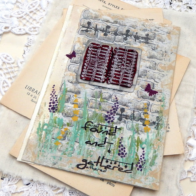
Hi everyone, it's Jenny (Pushing The Right Buttons) with you today, and I'm here to share with you a new journal page that features images from one of Seth Apter's new releases. 

I am a huge fan of Seth's designs particularly because they are so often based on the architectural and structural features he sees around him every day in NYC. Looking at them from a different perspective they could also represent things seen in and on buildings in other parts of the World, like a cottage in rural France for example...


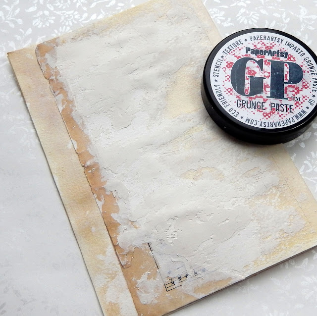
This piece begins with the edge of a torn piece of manuscript and some PaperArtsy Grunge Paste, all designed to give the feel of the side of a rustic building.


Apply Sand, Stone, Heavy Cream and Chalk Fresco Finish paints in layers (working from dark to light) with a spatula to blend the manuscript and Grunge Paste together.


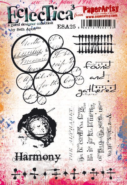
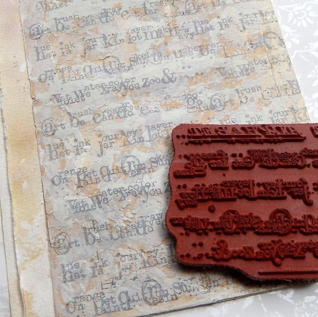
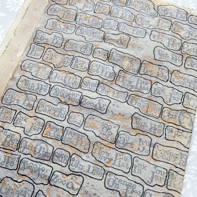
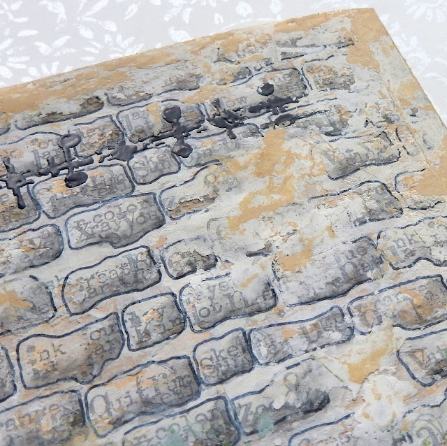
Seth's 'The Alphabet' text stamp from his new ESA25 stamp set was the original inspiration for this whole piece - to me the way the letters and surrounding tiny text have been grouped look like uneven brickwork.

  
Repeat stamp 'The Alphabet' (minus its title section and final line) using a pale grey permanent ink, knowing the uneven layer of Grunge Paste beneath will give the stamping a worn feel by missing parts.
 

Use the grouping of the letters as a guide and draw around them with a permanent marker (black or dark grey are perfect for this). I would suggest practicing on a piece of scrap of paper so you can work out what you want your 'bricks' to look like.
 
 
Add some shading to make the bricks look more realistic - I used a watercolour pencil along the bottom and left-hand side of each brick, blending out the shading with a water brush. At this point you can reapply patches of Grunge Paste to break up the pattern a little and tone down the lines around the bricks if they are too prominent with some more paint.
 

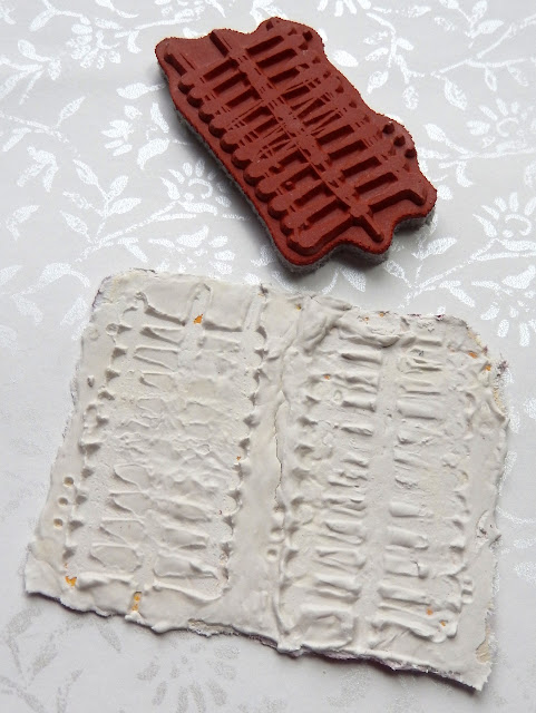
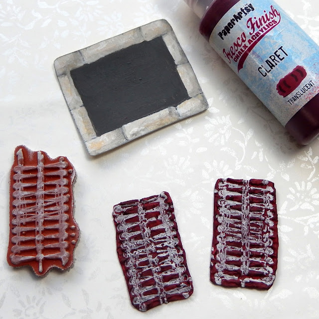
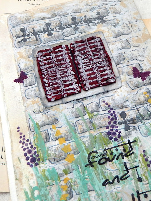
This second stamp from Seth's set immediately reminded me of window shutters. To recreate them start by applying a thick layer of Grunge Paste to a piece of card. Allow it to start to dry a little then push the stamp into the paste to create an impression. Two hints; first, if it doesn't create the right impression use a wet spatula to smooth out the paste and try again. Second, make sure to spritz your stamp with water before plunging it into the paste and wash it as soon as you've finished to remove excess paste.
 
 
When the embossed paste has dried paint it and then re-stamp with a contrasting permanent ink (I used a white StazOn Pigment pad for this). You can make a 'mount' for your completed shutters by drawing brick shapes on a slightly larger piece of card, painting them with the same paints as the main wall. It's worth painting the centre of the mount too since some of it may show when your shutters are glued on top.


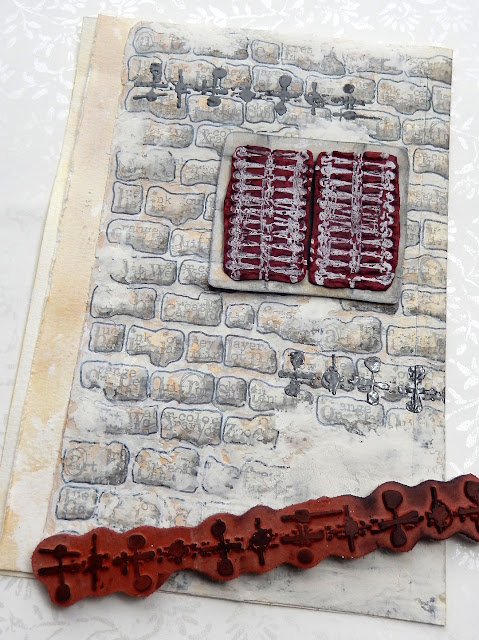
Older walls often have metal ties inserted into them to prevent them from pulling apart and ultimately falling down! Another of the stamps from Seth's set is perfect for recreating those. Try clear embossing over your stamped 'ties' to give them a metallic look.
 
 
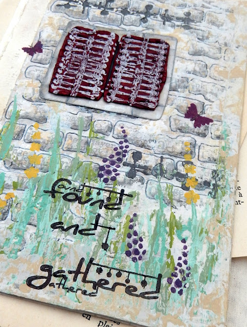
With the building 'constructed' it's time to add some prettiness and colour. One place to start is with Kay Carley's stencil PS080 which helpfully includes little butterflies and dragonflies as well as the grasses and flowers found in a rural border. Use a mix of green shades for a more realistic feel.


After starting with the stencilled greenery you can make it even more 'wild' and unstructured by dipping a wooden skewer into the various green paints and adding pointed lines over the top. I also added extra detail to the flowers following the positioning from the stencil.


It's often only when you get to see the 'almost complete' stage of a project that you can take a step back and consider if it needs any adjustments. In this case with the walls looking too grey I went back over the edges with a little more Grunge Paste and followed up by adding patches of the Sand coloured paint.


The window panel was glued into its final position, a little over from where it was originally planned.

 
To help draw the eye around the finished page a little better, a couple of the tiny butterflies were stencilled in place using a mix of the Claret and Grape paints. You can draw in the tiny details like the antennae with a fineliner pen.


I found when it came to stamping the phrase 'found and gathered' from Seth's stamp set it didn't quite fit around the flowers. To make it work I stamped the first two words independently of the third, moving that one a little further over to the right.


Here's a reminder of what the finished piece looks like;


Take a look at the images in your stamp sets with fresh eyes to see what they bring to mind. It may be something you've encountered on adventures abroad or even something much closer to home. You don't need to draw an entire building or landscape to capture the feel of those surroundings.

Thank you so much for stopping by.