Showing posts with label EAB16. Show all posts

Tuesday, 16 November 2021

2021 Topic 14: Mash Up LPC EGL EEV EAB {by Nikki Acton}

 2021 Topic 14: Mash Up LPC EGL EEV EAB


When 
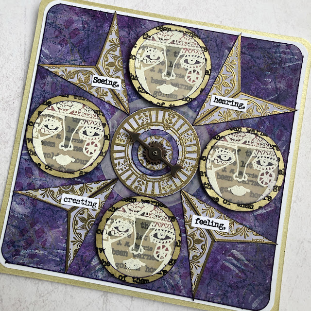
you take images and use them in a new way, it opens up some many creative opportunities. Look through those faces and imagine the words that they're thinking in the background! Nikki has chopped up her stamped images to create something that's wonderfully graphic with an artsy flair.
~ Keren.

Hi everyone, Nikki here from Addicted to Art with you today. I am a great fan of our 'Mash Up' themes. I love the challenge of bringing things together that I wouldn't instinctively combine. 

I was very inspired by some of Keren Baker's samples for the new Lynne Perrella release and her use of Duralar. I am yet to try this product but reached for some vellum in this project instead.

I am not sure what drew me to this colour choice - but started some background work using very roughly painted patches using Fresco Chalk Acrylics in Blueberry, Periwinkle and Byzantium. I then used the same colours along with Archival Inks to add some texture using Ellen Vargo's stamp sets EEV03 and EEV05.


I always do an extra scrap of background using the same colours, so if I need some coordinated coloured card I have some to hand. As you can see below this happened underneath the clock hand - to punch a small circle.
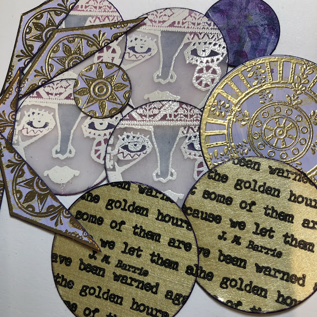
 
 
These hand carved style stamps are a 'go to' for me - for any background work and especially on my Gel plate (which is why some of them are VERY dirty!).


I am not quite sure what the theme of this project is - it evolved from wanting to use the vellum stamped faces and developed from there! I heat embossed the smallest image from Lynne Perrella stamp set - LPC053 with white embossing powder before using dies to cut out the circles.


On the reverse of the vellum I added some colour with Promarkers. On some card painted with Periwinkle, I stamped Gwen Lafleur's images from EGL01 with Versamark and heat embossed in gold. 
 
 
I love how there are shapes within the shapes on this stamp set from Gwen; I often use only part of the images. The diamond has been used to create 2 triangles as well as the central circle forming the top layer of my compass in the middle.
 

The final designer stamps in the 'Mash Up' is Alison Bomber with her selection of wonderful quotes in various themed sets. On this occasion though I have used them not as quotes but as background text, and then selected some individual words.


I wanted the translucence of my vellum faces to have a gold background so used Fresco Chalk Acrylic in Gold to paint some card and then die cut some circles just bigger than the faces. I stamped these in Black Archival ink with one of Alison's quotes.

  
The stamps sets I used for the 4 individual words are Alison Bomber sets EAB16 (Walt Whitman quote) and EAB19 (George Bernard Shaw quote).


You often hear stamp designers say 'you don't have to use the entire stamp' - well I took them at their word here! The faces, the halved diamonds and the word quotes are all partial stamped images!

Nikki x

Instagram: a2a.craft
Pinterest: nikacton
YouTube

Saturday, 18 September 2021

2021 Topic 11: Twinkle Twinkle with ESA {by Jenny Marples}

   2021 Topic 11: Twinkle Twinkle


With a really achievable 'painting over an image' technique from Jenny, this lovely fairytale inspired page has layer upon layer of lovely ideas. The twinkle of stars from embroidery and a night-time paint effect adds a clever emanating glow
~ Keren

Hi everyone, it's Jenny (Pushing The Right Buttonswith you today, and I'm here to share a collage piece which took a decidedly fairy-tale twist as the Twinkle Twinkle theme pushed through. 

Seth Apter stamps were used to enhance the main image, picking up on the theme and helping to suggest what may be around it rather than needing to draw in the whole scene.


Continuing to focus on architecture I experimented with a different method for creating the focal image of a window, one which doesn't require you to draw the initial image.


Before we take a look at that let's begin with the collage style background which made use of stamps from two of Seth Apter's stamp sets, ESA02 and ESA18.


Having kicked off with layers of manuscript, white gesso, asemic writing in pencil and brown ink I wanted to add some stars to evoke those that might be seen in a night sky. To give some control over where they would be on the page I stamped the stars onto wet strength tissue using Sour Grapes Fresco Finish Paint before applying this to the background with a generous amount of matte gel medium.


To emulate the look of bricks on the edge of a tall building I stamped Seth's interconnecting blocks border in a continuous strip down the centre of the page using a dark blue ink.


It's always good to add extra layers and textures to build a 'frame' around your focal image and draw attention to it. I'm sure I am not the only one to have an ever-growing collection of unused scraps which can be called on to do this. Try dividing those scraps into colour families and putting them into transparent page pockets so you can find them more easily. I chose some leftover teabag paper stained with Limoncello Infusions and a crumpled piece of tissue that had turned brown on the edge.


Now for the window; I wanted to try painting over a printed image rather than drawing one this time. Several years ago I took a photo of this window on a visit to Auxerre in France. After printing it onto photocopy paper I stuck the image onto card with matte gel medium and applied some Grunge Paste around it to replicate the look of an aged wall. The photo was taken during the day but I wanted to make it look like night had fallen so I began by adding a base layer of Slate Fresco Finish Paint around the bricks framing the glass. Alternate layers of Baltic Blue and Slate Fresco Finish Paints were then applied on top, with less and less paint used each time until I had the depth of colour required.


The bricks around the window were painted with Surf's Up Fresco Finish Paint, dry brushed and edged with more of the Slate to deepen the colour. In my original photo the walls around the window were 'pebble dashed' with no bricks exposed. To leave it this way made the window look like it was floating so I added some bricks beneath to emulate those stamped onto the background, giving them the same paint treatment as those around the window. Finally the dark glass in the window was over-painted with Sand Fresco Finish Paint to make it look as though a light inside the building was shining through. I added extra highlights with an iridescent gel pen and Snowflake Fresco Finish Paint, also applying tiny touches to the bricks and window ledge before outlining the main elements with a fine black pen.

 
To add an extra touch of texture I coloured some cotton fabric with Wolf Eye Fresco Finish Paint before over-stamping it with the large text stamp from Seth Apter's ESA13 stamp set in Iceberg Fresco Finish Paint.


Prior to adding the cloth and window pieces to the background I layered them together and hand stitched the three stars around the window. Once in place on the collage background splattered the whole piece with dilute Snowflake Fresco Finish Paint to give the impression of a starry night sky - it was at this stage that the collage turned from having a simple architectural feel to one that looked more like an illustration in a fairy tale book.


Going with this fairy tale theme, and as a way of finishing the piece I stamped a phrase from Alison Bomber's EAB16 Magic & Wonder stamp set onto card and cut around it before mounting it at the base of the window.


Here are some final photos of the finished piece.


If you feel less confident with drawing a window I hope you have a go at painting over a printed one, remembering to take time to build up the layers of paint and drawing around the finished elements to make them stand out. And if you are then going to add your painting to a background try using your stamps to suggest other parts of the building and surroundings.

Thank you so much for stopping by.

Tuesday, 17 August 2021

2021 Topic 10: My Favourite Colour with EEV {by Nikki Acton}

  2021 Topic 10: My Favourite Colour


Impact isn't restricted to a bundle of colours, Nikki has reduced her colour palette choices to two and also uses the fabulous reductive painting technique to create drama. The addition of stamped and painted book pages elevates the design. If you struggle with choosing combos, take a leaf from Nikki and restrict yourself simply to two.
~ Keren

Hi everyone, Nikki here from Addicted to Art with you today, and I'm here to share a journal page using one of my favourite colour combinations using stamps by Ellen Vargo (EEV).

I have done a few Tracy Scott workshops recently, and she reminded me of the method of creating a background and then hiding some of it by painting over certain areas - similar to subtractive or reductive painting. This creates areas interest or contrast. Tracy is a genius at doing this!


I gathered my colour selection to begin. I used Fresco Chalk Acrylics - CaramelSandMermaidCerulean and Egg Shell, a favourite stencil by Tracy Scott - PS224 and stamps from Ellen Vargo (EEV05 and EEV09). I created a very random background using partial stamping and stencilling and not too much thinking!


Once this was complete I began planning a layout - adding some stamped images and some circles drawn with a compass. These are the shapes I would paint around later. 

 
 I began painting around my shapes with Eggshell, but later decided the contrast to the sand colour was not great enough so repeated with Cerulean. You can see the stamped images from Ellen Vargo Stamp Set EEV09.


Having painted around the circles and stamped imagery I went back to my stencil and texture stamps to add a bit more detail. 


The stencil was used to add more Cerulean onto the Sand coloured circles and the other way round, with the texture stamps from EEV05 creating additional visual interest.


I wanted some more contrast - so took some book pages and stamped my images on the text, adding a bit of colour.


I also added some paint to the text so that I could punch some small circles.
 

My finishing touches were some splatters of paint with Fresco Chalk Acrylic (Persimmon) and a quote from Alison Bomber Set Set 16 (EAB16).


More painted book pages formed the background for the words which I carefully tore to shape.


My colour choices were very safe today! It's hard to go wrong with two colours - and easy to still get different tones with the fabulous choice of Fresco Chalk Acrylics to chose from! Perhaps next time I will be bolder. What would you use?!

Nikki x

Instagram: a2a.craft
Pinterest: nikacton
YouTube