Showing posts with label ESA13. Show all posts

Saturday, 18 September 2021

2021 Topic 11: Twinkle Twinkle with ESA {by Jenny Marples}

   2021 Topic 11: Twinkle Twinkle


With a really achievable 'painting over an image' technique from Jenny, this lovely fairytale inspired page has layer upon layer of lovely ideas. The twinkle of stars from embroidery and a night-time paint effect adds a clever emanating glow
~ Keren

Hi everyone, it's Jenny (Pushing The Right Buttonswith you today, and I'm here to share a collage piece which took a decidedly fairy-tale twist as the Twinkle Twinkle theme pushed through. 

Seth Apter stamps were used to enhance the main image, picking up on the theme and helping to suggest what may be around it rather than needing to draw in the whole scene.


Continuing to focus on architecture I experimented with a different method for creating the focal image of a window, one which doesn't require you to draw the initial image.


Before we take a look at that let's begin with the collage style background which made use of stamps from two of Seth Apter's stamp sets, ESA02 and ESA18.


Having kicked off with layers of manuscript, white gesso, asemic writing in pencil and brown ink I wanted to add some stars to evoke those that might be seen in a night sky. To give some control over where they would be on the page I stamped the stars onto wet strength tissue using Sour Grapes Fresco Finish Paint before applying this to the background with a generous amount of matte gel medium.


To emulate the look of bricks on the edge of a tall building I stamped Seth's interconnecting blocks border in a continuous strip down the centre of the page using a dark blue ink.


It's always good to add extra layers and textures to build a 'frame' around your focal image and draw attention to it. I'm sure I am not the only one to have an ever-growing collection of unused scraps which can be called on to do this. Try dividing those scraps into colour families and putting them into transparent page pockets so you can find them more easily. I chose some leftover teabag paper stained with Limoncello Infusions and a crumpled piece of tissue that had turned brown on the edge.


Now for the window; I wanted to try painting over a printed image rather than drawing one this time. Several years ago I took a photo of this window on a visit to Auxerre in France. After printing it onto photocopy paper I stuck the image onto card with matte gel medium and applied some Grunge Paste around it to replicate the look of an aged wall. The photo was taken during the day but I wanted to make it look like night had fallen so I began by adding a base layer of Slate Fresco Finish Paint around the bricks framing the glass. Alternate layers of Baltic Blue and Slate Fresco Finish Paints were then applied on top, with less and less paint used each time until I had the depth of colour required.


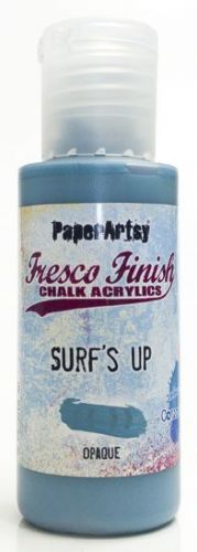
The bricks around the window were painted with Surf's Up Fresco Finish Paint, dry brushed and edged with more of the Slate to deepen the colour. In my original photo the walls around the window were 'pebble dashed' with no bricks exposed. To leave it this way made the window look like it was floating so I added some bricks beneath to emulate those stamped onto the background, giving them the same paint treatment as those around the window. Finally the dark glass in the window was over-painted with Sand Fresco Finish Paint to make it look as though a light inside the building was shining through. I added extra highlights with an iridescent gel pen and Snowflake Fresco Finish Paint, also applying tiny touches to the bricks and window ledge before outlining the main elements with a fine black pen.

 
To add an extra touch of texture I coloured some cotton fabric with Wolf Eye Fresco Finish Paint before over-stamping it with the large text stamp from Seth Apter's ESA13 stamp set in Iceberg Fresco Finish Paint.


Prior to adding the cloth and window pieces to the background I layered them together and hand stitched the three stars around the window. Once in place on the collage background splattered the whole piece with dilute Snowflake Fresco Finish Paint to give the impression of a starry night sky - it was at this stage that the collage turned from having a simple architectural feel to one that looked more like an illustration in a fairy tale book.


Going with this fairy tale theme, and as a way of finishing the piece I stamped a phrase from Alison Bomber's EAB16 Magic & Wonder stamp set onto card and cut around it before mounting it at the base of the window.


Here are some final photos of the finished piece.


If you feel less confident with drawing a window I hope you have a go at painting over a printed one, remembering to take time to build up the layers of paint and drawing around the finished elements to make them stand out. And if you are then going to add your painting to a background try using your stamps to suggest other parts of the building and surroundings.

Thank you so much for stopping by.

Tuesday, 31 August 2021

2021 Topic 10: My Favourite Colour with ESA {by Amanda Pink}

  2021 Topic 10: My Favourite Colour


Ohh I adore these clean and crisp blues, and doesn't Amanda make the most amazing backgrounds?! And I love how she adds those striking layers on top! The shadow it is just wonderful to make the word pop! Read on to see how she has pulled this beauty together!
~ Leandra

Hi everyone, it's Amanda Pink (ink-a-pinkwith you today, and I'm here to share with you a mixed media art block that I have created for the current theme 'Favourite Colour'. 

Blue has always been a favourite colour of mine along with the classic monochrome colours of black white and grey so it was pretty uch a given that they were my chosen colours for the theme. 
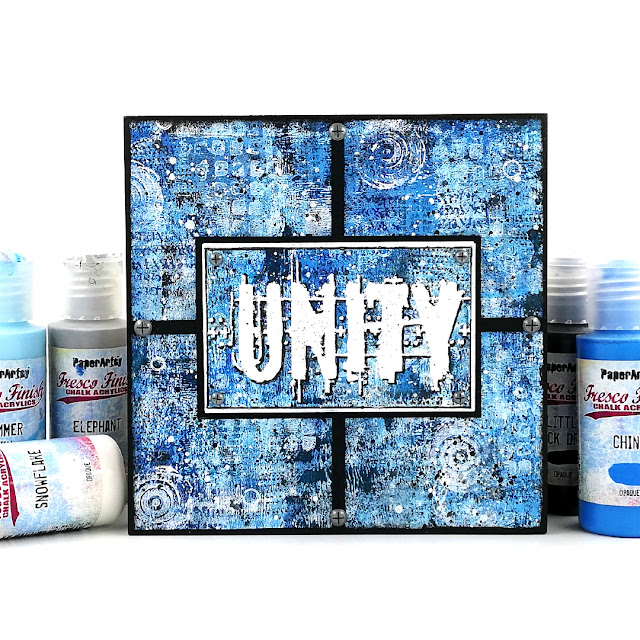
My art panel is the result of lots of paint layers, detail stamping, a touch of stencilling and some embossing that along with the 'sectioned' finished design come together in 'Unity'. 
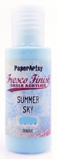
PaperArtsy have so many blue and grey Fresco Chalk acrylics there was lots of 'umming' and 'arring' deciding which to choose. In the end I thought why not go big and use all the colours in two of PaperArtsy colour families: 'Bright Clean Blues' (Blue Oyster, Summer Sky, Smurf, China, Glass Blue, Twilight) and 'Greys' (Snowflake, Concrete, Koala, Elephant, Slate, Little Black Dress). 

If you aren't familiar with PaperArtsy fresco colour families or are interested in finding them out  you may like to check out the end of this blog post here where they are all listed.  

Not sure of the size I wanted the finished piece to be I created a masterboard working on a piece of  PaperArtsy Heavy Smoothy as I knew it would take the layers.  A brayer is a great tool to use for this type of creativity as it allows for quick application and can also give the paint some texture when applied.
For a gradual build up of layers and depth of colour I alternated between the two colour families, So for every colour from the 'grey' family I laid down I then laid down a colour from the 'bright clean blue' family ie, Koala, China, Elephant, Smurf and so on repeating the process many times over. 


So far along and following my creative muse I felt the need for another colour outside the 2 colour families so in keeping with the 'favorite colour' theme I added some Inky Pool, one of my absolute favourite PaperArtsy colours.  


Many layers later (lost count how many) I was pleased with how things looked 


 Close up


The brayer application of the paints created texture like I  mentioned at the start and  I thought the two colours families had played well together. 


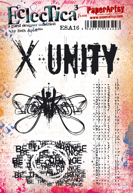
To add some detail to the masterboard I introduced some stamping using a selection of stamps from Seth Apter Set 13 (ESA13), Set 16 (ESA16), Set 24(ESA24), Mini 41 (EM41) and Hot Picks Set 2101 (HP2101EZ) .


I chose stamps that I thought would work well together but would give a good mix of letters and numbers (HP) shapes, 
text (all be it broken and obscure) and texture (ESA). For each stamp I used either a Fresco Chalk Acrylic (Snowflake, Inky Pool) or ink. 


Although some stamping appears more visible than others (intentional) they are all there. The large sets are A5 size, and the Mini is a credit card size stamp. These are such useful images when building up layers with paint.


The small white circles you may have spotted are all thanks to Lin Browns stencil 001 (PS001).
 

I like the 'openness' that you can create by simply drawing around a stencil design. I don't know about you but all too often I reach for the mediums to apply through the stencil when sometimes all that's needed is a pen!  


This was the section of the masterboard I cut to size and mounted on an art block. 

 
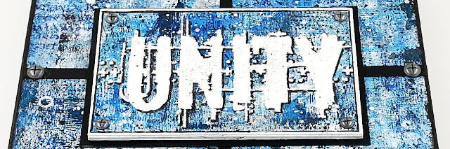
For the focal 'Unity' plaque I used the 'Unity' stamp from Seth Apter Set16 (ESA16)


The word was embossed on to a piece of the remaining master-board. I think embossing always helps an image stand out far more than ink stamping does and that's what I wanted. 
  

Using the excess master-board ensured a seamless connection (a 'Unity') between the main background of the art block and the background of the focal plaque.

A 'Unity' which I emphasised more by creating 4 connecting sections in the finished design.

I had such a great creative time making my art block and overall I'm happy with how it turned out. It's not often I create with so many colours and I've never on any of my makes used all the colours from one of the PaperArtsy colour families let alone two before but I'm so glad I did this time. They may not all be clearly visible in the finished piece but they all played their role in making it what it is. Same goes for the stamps. 
I wonder, what's your favorite colour? Favourite PaperArtsy colour? How many colours do you usually create with? Have you ever used all the colours from a PaperArtsy colour family in your work? I'm sure many of you will have but if you haven't why not give it a go and make something in your own creative style. 

Thanks for joining me today/ tonight 
Keep on Creating 
Take Care
Amanda
x

Blog: ink-a-pink 
Facebook: Amanda Pink 
Instagram: p1nkart 
Pinterest: PinkArt