Showing posts with label True Colours. Show all posts

Saturday, 22 July 2017

2017 #9 Aqua: ATC Trio {by Claire Snowdon}

2017 Topic 9: Aqua


This gorgeous blue arrangement is simple to construct, very striking yet full of plenty of small details - like a splash gold flecks. Perfect for gift tags, and I think this idea would work really well for wintry Christmas cards too - anyone doing those yet?? LOL


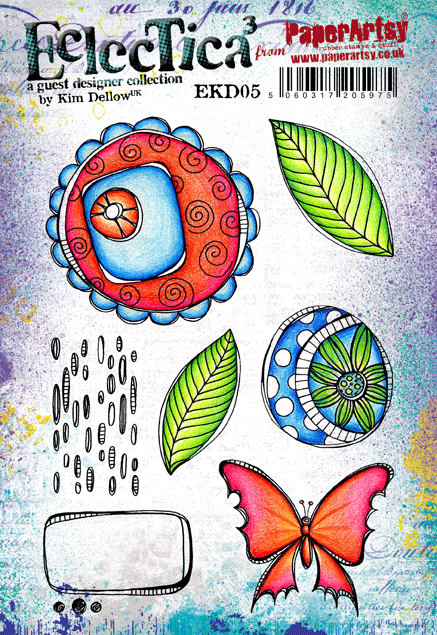
Hi everyone, it's Claire Snowdon with you today, and I'd like to share with you my trio of aqua artist trading cards (aka ATC's) created using stamps and stencils by Kim Dellow.

I enjoy making smaller pieces of art as they are quicker to make but create a great opportunity for trying out a variety of techniques, using different products or just practicing the basics.


I enjoyed creating the backgrounds for my three ATC's and used a smooshing type technique with Fresco Chalk Paint and a little water, then used negative stenciling on top.

PS048

I liked creating the backgrounds in this way as it gives and almost marbled watercolour effect.


I made the focal topper using Kim Dellow's stamps on each ATC a darker shade of aqua to give some contrast with the background - and just couldn't resist a little splatter of gold on them too :-)


I like to frame my ATC's using some doodling, distressing the edges and then mounting them on black card so they really pop.

Why not create some mini works of aqua artwork to try out those new products or a new technique you haven't used before?  Kim's stamps are ideal for mini art as there are loads of smaller elements that you can play with! 

Thanks for joining me tonight on the Paperartsy blog - be sure to come and visit me on my own blog or on Instagram.....Claire Xx

Blog: Claire's Crafty Makes
Twitter: Claires10
Instagram:Claires10
Pinterest: Mrs Sno

Claire these are so effective! You have used the same tone throughout, yet managed to get contrast so effectively with those lovely gelli-printed backgrounds! Fabulous ~ Leandra


We always hope that you  learn something interesting from our blog

Our creative team love to read your comments so much, so please take time to let them know you've been inspired!  

Why not join our 2-weekly challenge by blogging your create response to the current topic and link it here?

The current topic link Topic 9 (Aqua) will close 17:00 (London Time) Sunday, July 22nd 2017, and the winner will be announced 2 hours later at 19:00.

All links go in the draw to win a £50 voucher to spend on products of your choice from the PaperArtsy online store.

Friday, 21 July 2017

2017 #9 Aqua: 50's Blues {by Miriam Grazier}

2017 Topic 9: Aqua


I had to laugh at Miriam's blue paint line up below!. I don't think I have ever lined up our shades of aqua blues before, and I know there are plenty of other blues too!!! It does go with every other shade in the spectrum, so what's not to love! Let's see what she gets up to with those!

Hi everyone, it's Miriam here from Miriam's Creative Dreams with you today, and I'd like to share with you a small canvas board that I have decorated with a male theme in mind.

I challenged myself to see how many types of 'aqua' I could use.  I first gathered all of the Fresco paints that I thought would 'fit' with the theme, and I was not surprised to find that I have quite a few.


Looking through previous projects it is clear that I use aqua in my art quite a lot - it seems to be one of my go-to colour.  It's especially relevant now, in the summer time, as it reminds me of holidays and cooling seas. 


I wanted to use Infusions in my project and wanted to see how well they combined with Grunge Paste - and it worked really well - a small amount of the walnut appeared but it didn't develop any further once I had thoroughly mixed the infusions and Grunge Paste.  


I really enjoyed only using only a few colours in my project - it enabled me to create some lighter areas and some darker areas.


I outlined part of the stencilled areas with a white gel pen - this made the aqua stand out a little more.

I used one of my favourite Hot Picks stamp sets - HP1218.


I added a watered down wash of Caribbean Sea over the main stamped image.  This brought the Aqua theme into the image and tied the project together.


I really enjoyed this project - it challenged me not only to be limited to colour (which I don't often do) but to create a 'male' themed project.  I really enjoyed mixing Infusions with Grunge Paste and then looking at the effects that it creates.  In fact, I can see myself trying this technique with different stencils and colours.

Thank you for joining me tonight. Pop over to my blog to see more details of how I created this project. I hope you have been enjoying the Aqua theme and I hope that I have inspired you to create your own Aqua themed project.  

Happy Crafting!
Miriam


It's a popular stamp Miriam, and yes, a good one for the men in our lives too! I love how the GP worked wonderfully to contrast with those infusions so well, and I think we can safely say there are many shades of aqua in the Fresco Paint range! Haha! ~ Leandra


We always hope that you  learn something interesting from our blog

Our creative team love to read your comments so much, so please take time to let them know you've been inspired!  

Why not join our 2-weekly challenge by blogging your create response to the current topic and link it here?

The current topic link Topic 9 (Aqua) will close 17:00 (London Time) Sunday, July 22nd 2017, and the winner will be announced 2 hours later at 19:00.

All links go in the draw to win a £50 voucher to spend on products of your choice from the PaperArtsy online store.

Wednesday, 19 July 2017

2017 #9 Aqua: Teabag Art Canvas {by Alison Hall}

2017 Topic 9: Aqua


Alison Hall is here with a fabulous idea for tea bags! Only she would think to gelli-print tea bags! If you ae a tea-drinker who loves Aqua, then this one is for you, although I can easily imagine it would look equally amazing with any colour of your choice too!
 
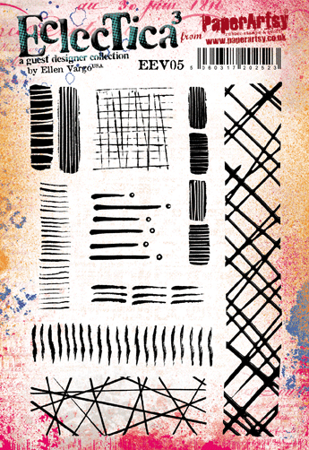
Hi everyone, it's Alison/Craftytrog with you today, and I'd like to share a teabag art canvas with you, that I made using PaperArtsy Eclectica Ellen Vargo stamps.

Since I discovered the joys of using teabag papers, I can't stop collecting every teabag I use. I have plant pots on my kitchen windowsill, just to drape them on to dry! I simply wait until they are totally dry, tear the bag on one side, and empty out the tea leaves. The tea leaves make fab texture when you add them to paint, gels and pastes too. The papers take ink and paint beautifully, and on this project I used them to take prints with my Gelli Plate, using PaperArtsy Fresco Chalk Paint.


I started by picking out the aqua family group of PaperArtsy Fresco Chalk Paint. These are Mermaid, Bora Bora, Beach Hut, and South Pacific. They go from light to dark, and all tone together beautifully. Then I picked out 3 great stamps sets by Ellen Vargo, that have a variety of fabulous patterns in them. They were perfect for the abstract background I had in mind.
Using my 3x5 inch Gelli Plate, which is the perfect size for 2 teabags, I decorated a multitude of papers by stamping into the paint with various stamps from the 3 Ellen Vargo sets. I got quite carried away at this point, as I hadn't decided what size canvas to use.


As I was taking the prints, I stamped the paint from the Gelli Plate and stamps onto an old PaperArtsy Paint chart. This made a great background that I would use later. 


After I'd collaged my chosen painted teabags onto a 6x6 inch box canvas with matte medium, I decided I needed a focal image. Using Little Black Dress Fresco Chalk Paint, I stamped the circle and line image from EEV03 twice, onto the background I'd created on the paint chart, then cut it out.


I finished my trees/flowers off with some pretty shell buttons tied with string. Then, to add some impact and to frame my canvas, I painted the edges with Little Black Dress Fresco Chalk Paint.


I hope you'll give teabag printing a try. It can be very addictive! You need to be a little careful when glueing, as the paper is quite delicate, but it doesn't tear as easily as tissue. I usually apply matte medium to my surface, lay the teabag on, then paint the medium over the top so that it soaks in and adheres both layers. I love the look of the tea grains that are still stuck inside the bags. You can see them quite clearly above in the close up photos. 

I look forward to seeing your projects for the challenge.

Alison x

Blog( I've switched to Blogger): Craftytrog's Arty Adventures
Facebook: Alison Hall
Twitter: @craftytrog
Instagram: @craftytrog

Fantastic Alison, this is super-cool recycling, and you are right, the tea leaves peeking through are such a cool contrast and definitely give an appropriate nod to your source! Love how the EEV stamps have worked for this project. Thankyou! ~ Leandra


We always hope that you  learn something interesting from our blog

Our creative team love to read your comments so much, so please take time to let them know you've been inspired!  

Why not join our 2-weekly challenge by blogging your create response to the current topic and link it here?

The current topic link Topic 9 (Aqua) will close 17:00 (London Time) Sunday, July 22nd 2017, and the winner will be announced 2 hours later at 19:00.

All links go in the draw to win a £50 voucher to spend on products of your choice from the PaperArtsy online store.

Monday, 17 July 2017

2017 #9 Aqua: Zinskis {by Wendy Mallas}


2017 Topic 9: Aqua {by Wendy Mallas}


Wendy not only has a bit of a thing for Zinskis, but she is also always making the most gorgeous books. Check out her links for more info as she also sells her work. Tonight she is sharing one of her perfectly formed creations - in Aqua of course!!

Hi everyone, it's Wendy with you today, and I'd love to share a star book with you. 

When the Aqua theme came up, I had to jump straight in as it's my absolute favourite colour range. It seems to be really on trend for many products these days and here's one example of how to make your own.

Books are my passion. My love of reading has merged into my love of making books. All books. Any books. I am a book artist and I love it! So here is a star book that involves no stitching - just double sided tape or your favourite glue. 


Elena Zinski Art has produced a cracking set of stamps yet again. Making focal points visible when everything is in the same colour range is challenging. Add some shading and highlights to the elements you want to pop.


My seven-point star book opens out and ties with a ribbon. A lovely addition to any coffee table.


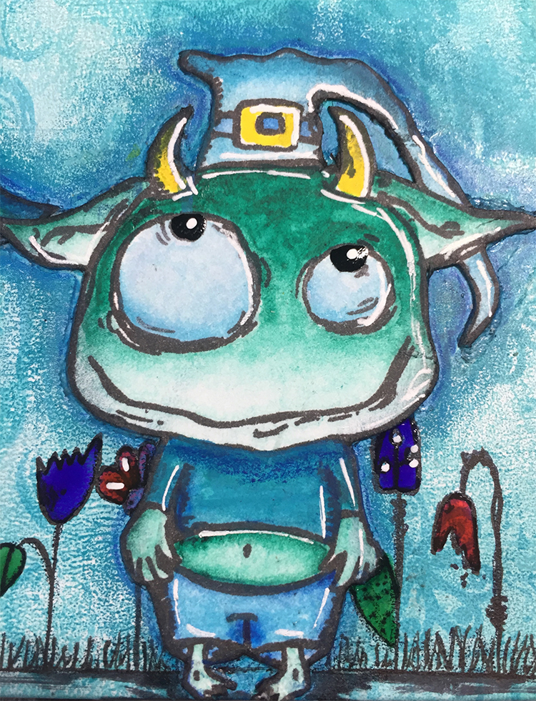
Out of the whole of Elena's new release, this is my favourite image. I really want to live in a house like this. How cool it would be to live in and work from a hat. This is the stamp set....(PaperArtsy retail stockists listed here) ZA15 can be found here.


The ribbon closure, made from plain seam binding dyed with Tim Holtz Distress Stains (Peacock Feathers and Cracked Pistachio), is secured around the spine and under the covers.


Layered mats on each page from pieces of PaperArtsy Heavyweight Smoothy Card, Gelli-printed using Fresco Chalk Acrylic Paints: Snowflake, Mermaid, Bora Bora, Captain Peacock, Beach Hut and Caribbean Sea.


And a couple of babes finished off the back cover. Now they really look like they're up to something!

This book is relatively simple to put together for an effective finish. By fussy-cutting the main stamped images and adding them to the background, it makes the covers very tactile and gives a little dimension. The book can be used for whatever you wish. It's perfect as a photograph album. Perhaps you could add a few pockets and tags to make it even more interactive. Don't be put off by using one colour. Just remember to use some shading and highlights to enhance the main tones. I'd love to see your own interpretations of this topic and project. Most of all, have fun!

Love and peace,
Wendy x

Blog: Wendy's House
Facebook: Wendy Mallas Illustration
Twitter: WendyWitwoo
Instagram: WendyWitwoo
Pinterest: Wendy Mallas
Website: Wendy Mallas

Ohh Wendy, this is a delight! I love blue faced people! And your gelli-printed backgrounds look dreamy! Thanks again for sharing your lovely work with us. ~ Leandra


We always hope that you  learn something interesting from our blog

Our creative team love to read your comments so much, so please take time to let them know you've been inspired!  

Why not join our 2-weekly challenge by blogging your create response to the current topic and link it here?

The current topic link Topic 9 (Aqua) will close 17:00 (London Time) Sunday, July 22nd 2017, and the winner will be announced 2 hours later at 19:00.

All links go in the draw to win a £50 voucher to spend on products of your choice from the PaperArtsy online store.

Sunday, 16 July 2017

2017 #9 Aqua: It's Not A Barbie Girl {By Carol Fox}

2017 Topic 9: Aqua


It can be more of a challenge than you expect to work with one colour palette. I love how Carol has made this fantastic book and stuck to her palette with different shades of the same gorgeous blue. How perfect is this for a travel journal!?

Hi everyone, it's Carol with you today, and I'd like to share with you a little journal I have made. I like to make things from scratch as I enjoy the whole process of printing my own backgrounds with a Gelli Plate and making something that looks so uniquely your own is lovely. I quite often make these to give as gifts as the pockets and tags just seem to be made to keep all those special keepsakes in. I have done them for the bride to be for Hen-do weekends and baby keepsake books, the list in endless. Keep them as simple or as intricate as you wish, you can truly make them your own. 


I only used the three colours Mermaid Fresco Chalk Paint, Bora Bora Fresco Chalk Paint, Inky Pool Fresco Chalk Paint and Snowflake Fresco Chalk Paint to print mt Gelli Prints, but it is amazing how much variation you can get. I also used a massive variation of stencils, to many to list, but the entire range can be seen HERE


With the variation of prints I had a good selection to mix up the pages when I made my book up so although I got a nice consistency with the colour there is still a nice surprise when you turn the pages.


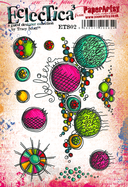
I used black ink to stamp lots of images from the Stamp Sets by Tracy Scott. I especially used the large flower from ETS09 a lot as I masked off the inside and added lines to write on, it was a lovely size for this, and the smaller stamps on ETS11 were lovely to add small details with.


I added a few extra bits, a large elastic wrap closure for the book using the large butterly (I do love how this turned out) , a charm and a couple of journal clips, using elements from the stamps sets above. Finishing my whole project off with some stitching and a bit of black paint to edge all the pages.


I added lots of bits to my journal, tags for extra places to write, and lots of stamped images throughout, I have for the main part at the moment left these uncoloured as I am intending to take this away with me next month to fill with holiday rambling and other stuff. It will give me something to colour if I fancy it and as all the stamping is done all I need are a few colouring pencils.


As I said in my opening post I love to make things from nothing. But what also works well for this type of book is a junk journal. I went to Rome last year and I came home with every bit of tat imaginable, but I used the tourist maps for my pages, cut up things for my tags and I ended up with a lovely memory of my holiday and a handy book to keep all the other stuff in too. I do have a link on my blog to the book instructions and also a very short video showing how I made my charm, a blog link is below.
What a beautiful and practical idea Carol! This palette just oozes summer, and such a treasure it would be to fill it with sunny memories from a special trip! ~Leandra

We always hope that you  learn something interesting from our blog

Our creative team love to read your comments so much, so please take time to let them know you've been inspired!  

Why not join our 2-weekly challenge by blogging your create response to the current topic and link it here?

The current topic link Topic 9 (Aqua) will close 17:00 (London Time) Sunday, July 22nd 2017, and the winner will be announced 2 hours later at 19:00.

All links go in the draw to win a £50 voucher to spend on products of your choice from the PaperArtsy online store.

Saturday, 15 July 2017

2017 Aqua: Water Fairy {by Dounia Large}

2017 Topic 9: Aqua: Water Fairy

Raquel from Spain yesterday, and today we have Dounia from France sharing her story about how she created her under-water-fairy, peeking up through the depths! Make sure to read every word! She describes her journey so well! A* for perseverance Dounia!

Hello everyone, Dounia from France back with you tonight. Have you ever had a clear idea of what you want your project to look like, and even a pretty good idea of how to get there, but the @?*%! thing just won't cooperate?? That's what happened to me when making this pendant inspired by the color aqua and all things blue!

I don't really know if this applies to other languages/cultures but in French, blue is the color of dreams. Therefore, while "Aqua" obviously evokes water and the sea, to me, this pale blue(s) also speaks of ethereal things, slightly vague and mysterious. I wanted to capture this feeling in my piece as a strange being partially hidden behind veils of blue.


I immediately knew I wanted to use the winged lady from Mini 09, she's one of my favorite characters (maybe even my favorite) from all the PaperArtsy collections. I must not be the only one to love her as she exists in two other sizes (Medium and Large)!


The Fresco Acrylic Paint line has many gorgeous blues, I chose Antarctic, Blue Oyster and Smurf for both background and accents, with a bit of Pearl glaze as fairy dust!


This is, I think, my fourth try, and not the one in the final project. The lady is stamped on tissue paper, painted on the back, then glued of a painted chipboard. My tissue paper is very thin so there was a few accidents... Of the course the more I failed, the more frustrated I became, which did not help the following attempts! I had to take an ice-cream break...


On this base, the idea was to build layer upon layer to create the impression of depth. I wanted her to be still visible but look slightly obscured, like she was below water. For that I alternated tinted but still transparent layers with opaque ones stamped only one the sides with Mini 41.


On the first try, I was too impatient/ambitious and did not managed to get the thickness and tint of my layers well enough. I ended up with something either not aqua at all or with my fairy so deep underwater she was invisible! I used one such attempt for the back of the pendant. The French saying means "Be cautious of sleeping waters": the surface might seem calm but you don't know what's happening beneath it and the water can wake up at any time. It is used to describe both situations and people. Considering this water hides a fairy, I thought it very fitting!


I finished with a crackle effect because... well I love crackles! Also when highlighted with a pale color (here white and pearl) they make me think of tiny ripples diffracting light.


In the end I am reasonably happy with the result, even if I would have liked even more depth. I might end up adding a few more coats of varnish just to try and bring the finished pendant closer to the idea I had in my mind! Generally I am more likely to go with the flow (and the unexpected detours) of a project and it goes better. There 's probably a lesson here! Anyway I made all the mistakes for you so don't hesitate to try the building of transparent layers, it brings such impact to a piece, it is very rewarding!

Thanks for joining me. Dounia x

Blog: Doudoulina

'reasonably happy' ??? OMG! You are only 'reasonably happy' !! LOL This is fantastic!! I know it took you several (frustrating) attempts to get where you had in mind, but it looks fabulous! The pearl edging is so pretty! And now you have explained the depth of layering, it really it such a great project, I think you should be ecstatic! ~ Leandra


We always hope that you  learn something interesting from our blog

Our creative team love to read your comments so much, so please take time to let them know you've been inspired!  

Why not join our 2-weekly challenge by blogging your create response to the current topic and link it here?

The current topic link Topic 9 (Aqua) will close 17:00 (London Time) Sunday, July 22nd 2017, and the winner will be announced 2 hours later at 19:00.

All links go in the draw to win a £50 voucher to spend on products of your choice from the PaperArtsy online store.