2020 Topic 12: Typography
Really
loving how the Kraft paper substrate, Kraft paper words layered on top
and Walnut brown infusions tie this journal page together so well with
those chiming shades of brown bouncing off each other. Can you see how
the infusions sink into the journal pages for those spots missed by the
randomly-scraped snowflake paint, giving instant depth and allowing the
same colour to have a two-tone effect? Plus plenty of Lin Brown quotes
abound. There is lots to appreciate here!
~ Leandra
Hi everyone, it's Claire Snowdon here with you today, and I'd like to share with you an art journal spread I created.
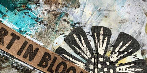
I've gone right back to the start with this journal spread - back to Lin Brown's very first stamp release for PaperArtsy! In February 2013, Lin started designing for PaperArtsy with a series of Hand Carved stamps,and matching dies - you can see the original blog post here.

I created my pages in a Prima Finnabair art journal - the pages I choose to use were two different ones; one was kraft and the other was already pre-printed with some typography, so I thought it would make a good starting point for this topic.


Then I added a mixture of Infusions: Green Man, Golden Sands, Emerald Isle and Slime.

I wanted to add more depth to the page so I added some Fresco Paint in South Pacific and Pumpkin Soup using my fingers to blend.


Then added some script stamping using ELB30 and Versafine Vintage Sepia ink.


I took an old offcut of text covered scrapbook paper and stamped the flower and leaf from ELB01 and ELB02 onto it and then fussy cut.


I
added all the elements to the pages and then splattered them with gold
pen. Then to finish I added Black Soot Distress Ink around the edges.

I hope you've enjoyed my typography project and that you'll join in with this theme! Thanks for visiting today, take care.


4 comments:
Gorgeous journal page... I love this. Love the kraft and the colours!
I really love this, it looks gorgeous! Lovely colors too! Thanks for showing very inspiring!
Gorgeous, Claire, and I love those stamps of Lin's!
LOVE it Claire... I like how we as designers for PA are all doing different type of arty projects.. I'm just sayin' hehe
Post a Comment