Showing posts with label ELB28. Show all posts

Thursday, 22 October 2020

2020 Topic #18 Small journal cover with EGL (by Noguchi Etsuko)

      2020 Topic 18: Geometric


With a little more geometric styled patchwork but with a completely different vibe, Etsuko has poured lots of time and creative energy into this amazing journal cover. She obviously was inspired by Gwen's workshops, so do check those out too.
~ Keren

Hi everyone, it's Etsuko from My favorite things with you today, and I'd like to share with you a small journal cover featuring by Gwen's wonderful art for the current theme.

The 'geometric' theme was a little difficult, but interesting and challenging. The class I took at Gwen's workshop called 'Patchwork Pages' fitted perfectly with this theme so I thought it would be a good idea to make it here.


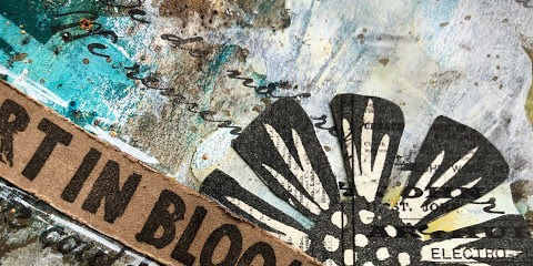
First I painted the background of each paper with a different Fresco paint and stamped on the Smoothy (Heavyweight) A4 white card. I used Fresco paint are SeaglassCaptain PeacockLemon MeringuePumpkin SoupVintage LaceWisteria, and Blueberry, stamps are EGL01EGL03 and EGL06.


I made the assigned hexagon pattern in Illustrator and cut each piece accordingly then connected each piece together to make these hexagons.


I cut some design papers to be a little larger than the original hexagon and stuck it to the bottom of the original hexagon so that it would be the margin. Then I made a circle in the center and finished the hexagonal parts. Also I made large and small paisleys on the Smoothy (Heavyweight) A4 white card by EGL07 for embellishments and painted with watercolor pencil. Next I embossed the ELB28 DREAMS with black powder and cut around it and distressed it with Sepia Archival.


Next I made the masterboard for the book cover. I stamped several stamps EGL07, JOFY62JOFY36 and JOFY41 on the copy papers by Versafine Clair Nocturne ink and also prepared the design paper.

I tore off each piece of the paper, collaged them on the Smoothy (Heavyweight) A4 white card, and distressed them in places with Fresco paint Toffee. I cut the collage paper in half to made the front and back covers.


I laid out the hexagonal motifs, glued the paisley embellishments and the word 'dreams' on the covers then I made the Catholic Stitch Bookbinding with the covers and watercolor papers of the same size.
To make the back cover paper, I painted Fresco paint Wisteria on the Smoothy (Heavyweight) A4 white card and when it dried I stamped EGL03 it all over by Blue Violet Archival.


I glued the paper to the back of the cover and distressed the edges with Sepia Archival to make it look old.


Finally I made a tassle with Kochis charms and beads attached to the spine.


I had a lot of fun using Gwen's stamps and although they take a little bit of work, I find myself getting hooked on them in the process of making them. Please feel free to contact me on using Facebook etc. if you have any questions about my photos or explanations. This idea  was from Gwen's workshop 'Patchwork Pages' if you are interested in this please visit her site as she has more workshops.

Thank you so much for visiting.
Etsuko xxx

Blog: My favorite things
Facebook: Etsuko Noguchi
Instagram: Pixienest
Pinterest: Etsuko N


Saturday, 11 July 2020

2020 #12 Going Back To The Start with Eclectica Lin Brown Stamps {by Claire Snowdon}

2020 Topic 12: Typography


Really loving how the Kraft paper substrate, Kraft paper words layered on top and Walnut brown infusions tie this journal page together so well with those chiming shades of brown bouncing off each other. Can you see how the infusions sink into the journal pages for those spots missed by the randomly-scraped snowflake paint, giving  instant depth and allowing the same colour to have a two-tone effect? Plus plenty of Lin Brown quotes abound. There is lots to appreciate here!
~ Leandra

Hi everyone, it's Claire Snowdon here with you today, and I'd like to share with you an art journal spread I created.

I've gone right back to the start with this journal spread - back to Lin Brown's very first stamp release for PaperArtsy! In February 2013, Lin started designing for PaperArtsy with a series of Hand Carved stamps,and matching dies - you can see the original blog post here


I created my pages in a Prima Finnabair art journal - the pages I choose to use were two different ones; one was kraft and the other was already pre-printed with some typography, so I thought it would make a good starting point for this topic.


I scraped on a thin layer of Fresco Finish paint in Snowflake to give a good base for my pages. 


Then I added a mixture of Infusions: Green Man, Golden Sands, Emerald Isle and Slime.


I wanted to add more depth to the page so I added some Fresco Paint in South Pacific and Pumpkin Soup using my fingers to blend. 


Then added some script stamping using ELB30 and Versafine Vintage Sepia ink.


Lin has loads of different quotes in various fonts amongst all of her stamp sets so I chose a few of my favourites and stamped some directly onto the page using Versafine Black Onyx ink and some onto kraft paper.


All the quote stamps are from these sets: ELB01, ELB02ELB05, ELB28 and ELB33.


I took an old offcut of text covered scrapbook paper and stamped the flower and leaf  from ELB01 and ELB02 onto it and then fussy cut.


I added all the elements to the pages and then splattered them with gold pen.  Then to finish I added Black Soot Distress Ink around the edges.


I hope you've enjoyed my typography project and that you'll join in with this theme!  Thanks for visiting today, take care.


Monday, 23 July 2018

2018 #13 Mint, Sage, Claret & Gold with ELB {by Wanda Hentges}

2018 Topic 13: Mint, Sage, Claret & Gold (Colour Topic)


Wanda has created a bright and cheerful accordion book. Lots of texture going on and it's so nice to see Lin's stamps on a project like this - a perfect fit! ~ Leandra

Hi everyone, it's Wanda Hentges (Art By Wanda Blog) with you today, and I'd like to share with you an accordion book.

An accordion book popped into my mind, I hadn't made one in a looonngg time, so that is where I went with this project.  I had a wonderful time creating the book with this color combination and besides black (and Grunge Paste) I really did only use these 4 colors.  I love a challenge but these colors go so well together that it wasn't hard at all.


I've used all Lin Brown stamps and stencils today.  Lin is one of my favorite PaperArtsy designers!!! 


I've used stamps from ELB09, ELB23, and ELB28.  


The stencils used are PS002, PS003, PS043, and PS044.


I really love these colors together.  Even mixing them makes gorgeous colors. The pink flowers on the first panel - the color is a mix of Hint of Mint with a drop of Claret. Over on my blog I have step-by-step photos of building the background and all the elements.

Something I've been trying to work on when using paint (and Fresco Finish Chalk Acrylics are my favorite) is more layers and letting go, not being afraid, to cover some stuff up even if I love how it looks before covering.  It often makes for more interest and a look you just can't get when you want to let everything show.


It was very interesting when I added in the streaks of Hint of Mint how it made the leaves that were stenciled with Claret look darker.


A stamping platform works great if you want to stamp directly onto your background.  It allows precise, multiple stamping to get a darker image  when stamping over layers.


If your project is too long for the platform, all you have to do is flip it around and stamp from the other side.


On the inside of the book, Gold was mostly used as an accent and I love the way you don't notice it as much when looking straight on but it certainly catches your eye as it moves!!


From today's joys to tomorrow's dreams, I hope you've enjoyed this accordion book.  As I mentioned, there are complete step-by-step pictures on my blog.  If you are reading this post at a later date, just go to this same date on my blog to find the post.  

This is a fabulous color combination!!!  I hope you are inspired to create something with these colors!!!  You can link up to your project on the introductory post for this theme.  I hope you do and then I'll be stopping by for a visit.  
To join our challenge and win a PaperArtsy £50 gift voucher:
Simply make something arty relevant to the topic, and link your creation from any social URL (eg. Instagram, Pinterest, Blog Post etc) sharing your original make to this challenge page.

The current topic link Topic 13: Mint, Sage, Claret, Gold will close 17:00 (London Time) Sunday, August 12th 2018, and the winner will be announced 2 hours later at 19:00.

All links go in the draw to win a PaperArtsy gift voucher. Please make sure we can contact you as a prize winner - it helps if you share your contact info from the platform you opt to use.

Good Luck! If you have any questions, don't hesitate to ask!