2020 Topic 12: Typography
If we were to count the textures in Jennie's lovely
piece, we'd be there for quite some time. Neutrals need not be pale and
insignificant, they can 'roar' with life too. There are plenty of
typographical elements here too, so don't miss them!
~ Keren
Hi everyone, it's Jennie (Live the Dream)
with you today sharing some super typography vintage stamps on a canvas
style board. I always love stamps that give and give and these are
superb in that they can be used in so many different ways and on so many
different textures.
I
have worked with two sets of Ink and the Dog stamps from the Letters
range. These are quarter plate (A6) size and are available unmounted red
rubber, or as trimmed EZ mounted where each image is trimmed for you:
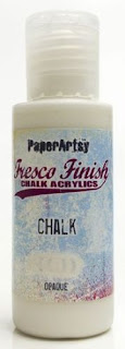
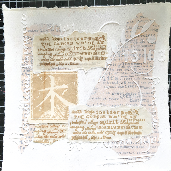
I decided to work on a piece of heavy watercolour paper which I have torn into shape using a ruler (5 ½" x 5½"). Whilst this gave me a good heavy base to layer onto, I was unable to do any stitching with the sewing machine which I had planned as it became too thick. I sponged Chalk and a little Toffee Fresco Finish Paints onto the paper before adding some text tissue paper and texture in the form of some text elements of Sara's new stencil.
Before I start a project I always like to stamp onto different substrates .... I always have on my desk bits of tea dyed paper, coffee filters, (some of which are coffee dyed), linen and three or four different brown inks.
I started randomly layering bits onto my background ... I really have no idea where I am going but try to adhere pieces around the outside edge.
I try and get the focus in as soon as I can otherwise it does become very random! It was at this stage I realised the thickness of the layers was going to prevent me using the sewing machine otherwise this focal image would have been outlined with stitching.
From here it was about building up elements of focus. I do love a little clump of linen, muslin and coconut buttons. I love that it doesn't lie flat but I love the softness of the textiles.
As I couldn't add any stitching I had to look for something else to fill the space so opted for a couple of lines of waxed cotton which replicated the lines from the stencil.
I'm
afraid I am a bit of stickler for keeping everything straight and
square .... it is a personal thing but I hate anything stuck down in my
own work at an angle!
You also may notice that I have 'turned' the lovely lady. I had intended to adhere flowers here but it didn't look right. I needed my lady to be looking into the canvas so stamped on tissue and adhered her onto watercolour paper back to front.
I have created a bit of depth on this side too by adding foam pads which allowed the little tags to appear to "hang".
I
find that working in a particular shape really matters. I started this
piece on a rectangular piece of watercolour paper and I just couldn't
get it to work well. So I went back to basics , putting everything aside
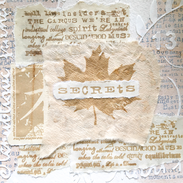
and worked out what I really wanted as my focus ... which was the leaf
with the word Secrets across it and I realised it was square! Once I had
that sorted I was away!
I
love text and words and use them all the time on my work. I couldn't
imagine a piece without some words or randomly poorly stamped text. To
me it is the basis and supporting element of my work. I have used the
text stamps in both these sets in different ways, sometimes isolating
words, sometimes using them as a background and stamping on different
substrates to give different effects. The lovely lady was a bit of an
afterthought and goes to prove that you can design and create with text
only!
As always thank you for joining me.
Jennie x
Blog: Live The Dream


4 comments:
Beautiful work Jennie!
Gorgeous project as usual Jennie
Such a gorgeous textural piece, Jennie - and so many fabulous fonts to enjoy!
Alison x
I love this piece! Good tip about stamping several stamps on different substrates you might want to use.
Post a Comment