For this second topic of 2023 (under the umbrella theme of TRACKS for the current quarter) we are continuing our journey in colourland and our expanding our understanding of the colour wheel.
Colour has a crucial role in all crafters' worlds but we want you to feel confident experimenting and playing with it to find find YOUR colour palette; perhaps to explore a colour theme for a series of works or for the item you are working on now. I'm sure we all have successfully 'made mud' or ended up with clashing, uncomfortable results when mixing colours, and we know this can be frustrating and discouraging, especially if you don't really know what you need to do to improve on this outcome for next time!
In 2022, we started our adventure in colour theory, taking you with us and explaining how to mix colours to create new and successful combinations,]. Hopefully we have played some part in helping you understand why some colours work better together than others, but also how to make 'nice mud' when you want to!
This time, building on our knowledge from last year, we enter the (sometimes treacherous) realm of four-colour schemes, for more variations and playful possibilities!
Throughout 2022, the blog offered 3 topics exploring the colour wheel. We hope those topic introductions and our bloggers' posts will become a reference for you to fall back on and further your colour game.
To build strong foundations, Leandra shared live how colour mix to create your own colour wheel to your taste. She explained how branching away from the classic bright Magenta/Blue/Yellow primaries and trying other colours opens up new possibilities, for example starting with pastel or rustic options for more muted results. You can also find all this information in the introduction to the 2022 yearly colour theme.
Once you have your own wheel (the PaperArtsy wheel is available here), you have quite an number of typical colour schemes you can apply to your project; 3 options were covered in 2022
This first topic focussed on the most famous and simple colour combination: complementary colours! Picking 2 opposites on the colour wheel is a sure way to achieve the greatest of colour contrasts. Just be careful to not mix them (that is how you make brown by the way!) Despite its simplicity, the possibilities are endless, especially once you start making your own colour wheels and get beyond bright colours to play with dark, pastel, rustic or desaturated hues. Opposites are always going to offer a striking, high impact result with some energy.
In round 2 of our colour wheel play, the focus was on split complimentary colour combinations or using one colour from any position on the wheel buddied up with the two colours either side of its direct opposite, creating a 'Y' or a thin triangle on the wheel.
Compared to just using complementary colours, adding a third colour allows more variation and nuance to build complexity. While providing slightly less contrast, this colour scheme still packs some punch. It's a more subtle version of the complementary scheme, and an easy way to get colours that will work without looking like you've tried too hard. It is also quite flexible as you can experiment with various ratios: all three colours in equal amounts, the tail of the Y as main colour with two tonal accents, or the split colours as one main colour block, with an accent of the third. And you get 12 different combinations from one wheel!
For our 3rd colour wheel topic, we continued with the 3-colour scheme, but this time we explored triads or 3 colours evenly spaced on the wheel. Those colours can separated by 3 wedges, 2 wedges or 1 wedge for 3 different atmospheres.
The most classic triad is the equidistant one, where the colours are separated by 3 wedges covering the whole wheel. This is a very balanced scheme, offering a lot of clean colour contrast. When reducing the spacing to 2 wedges, you end up with two opposites and a third colour balancing both. It is an easy way to soften and intensify the classic complementary contrast. Finally, with only 1 wedge between your colours, contrast is greatly reduced: you are basically ignoring half of your wheel! You can however play with layering similar tones and harmony is generally easier to achieve.
For more information, examples and inspiration, do not hesitate to revisit the introductions for those topics as well as the beautiful projects by our blogging team!
Now for 2023:
With a full year of colour theory under our belt, we are ramping it up a bit. Let's get adventurous and tackle the options within 4-colour schemes!
I want to start with a disclaimer: while doing research for this topic, it quickly appeared that nobody agrees on semantics ie Tetra vs Quad. Various names are used for these schemes, and sometimes the same name is used for different combinations so it can be confusing. We do not pretend to have the final say, but for clarity, we made a choice to use vocabulary consistently. We tried to settle on names that seem both logical and commonly in use and we hope they work for you too! When applicable, I have tried to add the other common names, so you might recognise them.
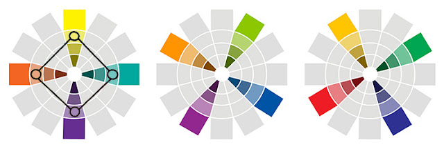
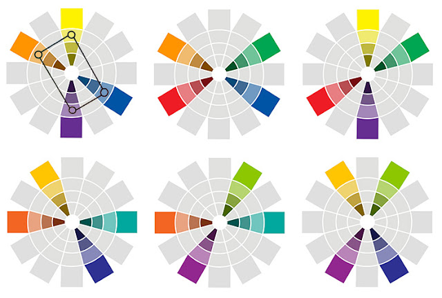
As you can see from the following graphic, tetradic combos are made of 4 colours. 'Tetra' means 4 in Greek; these are also sometimes called quadratic combos, as 'quadra' is also 4, but derived from Latin, see what I mean about semantics? On a colour wheel, this applies to two pairs of opposite colours.
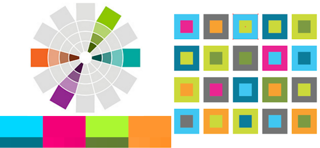
A 12-segment colour wheel will create 3 types of tetrads: a square, a rectangle and a slim rectangle. The further apart the space between each colour, the more contrasting the colours will be, creating 3 different colour harmonies that we will explore in more detail.
Source: Alex Guzman
If you prefer to see them in action, please check this video by Dr Oto Kano:
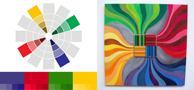
Like the geometric figure it is named after, all 4 colours are equidistant on the colour wheel, and separated by 2 wedges, making them the furthest apart from each other they can be (quadratic colour sometimes refers to this combo specifically and not all 4-colour combinations). This is a very balanced and contrasting scheme. 3 possible combinations are possible within 1 wheel, each composed of a primary colour, its secondary opposite and 2 tertiary colours.
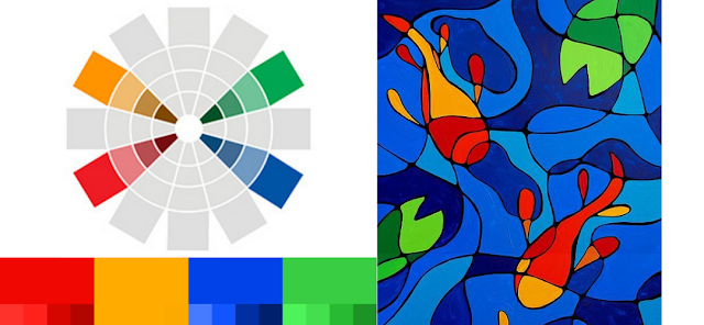
Let's start with the classic Red/Green/Yellow /Blue. All the main colours together! Only for it to actually be a square combo, the yellow is actually light orange and the blue Purple blue. Still maximum contrast, especially with bright shades.
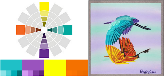
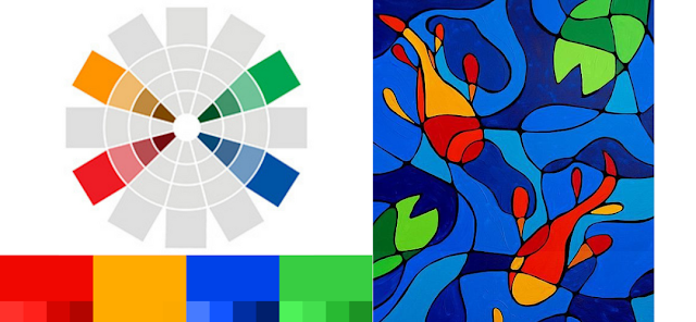
Now with yellow as your primary choice, it will be balanced by purple, dark orange and turquoise. Notice how you always have two warm tones and two cool ones? Those are often easier to make work together. Here the cools are used in both bright for the bird and soft shades for the background, a sure way to harmonize!
Source: S Audrey
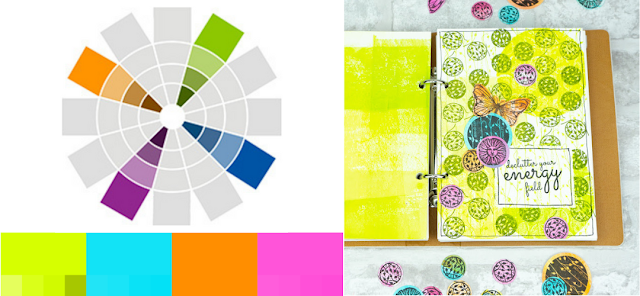
Blues are partnered with orange, red purple and green gold. In light, zingy tones, they make each other pop for maximum pep.
This time the 2 complementary (opposite) groups of 2 colours are only separated by 1 wedge (this is also called Double Complementary, despite the fact that all tetrads are double complementarys!). There is still a lot of contrast but also more opportunities for harmonies inside the warm and cool groups. You have 6 possible colour schemes within 1 wheel. You can either partner 2 primaries with their 2 opposites secondaries (first row of wheels below) or 4 tertiary colours (second row of wheels). Lots of tetradic combos will instinctively fall into this category, as it is the easiest to work with.
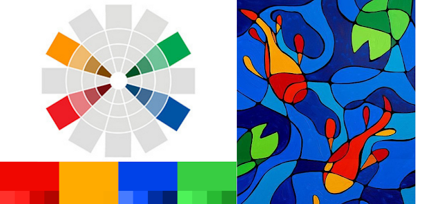
Here are some examples. Another version of the 'main colours': red, green, blue and... orange! In this square combo, the two warm colours are closer together(1 wedge) than they are to the cool colours (3 wedges). Therefore grouping the colours by temperature is a easy way to create great and clear contrast.
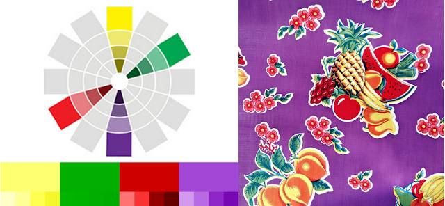
Let's look at another 2 primaries/2 secondaries combo: yellow, purple, red and green. This time the warm colours are further away from each other (3 wedges) than they are from the cold ones (1 wedge), creating a completely different hierarchy and atmosphere. The yellow and the green actually harmonise better than the yellow and the red, making them pop.
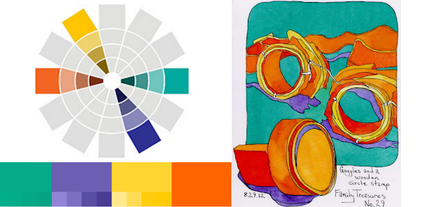
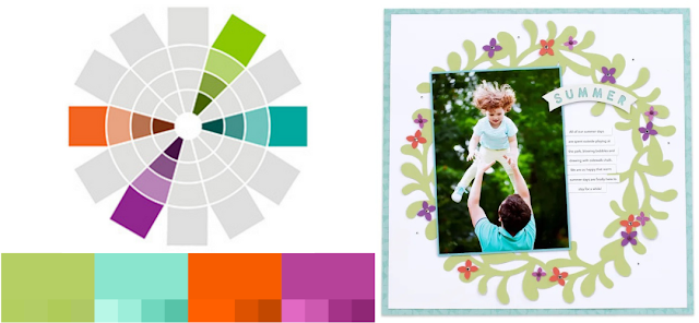
Now playing with tertiary colours, they can still be bold and bright! The warms are back together and the artist used that contrast fully. Cold colours for the background and warms for the focal elements.
Softer versions are often easier to harmonise? Using focal photo main blue to frame it and also the page creates cohesion while letting it detach from the other elements by colour contrast.
Yes, this name is not the most distinctive but the only other possibility I have seen is 'Double Split-Complementary', which is very long and not very clear, so 'Slim Rectangle' it is! Our 2 pairs of opposites are adjacent (or analogous in colour speak) this time. Contrast is still strong because of the complementary colours sitting opposite each other, with the more subtle variations between the 2 adjacent colours. Again there are 6 possible colour schemes within 1 wheel. Each combination regroups a primary, its secondary opposite and 2 tertiary colours.
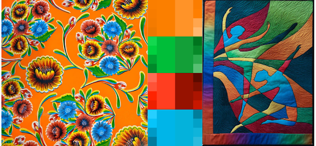
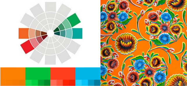
With the slim rectangle scheme, the contrast is between the 2 opposite groups of adjacent colours. See how in this fabric, the blue flowers and green foliage pop on the orange background, while the yellow and red flower are much more discrete.
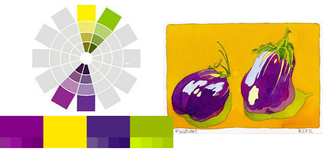
An instinctive way to use such a combination is therefore to group the analogous/adjacent colours, creating subtle variations in the same block. Here the yellow and green gold fill the background, making the purple eggplants stand out greatly.
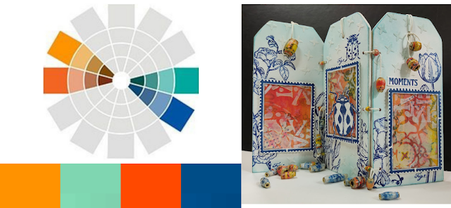
Ellie Knol used the same concept in tag book. The blue-green and orange part make each other stand out without clashing thanks to the frames and colour blocks.
We have already explained a lot of possibilities, but do not forget that contrast comes not only from the hues chosen but also their brightness/softness/darkness etc. Within a specific scheme, you can play with with the saturation and lightness of your colours to achieve a pleasing and useful palette.
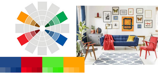
Let's explore the Red/Orange/Green/Blue rectangle. Using the pure hues, you have 4 colours of the same intensity. It makes for a very bright and busy project, not always easy to balance comfortably.
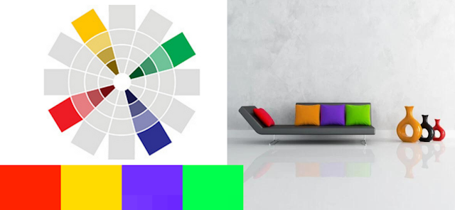
If everything looks too bright or gaudy, do not hesitate to change the vibrancy of your colours. For example, using darker or lighter versions in the mix will greatly soften your final project. Using colours of different lightness will make the brighter ones pop more and 'take the lead' in your composition. In this living room, the darker blue and red stand out compared to the lighter orange and green. Blue and Red are not opposite, creating a softer harmony, consolidated by having their respective complementary strategically placed in the room. The Red/Green complementary creates an horizontal axis, while the Blue/Orange one brings focus to the center of the picture, with a slight vertical elevation.
Playing with saturation, or more or less diluted colours, is an other avenue to harmonise a tetrad scheme. Here the opposite are used together: Blue/Orange in the background and Red/Green in the foreground dinosaurs. While the red and green are bright and saturated, the blue and orange are more muted and diluted with neutral tones. This makes the landscape softer, allowing the more intense focal elements to pop.
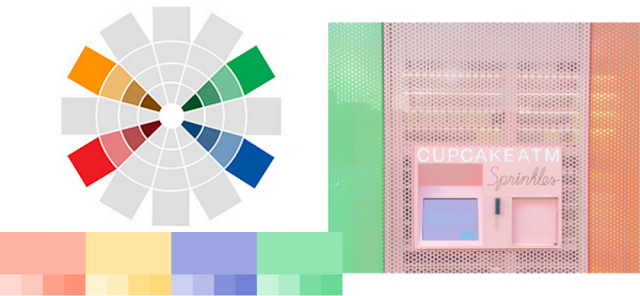
Now if all your colours are softer versions, you lessen the risk of clashing and gaudiness but also lose contrast. The topical soft colours of this Cupcake ATM make for a pleasing whole but nothing stands out particularly. As all the colours have the same intensity, contrast is only provided by the hues and the rectangular scheme. You then decide if this is enough for you or not!
When you are making your own colour wheel, all the variations generally come from the 3 colours you choose to start with. To learn how to start, check the introduction to 2022 colour theme as well as Leandra's live in our Facebook Community 'PaperArtsy People' on how to create your own colour wheel. What is more interesting is when you branch away from the classic primary colours of Magenta/Blue/Yellow. You can also be inspired by the community amazingresults by following along!
.
Now, here are a few ideas to go further and create truly unique colour wheels:
Shifting: replace one or 2, or 3, of your starting colours by a secondary or tertiary. You can use green/green gold/light orange/orange instead of yellow, orange/coral/mauve/purple instead of red, purple/lavender/turquoise/green instead of blue.(above) The more stark the departure, the more surprising the results! Jennie Atkinson shifted all 3 in her blog post for a truly delicious wheel.
Intensity: Instead of starting with colours of the same intensity, as we tend to do, mix things up! Have one or two of them be softer/brighter/lighter/darker for more variety. For example, Amanda Pink mixed two light colours with a very dark one for an amazing blog post.
Tones: All the reference wheels are made with pure clean colours, to better show the hue but try using greyish or other half-tones colours and you will be amazed by the results. For example choose khaki instead of yellow, grey blue instead of blue or dusty pink instead of red. Autumn Clark did that with both her blue and her yellow in her blog post, for rustic and mysterious colour palette.
Neutral: Time to get radical! Let's replace one of your starting colours by a neutral for a completely different wheel. Beige can shine instead yellow, grey instead of blue, brown instead of red. Se this great blog post where Floss Nicholls uses Stone instead of a blue.
Making the wheels is part of the fun and once you have a wheel you like, you can choose whatever tetrad you like and start another round of play!
Tetradic schemes are the richest of all available colour schemes. They give you the most variety, opening up some fun and creative options for you, but they may also be a bit more difficult to pull off. So we have complied a few tricks to help you.
Divide and conquer
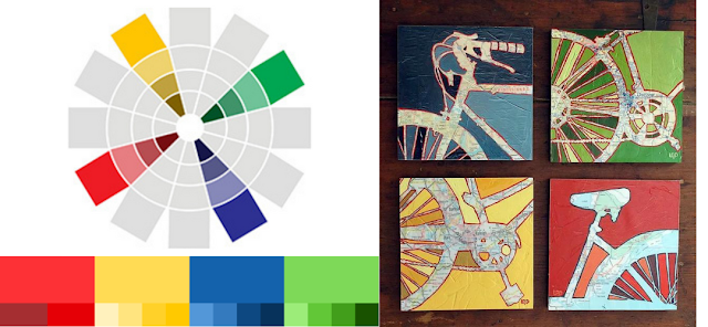
Colours clash when they are next to one another. To avoid this issue, let's just not put them too close to each other! The extreme solution is to complete separate the 4 colours, as in this 4-piece print.
It does not have to be this dramatic. First make sure that all 4 colours are not in close proximity too often. An interesting exercise is to go further and insure a maximum of 3 colours are in contact using layering and piecing. Try it out and be creative!
Play favorites
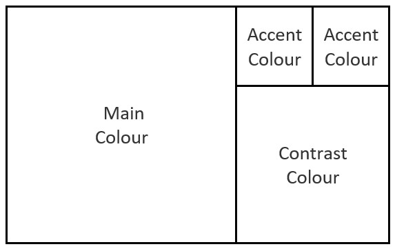
Colour balance is a bit more difficult with 4 colours. While it certainly can work in some cases, you should probably avoid using all four colours in equal proportions. Tetradic colour schemes, especially the square and rectangle ones, work best when you choose one of the four colours to be the dominant one and use the other three as contrast and accent colours. This prevents your project from appearing too busy or unbalanced as it is deliberate. In interior or web design, a classic ratio (in space covered) is: 60% main colour, 30% contrast colour and 10% accent colour(s), which is also a great rule of thumb for crafty projects. For a more visual representation, you can, for example, use Fibonacci colour ratios:
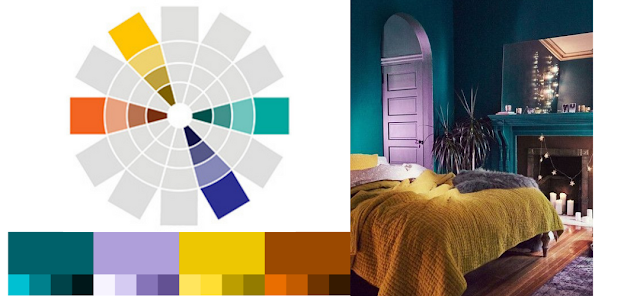
This painting roughly follows this rule, with teal as the main colour and its opposite, dark orange, as the contrast colour. Despite the bright shades, it allows for a cohesive image homogenized by the bold background.
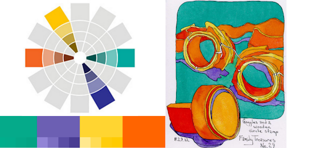
Again teal is the main colour, with light orange as its contrast. Its actual complementary colour is the least predominant one, and they never touch. The ratio is more of a geometric one, where each colour appears twice as much as the previous one.
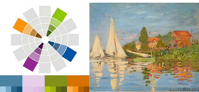
The impressionists were inspired by colour theory and colour perception. In this Monet water scene, the main colour takes up to 75% of the space with orange and green gold as its contrasts. The pink is barely visible, tucked in the cloud but it also provides shadow to the houses and reflections, unifying the palette.
Source: Claude Monet
Keep it neutral
To prevent clashing, you can balance your tetradic colours with a neutral background or a good amount of white/neutral space. In terms of interior design, A room with orange walls, red drapes, blue furniture and a blue rug would be overwhelming. However, a room with white walls that also uses red, green, blue, and orange pillows, rugs, and window treatments has plenty of vibrancy, but it is still calm enough that you can relax within the space.
When crafting, that means leaving plenty of room for your elements to breathe and using neutral colours to separate the different colour groups. We already know that white and black make colours stand out, they also prevent them from clashing!
Now, black and white are not your only options. Any neutral colour will work: greys, beiges, off-whites etc. You can then match them to the tones of the rest of your project to be better integrate, like the taupey wall of this architectural page.
Also keep in mind that our perception of colours varies depending on the others surrounding them, both in shade and hue. The same colour looks lighter on a dark background and darker on a light one. When close, colours tend to bring out each other's opposite tones: Red close to blue will look more orange, while the blue looks more green. This is called simultaneous contrast.
On a larger scale, the colour of your backdrop also has an crucial impact. These two fabrics have the exact same pattern in the exact same colour only one is on a white background and one is on the black one. As the colours are bright, they pop contrasting on black and look a lot more washed out on white.
We already have seen how using colours of different saturation and value may help avoid gaudiness. Using one or two opaque softer colours as your ‘primaries’ to mix your colour wheel will greatly help you achieve a pleasing result. Perhaps a pastel, a coloured grey or even a neutral within the ‘primaries’ of your colour wheel will create an interesting starting point.
Another trick is to reduce one (or more) of your 4 colours into several shades. The following blanket pattern uses 4 very bright base colours which could have clashed. Darker versions of the blue and green have being added to the mix, effectively introducing more colours to spread the contrasting one more.
The base colour of this fabric and quilt are not that different but the gradients in the quilt add a lot of shade variation. This not only add complexity but it also partially softens the contrast between the colour blocks.
By nature, your tetradic combo will generally have 2 warm and 2 cool colours and those two groups will naturally contrast with each other. As with hues, working with equal amounts of warms and colds is tricky as just a slight difference will be unconsciously perceived as imbalance. So if you have difficulties with the colours of your project work, think about choosing one to be visibly prevalent over the other, making it intentional.
Here, with the water and lily pads, the cool colours are obviously dominant, making the warm focal elements pop. With more fishes, the the painting would appear appear gaudy and be a lot less readable.
Choosing a warm or cool theme has a lot of impact in the final look and perception of a project. They are not called warm and cool for nothing and evoke different feeling and associations. It will also dictate which colours of your tetrad will stand out more, depending on their separate contrast with the main, as shown in these two fabrics.
All these links can also be found from our linktree here and its easy to save the PaperArtsy colour wheelfrom this link, print it onto card and you are ready to start exploring colour.
Colour Theory videos
If you want to see someone talking through the theory, mixing colour and then going further, this is a really informative video by Kyle Heath. If you're just interested in the colour mixing, he starts with that, but you may want to keep watching, as there's so much useful information.
Here is Dr. Oto Kano's whole series on Colour Theory, including colour mixing, avoiding mud, customizing your palette and the different classic schemes. A great resource and each video is under 20min long.
Digital Palettes and Colour Schemes
Online colour wheels and palette creators are great to explore and experiment before actually breaking out the paints. They are also allows you to better understand the colour choices of art pieces you like, or don't like!
Adobe Color is free and offers a customizable colour wheel to generate palettes, and a palette and gradient extractor. You can change the background from white to black which is a great feature. The available colours are based on the Pantone catalogue.
All the palettes in this post were made with Paletton, also free. While it is less intuitive at first use, it is also more customizable. You can choose the number of colours in your palette, the distance between you colours on the wheel as well as the type of file to download your palette. Once I had the hang of it, I personally found more versatile and complete than Adobe Color. You choose the hues on the exterior of the wheel, then can modify each colour lightness and saturation in the central part, also creating and adjusting harmonized sub-colours.
We hope this gives you everything you need to get started, and hope you have loads of fun playing with colours!
If you want to create along with us we would love to see what you get up to!
You could tag us on Facebook, Instagram @paperartsy , Twitter, or post in PaperArtsy People Group on Facebook. We really love to hear about how the blog topics have inspired you, so don't be shy!!
A note from Leandra: Tracy has taken her designs a tiny bit smaller in size for this release which means you get more stamps for the same price. It also means these are going to work for smaller formats - maybe you might make some cards or tags? With flowers and fish you can create a beautiful floral display of cascading flowers with a little bit of simple masking, or maybe some fishy mandalas. Don't think you can't go big though - as you all know, Tracy certainly knows how to grow small designs into much bigger ones by developing her mandala style layers.
Don't forget Tracy will be along to share with you LIVE her new products and ideas over in our facebook Group, PaperArtsy People shortly after this post publishes. I hope you can drop by for the live, or try to catch the replay. it's nice to hear from the designer about each new release and understand more fully the ideas they have with each product!
For the next few months, these stamps are only available EXCLUSIVELY from our approved stockists. Please check the list at the foot of this post to find a retailer online or geographically near you, it makes sense to order within your country where possible.
Hi everyone, Tracy here
I'm super excited to share with you my newest release for PaperArtsy. 3 stamps and 3 large coordinating stencils.
Can you believe it's already that time again, I just don't know where the time is going!
I've had an absolute blast both designing and playing with this release, I tend to go with my gut for each release and design according to my current obsessions and this one is no exception.
Coloured pencils, colouring and doodling are right up there at the moment and I wanted my designs to be easy to colour and inspire me to go on a doodling adventure and I certainly think they've done that... however I think I'll let you be the judge of that!
Price: RRP €23.00 +VAT Size:5" x 6" (13 x16.5cm) All stamps are individually trimmed onto cling foam, with a laminated storage sheet.
Tracy Scott Collection stamp set 078 (TS078)
Happy Planner Page
So I recently bought a planner... life is getting so crazy these days that I can't possibly remember everything so decided to bite the bullet and get myself down the planner route...
Of course there was no way this was going to be a plain page planner and I knew immediately I would be decorating the pages.
I found the paper excellent to stamp on and colour with my Prismacolor pencils and lets face it who doesn't love a flower page to make you happy.
I wanted a doodled flower vibe with this stamp set with lots of elements to combine into various combinations and the idea for this set actually came from a doodled altered magazine page that I had completed earlier last year.
I'm loving how it has turned out.....almost makes me not want to write on it!!!
I love the combinations you can create with this set, for this design I have used a masking technique to really add to the layered vibe.
The biggest bonus of using my Prismacolor pencils on these stamps is that the translucency of the pencils still allows the details of the stamps to show through,
Off The Page
So my first sample uses the masking technique and creates depth without adding bulk to the page but for my second sample I decided to showcase how these flowers can be layered up to really create a 3D off the page focal image...
Cutting and layering really does give these stamps a real wow factor.....
Tracy Scott Collection stamp set 079 (TS079)
Fishy Mandalas
I keep a list of all the stamp set themes that I want to do and 'Funky Fish' have been on there forever so I felt it was about time I brought them to life!
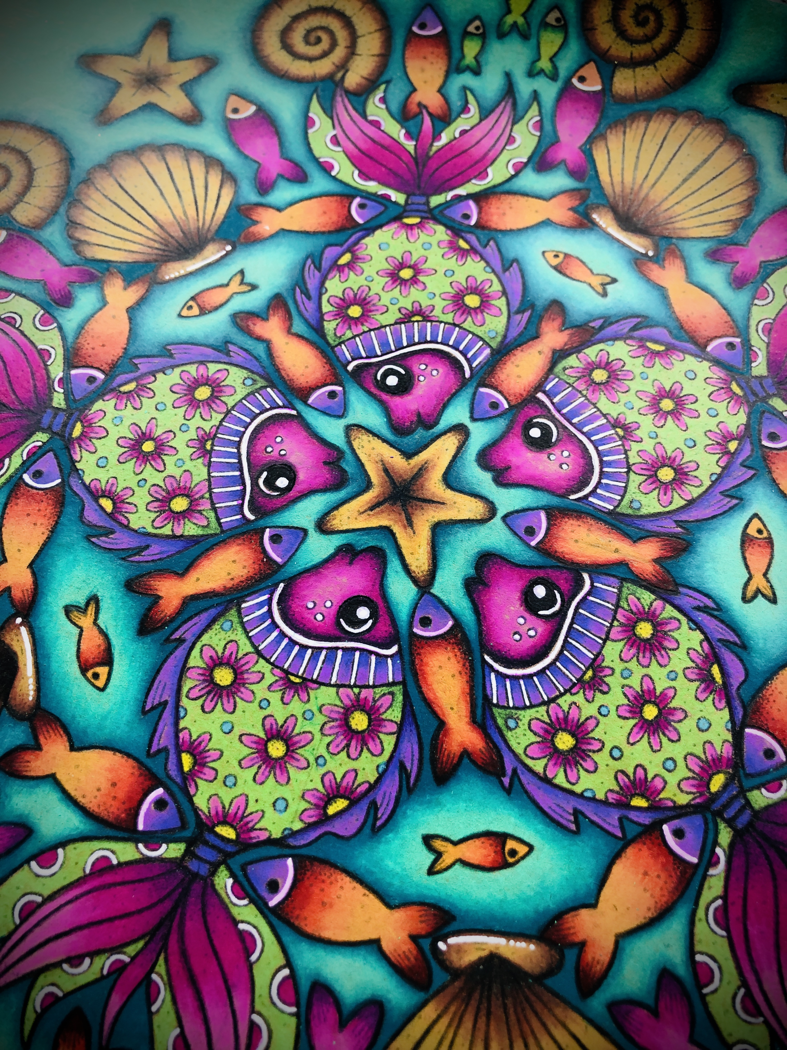
Of course these cute stamps are perfect for cards and art journal pages as well as scrapbook layouts but I just knew that they would make the most amazing mandalas... so that was the route I had to take for my first sample (I think this may be my favourite sample from this release.. but sshhhhh don't tell the others!)
So many combinations with this set to really create a stunning project.
I decided to cut apart my small shoal of fish so that I was able to use them separately as well as place them on the block together in a cluster, I found this worked really well for some of the smaller areas that needed filling in.
Sketchbook Pattern Play
Most of you know by now that when I get new stamps I like to have a little play session in a cheap sketch or composition notebook (I find the cheaper the book the less I worry about stamping onto the pages!)
I like to just get a feel for what they can do without the pressure of ruining a project.
These are just a couple of ideas I got using these stamps...
I think these would be fabulous stamped tone on tone to create an interesting background page for a journal page or maybe even stamped black on white for a cool background for a special card.
The small fish could make a great frame as stamped below maybe for a photo on a scrapbook page too.
And what about using the masking technique to create some funky shell flowers, these would be brilliant either just coloured in or you could colour, cut and layer to create some fabulous 3D embellishments.
I really do think the possibilities are endless.
Under The Sea
For my 3rd sample I decided two showcase the stamps how they were originally intended... to create an underwater scene of course.
There are so many elements to use and they work perfectly with some of my previous releases too to create even more options....
Tracy Scott Collection stamp set 080 (TS080)
3D Watercolour Mandala
So very often I add elements to previously 'completed' projects and I knew this one was going to work perfectly.
I actually coloured, cut and layered the elements from this stamp set completely separately, just wanting to build up and expand on the original image.
However once I'd finished I spotted this hand drawn mandala sitting on top of a pile of projects and the colours were just shouting out to me and to top it off the 3D embellishment I had created was the perfect size for the centre.....voila!! A new lease of life to an older project.
The elements in this stamp set make it really simple to build up the central focal image to create a much larger embellishment for a more sizeable project.
Water soluble pens were the go to for this focal image, they allow all the original lines of the stamping to show through so you don't lose any details.
Everything was layered with 3D foam to really add some dimension to this piece and what a difference it makes.
Pattern Play on Gel Prints
I had a bunch of gel prints that I really didn't know what to do with so decided to have a little play and see what some of the other stamps in the set could do.
I love how the stamps in this set offer so much variety and really give so many options, everything from background pattern stamping, to beautiful mandalas (did I mention I love a mandala!) to focal images, I can even see this stamp b being used for Christmas cards (this little flourish stamp really does make the coolest snowflakes too!!
Mmmm did I say how much I love a mandala....
And how cool would this pattern be as a background for a card or even for some collage paper?
I really can't get enough of playing with these and love the patterns that I've already managed to create.... just need to sit down now and play some more.
Large Size: 6.25" x 9.5" (16 x 24cm) Price: RRP €6.58 +VAT
PaperArtsy Stencil by Tracy Scott {Large} 365 (PS365)
Doodled Heart
Oh I just love a swirly pattern and just knew this was going to be a new go to stencil. Of course it's going to be fabulous on a journal page or as a wonderful inked background for a card or scrapbook page. but for my first sample I have used the stencil as a template to create a beautiful heart shaped focal image. I drew out my heart and then filled in the design of the stencil within the shape (how cool would this be for a handmade valentines card?)
I used my Prismacolor pencils to add colour to this design in my junk art journal but could certainly be cut out and mounted up to be a 3D embellishment on any project.
And the beauty of using the stencil as a template is that I can create any patterned shape in any size using this same technique.
Gel Plate Play
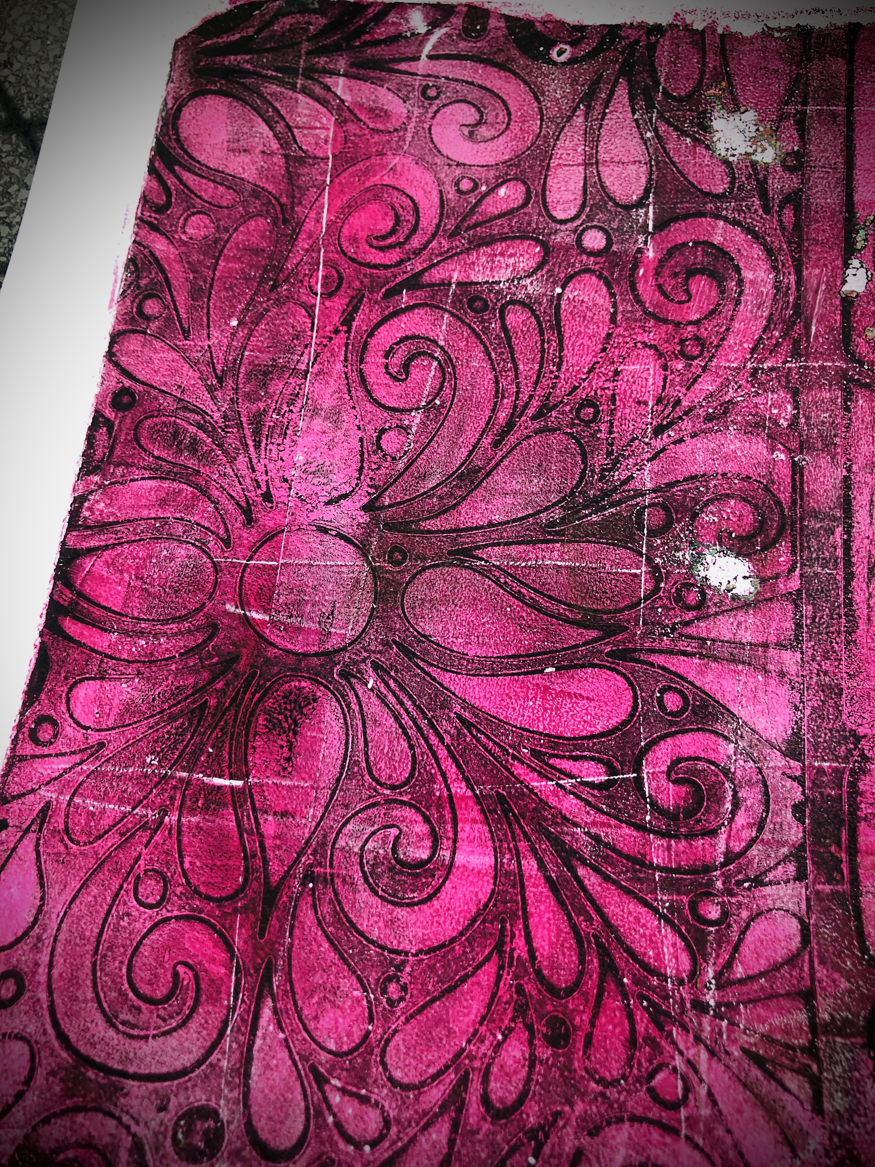
I decided to grab my gel plate and have a little play, I knew that this stencil was going to work perfectly on the plate and I just love the way the pattern looks with the paint.
A second variation on colour, I'm thinking this would be amazing as a card background maybe even with the coloured heart from sample 1 placed on top?
Im thinking these would be perfect as background pages for a mini handmade art journal or even as some collage paper for other projects.
PaperArtsy Stencil by Tracy Scott {Large} 366 (PS366)
Stained Glass Mosaic
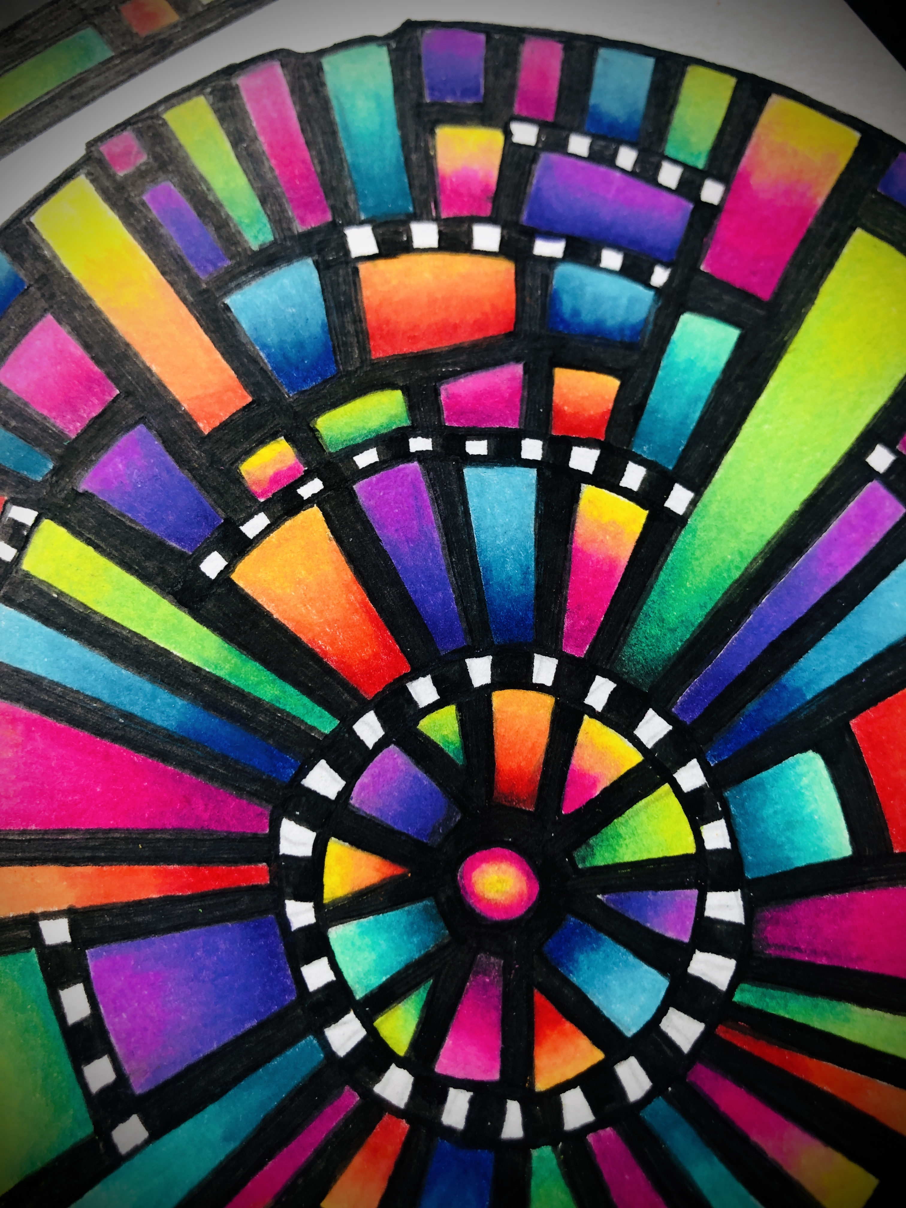
I am in love with this stencil (circles are always a good thing aren't they?), It reminds me of stained glass and I just knew that my sample had to reflect that feeling.
After sketching out the shapes into my junk art journal, I happily set about the task of colouring in using my Prismacolor pencils. The colours look like they are glowing, this sample makes me very happy!
So although I used the stencil as a colouring template I can certainly see both the main focal as well as the borders included will work brilliantly in the backgrounds of an art journal page or even embossed for an extra special card.
Im also thinking this stencil will work perfectly as a cutting template to create a really cool cut out art journal page....ummmm I think I'm off to give that a try right now!
PaperArtsy Stencil by Tracy Scott {Large} 367 (PS367)
Gel Doodles
The idea behind this stencil was always as a starting point for doodling, large spaces are ideal to be able to add your own details and designs and the possibilities and variations are only limited by your own imagination.
I grabbed my 5x7 gel plate and loaded it with paint, pressing it down onto my journal page leaving a white border around the outside.
Once dry, I grabbed my stencil and drew out the main shaped of the design onto my background.
I then proceeded to start filling in the spaces with different doodles, leaving some of the spaces blank and then used my coloured pencils to really add depth to the page.
White and gold pens were used to finished off the page and really add some gorgeous details bringing the whole project to life.
So I did this whole project in colour but this stencil could equally be used to create a black on white doodle or I think even white gel pen on black paper would be stunning.
Gel Print Play
Again I knew that this stencil was going to be amazing on the gel plate so had to give it a try and have a play and how right I was.
I love the way this looks after printing, both the positive and negative prints look great.
I made a bunch of these to use for collage material and may even doodle onto some of them.
I just did a very quick printing session with the stencil. but just love the way in looks. I'm thinking I will be doing a lot more with this one in the very near future.
Thank you so much for joining me this evening and I hope you have enjoyed seeing some of my ideas with my new release.
Don't forget I will be going 'live' in the PaperArtsy People Facebook group at 7:30 pm UK time to share these and maybe a few more surprise samples.
Tracy
PaperArtsy Stockist List
Our stockists are your go-to source for all PaperArtsy products, and we suggest that you also use thePaperArtsy PeopleFacebook group to source aretailer in your country. Many are members of our FB group and will happily share links to their online stores.












.png)