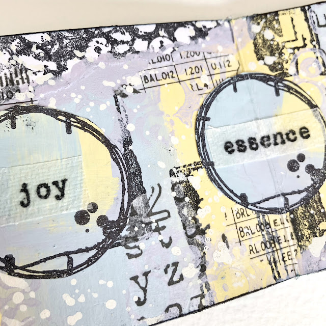
New Year greetings to you from all of us here at PaperArtsy HQ,
It just hit me before the New Year celebrations started, that we are almost 1/4 of the way through this century! We were with some friends having a coffee and remembering back to all the Y2K fuss, do you remember all the preparation to get ready for the new millennium digitally? There was a fear that digital clocks, banking systems were all going to grind to a halt when going from 1999 to 2000. That was our final New Year's eve in New Zealand, and being pretty much the first part of the world to cross the dateline into the New Year, I think everyone breathed a sigh of relief as the world didn't stop turning and digital systems just ticked on over without a blink to 01.01.2000.
And in another blink, here we are, heading into the 24th year of this century. Things we could never have imagined, like our kids phoning us on a small device to say they are staying over at a friend's house, or using the world wide web on a wrist watch seemed as unlikely as a car zooming about mid air, or unmanned! I wonder what progress the next 25 years will hold as we come to grips with the next level of predictive automated technologies.
Our industry of manufacturing red rubber stamps is currently categorised as 'analogue' and ironically that vintage vibe and 'old school' concept of hand journaling is once again a pretty cool thing to do because it is by hand, and because it is retro! For us, it has been a very cool thing to do for most of this century! And how fabulous that we are still seeing new crafters, millennials (older and younger) still come to appreciate self expression through paint, paper and traditional stamps. Learning to make something by hand might considered 'quaint' or a bit retro , but is also recognised as a desirable, therapeutic, positive way to feel good, and a rewarding, enjoyable way to use your time.
It strikes me as a fabulous coincidence (I wish I could say it were planned) that we chose the timeless theme of typography as a focus for the final quarter of 2023. As we hit our 20th year in business, we remain true to our vintage design roots. We continue to use timeless imagery, elements, fonts and script as we did when we started out in 2003/04. Back then we had one line of stamps 'Ink & the Dog' which we still sell today. Now we are very happy to represent many other design styles by bringing under our umbrella, a range of designers who create differently to our 'in house' PaperArtsy style. Each year we evolve to bring to you new ideas, new designs, new people, new bloggers and new creative learning opportunities. And what a joy it is for us to do so!
So for the last round-up post of 2023, we look back at some of the incredible ideas that have been shared on the PaperArtsy Blog.
We have carefully selected some posts from Topics 10: Tags, 11: Monochrome, & 12: Focus on JoFY, and as I already mentioned above, the theme overarching these Topics for the last quarter of 2023 was 'Typography'.
We hope you enjoy taking a look back at some blog highlights from this period, we are so thankful to have such an inspirational blogging team who share with you their wondrous ideas for each and every topic.
Here's to another year ahead and long may you continue to be inspired!
Leandra

Be it letters, numbers, fonts, bold, illegible, funky or vintage, this theme is one that crops up in our creative journey when designing stamps, stencils, papers and more with regularity. You might like to check out Dounia's theme introduction post where she outlined how typography can inspire us to make art in so many different ways! Let's check out a few interpretations of this theme.

Jenny Marples often creates not a spread, but entire books for her posts. What a treat for us to soak up! Page after page is the most glorious eye candy. When you look closely, you can see all the elements that she pulls together to add depth and subtle layers within her pages.

For example, she will often start with a colour palette that might have soft, subdued background colours or papers, like the example above. Various vintage papers, manuscripts are collaged together, and gently softened with neutral opaque shades of fresco paints.

Those pages have been further over-stamped with the same botanical images that will be used as the focal stamps, in this case, Alison Bomber's botanicals. The image can look different when stamped with various inks depending on the type and colour of the underlying paper. Shape, form, and repetition can be a big part of representing typographical themes - even in your underlayers!

Onto this subtle background, Jenny builds her focal 'clusters' together from water-coloured botanicals, tags, lace and often you will spot stitched accents and quotes, all arranged beautifully to 'pop' on top of those interesting background layers. There are many more photos in her blog post here!

Another typographical masterpiece came from Riikka Kovasin where a story was hidden within the tag-flowing garment. First she added colour to tags in various shades of blue with paints, infusions, pencils.

Then she started to write the 'story' of the girl whom she was dressing. The tags were written on from different angles, and in different fonts, even typewritten to add variety, and to deliberately make parts of the story illegible or hidden from view. Read more about this journey in her blog post here.

Mags Woodcock offers a masterclass in how to use a couple of bold Tracy Scott stencils in numerous imaginative ways, from gel printing to rusted. It's a bit like a 'with one product' challenge! How many different ways can you spot that she has used stencils below!
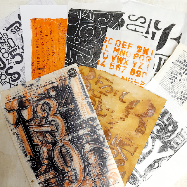
Her original blog post is here, head on over to find out all those techniques and much more. Typography is often expressed within stencil patterns, and I find those stencils among mu most favourite for their versatility.

From luggage tags to mail bags, teeny tiny jewellery price tags to clothing labels, tags are a method we often use to help us identify, classify or even price something. They are used to communicate important information. Using them in our art is a way to add a focal to a project, or even a tiny little embellishment, they can add texture or perhaps a tag might be hidden inside an envelope to make your project interactive.
Tags are a crafting staple that we simply could not do without, just for swatching colours from paint, to watercolours or pens to inkpads, tags are not only handy, they are aesthetically appealing and super useful too!
Head on over to the topic introduction post if you are ever short on ideas, or find yourself staring at a blank page (or tag), these posts are great to bookmark for future reference!

Liesbeth Fidder-de Vos created this beautiful project, it's quite large if that door stamp is anything to judge by! We love how the background tag is stamped with the stunning Portuguese tiles, alternating with crackle painted background.
But look at this .. the project is an accordion series of tags that rest on a little shelf on that background! Check Liesbeth's post to learn all the details.

What about this... by Claudia Neubacher? The blue and rust brown contrast is so striking, and that repetition of presentation and composition allows you to focus on the changing words in this piece. Super elegant, and makes you stop to think about how we use time. Read all about it in her original post.

Autumn Clark dished up gorgeous shades of autumn within her tags, and of course falling leaves. Adding some branches to her composition was inspired , those gold accents with these Lin Brown stamps was perfect! You ca find her blog post here, a beautiful read.

And seeing as we are 20 years old this year, now might be a good time to look back at our first stamp collection (all still available today), Ink and the Dog! check out this post by Renata where she used large tags to become the book pages. I love looking back at some of our classic vintage designs. Find out more here.


It might sound simple, working with one colour, but when you actually start to create something, it can end up a bit more difficult to work with one colour than it might at first seem! Some iconic art pieces are as simple as a block of colour, or something tone on tone, very very basic visually. Another way to tackle a monochrome theme might be to explore texture, or different tones of the colour. Head on over to the topic introduction post to get a better idea of how you might explore this concept here - link to the topic introduction.
Let's take a look at what a few of our bloggers created for this topic!. We love this colour wheel that kicked things off for Etsuko Noguchi.

This is such a great way to start, make a wheel from your chosen colour - in her case Tangerine Twist, she used Little Black Dress and Snowflake and the other 2 mixing colours, and what a wonderful range of ochre colours it creates! Turn 1 colour into 8. Check her original post where she works with France Papillon stamps.

As part of our colour topics, we have been asking the blog team to share their created colour wheels, this helps you to see the additional colours that are possible, and how to get there - colour mixing adds value to the paints you have on hand!

Floss Nicholls loves muted colours, and Tinned Peas with Cloud 9, a warm-ish white, created lots of lovely greens for her to work with to produce this abstract circles design. If you've ever done a class with Jo Firth-Young, you will know how much she loves Tinned Peas too, and I think it's pretty cool to see that a person's style can really impact how they use colour to let their personality shine through. See more of Floss' post at this link here.

You soon get to know someone's favourite colour with a topic like monochrome, and it was no surprise to me that Asia Marquet opted for splashes of purple. She is the master of grunge, but somehow she also keeps things kind of minimalistic too. Most of our bloggers chose to use a dark and light neutral to counter the bold colour pop. Asia also uses textures for another layer of contrast. Those Seth Apter stamps are perfect for this kind of composition, you can find many more details at the link here.

This piece by Keren is perfect to hang on the wall ... I was entranced reading her account of creating it. She struggled a little bit (hard to imagine!), but every decision she made was perfect, from embossed duralar to stencilled Grunge Paste. I think when we go out of our comfort zone it can seem harder to get where you want to go, but listen to your instinct, and you will conquer! Keren totally created a stunning arrangement of layers, textures and subtle details, along with not-so-subtle details! It's beautiful!

Magenta and Black are a classic contrast, and I think you will agree, this is stunning! Look at where a black puddle can lead to! See more of Keren's post here - she also alters some giant playing cards!


Jo is our designer with the most stamps, stencils and minis to her name! She has been with us the longest, and her style has been consistent throughout. Whether you pick up one of her first stamps, or something more recent, they all can coordinate with each other because of how she constantly tries to ensure her newest designs will sit well with earlier ones. She is a gel plate enthusiast, so many of her stencil patterns are well suited to gel printing. When we kick off each Designer Focus, we start it with an interview, so if you'd like to know more about Jo, and her thoughts on creativity, head over to the blog to read this post now!

Nikki Acton is so good with block colours and high impact. For this post she offers the quadruple whammy of the whole quarter rolled into one project: Tags, Monochrome, Jofy and Typography - plus all that involves 25 tags and a box!

One small detail I love was how she created her own embellishments using portions of stencils as templates and tracing the outlines and shapes onto black or white card. It's nice to find new and unexpected ways to use your products!
Victoria went for a framed fabric creation, you might think she did a lot of sewing for this, but her approach was to use glue, which she really liked for speed and ease! Read all about it in her original post here.

As Christmas drew near, we did manage a few last minute Christmas treats for you. First up was Keren Baker with these stunning festive mushrooms. Her blog post is a delight!

And what better way to round off the Jofy topic, and the year, with some Christmas cards from Jo herself. She will often start by selecting her colours, and this year was blue, a pinky red and gold ... look at those stunning printed backgrounds.

But this series of Gold prints - well, can I just say! Aren't these amazing, that one on the left is just awesome!!!

And then she weaves her magic wand and suddenly from those backgrounds emerges an array of pretty cards! Patchwork pieced, a few die cuts, and some tiny JoFY clusters and everything looks absolutely perfect! If you would like to see all the cards, here is the link

A huge thanks to our bloggers, designers and you for reading these posts!
We will be back to the normal blog schedule in February. January we are taking a short break, but already our blog team are starting on their posts for February, March and April, so keep your eyes peeled for those!
Wishing you the very best for a fabulous year ahead!
Leandra and all the team at PaperArtsy.