

Hi! Dounia here with you to introduce another quarterly theme. For the last part of 2023, we will be playing with the concept of TYPOGRAPHY!
This year we have added overarching themes that complement the 3 topics within each quarter. We hope they help fire your imagination and inspiration when starting a project, as well as show you new ways to use well loved themes. To leave the playing field as open as possible, we have chosen broad themes with lots of interpretations. Our fantastic team of bloggers will incorporate these ideas in their projects in addition to the monthly topic and we love to see the range of ideas they dream up! We can't wait to see what you make of it too!
TYPOGRAPHY is the word for this final part of the 2023 year, and will arch across the next 3 topics: Tags, Monotone and a JoFY designer focus. This post will hopefully whet your appetite for all things letters and numbers and how these elements offer interest and impact within your art.
Typography is a concept every crafter pretty much already uses in one form or another! From script stamps, to bold stencils, these are often our go-to layers in any project. However we think sharing with you a ranger of variations within this one post is a great way to be reminded of the versatility of typography, and even maybe introduce you to new ideas to include it in a project.
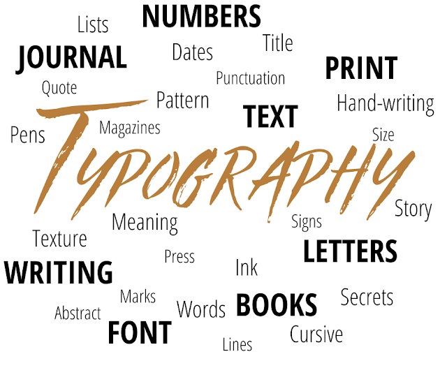
As usual, we have tried to present you with a mix of eye candy and artistic and crafty inspiration, coming from this blog and beyond. Let's start with the word cloud our bloggers were given for inspiration:

According to Wikipedia: 'Typography is the art and technique of arranging type to make written language legible, readable and appealing when displayed. [...]. The term typography is also applied to the style, arrangement, and appearance of the letters, numbers, and symbols created by the process. [...] Typography also may be used as an ornamental and decorative device, unrelated to the communication of information.'
When crafting and creating, I think we play with all three of these definitions, depending on whether the letters and numbers used are supposed to make titles, text, patterns or ornaments. For a more developed look at the technical side of typography, you can check this Beginner's Guide by Jaye Hannah on Carreer Foundry.
To start our inspirational journey, let's start with letters and numbers used as single independent signs and entities. This is not a new concept, as intricately decorated letters, called initials or drop capitals, have been an integral part of illuminated manuscripts since the Middle Ages. All styles and complexities are possible, as apparent in this initial capitals Pinterest board by Toula Breidi,
 from a Book of Hours in Latin, Bibliothèque Nationale de France
Initials have long been an example of letters using independently and often an opportunity to develop unique and detailed one letter artworks. Embroidery is only one of the media used for initials but certainly one with infinite variations in style and complexity. You can have a taste with these embroidered monograms Pinterest boards: varied and modern by Gouri Joshi, traditional and intricate by Stacy Mishina, or fresh and colourful by Ikariska.

Reminiscent of filigree letters, this paper cut is a labour of patience and love. Maybe a similar look could be achieved by drawing, or within a stencil!

Recently, big decorated letters have been trending in home decor for quite sometime, adding both an artistic touch and a meaningful message to a wall. If you want to make your own, they can be fun quick project to personalised, and there are hundreds of ideas all over DIY internet. To get started, here is a compilation of tutorials from Deja vu designs, as well as more inspiration by DIY Joy, and this pinterest board by Croc'Odile. If you are more into numbers, be sure to browse this Found numbers collection by Mark.

In book, letters generally are the stars of the show but Marion Bataille take the concept to another level with this interactive pop up book. Pop up letters and titles are a great way to a add wow factor to a card or a journal spread!

When you try and forget their alphabetical meaning, letters and numbers are inherently decorative elements! Nowadays there are thousands of different fonts to play with for all atmospheres and styles. You can get a few ideas with this extensive Pinterest board by Alexandrine Coste. Let's not forget numbers! For some specific inspiration, you can check this Number art Collection by Anita Russel.

Here Tracy Scott mixed fonts and sizes within this stencil design to create an amazing spread of digits without worrying about creating date or other significant numbers.

Taken separately, letters also make beautiful patterns for backgrounds. We are trained to look for words and significance when seeing letters, but layering them help muddle their shape and calm that instinct while creating coherence with the title.
Being in the background does not necessarily mean your letters are random! Relief is a subtle way to add interest and this would already be a fantastic way to use all those spare chipboard letters you are always left with. But if you look closely, the background letters spell the sentiment repeated in black!


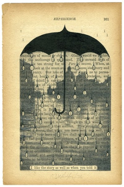
Of course letters and numbers are generally not found in isolation but linked in text, tables or charts. Those are all around us and an endless source of materials and inspiration. Text is full of meaning, it is up to the artist to extract the the pieces they want to highlight, be it patterns or words. Picking and choosing words on a page to reveal new language is an entrancing transformative process!
Julia Strand applies the same principle on a whole other level, hollowing full books to create links and meaning between elements chapters apart!

Again, text can be voided of its meaning and used purely as a pattern, one so very well known to us it is instantly recognisable. As it is linear, it is a great way to bring structure to a piece, and make it contrast with more soft or organic elements.

Mixing sizes and fonts is a great way to create cohesion and interest at the same time in a composition. The possibilities are endless: Bigger fonts with white space contrast with tighter, busier blocs of text, print stands out against cursive and bold elements detach from finer script. For more inspiration with book pages and text in general, be sure to take a look at this Fun with Printed Text collection by Creatokate.

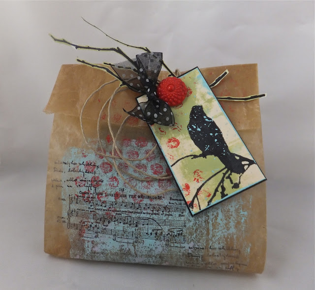
You can find more ideas and inspiration in Topic 2021 #13: Tiny (news) Print on this very blog. Then using all these principles, you can try your hand at using text as the only ingredient for a full project:

Sue Abbott

After using others' text, let's make our own! If you are not confident in your handwriting, no problem: text is everywhere: magazines, books, posters, packaging... and cutting out letters to make new sentences is not just for shady people!

Want to spread your own words in ink or paint? Stamps and stencils are your friends! They offer endless letters, words or full alphabets to create sentiments in your own style and voice. For some more inspiration, check this Artistic quotes collection by Dara Troshane, or Topic 2015 #9: Words on this blog.

If your are more attracted to the beautiful words crafted by poets and writers, you are covered! Thoughtful, funny or cheeky sentiments are available in various forms, like stamps, stickers or rub-ons, ready to be made your own! Lots of variations around quotes in our Topic 2020 #19: Words of Wisdom.

Now writing is an art form on its own. Calligraphy offers amazing variations of materials, styles and subjects, from traditional to incredibly modern. You can marvel at some examples in this Calligraphy collection by Sofia Herrera Repetto.

If this seems unattainable to you, there are many simpler styles or projects aimed at beginners. Little secret: some are even doable using stamps and stencils instead of hand writing...

If you want to become more confident in your handwriting, practise makes better! Try various styles and media to find your comfort zone and your style. See it as just a form of doodling and don't put pressure on yourself!

With the ever increasing interest in art journaling, hand writing is becoming even more prevalent. Many creators reconcile with theirs by using it as part of their spread, just an other element of colour and texture. It can be more or less prevalent and readable and is a great way to add very personal touches without stressing about the content or the execution!

Of course, handwriting can also be an integral part of the design, making full use of the duality of text, both meaningful and decorative. This practice takes as many forms as there are creators and you can get a sample in this Using text in Art Journaling collection by Sheri Seawright as well as our Topic 2021 #15 Journaling Gratitude.


Now, you probably noticed that in this post, I have so far only showed you examples using the Latin alphabet. However, it is far from the only one to chose from! Even for us who can only read the one, other writing systems can be an amazing source of beautiful patterns. You just have to a little bit careful about the potential meaning of what you are using! Nowadays, crafts products are available in a wide range of languages and alphabets for you to broaden your horizons. I am also taking advantage of this section to share some of my fascination for letterpress, the older version of stamping and arguably the reason for the rising and development of typography! Movable lead or wood letters, or types, are available in numerous writing systems:

Greek

Chinese

Arabic
All of these are from the collections of the French Imprimerie nationale, that keep matrices and punches in 65 different writing systems and 150 styles, including the exclusive fonts used by the French governing systems since the mid 17th century. Some of those might surprise you:

Egyptian Hieroglyphs
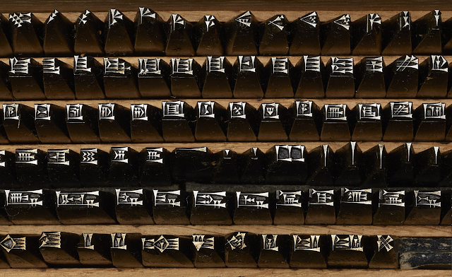
Cuneiform (Nineveh)
Not just limited to travel related projects, mixing writing systems opens your work to other cultures and influences. Is it often used to represent the relationships between people and the diversity of mankind.

Another possibility is to veer the other way, toward abstract or asemic writing. Something that looks like text, respecting its visual structure but without actual letters or set meaning. This is using text as a pattern taken to the extreme! You can see this concept developed in this Asemic Text Art collection by Reb Livingston.

Let's now focus on another way to translate sounds onto paper: music writing! For a long time, like text, writing and copying music was a long and meticulous process. With the development of the printing press, movable types for music were also made, but the necessity for accurate spacing and the large number of necessary signs made the process even more involved and time consuming than text composition.


Printed music from the Catalogue of characters and vignettes of Mister Delacolonge 's foundry (1773), totally consultable on line on Gallica by the BnF
As soon as it was available, the process of making cohesive printing blocks, or stereotypes, was applied to music. Those are now regularly found in flee markets and antique shops and can still be inked and stamped! They also make sturdy and textured substrates form music inspired projects.

Do you know there are also music typewriters? Most look like regular typewriters and print the staves as well as the notes and others keys, but there is also this strange contraption, the Keaton music typewriter, that types on already lined paper!

Picture by Marcin Wichary
Sheet music is now widely available and another instantly recognisable pattern! Its unique linear look and its musical evocation make it a great substrate for loads of projects. You can get some ideas in this compilation of Upcycled Music Paper Crafts by Dishfunctional Designs or these Examples of Sheet Music Art on Buzzfeed.

I am sure we all have at least one music stamp in our collection, they are everywhere! and so useful... They provide instant structure and whimsy in a background, or make a beautiful highlight for a sentiment.
Now, going back to my letterpress obsession, outside letters and numbers, most printers also offered decorative elements to be added to your text. On their own movable types, this typographic ornaments could be used in line with the text, or between paragraphs, or combined in infinite variations. Those were displayed in printers' catalogues along their available fonts, often with example of intricate compositions:


From Collection of ornaments that combine in the different vignettes of the N. Gando foundry (1745), totally consultable on line on Gallica by the BnF.
THis shows you that pattern play in very much not new! Those vignettes, or typographic ornaments, can get pretty detailed and complex, as those of the Luce font (1740-1770), kept at the Imprimerie Nationale. This baroque font includes special bodies designed to print and decorate poetry and was to be used exclusively by the (then) Royal Printer.

Bigger and more elaborate images called vignettes were also available, though generally engraved by hand on hard end wood rather than cast in lead, for better precision and lesser weight. All of this to remind ourselves that frames, spacers and ornaments are an integral part of typography! Those had their own section in the catalogues and often reflected the trends and political climate of the time. The following pages are from a French catalogue printed in 1808, during the 1st Empire, and contains a lot of military symbols as well as the eagles and bees representing Napoleon.


from Catalogue of the various characters, vignettes and ornaments of J. G. Gillé's foundry and printing (1808), totally consultable on line on Gallica by the BnF.
Finally, all these movable characters were kept in specifically designed drawers called type case or printer trays. As different languages used the letters in different ratios, those cases have unique configurations for each languages, even using the same alphabet. For example:

The California job case, used in the USA, picture by Daniel Morris

The Parisian case, used in France, Musée de l'Imprimerie de Bordeaux, picture by William Ellison
In some fonts, especially the bigger ones, capitals were in a separate case, placed above the regular tray on the composition table, hence the names uppercase and lower case! Those trays with all their different configurations are nowadays found empty in flee markets and make amazing substrates to sort and displays trinkets. Repurposed printers trays are a big home décor trend, as illustrated by the article 11 ways to repurpose Letterpress Drawers by the Spruce.
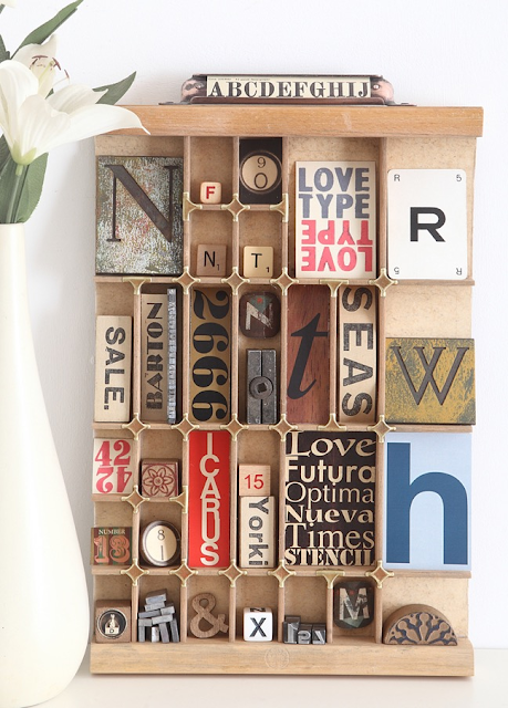
Altered type cases are an invitation to create little worlds and display our hoarder tendencies in an artistic way! Intrigued? You can get some eye candy and crafty inspiration with this Pinterest collection of Altered Printer Trays by Kellie Fortin

I hope you found this post inspiring and that you now fell the need to review and use all your letters and numbers stamps and stencils! If you want to see more developed projects in this theme, do not hesitate to check our previous Topic 2020 #12: Typography and Topic 2016 #16: Typography, fonts quotes.
If you want to create along with us we would love to see what you get up to!
You could tag us on Facebook, Instagram @paperartsy , Twitter, or post in PaperArtsy People Group on Facebook. We really love to hear about how the blog topics have inspired you, so don't be shy!!


No comments:
Post a Comment