

Hi everyone, it's Leandra back with you for the 3rd instalment of the annual PaperArtsy blog review, and this one really is a doozy! Our blogger by this part of the year were thoroughly enjoying the theme, and how the 3 topics could bounce off each other, so we saw a fair bit of cross-pollination of topics this quarter! But first a bit of behind the scenes catch up from me!
I've been hearing from lots of people that 2023 seemed like it was the most 'normal' year we have had in some time! Yay for that, right!?
Mark and I still have lists and lists of things that need doing in and around our property here in France, it seems to take forever to get things done when juggling work, visitors and planning forward, but we are thoroughly enjoying ourselves. It is a never ending surprise that we have met so many people since our arrival, and in particular we have become super friendly with people from the closest neighbouring houses. But even in the nearest villages as we settle into a Sunday routine of Brocante visits and such, we are gradually meeting up with other 'regulars' on the similar schedule! We never expected to be so lucky to be surrounded by so many chatty, welcoming people in this little corner of rural France. We feel so fortunate and are content to be here.
This year we were also joined by our parents from New Zealand who each stayed for 3-4 weeks, as well as other New Zealand friends - the house was full from early Spring to late Autumn. In November we managed a trip to New Zealand ourselves for our niece's wedding, which was also an opportunity for us to catch up with many New Zealand people who we have not seen in a very, very long time! Nothing like a wedding for a good excuse to catch up!
After a few tough years, not only planning a move, but navigating covid, for us 2023 finally felt like a year of enjoyment, social activites and a lot less stress, which was truly needed! We are finding a nice balance and starting to understand the seasonal cycles that French life is very much based around, be it what you eat, through to what you do. It is a culture full of tradition and ritual, and people here use the seasons to plan events, festivals, celebrations and food or wine related harvests, there is always something new to learn and discover, be it a place, a flavour or an activity.
One of our serendipitous highlights was booking a last minute vineyard tour to one of the higher-end producers in St Emillion. We had 4 kiwis here, and as the 6 of us drove up to the magnificent building on the estate, we realised harvest had begun (it only lasts for 2 weeks, you'de be surprised how small each vineyard is physically, and during harvest, with all hands on deck, it is quite common for tours to stop). We not only got to taste the grapes that had just been picked, but ohhh the smell as you walked through the room of tanks holding the new season's liquid was like you were being blasted with raisin vapour. It was incredible to smell the fresh grapes already being squeezed of their full juice. A real treat to see all the action of harvest up close.
Speaking of learning new things .... Quarter 3 on the blog had the theme of 'Transparency' running through all the posts, another wonderful concept with wide reaching creative opportunities easily incorporated into crafty projects. Our bloggers came up with many fabulous ideas!
The topics were also popular: 7: Art Dolls, 8: Master Colour Wheel and 9: Lynne Perrella, designer focus. I was super keen for this entire quarter and what it would bring - all my favourite elements were coming together for this quarter!
Come along with us as we take a look back at some of the highlights...

Transparency can be anything from delicate overlays like mica, vellum or acetate, to see through layers we apply: glaze, embossing powder, glass or wax, or perhaps something that disappears like tissue paper. Head over here to see the topic introduction and a wide range of ideas that Dounia presented. We thought it would be nice to highlight a few of the transparency interpretations by our bloggers...
Martha Ponsanesi made a gorgeous mini accordion book with printed tissue in the background and Lynne Perrella stamps throughout. The transparent part of this project was the vibrant alcohol inked cover/ sleeve that surrounds the book-in-a-box. It's a delightful cheery idea. Check it out here

What about this resplendent Egyptian tribute? Riikka Kovasin used tissue paper onto wood in tiny squares for the garment on this Egyptian goddess. It wasn't all plain sailing though and she did have to tweak things a bit but the resulting impact is fantastic. Read all about it in her blog post here

Etsuko Noguchi created these two little shrine boxes with see-through panels, the overall style was quite steampunky - Darcy's stamps do often head in that direction. The accents with metal embellishments fit in beautifully. Etusko's blog post is well worth a read, she always explores interesting products and ways to use them!


Art Dolls have been a passion of mine for some many years, there even used to be a magazine dedicated to them back in the day! It is a theme we regularly come back to because the scope is so wide, paper dolls, stuffing, filled dolls .. or event a bottle doll perhaps! If you want more inspo for this theme, check out the topic intro post
Renata Peley's post created a bit of a buzz using Nicci Battilana's articulated doll stamps. The 'stage' frame was an inspired choice and really helped set off those dolls and thier personalities so perfectly. Check her blog post here.

I hope you did not miss this ... by Floss Nicholls. She painted onto some thick plastic packaging and then scratched off some of the paint to make patterns with an embossing stylus - this packaging became part of her art doll's clothing. She also stamped onto organza, and we love how the 'hair' comes from a Sara Naumann foliage stamp! Here's her blog post .

We were absolutely blown away by Rikka's take on the art doll theme - she made a pair of crows! These imposing characters challenged Riikka initially, but after one came into being, she had to make another. Her story is a fabulous read, you can find out all about the process here. The Scrapcosy stamps she used were stamped onto the black fabric, and then embroidered to highlight the petals in a monochromatic colour scheme. Riikka often ties her work into her Finnish roots, so with each post, she also weaves a tale throughout, making her blog posts extremely interesting and educational!


For our colour topic, we decided it was time for a sort of round up post. By this time (18 months or so with a colour topic every quarter) we had been studying numerous 'colour theory' combinations (complementary, split-complementary and so on), so we thought, why not create a 'master wheel' where we chose the 3 starting fresco colours, and then each blogger could explore the various combos each colour way could allow, and they could choose to make something with one of those combos.
Our 3 colours, after much deliberation, were Butter, Aqua Duck Egg and Candy Floss, these can be identified as primary colours, and they mix to create a soft, user-friendly, well balanced master-wheel. Those 3 colours created over 100 possible combinations. The topic intro to is a handy review post, so if you want to know more about colour mixing and combinations, this is a really good one to read - here's the link: Topic intro post

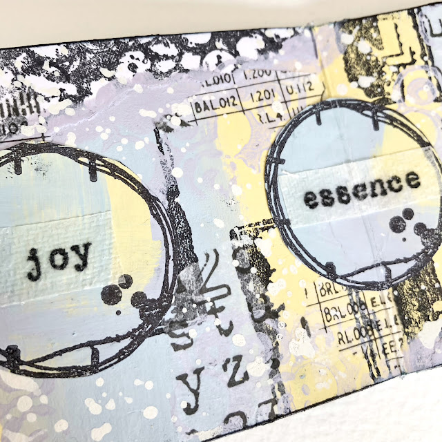
Nikki Acton chose this split-complementary colour combination. Butter with the colours created either side of opposite (blue-grey and purple).

Nikki layers her colours and page layers to get a balance of elements. She's used France Papillon images throughout, and when you look at the up close image below, you can see how the colours work so well together. Her transparent element was stamping Alison Bomber quotes onto paper towel, and then using wax to make them transparent. Check her post here for more info.
Autumn Clark discovered 4 options within the Triadic colours created when you have 3 gaps selected between each. which one would you choose? The eagle eyed among you might notice that she substituted Lake Wanaka for Aqua Duck Egg ... but what a gorgeous wheel....


Autumn worked with Sara Naumann's bird series of stamps to make a wonderful book. You can see how the Peach, Purple and Teal colours she created all bounce off each other. You will find more pictures of the pages over at her blog post here.


Etsuko Noguchi was asked to add grey to her master wheel - this adds shade to the colours, taking them in another direction. The result was the frame above. In her blog post she explains really well how she mixes them to create more colour options For example, here is the chart she made ...

Here Etsuko shows how the slightly edited colour is used to stamp over background layers

We hope you've found our deep dive into colour useful, but most of all, we hope it gives you confidence to try colour mixing yourself to open up new creative options as you unlock new colours. Etsuko's blog post is full of lots of useful tips.

Many of you will know that Lynne Perrella's inimitable design style is a stand out masterclass in how create lots of details within a stamp! We are always so excited to see what she does next, and what we also love, is to see bloggers use her stamps in their unique way. Each time we shine the spotlight on one of our designers we share a bit of the back story for you, then you get a better understanding how they tick! If you would like to read about Lynne, then head here to the topic introduction post
Lynne loves bright, but Jennie loves muted, so immediately you see a different take on how these designs can look. Jennie's envelopes and tags were so delicate and pretty with the touches of lace, tying in perfectly with the lace series of stamps Lynne designed not too long ago. Check the blog post here.

What about this by Mags Woodcock? The transparent part of her doll was the bottle structure support. Lots of rusted fabric layers, and a terrarium hat no less! Read all about it in her original post. That stamp is A5 tall, so it's a beauty for a larger format project like this.

Also, I hope you saw this by Keren Baker. Her blog post is here and you will discover she made a treasure box holder to keep the hand sewn brooch in! Again so many details to explore, from the stamped box to the acetate painted lid.

A few of our bloggers in this quarter challenged themselves to bring together all 3 topics (Art Dolls, Master Wheel and Lynne Perrella) from this quarter for example Jenny Marples here

This post is quite incredible, as Jenny makes a colour wheel, then dyes fabric to match the 'Master wheel' topic. Her Art Doll is hand made with lacey undergarments, and the Lynne Perrella stamps are not just the face of the dolls, but also make up the accoutrements of her attire too. The planning, thought and passion that goes into a creation like this is just stunning, even the backdrop wallpaper uses the Master wheel colours. And like I say, Jennie wasn't the only blogger to take this approach!
We'll be back in a few more days with more highlights from the PaperArtsy Blog, hope to see you again!
Leandra




.jpg)


