Monday, 6 February 2023

2023 Topic 02: Tetradic Colours {by Keren Baker} with Kay Carley Stamps


Hi everyone Keren Baker with you today,

I'm always up for a challenge and I've been loving creating structured art recently. When the Tetrads topic came up, loving colour as I do, I thought it might be fun to use Kay Carley's floral stamps to make a structured piece and just add in the colour challenge. It didn't quite turn out as I was expecting!


Here's the first finished piece. I ended up creating 4. To say it stretched me creatively is an understatement!  At PaperArtsy, all the bloggers are also creating with the overall quarterly theme of 'Tracks' in mind. I love how the embossed parallel tracks are juxtaposed with the overlapping tracks of the stems. More about that later.


With this being a colour topic, I had chosen my terrific trio. Except it wasn't so much as terrific- it was terrifying! I'm a 'brights' girl and having chosen 'soft' colours was already worrying me. I got my supplies ready and thought if I at least created a colour wheel, perhaps inspiration would strike.


I also gathered a few 'backups'; I thought I might need to create shades and tints. Oh and adding a little brightness to add depth to my cards.


As the main point of this topic is the Tetradic scheme- I wanted to pick some slightly different colours to create my wheel; not going for a light red or pink, and picking a more peachy colour. The PaperArtsy Chalk Acrylic translucent Ochre colour is slightly brighter as I wanted to see how that would play with the subtler opaque colours of Peachy Keen and the bluey-green Aqua Duck Egg.


I painted up my wheel (for the downloadable colour wheels go here & if you've not done one before, go here for an illuminating how-to).


I was using the Tetradic 'square' scheme and to make it easier for me to decide (I'm more visual), I created this easy tool using just a die-cut square with some punched out circles at each corner, secured with a brad so it could rotate. You could easily create one for the rectangle and slim rectangle too. Here's the 3 versions and my final colour combo choice was number 3.


Truth be told, at this point I was NOT enjoying the process. But I'd painted all the leftover mixed paint onto a piece of PaperArtsy Smoothy cardstock (which turned out to be the saving 'spark' I needed) and then I was procrastinating hard. I knew I'd need a small stash of the correct colours for whatever I'd create so spent an 'undisclosed' ;-)  amount of time making up the colours and transferring them into little glass bottles I had leftover from a previous PaperArtsy blog post.


Can you sense my avoidance of starting?! It was time to just stamp and paint and get going. I stamped, painted and ended up with lots of fussy cut images. It's well worth having a stamping platform around as with tiny/thinner images like these, you'll really benefit from being able to over-stamp them after painting. 


This was where the 'eureka' moment came. The punches that I'd had out to make my tetrads 'viewer' were still on the table along with the leftover paint sheet. What if I just punched all the 'clean-up sheet' with different sized punches and used them to 'anchor' my stamped elements? I punched just a few circles (haha!).


Now I could feel my creativity starting to begin.

Most of the final creating was more compilation and deciding on designs than anything else. All the groundwork and supplies were ready, and this made for some speedy making which was a contrast to my super slow beginning. 

You can hopefully see on the first couple of the photos the embossing which I added to the main cardstock layer to give more texture to the white and fit the design in with the Tracks theme.


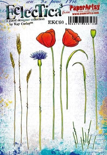
You can see the beautiful flowers from the Kay Carley stamp set EKC60.

The tracks (both parallel and crossing) reminded me of relationships I've had with friends; some where I've made amazing friendships after remarkable seemingly chance meetings ( tracks intersecting and crossing) and other people who you like and know but you never seem to deepen in relationship with and remain as parallel tracks; always a distance away but heading in the same direction!


The next project came from a desire to do a more relaxed design, rotating the 'tracks' and using a playful quote from a JoFY stamp set JOFY72.


The beauty of the circles is that not only do they provide interest, texture and movement to the design, they also tie the colour scheme together (adding hints of the other colours in the colour wheel) and most importantly 'ground' the stamped images so they're not 'floating' on the white space.

I didn't feel that the projects were finished- I had plenty more circles and a few more stamped images left. I also wanted to ink up
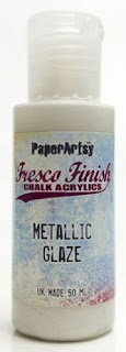
 this set from Kay Carley EKC56 which seemed to fit somehow. Using the Fresco Finish Chalk Acrylics Metallic Glaze helped bring the flowers to life.


It's hard to capture, but hopefully you can get idea of the fabulous metallic shine that the glaze gives!


I love the exuberance of Kay's floral design and the life it brings to the piece. The sentiment was from one of the sets I've had for a while, Hot Picks stamp set HP1301. I looked at the leftovers on my table and thought I should be particularly thrifty!

All the punched circles had obviously created waste, but instead of throwing them away, I liked the circular edges and decided upon creating a giant tag.


I love adding dots and dashes and these projects were no exception. You can see I stamped the background with a soft blue ink and used the floral Kay Carley stamp set EKC56 again. The circles are actually suspended on string and I love how it looks a little like a vase. The sentiment for this (& the first card) came from the JoFY stamp set JOFY73.


I learned to persevere with this set of projects. Truthfully, they're not really my style per se and for some reason the pastel tones seemed to hamper my efforts to make them more artsy rather than pretty. I also wish I'd added some stencilled elements for texture on the background.

I was quite pleased with myself for finishing- and loved using up all the bits which is something I'll definitely try and do more of, as it incorporated a fun unexpected element to the designs. Will I create with pastels again? Possibly, but I need a little break from the stress of it (only joking!). 

These card projects are perfect for beginners and Kay's beautiful designs are very inspiring, and I'm itching to go all rainbow using them. How have you overcome design struggles and do you use leftovers to great effect? We'd love to hear about it!

Keren xx


Thursday, 2 February 2023

2023 Topic 02: Tetradic Colours {by Ellie Knol} with France Papillon Stamps


Hi everyone and a good day to all of you! Ellie Knol (PAPER-STAMPS-COLOR) here with you today.

I've been enjoying some creative time lately. This topic, Tetradic Colours had me thinking about playing with colors still in the classic yellow, red and blue combo but diverging from the bright primaries commonly used.

First I chose PaperArtsy Fresco Finish Chalk Acrylic - Blueberry It's a purplish blue which has quite a lot of red in the mix. I also chose Claret, a dark wine colour with a purple undertone. I completed my base with Yellow Submarine which is a warmer yellow then the usual primary one. All are translucent and all 3 colours contain more red than the 'pure' colours of a classic wheel. To be honest, I was not sure how they would work well together and if they would create interesting mixes.
 
I used these translucent colors to make some grungy prints on the gel plate. It also allowed me to easily incorporate this quarter's ongoing theme of TRACKS - through splatters, mark-making and repeat-stamping in the printed layers. I'm looking forward to sharing with you how I managed to balance all 4 colors within one project.


    And yes: this post has something to do with collage fodder! Read on to find out!


I had to do some reading before creating this particular color wheel. I am not new to color mixing, but still had to question 'what is a Tetradic Colour scheme'? I learned that it's 2 couples of  complementary (opposite) colors, making four colors in total. A 12-segment colour wheel will create 3 types of tetrad: a square, rectangle and slim rectangle, so lots of options to choose from. 

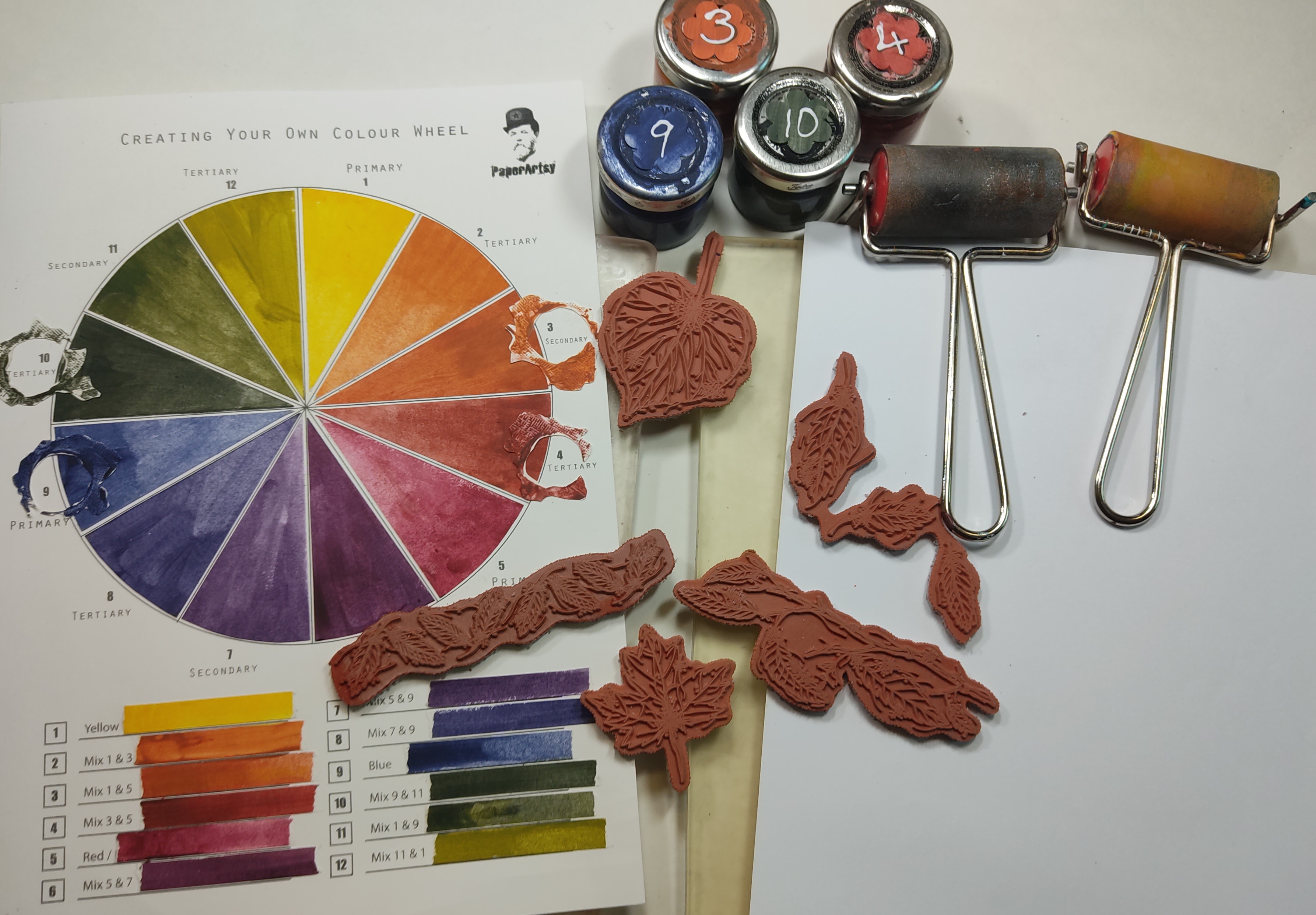
These are the 3 colors I chose to create my 12 segment color-wheel from: PaperArtsy Fresco Finish Chalk Acrylics - Blueberry, Yellow Submarine and Claret.


After mixing the colors, my plan was to have a big gel printing session, and using some of the prints with France Papillon's stamps. So I got out all the supplies like a PaperArtsy brayer, two 8x10 inch gelatine plates, paper, etc. I also covered my work space with a large piece of white sturdy paper.


The first step for this project was to mix my colours. I did it in small jars as I was going to use them in more than one stage and so knew i would need quite a bit of each. I did not want to have to mix and re-mix in small batches. A useful tip: I put some clean tiny stones in the jars to help mix up the paints. 


Filling out the color wheel was fun, but so messy, lol. Once it was complete, I tried several combinations and chose a "skinny" rectangle Tetradic color scheme using the numbers 9, 10 and 3, 4 on the wheel. I stamped the colors onto a separate piece of cardstock and adhered that to the wheel for you to better see my selection. I like the look!


Don't judge .... but when I chose these colors I did not realise they were going to match the colors on the stamps packaging!! What are the chances! I chose France Papillon stamp set 28 (FP028) and stamp set 30 (FP030) for the main images and they are coloured with oranges, blues and greens! It really was pure coincidence, I only realized the match when I took this picture! 


Now the phase of the color scheme is ready; let's dive into the next step and get painty!
 

One of the tip given to us from PA HQ guidance for this topic was that Tetradic colour schemes can work well when you choose one of the four colours to be dominant, and the other three as contrast and accent colours. This prevents your project from appearing too busy or unbalanced. I therefore chose a prevalent colour for each of my prints, and off I went! I will not share the details of each of my prints as there are quite a few of them and each one is different but will give you a general idea of my process.

I had one big concern of course: while brayering the colors onto the plate I risked mixing them and creating even more colors. As the slim rectangle tetrad contains 2 groups of complementary colours, the potential for mud was high! Did you know that 2 complementary colours mixed into each other will make brown? So I was  careful to let the colours dry completely on the plate before adding the next one.

I do like to build layers on the plate. Starting with my darkest colour, I put green #9 from my tetrad, just around the edges, in a very thin layer. Using France Papillon stamps, for example, the letters from stamp set 28 (FP028) here, I stamped into this layer with the clean rubber to pick up the colour and stamp it off elsewhere on the plate. After carefully leaving this color to dry, I then repeated this process with the blue, color #10 of the wheel. Adding the red-orange (#4), and orange (#3) the same way will create 4 layers. I chose to keep them really thin.  Remember that all my paints are translucent so all the details of each layer can be seen.


Here is another tip: As you can see I used two gel plates at once. That way I can brayer off all excess paint onto the second one, saving a lot of paint and creating two gorgeous prints at the same time! After all these layers are built on the plate and dry, I pulled the print with PaperArtsy Fresco Finish Chalk Acrylic - Snowflake, for a unique and beautiful result each time.

For other prints, Paper Artsy Stencil by France Papillon (PS347) gave me some extra patterns options on the gel plate. I love the row of leaves along the side!


On some of the prints I only used two of the color mixes, eg. green and blue. You can some examples of my tracks in the prints: repeated elements and patterns from the stamps and stencil, deliberate texture and accidental mark making (there was a hair on one of the plates and the mark ended up on the print of course!).

I also brayered the green and blue onto the plate alone to create an 'ink pad' to stamp the birds with onto white cardstock. These images will be easy to use in the project as they coordinate, or can be saved as collage elements for future fun.


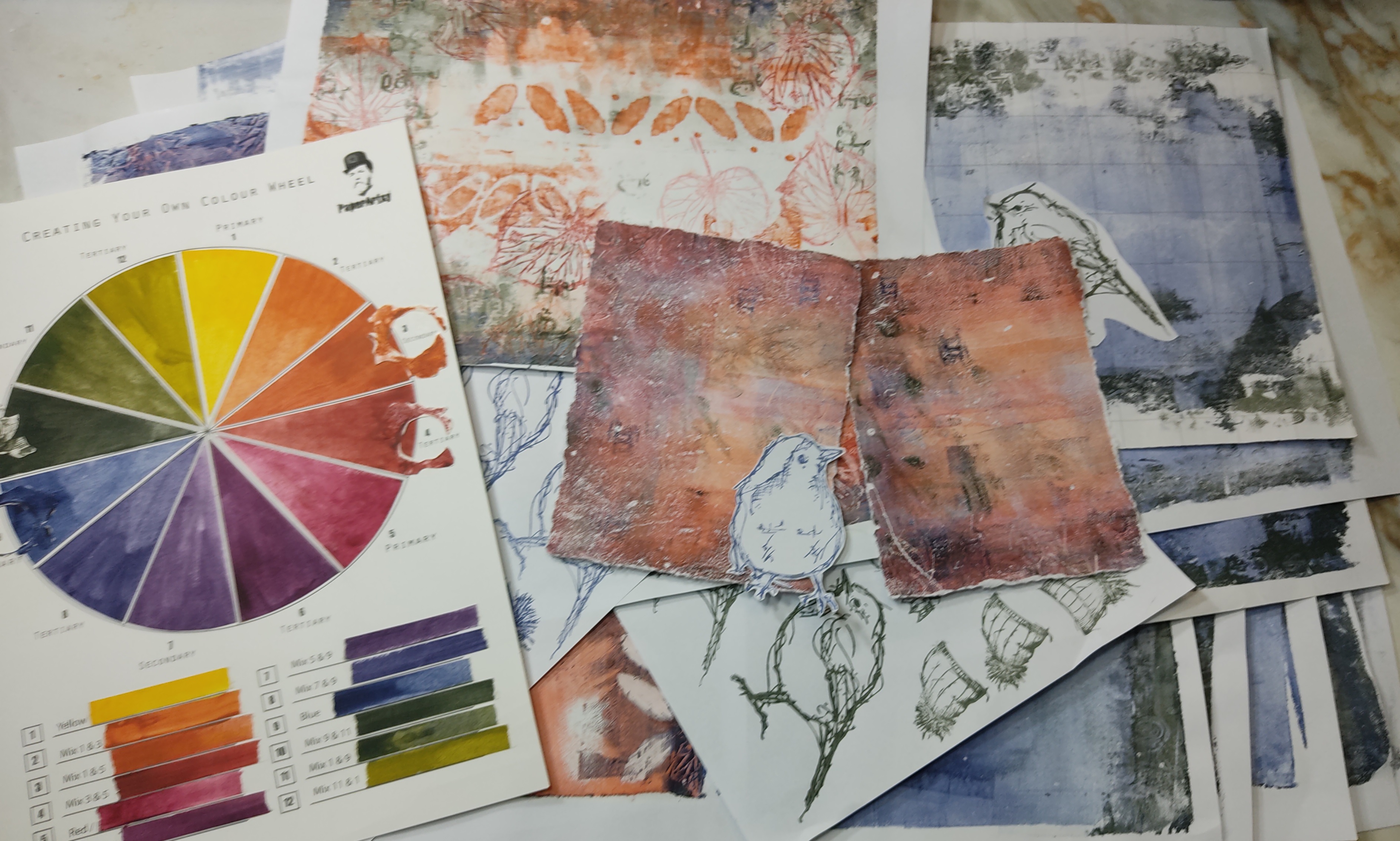
This picture contains only 6 of the 30 gel prints I made. It was a difficult to choose ONLY one of these prints for the actual project. In the end I chose a grungy red/orange one that only had a tiny bit of the green/blue in it. It's hard to believe but it was my first pull of one of the 2 gelatine plates! Apparently the rest of the session was just for fun.

I decided to make a pair of booklet covers so I tore the print in half and then to size. Here is my final choice, among its fellow prints.


To contrast, I painted the cover blanks with green #9. I also added a piece of cotton below the print to separate it from the background and make it pop.
 

Now that my base is ready, it is time to decorate it, with a few changes in direction along the way.


For one, I was convinced I was going to use this bluish print for the project. In the end, I chose another one but it still is my favourite print in this session.


I also planned to use the birds stamped in blue and green Fresco-mixed-colors as focal elements. However these proved tricky to fussy cut and I could not eliminate the white border as much as I wanted. I decided to stamp them directly onto the background.


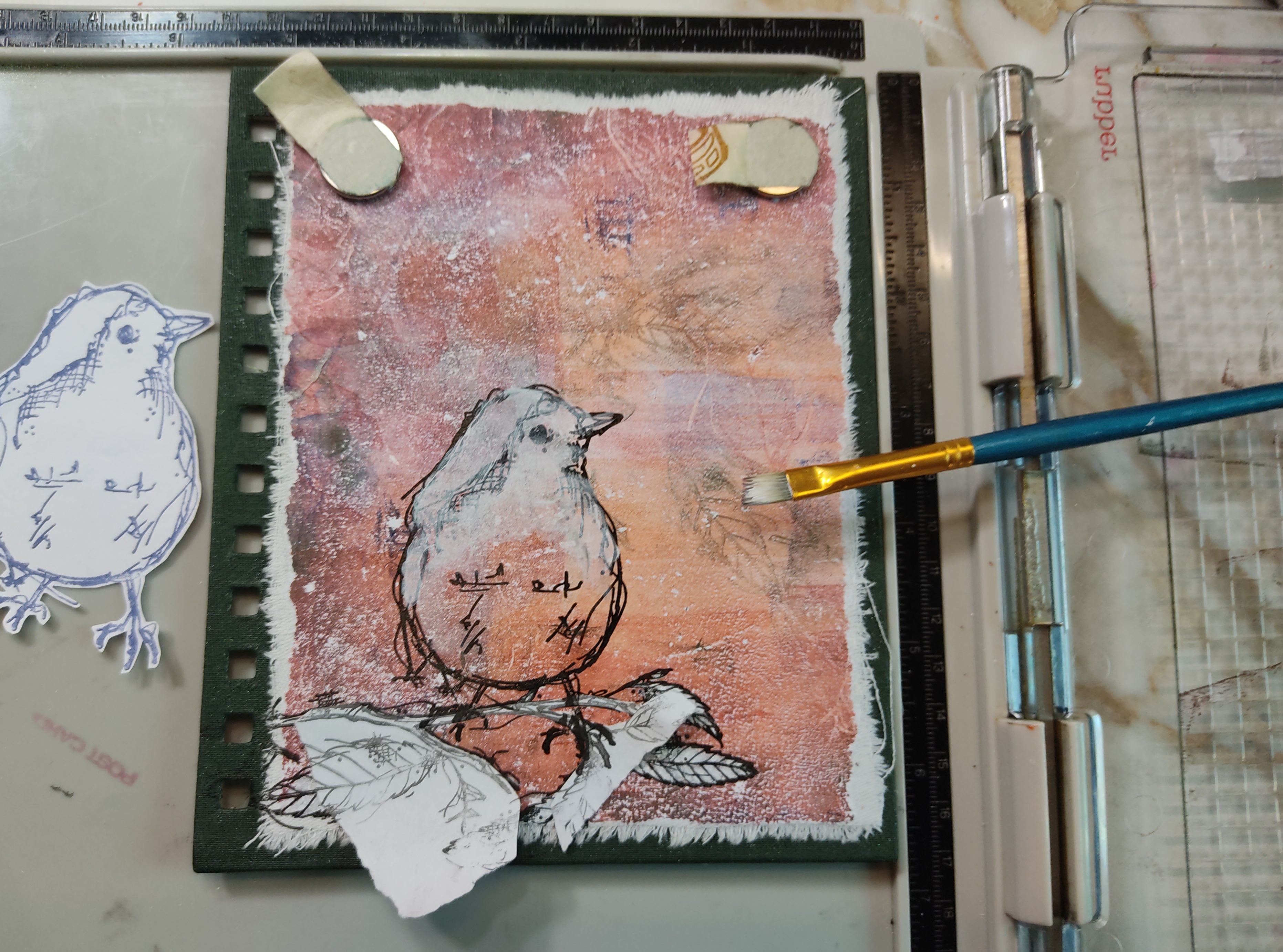
To make this easy, out comes the stamping platform! I started by stamping the branch  from France Papillon stamp set 29 (FP029) image with a black ink, painted with a white acrylic, stamped again once the paint had dried and heat embossed it in clear. I then followed the same steps for the bird from France Papillon stamp set 30 (FP030)I was careful to mask the branch to make the bird 'sit' on it properly.


There you go! A crispy and light birdie on a branch! 


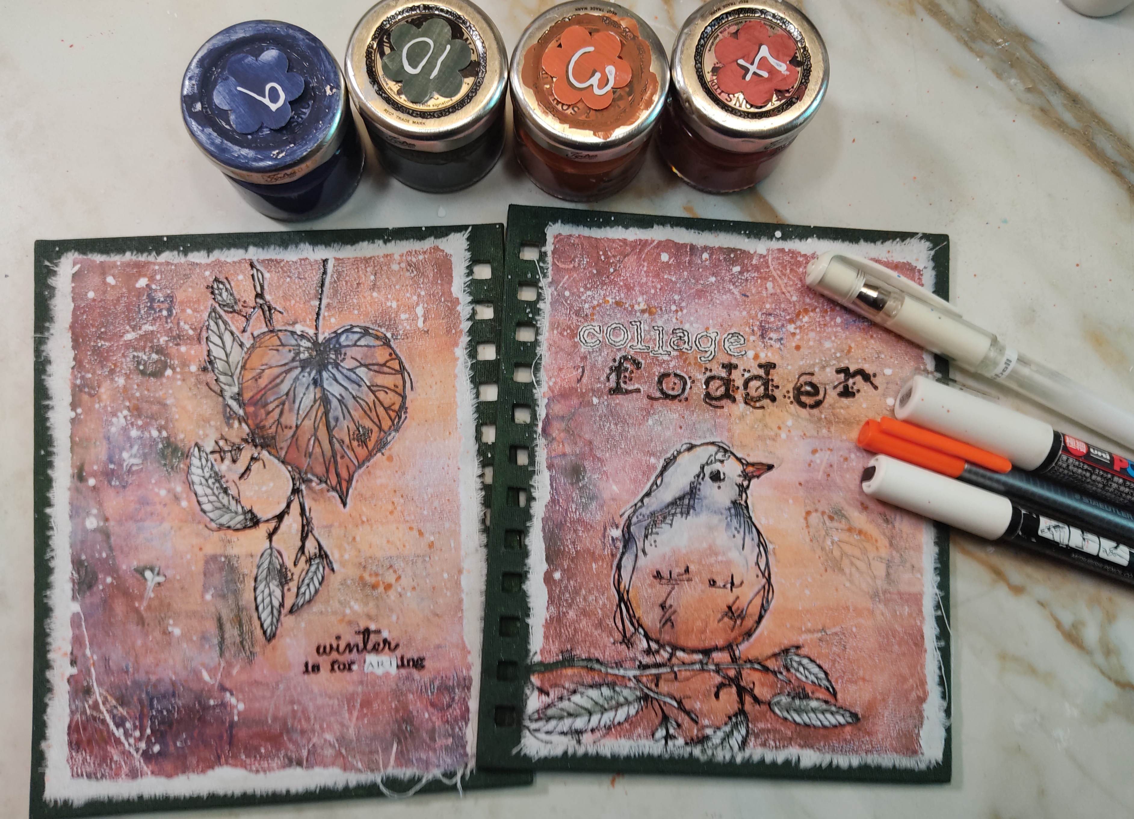
Do you see the word 'fodder'? These are stamped with a black ink and heat embossed alphabets from France Papillon stamp set 28 (FP028)! Such a versatile set!


As the paints I chose initially are all translucent, I could then come back with my mixes to add some colour depth to the focal images to make them pop off the background.


White acrylic pen lines also add depth and interest! I added some more fussy cut alphabet letters (from Ink and the Dog: Words plate 3 - W3) to create the word 'collage'. White splatters? yes please! Orange splatters: also yes! Best way to animate a background!


Finally, I only had to re-assemble the booklet and close the metal spiral, all done! I LOVE the front! The torn edges of the cotton and papers add to the feel of the project.

 
The booklet is not actually filled with paper pages but with plastic pouches. I found a pack of 30 in a thrift store for an euro, quite a bargain! I can therefore fill the book with some collage fodder to be used in future projects.


A close up of the words and bird on the front cover.


The back cover is full of tracks: a hair left a white line on the print in the left lower corner, such a happy accident!


Did you notice? I changed the quote from France Papillon stamp set 30 (FP030) to read "winter is for ARTing" as a sentiment on the back cover. I used a piece from a PaperArtsy correspondence card: the word art is all over the place :)


Enjoy some more pictures.


I loved making this collage fodder book. To be truthful, I would never have tried mixing these three colors by myself and I am glad I signed up for this topic as I learned a lot! I was particularly happy with the very deep green it created.... a moody green I will call it.

Would I change any of the process? I don't think so. When come the time to write the looong post I always think I should limit my steps, lol. But it is difficult to achieve for me... I hope you don't mind!

Create and relax with making art, or read a book in winter, as France suggests...


Facebook: https://www.facebook.com/EllieKnolCrea/
Instagram: https://www.instagram.com/ellie.knol/

More Posts to Enjoy