


It's Claudia here with you today to share an easy to do birthday card with a hidden surprise!
I love PaperArtsy's actual "hidden" theme and combined with the new "Ink Pads" topic, it made me think of two birthday cards to make for my wonderful son and for my evenly wonderful niece. I had two amazing nature themed PaperArtsy Hot Picks stamp sets in mind that have stamps on them that can easily be transformed into "moving images" that reveal another - hidden - image...a kind of birthday (card) surprise, if you want.
My idea was to use these alongside with some heavy water colouring - so the choice when it comes to stamping ink that shows every tiny detail of the stamped image AND withstands loads of water being added by a brush was an easy one - a Tsukineko VersaFine Clair (Nocturne) ink pad!
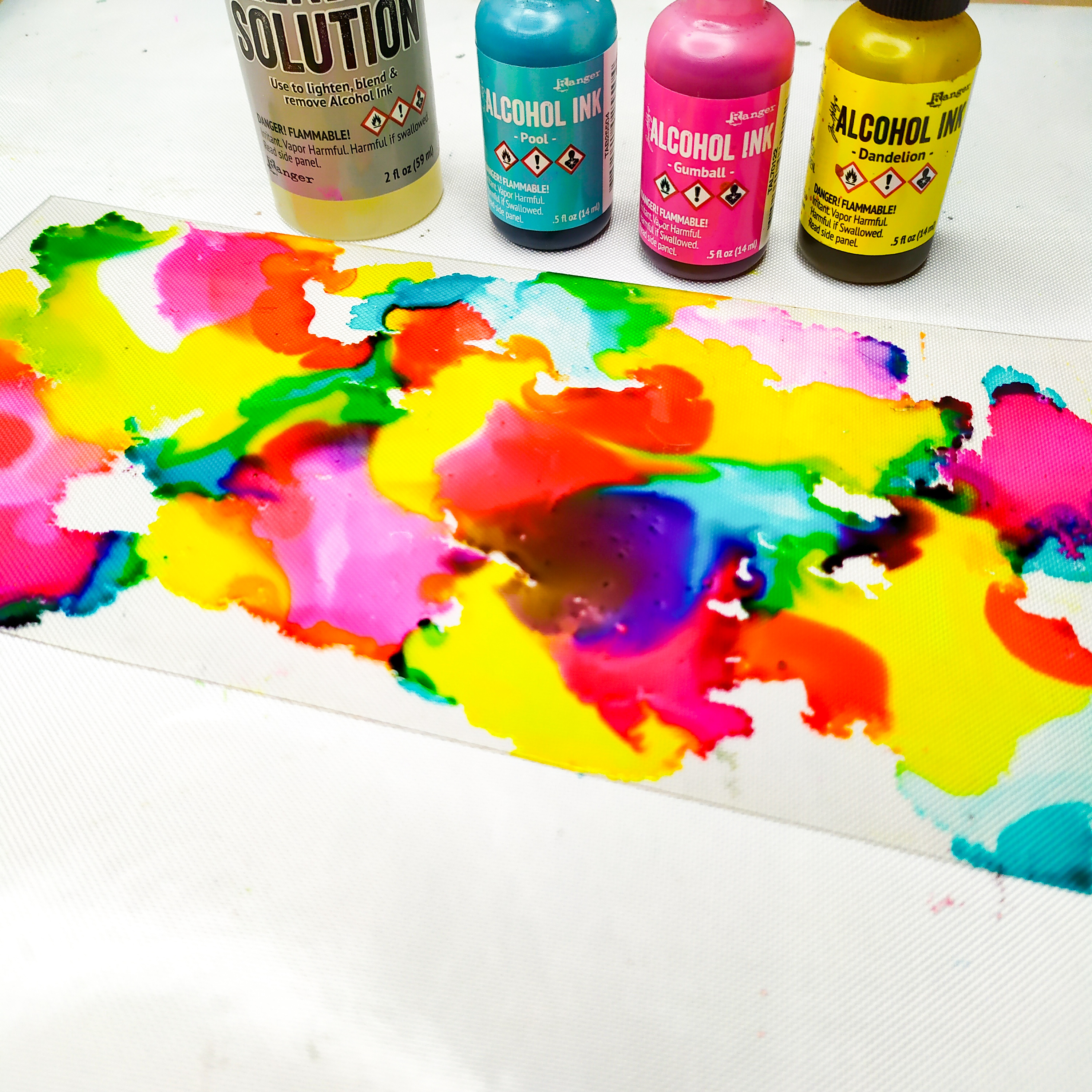
To create soft water colour-y effects with the PaperArtsy Fresco Finish Chalk Acrylic paints I needed to go with tones that either read "translucent" or "semi-opaque" on their labels. I went for three basic colours (red, blue and yellow) and one particular orange tone that I knew I could not mix with the basic colour tones.
But first things first - the finished project (and the PaperArtsy products I used):

The two birthday cards look as simple as they are in the making - I promise! And all I needed were the two stamp sets, four PaperArtsy Fresco Finish paints and one PaperArtsy stencil.
But this picture does not reveal the hidden surprise...a hint: its making involves a tiny bit of paper mechanics (of course I will show you how to do it a bit later in this post).


Here - once again - the supplies I needed to create my cards. The stencil I used to create the quote is not shown as that was a spontaneous idea. You'll find info on it later in the post.
The card stock shown in the picture is PaperArtsy Smoothy Heavyweight A4 White Stamping Card (SCA4H), but you can as well use heavyweight smooth printer paper if you are not sure about your stamping skills.

The Tsukineko VersaFine Clair ink pads are my go-to ink pads when it comes to very fine detail stamps or techniques like heat embossing or colouring in stamped images with water colours. They are quick drying, light fast and fade resistant and absolutely waterproof (as they are oil based pigment inks). And they are also perfect for the technique I want to show you in a sec! ;)


You can see how the image details are still crisp though I have really given this stamped image a heavy dose of water colouring. No smearing at all (though I always heat dry the stamped images to make sure they have really dried...the Tsukineko - VersaFine - Clair inks really do dry quick, but I like to play it absolutely safe).

And this squid buddy's background image withstood the same treatment with heavily diluted PaperArtsy Fresco Finish - Glass Blue (FF102) just as safely. This paint is translucent - so it is perfect for letting the details of the stamped images show through.
But what is wrong with this image? Why does it show mirrored and how could that happen"?

Of course this was no accident! I needed this particular image to be mirrored, because I wanted my "hidden surprise" to swim to the left and needed the space to its right to hide it (the top banner picture already showed the little trio of fish that can be pulled out of the nautilus). Mirroring stamps is quite easy to do, but it takes a bit of practice (so if you do not want to mess up on the heavyweight PaperArtsy card you should try it several times on cheap smooth heavyweight printer paper).

You thoroughly ink the stamp (just like you always do) - I have "fixed" mine to my non-stick craft sheet for that purpose - and then you carefully roll the brayer across the inked stamp without changing the direction. Pay attention to not smudge any detail. Rather work with no pressure than too much - that helps avoiding sliding off with the brayer. The most tricky parts are the start and the end of this rolling process as these are the moments when you slip and smudge most easily.

Then roll the reverse image from the brayer onto the substrate where you want the image to appear on your project. I prefer to use a silicone mat for this as it helps with not losing any detail while rolling the brayer across the paper or card.
For the "hidden surprise" repeat this process on a scrap of left over smooth card so you have a second reverse image of the nautilus.
This technique definitely needs a bit of practice. Not smudging the image when taking it onto your brayer is the hardest part, but you will quickly get the hang of it! Of course this technique only works with "narrow" designs, as the brayer's circumference defines the size limit of the image's width.
It's a technique that comes in especially handy when you need symmetrical designs (like for example two hands pointing towards some focal image in the centre of your project from the left and the right). In my case I just needed the nautilus to look to the other side (and I can live with the reverse text as it still adds lovely texture to the background).

Time to get into the "paper mechanics" zone!
That sounds more tricky than it actually is. What's important is that you use images that work together - one with a possible "opening" for the other to appear in it.
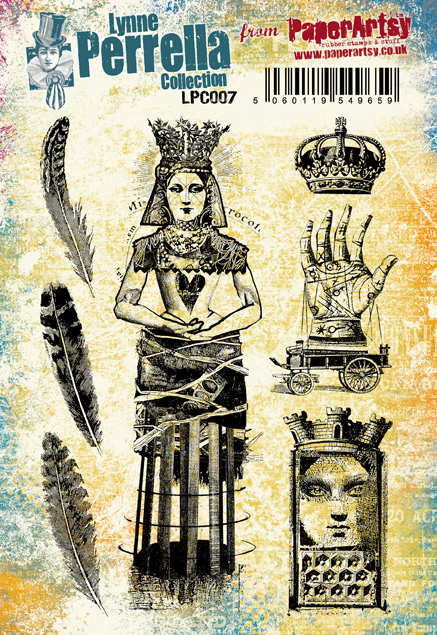
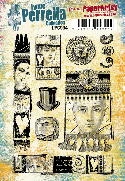
The lovely images I've used come from the two marvellous PaperArtsy Hot Picks stamp sets


The fish from the HP1111 stamp set is just the perfect size for the opening of the nautilus from stamp set HP2302! And its giant squid and the metering rule were a perfect match too. On the rule you can circle the age of the birthday child (I did so using a red marker).


Most important is that this tab at the end of your strip is at least four to five millimetres wider each at top and bottom than the incision the strip is going to be pulled through. You can eyeball that. In case you forgot to make the tab you can still glue one to the strip's end afterwards.


As the back of the card was going to be covered by another piece of card the exact same size, I shortened the upper end of the tab that was in the way of the double sided sticky tape I was going to use later. One wider tab end is enough in this case as the strip runs close alongside the card's edge. This way it cannot be pulled out accidentally as there is no room for the strip to move sideways towards the card's edge. In any other case two tab ends would be crucial!
Now that I was sure all my paper mechanic parts were working, I could move on to paint the stamped images and finish off the cards by adding sentiments and such.


Before I fixed the painted nautilus image to the card I inked the edges using a blending tool and Ranger Industries - Archival ink (Jet Black). Its pigments are less oily (and also my ink pad is quite dry already), so there is no risk of smearing on black ink when blending.


I used my Faber-Castell PITT artist pen to add the "Alles Gute zum Geburtstag" (= German for happy birthday) quote to the fish strip. Once everything was done and in place, I used thin double sided sticky tape around the edges to glue another piece of card to the card's back to hide the mechanics (and some smudged on fingerprints as well).


As you can see I also did another birthday card using the giant squid and ruler images to create a hidden surprise that can be pulled out - using the same paper mechanics technique.


I tested the cards on hubby (without telling him that there was a hidden surprise) - to see if one gets tempted by the card's designs to pull out the fish and the squid from their shells....and it worked! :)


It was such great fun making these and I cannot wait to give them to the birthday children this June and in August!!!!
Have fun creating your own "hidden-surprise-birthday-(or other)-cards"!!!!
Hugs and happy crafting!
Claudia xxx


.png)

