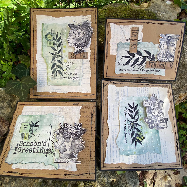
Hi everyone, it's Leandrawith
you today, and I'm here to share with you some tiny print ideas with
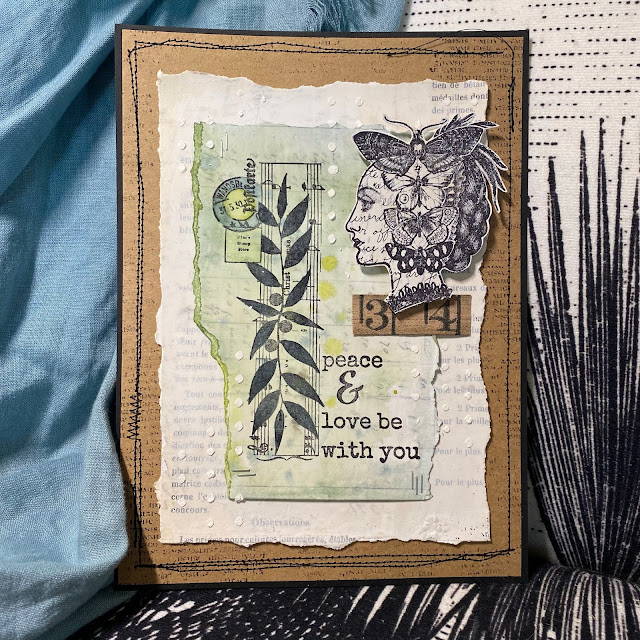
Lynne Perrella and Sara Naumann stamps. These cards were planned to be
simple,it was the 'Absorbent Ground' (a Golden product) I was digging
into testing for this post. If you are looking for fast Christmas cards,
then these are definitely that. Even the process I have used can be
simplified further without difficulty.
When working directly onto vintage papers,
or onto book pages, I like to knock back how bold the printed words look
to make the substrate more usable. Generally I use paint thinned with
Fresco Matte Glaze. This allows the image I stamp on top to be seen a
bit more clearly. However, for this topic, Tiny Print, I really wanted
the print to still be seen through all the layers, and with that in
mind, and to stay true to the intention of the product I was testing, I
opted for watercolours on top for a gentle tint. Yes, I could have used
Frescos, and those and infusions will be future experiments to explore
over the 'ground' product.
OK
so I am heading into a deep dive on how I found this tub of 'Absorbent
Ground (white)', seen in the centre of the picture below. When I took
this photo I didn't know realise where I was heading, but I adore gels,
mediums etc so this was a chance to explore! The plan was to find out
if the 'ground' made it easier to create watercolour backgrounds on
vintage papers. Answer: well, it kind of helps, but it still isn't
anything like working directly on good watercolour paper...however, it
served my purpose pretty well in the end as you will discover as i walk
you through the process. I ended up very happy, but not for the reasons I
originally expected.
As
an aside, both Absorbent Ground and Fibre Paste are Golden products
that are supposed to help your paper behave more like watercolour paper.
(they also have Qor branded versions of the same product) Qor are
Golden's watercolours, a fairly new product for them that seems to be
getting good reviews. They really do 'suck in' the colour into the
paper, and the colours seem to dry quite nicely on top of it, but they
actually don't let your 'wet in wet' watercolour techniques 'travel'
anything like they do when you get those magical effects on watercolour
paper, so don't get too excited....
However....
*drumroll*.... it creates a gorgeous 'toothy' surface to stamp onto,
and that WAS AMAZING! Let me attempt to describe how this product feels:
when you rub your fingers over the dry ground it's more gritty-chalky
and much more finely textured than fresco paints, which feel
silky-chalky by comparison. As a product it really seems to 'pull into'
itself the product you apply on top. So, for example, take a look at
just how black the inked images are in the samples I made. Usually you
would expect a bit of texture, a bit of the image to be paler in some
areas, but I must say, every print I made with archival ink directly
onto the absorbent ground was perfect! So for that feature alone, it was
a really good experiment to do! I LOVED how the rubber stamps with
archival ink perform over the ground.
So
let me back up a bit. It is good practice, when testing out theories,
to use the same brand where possible in the layers, this was also the
recommendation on the tub of ground. My vintage paper (a very old
handwritten record of each French plot of land within an property
purchase agreement) was particularly fragile, so I started by sealing it
with matte medium to secure it to smoothy card and then applied gesso. I
used a catalyst tool to get extremely thin layers. Matte medium
(Golden) in the tall bottle, is a pourable, runny product, much thinner
that a gel medium (see the videos below for info on these products).
Next
I applied 2 coats of the Absorbent Ground. It doesn't say how much to
apply, how thick, or how many coats on the tub instructions. For all of
these layers (matte medium, gesso, ground) I really, really liked using
the catalyst tool. It kept the layers thin and even while spreading only
a small blob of product and I didn't get any bubbling or buckling,
despite the paper being thin and fragile. The vintage paper certainly
felt stronger/ fortified after these layers had been applied.
By
the way, (another digression...) if you want to know more about gels,
mediums, and so on, we did this as a blog topic in August 2015 (here is
the link to the 'masterclass' blog post which is a really good resource - picture heavy with plenty of examples, a handy one to pin or save)
I
filmed 2 videos at the same time explaining the basics, and looking at a
few different brands and price points. If you don't understand what
mediums or gels are for, what the differences are, and would like to
have some ideas regarding use with paints and other colour products, or
if you are not sure what to buy and why, then this is a good starting
point to get your head around what is out there. (I love all texture
products, so I collect and use loads! But it does require discernment.
Note the difference between fine artist-grade and craft-grade products.
Even within a brand, there can be artist grade and student grade. If the
price is similar of an artist brand to a craft brand, then you may end
up paying over the top for a product with no track record! eg a shiny,
plastic gesso is really not what a gesso should be)
The
first video is about Acrylic Mediums (in other words thicker viscosity
products that we can use in mixed media for adding texture and much
more)
This
one is about Acrylic Pouring Mediums, in other words runny products.
Golden still make glazing liquid (2 of the tinted glazing mediums I show
are no longer available), but of course you can use the still available
clear glazing liquid in matte, satin or gloss to make your own custom
tint in the finish you prefer.
OK
back to the topic at hand: Tiny Print. Here is how my paper looked
after 2 coats of Absorbent Ground. I really wanted to be able to see the
writing on the paper (that was the whole point), and that is why I
chose to use watercolour on top, being translucent, I hoped even darker
colours would not obliterate the writing.
I
decided the next step was to apply the watercolour to the edges of my
papers that had been pre-torn to match the size of the stamps I was
going to use on top, while still leaving room for the LPC images to be
added later.
What
I found was that to get an even coverage, and no domineering 'tide'
marks I needed a fair bit of of water, so a water mister was good to
shift the colour around and still allow some contrast.
Next,
while the papers were still wet, I also dropped in a few concentrated
drops of colour in 2 different shades of colour. As soon as these hit
the watery surface they did soften out a bit, but nowhere near as much
as they would if I was working on good quality watercolour paper.
However, I quite liked how they settled, so I left them to dry off
naturally.
I was
interested to see notice they certainly dried 'into' the ground, and
the effect was almost soft and blurry - which I really liked!
You
can see how soft the background looks once dry. I did wonder if the ground actually
hinders watercolours looking as vibrant compared to how they might if they were used the
same way on watercolour paper. Anyhow, lucky I am not a watercolour
expert, as I might be disappointed with this 'ground' product, however, for me,
there were other exciting things about the Absorbent Ground that I was just about
to discover....
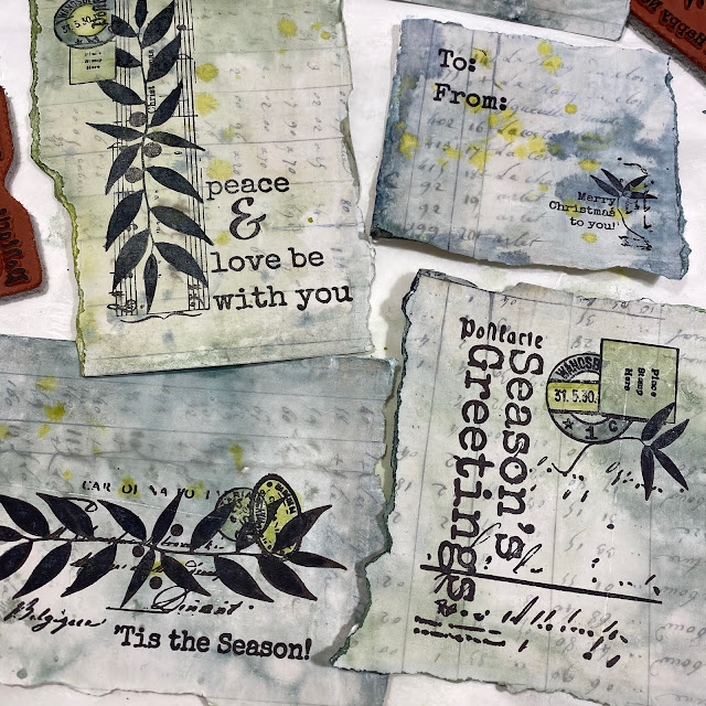
Look
at how beautifully it stamps up!! I could NOT believe this, the
archival ink looked blacker and way less purple than it usually does,
and the sharpness was spot on superb. I just LOVED how I had to really
peel the paper off the stamp, it was like it sucked right onto the
rubber and the stamp surrendered all its ink to the absorbent ground,
with the paper piggy in the middle - I guess they named the product perfectly, it absolutely IS absorbent!
These
are the Sara Naumann Christmas themed stamp sets I used, we released
these last year, and I really love them for making cards and tags for
Christmas.
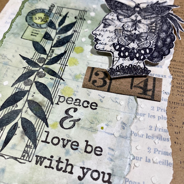
This
was my second sheet stamped with Lynne Perrella 'head' images. I
partially inked up some of the larger stamps as the intention was only
to use the heads. There are so many LPC stamps to choose from. We all
know how detailed these stamps are, and wow does Absorbent Ground pull
out those intricacies beautifully! I was very tempted to start using the
watercolours again to add shading to these stamps, even a touch of
sepia on the faces would look good right ?? But my plan was for
minimalist cards on this particular occasion, so I resisted the urge. I
know I will do this again, I've barely started playing with this
product. I will certainly run more tests, and create some collage
elements. Then in future projects I can then add colour if required. I
think it would be very handy to have some of these ready for immediate
use in my 'bits and bobs' stash!
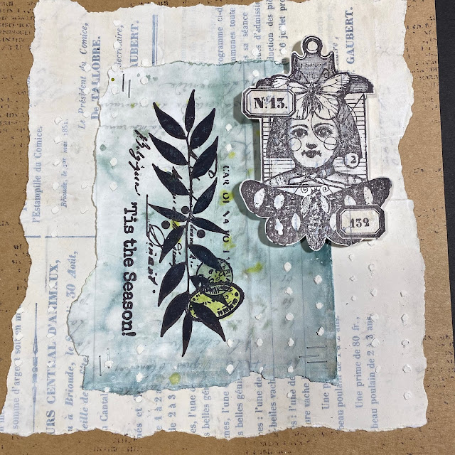
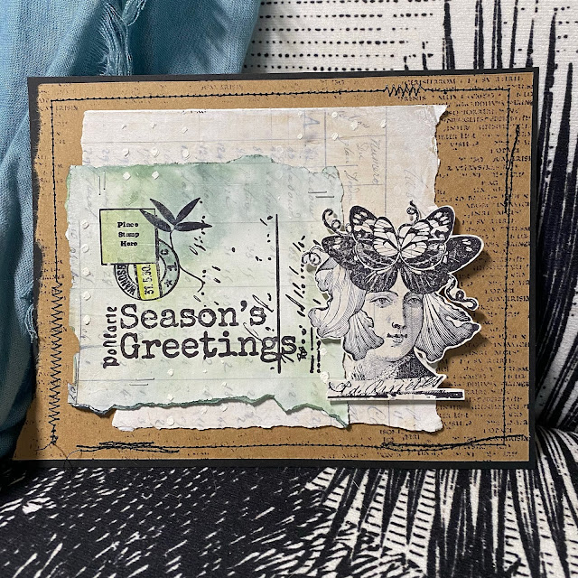
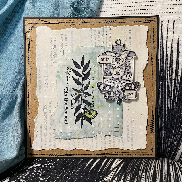
So
the composition is pretty simple. The coloured Sara Naumann stamped
layer gets stapled to another layer of lightly gessoed vintage paper.
The LPC head gets stuck on with foam tape, and then I used the popular
Sara Naumann stencil (those tiny dots) with Grunge Paste for a bit more
interest.
I occasionally added a bit more intense colour to the BG, (like on those postmarks)
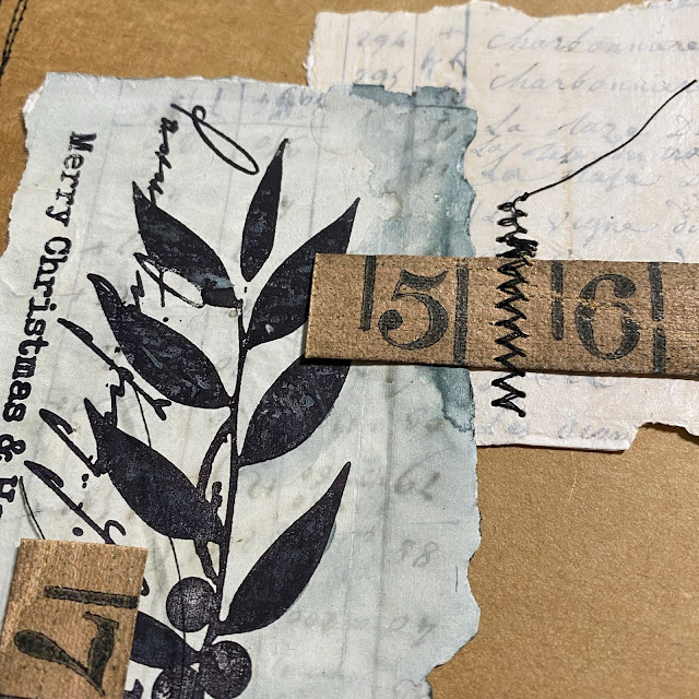
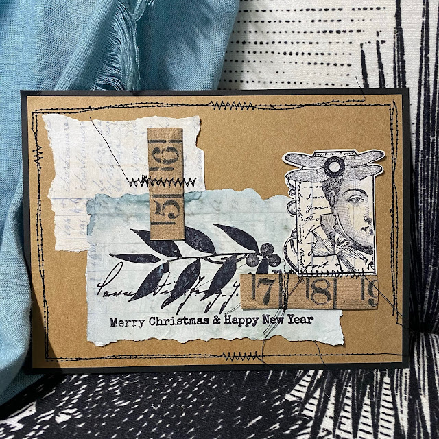
And
one sample was made from all the left over scraps, and some vintage
tape ruler I found in my stash, that tied in perfectly with the Kraft
paper background.
I
just love how you can still see the Tiny Print of the Vintage paper
peeking through. Who was that person who hand wrote all that information
out at the land office all those years ago!! Can you imagine !!!
I
felt black stitching was needed as the final touch to frame each
layout, and occasionally to secure embellishments. This is where you
need to do your worst sewn wonky lines possible - almost impossible for me after quilting meticulous 1/4" seams for years!
A couple more close ups of the detail ....
You
know, I think I could get away adding some sepia shading to those LPC
faces...I might go and do a bit of subtle faffing/ tweaking!
I
have inadvertently stretched a fast-card post out into a gels and
mediums play-fest, but that is what floats my boat, I just LOVE
experiments, and to find a product that improves your stamping - well
that is VERY exciting for me!
Let me know if you have played with that Golden product and what you have done with it!!
Ellie is stamping over lumps and bumps with great success!. She has a couple of platform tricks up her sleeve for you in this post, love how this little book turned out, feeling the urge to reach out and touch it!! ~ Leandra
Hi everyone, it's Ellie Knolwith
you today, and I'd like to share with you how to use your stamping
platform in many different ways with different inks/paints and onto
several substrates.
When
starting this project I wrote down what I see as an advantage of a
stamping tool; some of them were about the choice of multiple stamping,
others about stamping onto textured surfaces to stamp on (cotton,
structure paste etc), and of course: stamping with different mediums,
like embossing ink, paints and inks. You'll see which ones of these I
chose to make this project. Let me guide you through a different approach of stamping as would have been possible with just an acrylic block to stamp with.
I used the beautiful Hot Picks stamp set HP1502 ... one of my favorites from Paper Artsy; it's so very versatile and beautiful for vintage projects as well.
The finished booklet with covers from corrugated cardboard; the front and backside of it.
I added 12 pages of white watercolor paper to it; not sure what I will be using the book for, but it would also make for a beautiful gift!!
Here
you can see I prepped the surface of the corrugated cardboard with a
tag and washi tape to secure the hinge on the left hand side (this is
the front cover). I added white gesso with a palette knife to give the book a base to work on (a white base in particular!!). You can also use Snowflake Fresco Chalk Acrylic for this step if you like (think of a chalk paint as coloured gesso)
On
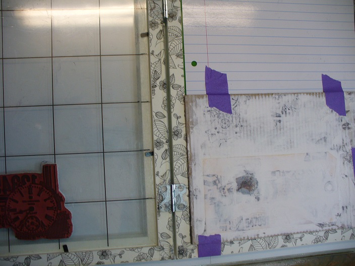
these photographs above you can see I stamped onto tissue paper with
the use of my custom made stamping tool. It's A4 and as far as I am
concerned the best tool in the world (smile). The reason I use
the tool is because now I can line up the texts and other stamps
horizontally easily, and the tissue paper won't move around that much. I
secured it into the tool with some painters tape.
I
kept on stamping; and covering up the previous stamped images until the
whole of the A4 sized tissue paper was filled up with random stamping.
No skewed stamping here ... I also had the choice to stamp it a second
time if it wasn't dark enough the first time.
I
tore the tissue paper in strips and adhered it to the front and back
cover randomly; I also added a postage stamp. I used a palette knife to
add structure paste to cover up the stamping and postage stamp
partially.
Now,
for stamping on this corrugated board, and the structure paste with all
its texture was going to be a problem without a tool! So, I attached
one of the covers to my tool with some painters tape.
WOW, multiple stamping! With a greyish ink first and then with some Fresco Finish paints - Beach Hut and Brown Shed (it's more a deep red, smile) I added a little at a time, stamped it, cleaned the stamp etc.
After
the paints had dried, I decided to only stamp part of the stamp with a
darker black to keep the red and blue part the way they were. I LOVE the
effect!
I painted the embellishments (frame and 2 corners) white Fresco Paint - Snowflake and when dry I sanded them to make them look vintage.
Assembling all of the embellishments and frames was fun. I
distressed the edges of the book with distress ink and a little bit of
red paint, just sparingly. I binded the book itself with a chinese binding.
I
used the same techniques to create the back cover, except the clock
part of the stamp has been done with distress inks first and then that
color was used to color the image itself.
I LOVE the possiblity of stamping with different colors and with different mediums! The sky is the limit here!
This
was a fun project to make! One that took a lot of prep work though, as
there are not really that many techniques online to use with the
stamping tool. I had to put my thinking cap on for the technique itself,
but I am sure I will be using this method again now I know it works
just fine. I also had written downan ideato
heat emboss part of the stamped images with different colors of
embossing powder, but I was happy with how this turned out, so skipped
it. Maybe for a next project, orperhaps you could give it a try?! What are you waiting for: go create and enter the challenge...
To join our challenge and win a PaperArtsy £50 voucher:
Simply make
something arty relevant to the topic, and link your creation from any
social URL (eg. Instagram, Pinterest, Blog Post etc) sharing your
original make to this challenge page.
The current topic link Topic 18: Stamp Platform Techniqueswill close 17:00 (London Time) Sunday, 28th October 2018, and the winner will be announced 2 hours later at 19:00.
All
links go in the draw to win a PaperArtsy £50 gift voucher. Please make
sure we can contact you as a prize winner - it helps if you share your
contact info from the platform you opt to use.
Good Luck! If you have any questions, don't hesitate to ask!
"Hello all, Kate here welcome
back for my last day of working with the amazing Lynne Perrella Stamps! I am in
LOVE with this collection because it is everything unique and vintage that I
love in a stamp. I am making a tag today so lets get started".
Once dry, I
sprayed and dripped red ink. A script
stamp was stamped in the background.
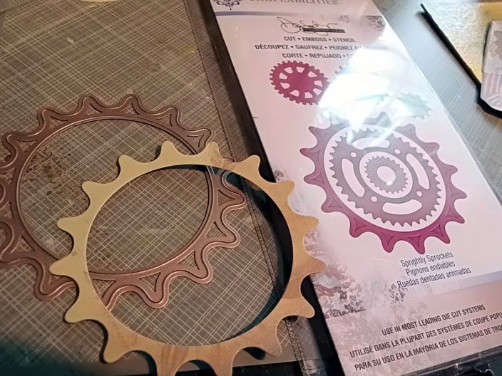
I added the
gear and doily to embellish then layered the stamped image over the top. I added a
layer of Fresco Finish Crackle Glaze over the stamped image to make the
colors pop.
Thank you for all your kind comments this week. I hope you feel inspired to join in the weekly challenge. Until next month.
~Kate~ Leandra Says: The build up of layers adds great dimension to the tag, Chatsworth is a real hidden gem to incorporate into projects. Thanks Kate for sharing your process. Gillian Says: I like the idea of the lace doily mimicking the gear die. Wonderful layers and textures to this tag Kate. Thanks for sharing your creativity this week.
If
you would like to join in this week's challenge and play along with
Kate's techniques, then do link up your creativity here, and go in the
draw to win some PA stamps of your choice! You need to link your entry
by 17:00, Sunday July 27th 2014.