Hi everyone, it's Leandrawith
you today, and I'm here to share with you some tiny print ideas with
Lynne Perrella and Sara Naumann stamps. These cards were planned to be
simple,it was the 'Absorbent Ground' (a Golden product) I was digging
into testing for this post. If you are looking for fast Christmas cards,
then these are definitely that. Even the process I have used can be
simplified further without difficulty.
When working directly onto vintage papers,
or onto book pages, I like to knock back how bold the printed words look
to make the substrate more usable. Generally I use paint thinned with
Fresco Matte Glaze. This allows the image I stamp on top to be seen a
bit more clearly. However, for this topic, Tiny Print, I really wanted
the print to still be seen through all the layers, and with that in
mind, and to stay true to the intention of the product I was testing, I
opted for watercolours on top for a gentle tint. Yes, I could have used
Frescos, and those and infusions will be future experiments to explore
over the 'ground' product.
OK
so I am heading into a deep dive on how I found this tub of 'Absorbent
Ground (white)', seen in the centre of the picture below. When I took
this photo I didn't know realise where I was heading, but I adore gels,
mediums etc so this was a chance to explore! The plan was to find out
if the 'ground' made it easier to create watercolour backgrounds on
vintage papers. Answer: well, it kind of helps, but it still isn't
anything like working directly on good watercolour paper...however, it
served my purpose pretty well in the end as you will discover as i walk
you through the process. I ended up very happy, but not for the reasons I
originally expected.
As
an aside, both Absorbent Ground and Fibre Paste are Golden products
that are supposed to help your paper behave more like watercolour paper.
(they also have Qor branded versions of the same product) Qor are
Golden's watercolours, a fairly new product for them that seems to be
getting good reviews. They really do 'suck in' the colour into the
paper, and the colours seem to dry quite nicely on top of it, but they
actually don't let your 'wet in wet' watercolour techniques 'travel'
anything like they do when you get those magical effects on watercolour
paper, so don't get too excited....
However....
*drumroll*.... it creates a gorgeous 'toothy' surface to stamp onto,
and that WAS AMAZING! Let me attempt to describe how this product feels:
when you rub your fingers over the dry ground it's more gritty-chalky
and much more finely textured than fresco paints, which feel
silky-chalky by comparison. As a product it really seems to 'pull into'
itself the product you apply on top. So, for example, take a look at
just how black the inked images are in the samples I made. Usually you
would expect a bit of texture, a bit of the image to be paler in some
areas, but I must say, every print I made with archival ink directly
onto the absorbent ground was perfect! So for that feature alone, it was
a really good experiment to do! I LOVED how the rubber stamps with
archival ink perform over the ground.
So
let me back up a bit. It is good practice, when testing out theories,
to use the same brand where possible in the layers, this was also the
recommendation on the tub of ground. My vintage paper (a very old
handwritten record of each French plot of land within an property
purchase agreement) was particularly fragile, so I started by sealing it
with matte medium to secure it to smoothy card and then applied gesso. I
used a catalyst tool to get extremely thin layers. Matte medium
(Golden) in the tall bottle, is a pourable, runny product, much thinner
that a gel medium (see the videos below for info on these products).
Next
I applied 2 coats of the Absorbent Ground. It doesn't say how much to
apply, how thick, or how many coats on the tub instructions. For all of
these layers (matte medium, gesso, ground) I really, really liked using
the catalyst tool. It kept the layers thin and even while spreading only
a small blob of product and I didn't get any bubbling or buckling,
despite the paper being thin and fragile. The vintage paper certainly
felt stronger/ fortified after these layers had been applied.
By
the way, (another digression...) if you want to know more about gels,
mediums, and so on, we did this as a blog topic in August 2015 (here is
the link to the 'masterclass' blog post which is a really good resource - picture heavy with plenty of examples, a handy one to pin or save)
I
filmed 2 videos at the same time explaining the basics, and looking at a
few different brands and price points. If you don't understand what
mediums or gels are for, what the differences are, and would like to
have some ideas regarding use with paints and other colour products, or
if you are not sure what to buy and why, then this is a good starting
point to get your head around what is out there. (I love all texture
products, so I collect and use loads! But it does require discernment.
Note the difference between fine artist-grade and craft-grade products.
Even within a brand, there can be artist grade and student grade. If the
price is similar of an artist brand to a craft brand, then you may end
up paying over the top for a product with no track record! eg a shiny,
plastic gesso is really not what a gesso should be)
The
first video is about Acrylic Mediums (in other words thicker viscosity
products that we can use in mixed media for adding texture and much
more)
This
one is about Acrylic Pouring Mediums, in other words runny products.
Golden still make glazing liquid (2 of the tinted glazing mediums I show
are no longer available), but of course you can use the still available
clear glazing liquid in matte, satin or gloss to make your own custom
tint in the finish you prefer.
OK
back to the topic at hand: Tiny Print. Here is how my paper looked
after 2 coats of Absorbent Ground. I really wanted to be able to see the
writing on the paper (that was the whole point), and that is why I
chose to use watercolour on top, being translucent, I hoped even darker
colours would not obliterate the writing.
I
decided the next step was to apply the watercolour to the edges of my
papers that had been pre-torn to match the size of the stamps I was
going to use on top, while still leaving room for the LPC images to be
added later.
What
I found was that to get an even coverage, and no domineering 'tide'
marks I needed a fair bit of of water, so a water mister was good to
shift the colour around and still allow some contrast.
Next,
while the papers were still wet, I also dropped in a few concentrated
drops of colour in 2 different shades of colour. As soon as these hit
the watery surface they did soften out a bit, but nowhere near as much
as they would if I was working on good quality watercolour paper.
However, I quite liked how they settled, so I left them to dry off
naturally.
I was
interested to see notice they certainly dried 'into' the ground, and
the effect was almost soft and blurry - which I really liked!
You
can see how soft the background looks once dry. I did wonder if the ground actually
hinders watercolours looking as vibrant compared to how they might if they were used the
same way on watercolour paper. Anyhow, lucky I am not a watercolour
expert, as I might be disappointed with this 'ground' product, however, for me,
there were other exciting things about the Absorbent Ground that I was just about
to discover....
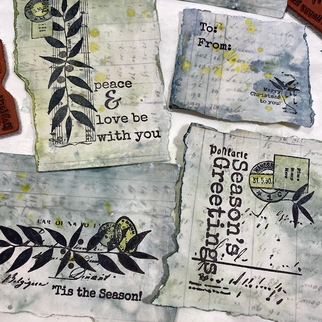
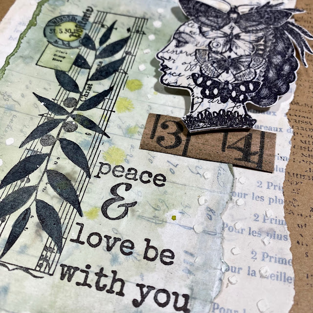
Look
at how beautifully it stamps up!! I could NOT believe this, the
archival ink looked blacker and way less purple than it usually does,
and the sharpness was spot on superb. I just LOVED how I had to really
peel the paper off the stamp, it was like it sucked right onto the
rubber and the stamp surrendered all its ink to the absorbent ground,
with the paper piggy in the middle - I guess they named the product perfectly, it absolutely IS absorbent!
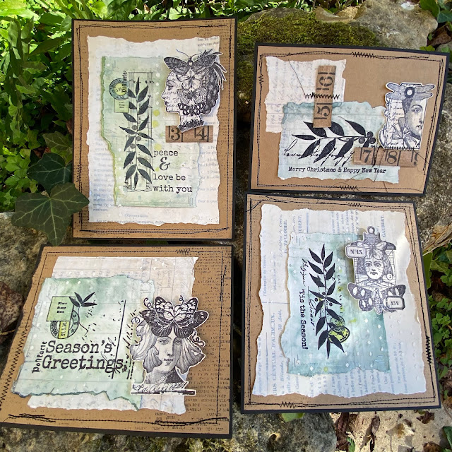
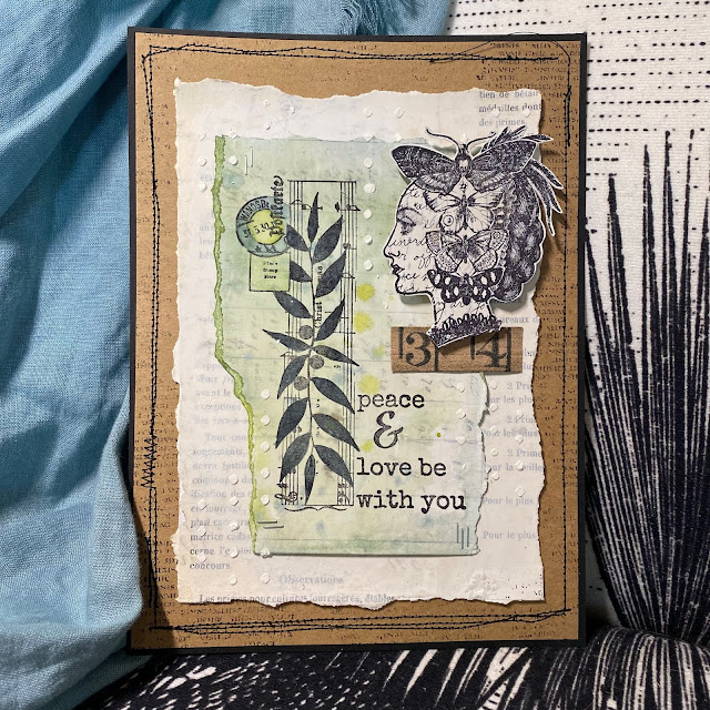
These
are the Sara Naumann Christmas themed stamp sets I used, we released
these last year, and I really love them for making cards and tags for
Christmas.
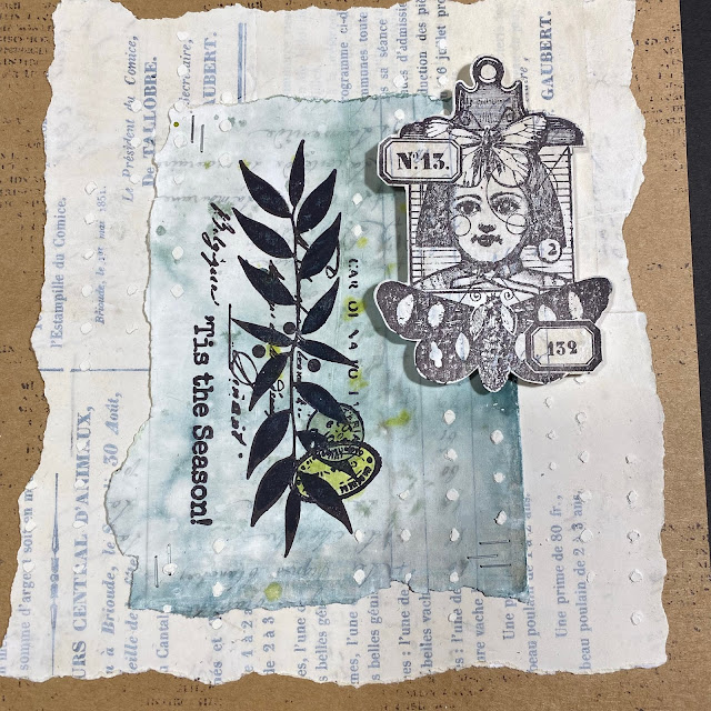
This
was my second sheet stamped with Lynne Perrella 'head' images. I
partially inked up some of the larger stamps as the intention was only
to use the heads. There are so many LPC stamps to choose from. We all
know how detailed these stamps are, and wow does Absorbent Ground pull
out those intricacies beautifully! I was very tempted to start using the
watercolours again to add shading to these stamps, even a touch of
sepia on the faces would look good right ?? But my plan was for
minimalist cards on this particular occasion, so I resisted the urge. I
know I will do this again, I've barely started playing with this
product. I will certainly run more tests, and create some collage
elements. Then in future projects I can then add colour if required. I
think it would be very handy to have some of these ready for immediate
use in my 'bits and bobs' stash!
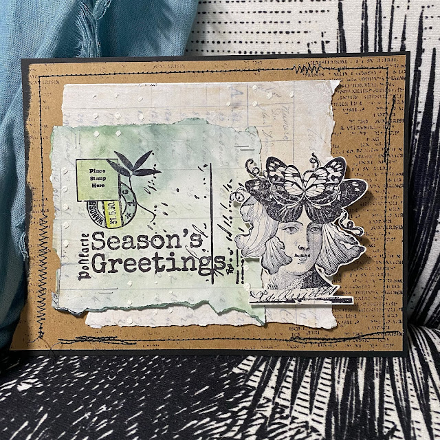
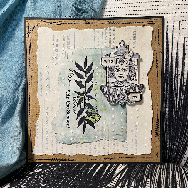
So
the composition is pretty simple. The coloured Sara Naumann stamped
layer gets stapled to another layer of lightly gessoed vintage paper.
The LPC head gets stuck on with foam tape, and then I used the popular
Sara Naumann stencil (those tiny dots) with Grunge Paste for a bit more
interest.
I occasionally added a bit more intense colour to the BG, (like on those postmarks)
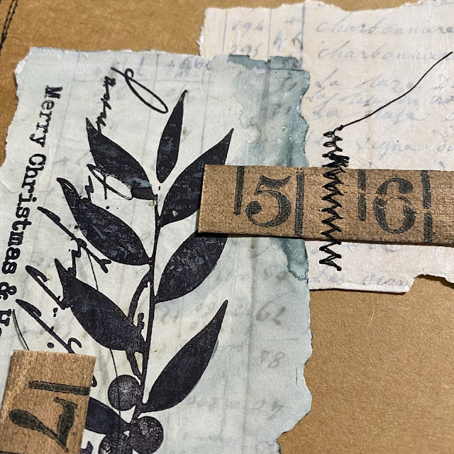
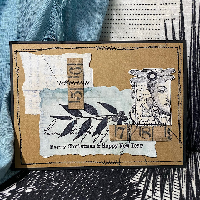
And
one sample was made from all the left over scraps, and some vintage
tape ruler I found in my stash, that tied in perfectly with the Kraft
paper background.
I
just love how you can still see the Tiny Print of the Vintage paper
peeking through. Who was that person who hand wrote all that information
out at the land office all those years ago!! Can you imagine !!!
I
felt black stitching was needed as the final touch to frame each
layout, and occasionally to secure embellishments. This is where you
need to do your worst sewn wonky lines possible - almost impossible for me after quilting meticulous 1/4" seams for years!
A couple more close ups of the detail ....
You
know, I think I could get away adding some sepia shading to those LPC
faces...I might go and do a bit of subtle faffing/ tweaking!
I
have inadvertently stretched a fast-card post out into a gels and
mediums play-fest, but that is what floats my boat, I just LOVE
experiments, and to find a product that improves your stamping - well
that is VERY exciting for me!
Let me know if you have played with that Golden product and what you have done with it!!
Anneke
is right, sometimes clean and simple is certainly not quick and easy,
but I'm sure you'll agree that this clever stamped grid effect is well
worth it. The lovely stamps from Sara Naumann are used in a bold and
beautiful way with these CAS projects.
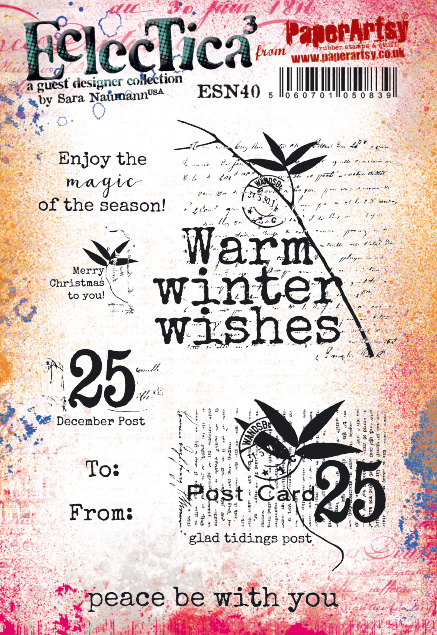
Hi everyone, it's Annekewith you today, and I'd like to share with you 3 Christmas cards I made for the current 'A Bit of Sparkle' topic. On the cards I did some striking black stamping using stamps from the ESN40 stamp set designed by Sara Naumann.
As you can see it's a set that holds a lot of beautiful text stamps. I've chosen to make minimalistic cards. I kept the designs simple because I wanted the text to be the eye catcher. To
add that bit of sparkle I worked with Mica Flakes and Art Sugar.
Glitter all over the place here; there will be glitter dust on my
worktable until Christmas I'm afraid :)
To
create the backgrounds of the cards I used a homemade one inch square
stamp which I used to create the grid pattern on the backgrounds.
I did the stamping with paint. On this card I used a combination of Fresco Finish Chalk Acrylics London Bus, Seaglass, Pine Grove, Hint of Mint and Coral. After stamping I outlined the squares with a white pen. I inked up the text stamp from the ESN40 set using Archival Ink Jet Black.
I've cut all the tree shapes from this post out of 340gms Smoothy Heavy Card Stock.
That paper holds wet media perfectly. It doesn't warp when adding
texture paste, paint, snow, gel medium...my favorite paper to work with!
I
applied a layer of Aleene's True Snow to the tree on this card using a
palette knife. I sprinkled Finnabair Art Sugar 'White' on top of the wet
snow. The sparkle doesn't show on the photo but believe me it's really
there :).
Here I did the stamping with Fresco Finish Chalk Acrylics Hint of Mint. Even if you're using only one single color, the grid pattern adds a lot of interest to the background.
To
create the texture on this tree I applied texture paste through a text
stencil (Tim Holtz Mini Stencil Set 32). After drying I painted the tree
with Fresco Finish Chalk Acrylics Cherry Red. I scattered Art Sugar 'White' over the wet paint.
On the final card I made a grid pattern with my homemade square stamp using Fresco Finish Chalk Acrylics Snowflake.
I decorated the trees using Finnabair Mica Flakes. I adhered the Mica Flakes to the trees with Golden Regular Gel.
Mica Flakes don't come in colors. I colored them myself using Ranger Alcohol Ink in Flamingo, Watermelon and Pink Sherbet. It's
a technique I learned from Tim Holtz. I put some Mica Flakes into a
plastic cup, added a few drips of Alcohol ink, stirred well with a
wooden popsicle stick and put the colored flakes on a paper towel to
dry. After drying I stored the Mica Flakes in small jars, ready to use.
Although the cards look clean and simple they weren't quick and easy to make. Stamping the grid patterns was time consuming, more specifically the card in the middle.
I
experienced a few problems with the Mica Flakes as well. After applying
Golden Regular Gel to the trees I scattered Mica Flakes all over the
trees. That way I could cover most of the surface with Mica Flakes but I
had to fill more than a few gaps. Picking up Mica Flakes with tweezers,
adding Regular Gel to the back with a small paint brush and putting the
Mica Flakes in place....I'm sure you get the picture :)
But after all I enjoyed making these cards. No effort too big to spoil my friends and family with my homemade Christmas cards :)
Thanks for joining me today. I hope you'll have a wonderful and creative month of December. Enjoy!
We
are into the new frosty colours tonight from Miriam. She has partnered
them with a lovely silver embossing powder and Sara Naumann's Christmas
stamps, and made a practical gift in the process! Leandra
Hi everyone, it's Miriamwith you today, and I'd like to share with you a project that I have created using the fabulous shaving foam technique.
This
technique never creates the same effect twice, which I love. I get
really excited, waiting to see what the end result will be before I
scrape the excess foam off the substrate. As messy as this technique
can be I have learnt to stay as tidy as possible. I enjoyed this project so much that I ended up creating a second project too which I will be sharing with you tomorrow.
I
have used the shaving foam technique a lot this year, starting with the
Sara Naumann release in January. It has been great to see it used more
and more since. One thing that I have learnt, which was great in my
project, is that I do not have to discard the foam after each use. I
can simply flatten it out and add more paint.
I
wanted the shaving foam technique to stand out on my project and so I
kept the design simple by using silver embossing and stamping. I love
the pattern of the shaving foam coming through.
The calendar itself is a MDF substrate from That Craft Place.
I loved the idea of creating a Christmas countdown. It was so easy to
put together and I loved the cubes. This could also be adapted to use
all year round just by not including Christmas wording.
The colours of the shaving foam looked so wintery and perfect when teamed with the silver embossing powder.
I
used my favourite colours for these projects. You could use more
traditional or more bold colours for these projects. I really hope that
I have inspired you to have a go at this technique yourself. This
technique is so much fun.
Thank you for joining me this evening. Pop over to my blog to read more detail about how I created these projects. Happy crafting! Miriam


.png)

