Showing posts with label Steel Grey. Show all posts

Monday, 19 May 2025

Mini album with Seth Apter Products {by Etsuko Noguchi}


Hi everyone, nice to be back with you again

Etsuko here with you today.

This year on the blog, we have free reign to do a deep dive into PaperArtsy product ranges of our choosing. For this post I have been exploring Seth Apter's products. Today I'm looking forward to sharing with you what I figured out when I made the mini album with Seth Apter's stamps.


In this post, my theme is how to create a mini album using Seth's stamps in a fun and effective way. Please take a look.


Before starting the project, I first prepared these Seth products. The stamps are the latest ones released earlier this year and the colors are Seth’s originals.  I used most of the colors for gel printing by Seth's colours. It seems to me that Seth weaves stories by making stamps from things that inspire him on his walks and travels. I share that feeling and wanted to enjoy creating my works using these stamps. The paints I used here were PaperArtsy Fresco Finish Chalk Acrylics - Glacier Ice, Niagara Falls, Fuzzy Cactus, Heavy Cream, Steel Grey, Rusty, Kiwi Gold, Tomato and some more. Fabulous stamps were Seth Apter's stamp sets 43, 44 and 45 (ESA43, ESA44 and ESA45).


First I used gel plates to make the base of the album and the collage papers. The first painting I did, that Seth showed in a video, was to use opaque colors and then lightly dab transparent colors on top of them. I used black and white papers and printed them alternately until I had a paper of a color I liked.


In addition to the two-colored paper, I also prepared some washi papers, added paints with  water and printed it using the same gel plates. I used these for thin tape and coloring points.


This time I decided to make a simple rectangular mini album in the √2 golden ratio, using a collage technique made from gel print papers I had made previously. The diagram above explains how to create the √2 golden ratio rectangle used here.


Draw the diagonal of the square, and use the diagonal as a radius to draw an arc that is tangent to the extension of the base of the square. Draw a rectangle that encloses the resulting figure. This is a √2 rectangle. Dividing it will create a smaller √2 rectangles (from book - Balance in Design). I tried to base the collage on this method, but I didn't use it for everything. When I overdid it a bit, or the colors didn't work out, I just relied on my usual eyeballing to fix it. Using this √2, the actual dimensions of the rectangular card are 3 inches high and 4 1/4 inches wide.


These six cards were my first attempts and after some trial and error I eventually created the following 12 pages of cards.


I created 12 rectangular cards, as described written above, 3 inches high and 4 1/4 inches wide using Smoothy (Heavyweight) A4 white stamping card and collaged the gel printing papers on them top. From the 12 collaged cards I chose this card as the cover of the album. I used 'CLASSIFILD' from ESA07 stamp set.


Now, let me give you a brief introduction to each page. The gel printing papers were used almost as is, and variations were added by stamping with ink or embossing powder. The technique and Seth's stamps used will be shown in the enlarged photos below.


On this page, I added some leftover pieces. The embroidered fabric, stamped paper, and textured wallpaper used for paint stamping. The metal 6 is made by embossing foil using a cutting die and then coloring it in a vintage style with alcohol ink to create numbers and letters, which I use whenever necessary.


The marks shown here are from stamps and Seth’s printed tissue paper, and I love the Damask pattern stamp on the right-hand page and I think it will come in very handy.


Here I printed the letter X onto fabric and stitched around it. Also I embossed it onto wax papers with embossing powder then I glued them over the collage.


The last page. The photo is a little dark and hard to see, but the grid on the left page is made of bronze powder. You can see it in the enlarged photo below. I used light pink gel print paper for this whole page.

For the spine, I chose a simple vintage-style card.


I mainly use Seth's new 3 set stamps here, but I chose this CLASSIFIED for the focal point because the words stand out. I used Seth Apter stamp set 07 and 44 (ESA07 and ESA44). Ranger Industries Archival Ink (ground espresso and jet black) with Distress embossing powder (Lost Shadow).


I used Seth Apter Mini stamp EM45 with Distress embossing powder (Lost Shadow). The green lines were made by painting Green Patina onto washi paper and ripping it into thin strips.


PaperArtsy's blank tissue is thin but strong enough that it doesn't wrinkle easily, making it a great product. It also goes great with stamps and Mattints, so I use it whenever I get the chance. Here I used the ESA35 stamp with white embossing powder on blank tissue paper. I took the photo with the light shining on it, so the tissue paper looks white, but you can't really tell from the outside. Satin Glaze seems to be good for adhesion.


From here on, I will introduce the products, which are made using the same techniques. I used stamps are ESA43 and ESA18The former used Archival Ink jet black with Lost Shadow embossing powder and the latter used mixed whitish powder.


Stamp is ESA34 with some Red Ink.


Stamped ESA43 with bronze powder on the Vellum paper.


Stamped ESA45 with Seth's Baked Texture the altered page.


Stamped ESA45 with Archival Ink jet black with Lost Shadow embossing powder. The photos below show the products used above.


I decided to make a fabric hinge to hold the 12 cards in the album. To match the colors of the album, I diluted Bougainvillea with water and dyed some off-white fabric, then dried it and it turned out a great color.


I stamped the EM69 stamp all over the dry cloth using Destress Ink Vintage Photo.


I rip a piece of hinge fabric to the width of the card, attached it between two cards with double-sided tape, and then joined two other cards together using a sewing machine.


I wanted to dangle something from the back of the album, so I tried out a lot of different things but nothing seemed right. I thought a simple thing like a branch would be good, so I bundled together some hemp string to make a branch, then wrapped embroidery thread around it and made it like this.


Since I made the width of the hinge fabric a little wider, the cards didn't hang loosely together, so I connected them tightly with backstitching like this. This completed the project.


In most cases, when I make an album, I emphasize unity and create one or two master boards, then insert photos and stamp images to create a flow. However, this time I wanted to try a √2 composition, so I made a collage using printed paper. There were some pages that were disjointed, but I enjoyed the process. I would like to use this experience to create more creative works. If you would like to create abstract works using Seth's stamps, please share them with us on Facebook, PaperArtsy people, or Instagram. We look forward to seeing you.


Thank you so much visiting.

Etsuko xx


Facebook: Etsuko Noguchi
Instagram: Pixienest
Pinterest: Etsuko N

Tuesday, 21 January 2025

Circle Book with Seth Apter Products {by Ann Barnes}


Hi everyone, it's Ann (aksbarchitectCREATES) here with you today.

This year on the blog, we are being given free rein to do a deep dive into one of the PaperArtsy product ranges, and for this post I have been exploring Seth Apter products. I have always been drawn to the circles seen so often in the PaperArtsy stamp designs by Seth. I wanted to explore incorporating some of these stamps into a handmade book. I'm looking forward to sharing this fun circle book that I created.

I love making my own books. I know for some people, the book binding can be a daunting task, especially when it involves sewing multiple signatures together. This circle book is created in a way that removes all of the stress and also allows pages to be easily removed and worked on or even replaced!


A while back I was inspired by a technique that Laura Denison Designs used to create a "Twisted Pin-Bound Book". For the binding, Laura used a "pin" that the pages swing/rotate around. Extensions can be added to the "pin" to allow for multiple thicknesses. You can easily find her project if you search for her on YouTube.

Since I envisioned creating a book in the shape of a circle, I struggled with how I would bind it together, and then I remembered Laura's technique. For my book, I use a "Chigago Screw". These fasteners are used for a variety of purposes, from construction to leather and handmade crafts and are easily sourced.

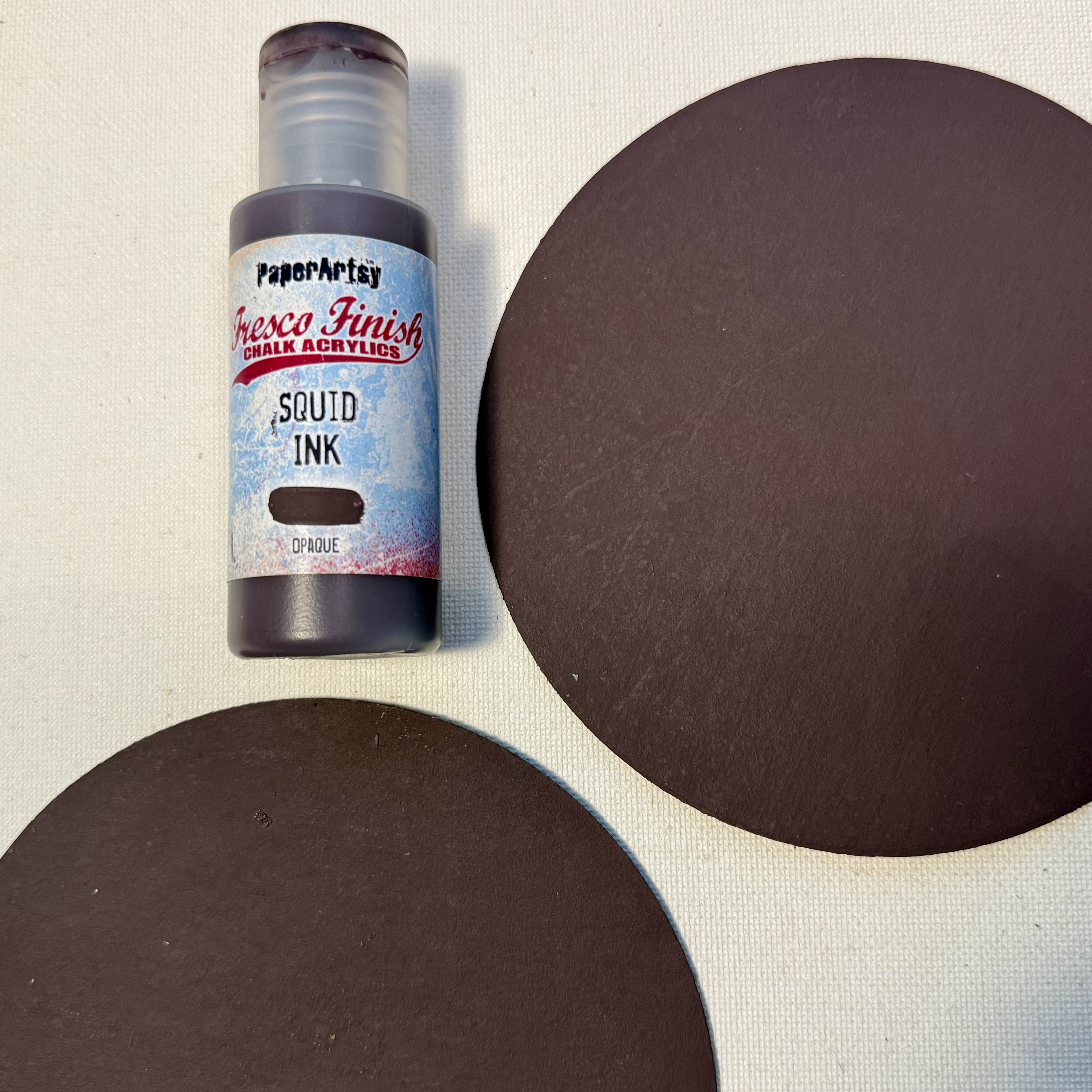
While I was thrilled to be able to put the hinged technique to use in my circle book, I must admit that one of my favorite parts of working on this project was playing with some new-to-me PaperArtsy Fresco Chalk Acrylic paint colors by Seth Apter. Squid Ink (FF56) becoming a fast favorite; I have already added it to my to be replenished list!
   
I loved selecting a palette from Seth's PaperArtsy colors and getting busy with my gel plate.


I first gather all of my supplies, starting with an inventory of which Seth Apter circle stamp designs I have in my collection. Seth has many wonderful stamp sets, the themes may vary but his incredible underlying grungy style remains throughout. When I saw the Seth Apter stamp set 30 (ESA30), I knew I'd found the perfect focal image for my covers. I also grabbed a few of his mini stamp designs EM40EM45EM107EM112.

My original thoughts were to create my book in a monochromatic color scheme, focusing on Fresco Chalk Acrylic blues in the Seth Apter range. When I started selecting my colors I grabbed Squid Ink, imagining that it would be a dark inky blue color, but as I began to add colors to my gel plate, I quickly realized that it was so much more. I fell in love with this deep, dark eggplant color. It is gorgeous and looks amazing with Steel Grey (FF134), as well as Midnight (FF123), Double Denim (FF128), and Venice Blue (FF133). When I realized that Squid Ink (FF56) was a purple, I also added Spanish Mulberry (FF71) for a bit of pop.


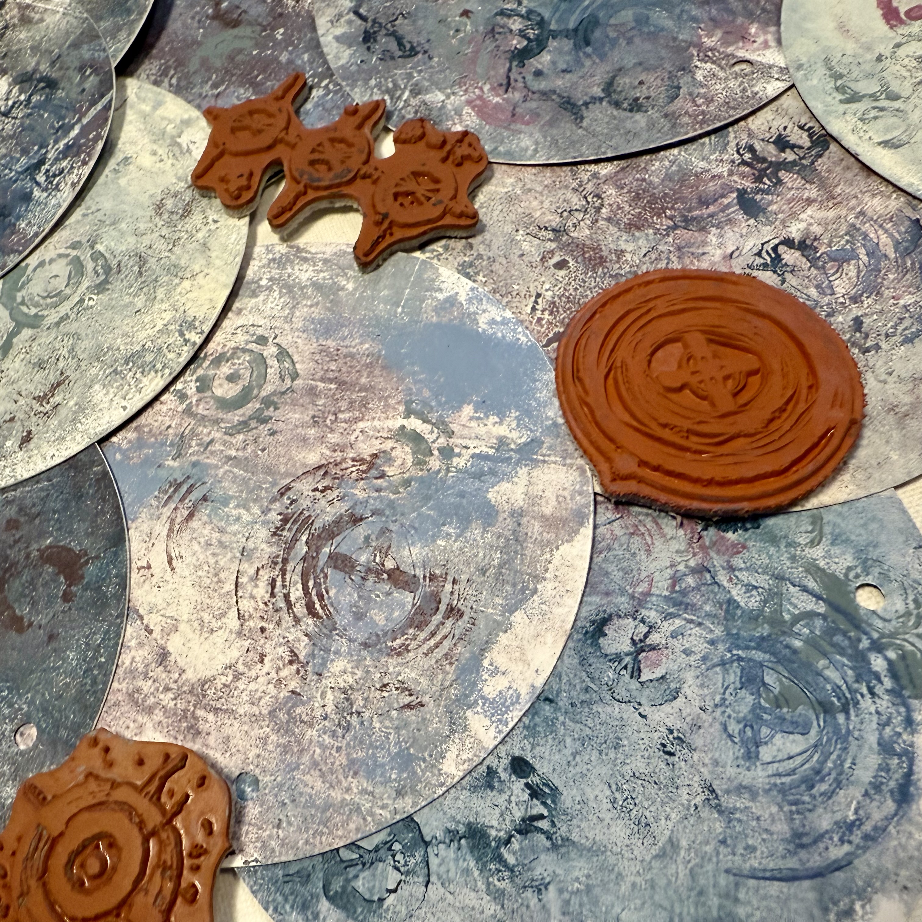
Using a brayer I add the paint colors to my gel plate and make pulls on high strength tissue paper. I layer the prints with each pull from the gel plate. When I have a nice background, I also stamp into the wet paint on the plate with some of the rubber stamps. (Note: if you prefer to keep your stamps clean, be sure to keep a shallow tub of water nearby to wash the stamps after using them with paint.) I love seeing the faint designs among the layers.


I am really pleased with the combination of colors that I have chosen and am excited to work on the pages. I originally envisioned using these pages as collage material for the pages inside the book, but after seeing how wonderful they turned out, I am considering covering the entire page with the tissue and building upon it.


When I have a couple large master sheets of tissue that I am pleased with, I make the decision to create double sided pages. The master sheet layers of color are fairly dark. I decide that one face of each circle page will be layered using the same colors, but in a lighter palette. Effectively each page will be light on the front and dark on the back (or vice versa.)


For the lighter sides I print directly onto the page, using Fresco Finish Heavy Cream (FF203). I love the look of these lighter sides, they both complement and contrast the darker papers.


After letting everything dry while I clean up from the gel plate printing session, I am considering how it will all come together. This is when I decide to paint the covers in Squid Ink. The dark cover will be the perfect base for the stamped image and also highlight the color which is seen throughout the pages. I have a feeling that I will want to take the pages in and out to work on them, so I decide that it will be a good idea to reinforce the hinge point. I die cut chipboard circles and paint these with the Squid Ink color as well.


Using Ranger Distress Collage Matte Medium, I adhere the tissue to the unfinished sides of the pages. I weight down the pages to keep them flat while they are drying. After the glue is completely dry, I use a sanding block to create a clean edge. I have found this to be a simple way to ensure that the edges align.


I cut circles of various sizes out of the remaining painted tissue. These circles will be used as college elements within the book as well as on the cover.


Each page is then modified using the collection of stamps I have gathered. Stamping always brings to mind something I once heard Seth mention during one of his demos, "try to make the stamps your own..." One way to do this is by partial stamping, where you don't imprint the entire design, and another way is to modify the image once it is stamped. I love playing around with different ways of making Seth's designs more of my own, it makes it feel more like a collaborative effort.


I select the location where the book will be hinged and then punch each of the covers and pages in the same location. I used a Crop-A-Dile to easily punch through the layered pages as well as the chipboard. You could use any suitable punch, just be sure that the hole size equals the diameter of the Chicago Screw post so that the pages will slip onto the cylinder. The book is almost complete.


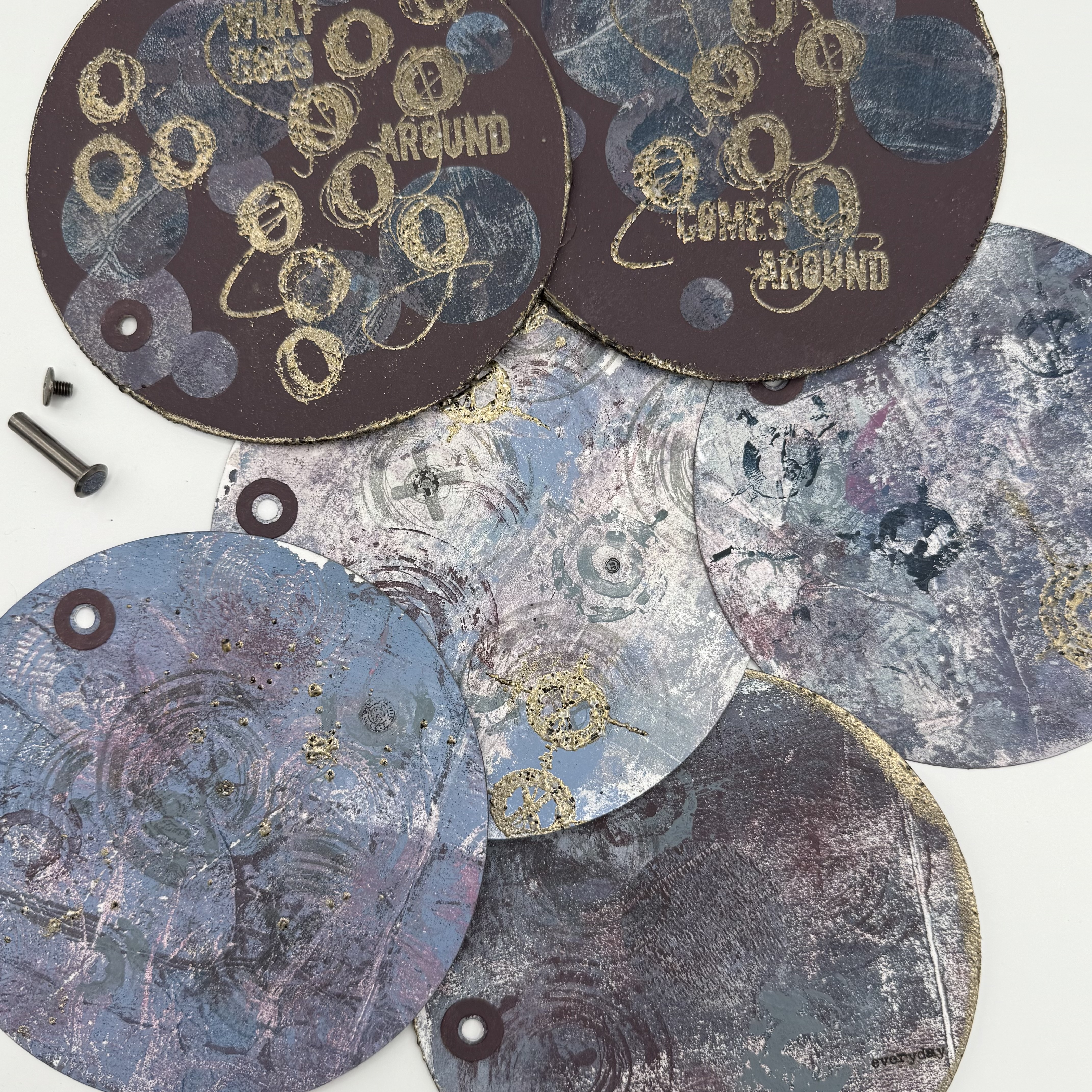
The last step to completing the book is adding the title. Since the book is circular and double sided, I thought it would be fun to have one portion of the title on the front cover and the second half on the back cover. Essentially allowing you to flip the book over and browse the back sides as well. When I chose the "what comes around goes around stamp" I thought it would be fun to use the first portion of the saying on the front and the ending on the back cover. To do this it required a bit of simple masking.


I use a stamping platform and an embossing ink pad to stamp "what comes around" onto my cover. Simply mask the words "goes around" so that they do not transfer. Then I sprinkle some charred gold embossing powder over the impression and heat it. I do the same for the back cover but I mask the words "what comes around". I then add embossing ink along the outer edge of both covers, coat it with embossing powder, and heat it. I have always enjoyed watching the powder melt.


While I have the embossing ink pad and powder out on my desk, I also add a bit of stamping and embossing to each of my pages. I use different techniques to create interest, making sure to brush off areas of the stamped images prior to heating to make the images unique.


I added some rub-on words and images to a few of the pages as well. I have a feeling I will be adding more to each of these pages over time. I just love how it turned out.


Obviously, I was drawn to the idea of creating a circular piece, but I think this binding technique could be used in a lot of different formats. I think the best takeaway from my project is that trying out new techniques and blending new color combinations can yield amazing results!


I hope that I have inspired you to pull out your stamps and Fresco Finish paints and try to create something new! Wishing you a creative day ~Ann