Showing posts with label 2023 Topic 12. Show all posts

Saturday, 9 December 2023

2023 Topic 12: Designer Focus: JoFY {by Autumn Clark}


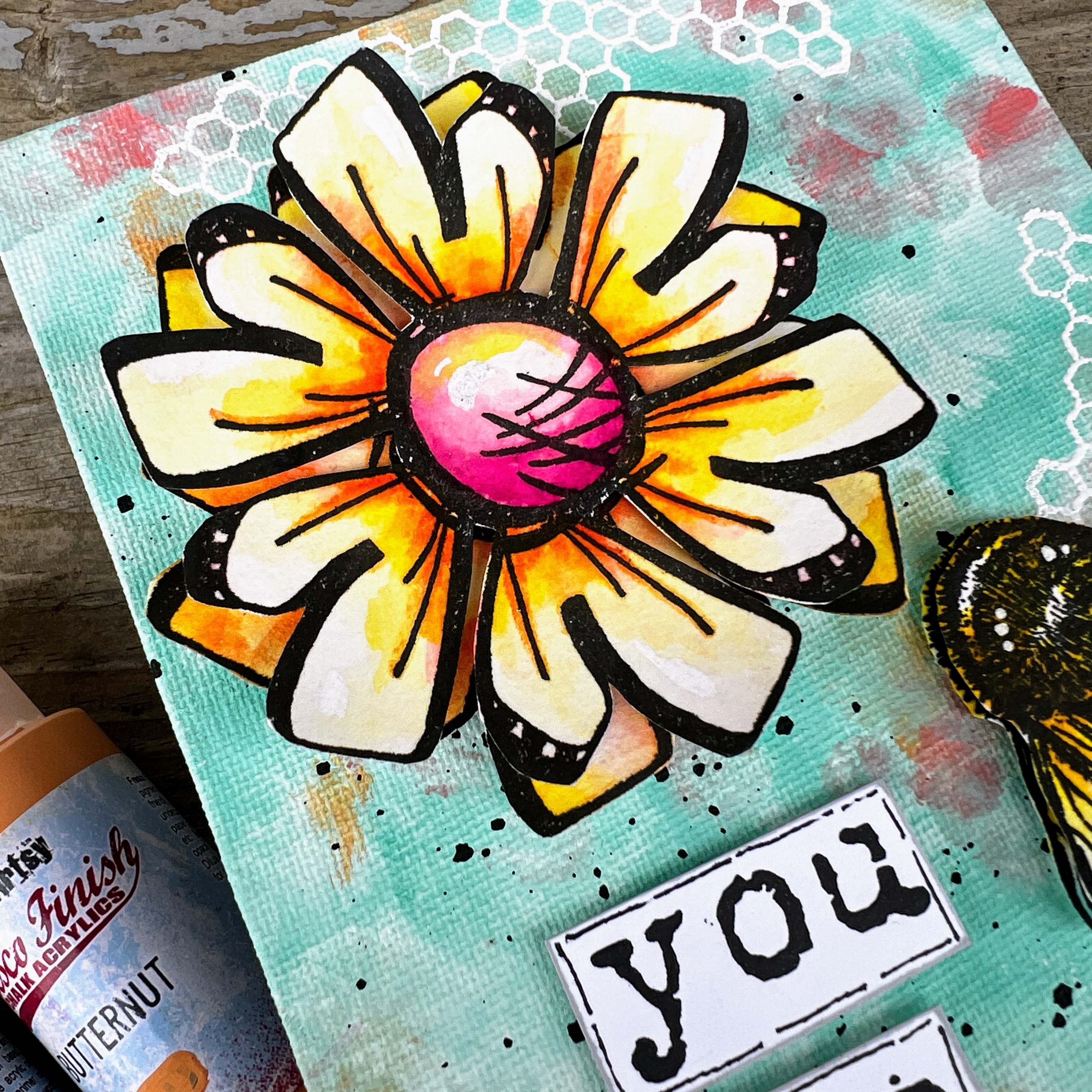
Hi everyone it's Autumn Clark from SewPaperPaint here with you today.  I've been enjoying some creative time lately, focusing on creating cards and gifts. This designer focus on Jofy had me thinking about building a stash of handmade birthday gifts. So I decided to alter some small canvases with Jo's beautiful stamps.  I hope you'll enjoy this simple process and get inspired to create some gifts of your own.


I really enjoyed experimenting with a new background painting technique using PaperArtsy Fresco Chalk Acrylics and mixing that with watercolor, a favorite of mine.  I hope it inspires you too!

What I loved most about these canvases is that they were as easy to make as a greeting card, but pack a bigger punch and can be displayed on a small easel throughout the year, long after one's birthday celebrations have ended.  


For this project, I didn't have much of a plan in mind, other than wanting to use some beautiful florals and ended up choosing my favorite  set, PaperArtsy stamp set 114 by Jo Firth Young (JOFY114).


I had picked up a small two pack of 5x7" canvases at our Dollar Tree store in the States, which ended up being cheaper than two sheets of 12x12" cardstock!  Score!  I was looking forward to mixing things up with these as substrates.


I scoured my collection and chose two stamp sets that would work together nicely from each designer.  First up was PaperArtsy stamp set 114 by Jo Firth Young (JOFY114).  I really enjoy coloring, but am lazy and cheat a bit - ha ha!  Here I've used cheap brush markers to add a variety of colors to the petals, then I simply used a water brush to blend the colors out.  It's easier than working in layers, but the result is beautifully variegated.  


Here are all of my happy little petals, colored and cut out nicely.  I wanted to create two different compositions with the flowers.


My second choice of stamps was PaperArtsy Eclectica stamp set 32 by Scrapcosy (ESC32).  I knew these darling bees would work beautifully with my blossoms.  I stamped two images and colored, then cut away the body of the second bee.  I curled the wings of the second images and used mounting tape to create 3D critters.
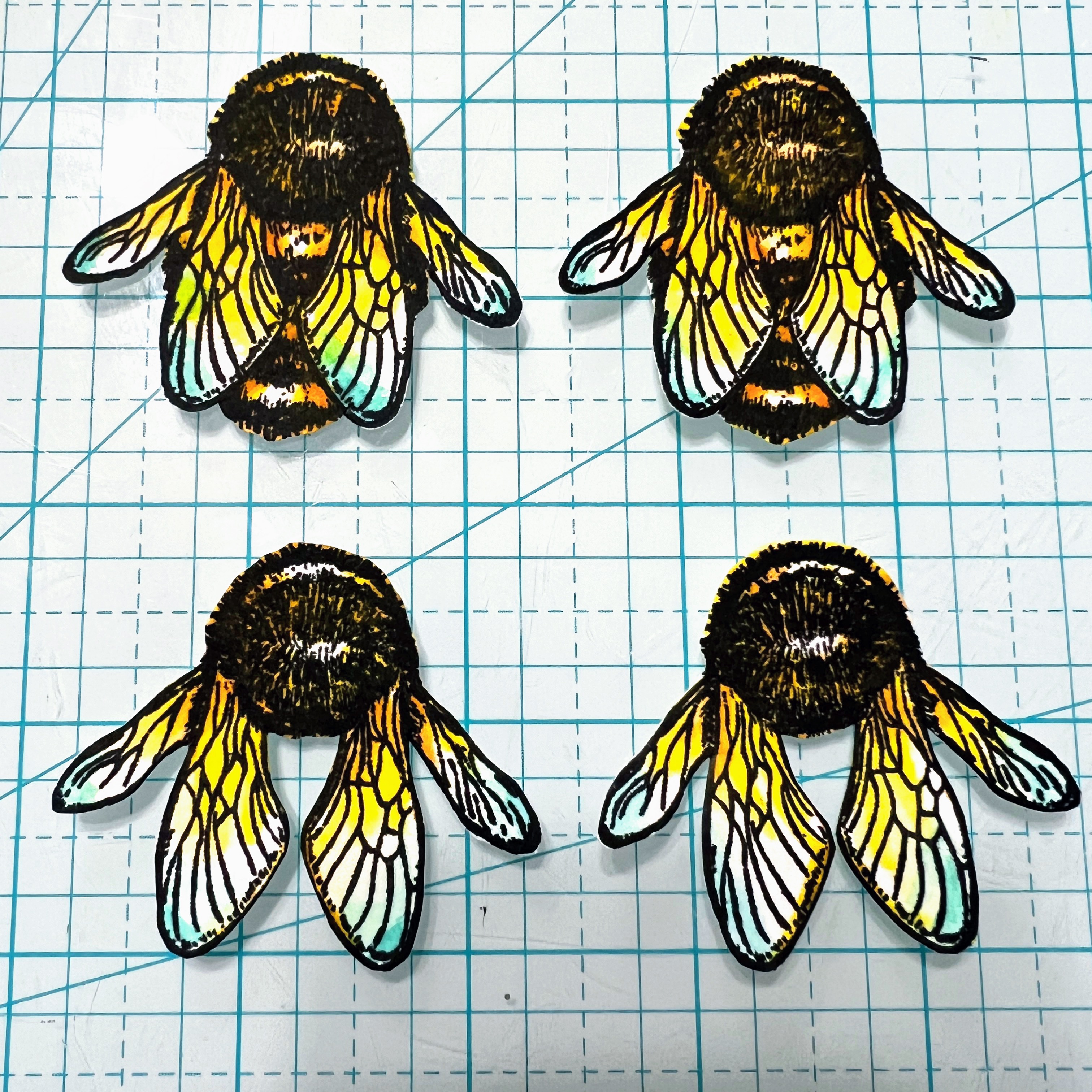


I just love how these bees turned out and the dimension they added to the canvases.  


I waited until I had colored my focal images before deciding upon paint colors.  I was really getting excited at this point and could see the project coming to life. I landed upon a beautiful combination of PaperArtsy Fresco Chalk Acrylics to include Butternut, Peach Nectar, Peppermint and Sargasso.  


I started by painting blobs of Sargasso and Peppermint onto the canvases, as shown.  


Next, I added smaller amounts of Butternut and Peach Nectar.  Once my painted layers were dry, I stamped the honeycomb from ESC32 with embossing ink and embossed in white on the panels.  
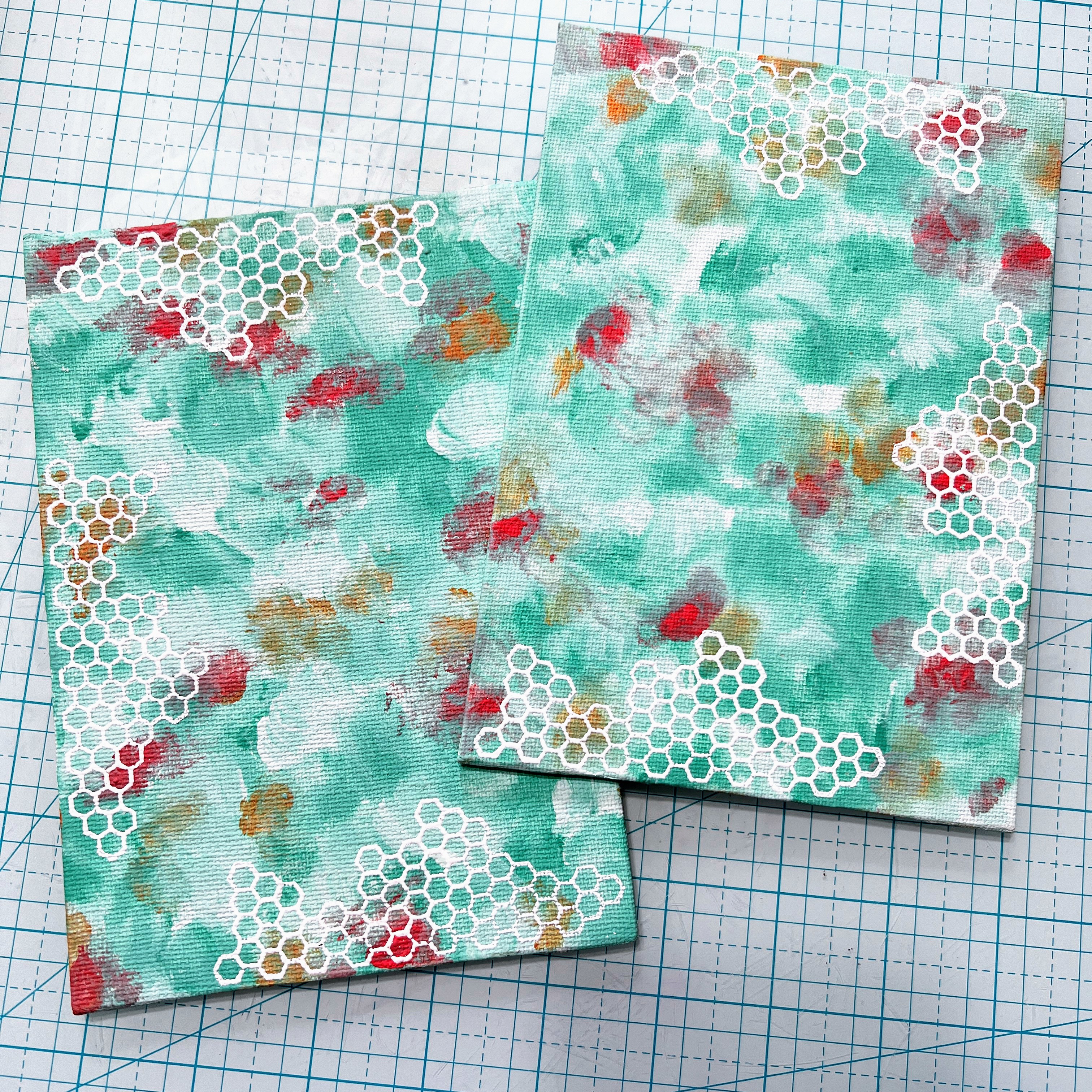


I started this project back in October because I was going to be away for a month.  When I finally came home at the end of November and was ready to photograph my canvases, the watercolor had sun bleached from laying on my art table in the open sun.  The trees in my front that normally shade my window had lost their leaves and the sun had been beaming in.  You can see how the color is altered in the pic below verses the coloring sample above.  To fix my pieces, I simply added more watercolor.  I actually like the more faded flowers in the end, though I was initially distraught!  Though, I'm going to look deeper into the lightfastness of my inks going forward...  I wish I had photographed them then and could do a side by side comparison.  


I decided to add some encouraging words to my gift panels and picked a very favorite stamp set, PaperArtsy Ink & the Dog Words 2 stamp set (W2) to spell out my chosen text.  


I cut apart each word and dabbed a grey ink pad along the edges, then drew in some black outlines.  
 
 
I really like the pop of white against the colorful backgrounds.  
 

I think the canvases are quite cheery and the colors work together very well. I'm so happy I was able to salvage the faded flowers with a fresh coat of color!


I think I'll search for some simple white frames for the panels or perhaps add some wire and bead hangers for the next set.  I'm also thinking of creating some of these canvases with Jo's fabulously fun snowmen stamps and giving them as Christmas gifts this year.  The possibilities are endless!  I truly hope these projects have made you smile and encouraged you to get stamping.  

xx, Autumn


YouTube: SewPaperPaint
Facebook: Autumn Clark
Instagram: @sewpaperpaint
Pinterest: SewPaperPaint

Thursday, 30 November 2023

2023 Topic 12: Designer Focus: JoFY {by Renata Peley}


Hi everyone, it’s Peley Renata with you today with a fun and crafty little project. A long time ago, when I just started doing mixed media, very soon I realized how beautiful and magical this world is. And instead of being a responsible grownup, I spent many nights browsing the internet for some amazing stencils and stamps. Even now I remember seeing the PaperArtsy line the first time, but the first designer that draw my eyes was JoFY, with her whimsical and colorful designs. And that’s when I started assembling my early Christmas wish list. Luckily my husband fulfilled my desires and bought me two gorgeous stamp sets. And those two stamp sets were some of the first ones that I got in my now beautiful collection. So, I thought it was fitting that I make a project highlighting some of Jo Firth-Young’s beautiful stamp sets, that she released this year.

You know that feeling, when you feel like crafting, but don’t have the mood or time to commit to a whole art journal page, or any larger mixed media project? Well, for such occasions, what’s better than creating tags or artist trading cards. Though it is also a really fun format to work in and a perfect format for experimenting. This time I won’t be experimenting much, but I do promise some fun and good time.  


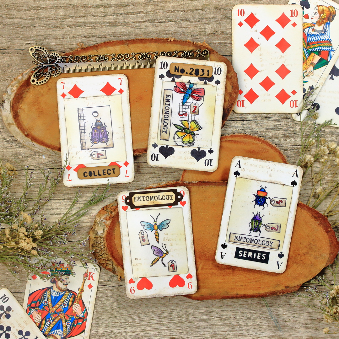
Recently we visited my husband’s parents and that place is like a treasure trove. I almost always find something that inspires me to create a project. They have some amazing vintage items, just laying around the house and collecting dust, but also some items that they got as an advertisement. And that’s precisely how I found my substrate and inspiration. On one of the shelves, they had an incomplete deck of cards with some company logo on the back. They weren’t vintage, or too pretty, but you know we crafters always find a way to make stuff look more interesting.

Now the two things came together for me: an old ugly deck of cards and new, gorgeous JoFY’s stamps.


Now that I had my main items for this project, I just had to figure out how to make them work together. But also, not to forget this quarterly topic: Typography. To be honest, the whole idea developed really fast, but soon I will tell you more about it.


Not long ago, in my previous blog, I was talking about my junk journaling crafting phase. That was the time when I was searching for ideas to make all sorts of fun pocket inserts. And one of my favorites was making something like specimen windows…or at least I think that’s how they are called. Anyway, that is what I have planned for this project, just in an artist trading card format.
The first step for this was to make windows in my cards. This took a couple of attempts as first I tested making windows with some of my cutting dies. None of them really fit my imagination so at the end I decided to create my own custom windows.


Those three cards on the left are the ones I cut using cutting dies, but the rest were the ones with my own measurements. I already said that my cards had an ugly back, so I decided to take two cards and adhere them back-to-back. In between two cards I would put JoFY’s stamped designs. To help the cards’ windows fit well and stay in place, using blue masking tape, I attached two cards to each other and cut them at the same time using a craft knife.


I cut out altogether ten cards, creating five atc bases this way. I planned to make three or four only, but you know the saying: “Two is one and one is none.”, and I was expecting to mess up up at least one. 😊

Anyway, now the basic frame for my cards was done. Simple enough, right? But now on to the second stage: making the middle layer and focal interest.

I originally intended to stamp on a plain thin paper or vellum (which I still think would look gorgeous), but then the typography topic came to my mind. So, I thought of a paper pad that I had for ages. This one is from Docrafts – Papermania: Bookprint. It is a very old paper pad and I can’t find it anymore for sale, but it looks something like this: one side has usually text in various fonts and languages with or without images, but the other side is plain white. Which was perfect as I needed one side to be blank so I could do some stamping. If you don’t have such paper pad, there are alternatives. Either book pages (sometimes if there is an end of a chapter, the other side of the page can be blank) or take a paper and stamp text on one side.


 For each card, I chose a different paper, just for fun. Of course, the next thing to do was stamping. My chosen stamps were PaperArtsy stamp sets by Jo Firth-Young (JOFY125 and JOFY126).


I cut the papers from the paper pad roughly to the size of the atc’s and drew in the outline of my window with light lines and graphite pencils, so that I would know where to stamp precisely. I stamped most of the stamps with a stamping platform and Ranger Archival Ink in Jet Black color, but again, there were some stamps that I didn’t want to stamp fully. For those cases I used Pigma Micron brush pen in black color.


As you can see on the image above, I really liked the stamp with those two insects on a tag, but I didn’t want the tag outline. Of course, you can solve that either like me, with partial stamping, or with some masking tape. Two ways but the same result.

Additionally, I stamped those two mini tags, and drew in some numbers using Pigma Micron pen again. I did try to imitate the style of Jofy’s numbers, but I’m not really sure how successful I was. :) 


Very soon, all four papers were stamped in the same way and it looked something like this:


Obviously, the next step was to color my images. As the paper on which I stamped was very thin, I didn’t dare to go with any heavy medium, so I opted for Prisma Premier colored pencils.


I always enjoy adding some subtle touches to my images so I thought to add a bit of shine to my colored insects using Art by Marlene Special Effects Glamour Glitter in Gold color.


I was happy with how the images turned out with bright and bold colors, but also with that touch of shine. Now obviously it was time to start making my artist trading card sandwich.


Originally, I imagined the cards with clean designs and bright and bold colours. I don’t know why, but at this point I started feeling attracted to an idea of adding just a tint of brown and making my cards look…not so neat and new. Anyway, let me show you what I mean.

First, I applied just a touch of the Antique Linen Distress Oxide ink by Ranger, using an ink blending brush. I applied the color on both sides of my paper but also on the cards.


After that, using Vintage Photo Distress Oxide ink I added some discrete interest using a text stamp from the PaperArtsy stamp set by Jo Firth-Young (JoFY102). The effect was very subtle, but I really liked it this way. Also, I added a bit of the same ink on the edges of my cards and windows.


Now was the time to assemble my sandwich, going something like this: on the back of one of the cards, I adhered the paper with the stamped image, over that the acetate and finally I adhered the second card.


I repeated the process for all the cards and in my opinion, they looked really pretty. But I still felt like something was missing.


For better or worse, very often I can’t resist adding small details. This time, one of those details was adding some more texture and interest using cutting dies. The die set that I found perfect for this set of cards was from Sizzix and Tim Holtz, called Specimen.


For each card, I made one embellishment and adhered it using a paper glue.


This was the moment when I decided to stop before I spoil the cards. Though I was considering adding some more interest using either dry, pressed flowers or some die cut florals. Maybe even a piece of thread…but not for me this time. 😊

Oh and a bonus fun fact, as the paper that I used for stamping is very thin, when I turn my cards towards a light source it becomes semitransparent and I can see the both sides of the paper. 


So cool, right? :) 


This was one of the projects where the idea and inspiration came easily. It all went smoothly and I was happy with the result. But when I try to make something like this next time, I will try either stamping directly on acetate, or use vellum paper. Also, I might really go for using pressed flowers and threads. Perhaps even add a metal charm as well. These are just some ideas for you or me to play with next time.

Anyway, this was my last blog post for this year, so I will use this opportunity to in advance wish you all a Merry Christmas and Happy New Year!

Renata 💜

If you enjoyed this process, but some technicalities are still not clear, or if you are a more visual type (like me), I have also prepared a full step by step tutorial for this project on my YouTube channel.